How skeleton based type design could shake up digital type design workflows

Filip Paldia
Posts: 53
The process by which we design type has not changed significantly since Fontographer has introduced into the market. Today, there are many experiments trying to breathe new life into the type design and one of them is skeleton based type design. Why is skeleton based design advantageous compared to traditional outline drawing?
I have written an article about at http://bit.ly/skeleton-based-type-design
I have written an article about at http://bit.ly/skeleton-based-type-design
1
Comments
-
People have been writing about this since the 1960s. In all those decades of nobody has created a tool that makes the concept worthwhile.5
-
Why a bitly link? Where does it go to?0
-
Why do you think that is? Is the concept itself flawed? Or what?James Puckett said:People have been writing about this since the 1960s. In all those decades of nobody has created a tool that makes the concept worthwhile.1 -
It would help if layout applications supported the concept—i.e. if fonts consisted of a skeleton, with instructions to execute the various parameters, rather than rendered PostScript outlines.1
-
Oh, I have promised to get in deep about the advantages of skeleton type design, but was busy launching my new typeface, and I'm glad to see this post, not being the sole hazard in the room

@James Puckett Did you try Fontark?
@Nick Shinn - That's a lot to expect from layout applications, but anyway in my experience the automating concept (in type app or layout app) is very limited, almost any parametric adjustment requires a professional adjustments and tuning after execution. It is very helpful in the hands of a type designer but not as much in the hands of an armature.
2 -
The main reason skeletons have limited usefulness is that the counterforms and letterspacing do not balance until you have a stroke. In addition the forms of calligraphic letters have as much to do with the finish of the stroke as the pen angle. A good minuscule might bend mid-stroke and flick at the finish.
Caps have very little to do with pen written letters and the balance of stroke is not easily articulated by Noordzij's model. For instance in the letter L brush angle changes between four and seven times. The brush is also fanned, pinched, and flexed.
That's not to say that a tool like this wouldnt work. You could conceivably model every stroke. By that time it might be faster to draw outlines.
Backing away from the stroke for a moment. There are also parallel typographic histories. Centuries old traditions of letters which began as outlines, or punches, or grid units or stencils and which have all independently exerted their influences.
Very curious to see how the project develops.
4 -
@Wes Adams Why not make an experiment? If you'll show us two-three letters (Say like the mentioned L) I will record a video of me trying to articulate them with a skeleton based drawing tool, and we'll have a visual way to examine things.
1 -
That's fine. @wwwwwwwwes on twitter.0
-
That's very true. Controlling the white shapes is the hard thing with skeletons, and a programming challenge (but there are ways to deal with it). But the overall ease of work is a great advantage, there are simple "things" you'd like to adjust or do with outlines that simply demands unreasonable amount of efforts and are most simple with skeletons, as controlling the width of diagonal straights and curves (changing the slant of a diagonal "the outline way" changes it's thickness while with skeletons it remains).Frode Bo Helland said:one can focus on white and black shapes intertwined, giving both attention, instead of letting one follow the other.
That's why I see (and use) the skeleton best for modelling and practically as a fast design tool (that can take you quite far in the process) and finalizing the work in regular tools which is much easier when you have a profound basis for your design.1 -
Frode Bo Helland said:
Only, the idea of a stroke in type design is very limiting: the edges are always tied together. Putting that whole thing aside, one can focus on white and black shapes intertwined, giving both attention, instead of letting one follow the other.
Seems like if you worked out alignment zones for stroke edges you might be able to build up letters as you would with component shapes. If the strokes maintained proportion ( say, thins 50% of thicks), and allowed for an optical override, maybe you could index them to a variable. Also, I agree that its limiting. Curious to see what theyre cooking up.0 -
-
Cool.
As said, (my) skeleton tool is not ideal for digitization, and not meant for that. If one have a "finished" letter design (made by hand) he's better of just trace and get it done with. The skeleton feature is best as a design and development tool and I'll upload a demo of how and what is it good for with Wess's beautiful letter soon.
0 -
Indra,
https://medium.com/@xyzajacf/6-game-changing-benefits-of-skeleton-based-type-design-bc112989604eIndra Kupferschmid said:Why a bitly link? Where does it go to?
You can use tools like http://www.getlinkinfo.com/ to check this")
Filip,
I found the article contents to be rather thin; I wished you said something more substantial, or showed us samples of what your tool can produce
Also, you have this quote, which is from the metapolator LGM 2013 presentation, but unsourced on your page:If you can name it, you can control it.
I hope you will source it 1 -
Are there any good, bold examples of typefaces that were built from skeletons? Apart from neon sign display fonts and technical fonts? I've seen lots of thin stroke fonts but not a lot of fat ones.
0 -
@Wei Huang’s Work Sans is at least partially built with Metapolator
0 -
Ray, not neon or technical, but a round nib script—I made Handsome from skeletal paths which I drew with a Wacom stylus into Fontographer, back in the day.
I then rendered it in several weights (with identical horizontal metrics) by applying various “expand path” transformations, or whatever Fog called it, as well as a version I ran through an Illustrator filter (centre).
The point is: one may design to suit the tool, as much as in mimicry.
“Truth to materials”, the mantra of my art teacher at school, Ron Dalzell. 1
1 -
My Hebrew font families Aran (21 styles. working on the Latin script for it now) and Hadkeren (5 styles) have been created with Fontark and are completely skeleton based, including optical corrections and varied stroke width.
Down on the pages you can find test fields for all the styles and weights, the leftmost tabs (circled) are the heaviest. 2
2 -
Here it is. First part of the video is creating Wes's C, after that you can see an example of further editing enabled by the skeleton principle (with FA'a engine).
This is just one example, I will gladly be challenged with other tests, calligraphic or other. https://youtu.be/SPimX3wu7h8
4 -
Looks great. Is it possible to align component strokes as opposed to editing the outline?0
-
Thanks. Unfortunately not yet, so when it comes to detailed serifs work you will probably manually work it out when finalizing the font.
Besides that, and few other issues from the edges of the beta swamp, it's a breeze and a most enjoyable way of work.
1 -
Ofir, how do you handle the thickening in the southwest section of the C curve, which in Wes' original is clearly the result of two separate strokes?0
-
This is the basic functionality of our outline generation engine. You can control the inner and outer outline independently on this scheme, plus it is possible to shift any outline node on the xy axis. So far for the sync and automated control, anything outside of this scope that can't be achieved with a skeleton modification should be performed at the moment manually in the Outline layer.
We have future enhancement plans to make it really almost unlimited.
3 -
An interesting challenge for deriving outlines from skeletons seems to be asymmetric weight gain. Generally speaking, when making letters heavier, one wants more weight gain on the inside than the outside, which is why equal path expansion is seldom adequate.0
-
The user and all related content has been deleted.4
-
Have to say, from outside its fun to see someone reinvent the wheel. The ability to dynamically alter the stroke weight is pretty slick. I imagine that would be a global change.James Montalbano said:Why not just draw the damn things?
Scope of the project is pretty extensive. You're building the thing from scratch?
How clean are the generated beziers?0 -
I think all this is interesting. I keep asking questions about how people might use strokes because it's something I don't think about. It's hard for me to think about skeletons. When I draw letters, I'm thinking about shapes. I deliberately try to avoid the concept of a pen, strokes...how a letter might be drawn.*
It's all negative space and weight and how these shapes look next to one another. It would be hard for me design letters with a skeleton. For example, if I'm making a heavy B, I'm not thinking about the thickness of strokes. I'm adjusting the size and position of the counters until it looks right next to the rest of the alphabet. I'm adjusting the curves on the outside and on the counters, not thinking about strokes. I'm looking at how the shape fits with the other letters; how the negative space harmonizes. Adjusting a stroke, to me, would get in the way of this process. Especially ultra-bolds.
* Other than handwriting fonts and scripts.8 -
Since Fontark's discussion has been jumped up I will answer you there.0
-
I am interested in too.Richard Fink said:
Why do you think that is? Is the concept itself flawed? Or what?James Puckett said:People have been writing about this since the 1960s. In all those decades of nobody has created a tool that makes the concept worthwhile.0 -
Well, this idea sounds as meaningful challenge, I'll be glad to test the algorhitms in such way. So, we might prove the concept, or at least identify possibilities and limits.Nick Shinn said:It would help if layout applications supported the concept—i.e. if fonts consisted of a skeleton, with instructions to execute the various parameters, rather than rendered PostScript outlines.0
-
@Ray Larabie @Wes Adams @John Hudson @James Puckett
@Frode Bo Helland Thank you for joining the discussion and sharing your thoughts. I wish to have better chance to develop more the topic
@Ofir Shavit I am glad as you that there is somebody else seeing the value in such aproach. We are able to generate well ploted oudline of stroke following a skeleton and currently looking for opportunities to integrate with existing type design tools.
@Dave Crossland you are definitely right. My approach was to open the topic and have an opportunity to participate on discussions. For me, there is nothing to conclude yet.
You know, It's already few years since I have started working on it. During that time more people has joined the project. With patience and delayed promised deadlines as it usually happens during a development of new technology. I have to laugh on my expectations We have something which could be shared and hope soon as public prototype.
On quoate: I haven't found the author. So, to me it sounds like an antient roman quoation. Good job! So, who should mentioned there?
0


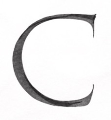 Offscreen Ofir has agreed to the challenge of this C I wrote with a broad edge brush.


![[Deleted User]](https://secure.gravatar.com/avatar/4a64fb71566d0b4e56fb2a244524664c/?default=https%3A%2F%2Fvanillicon.com%2F83f6992ca487b67bd3dd7df96e236fc1_200.png&rating=g&size=200)
Categories
- All Categories
- 47 Introductions
- 4K Typeface Design
- 495 Type Design Critiques
- 577 Type Design Software
- 1.1K Type Design Technique & Theory
- 670 Type Business
- 885 Font Technology
- 29 Punchcutting
- 539 Typography
- 125 Type Education
- 333 Type History
- 81 Type Resources
- 113 Lettering and Calligraphy
- 33 Lettering Critiques
- 80 Lettering Technique & Theory
- 569 Announcements
- 100 Events
- 116 Job Postings
- 170 Type Releases
- 182 Miscellaneous News
- 270 About TypeDrawers
- 54 TypeDrawers Announcements
- 114 Suggestions and Bug Reports