Short Monotype Descenders

Wei Huang
Posts: 102
in Type History
I vaguely understand that Monotype had limitations on the length on descenders. Here's an ad from Lanston Monotype advertising fonts with longer 'traditional' length descenders. What exactly stopped them from having 'longer' descenders?
Are any of those fonts affected with short descenders still around in digital form and still with the short descenders?
Did typographic standards and thusly our reading tastes/habits change because of this limitation?
Are any of those fonts affected with short descenders still around in digital form and still with the short descenders?
Did typographic standards and thusly our reading tastes/habits change because of this limitation?
Tagged:
1
Comments
-
There are at least two cuts of Monotype Bembo with different descender lengths. The one with shorter descenders is more widespread and the digital version follows it.
Some research suggests that the upper halves of letters are a higher priority in terms of legibility. In an effort in increase x-heights, the space below the baseline is most often sacrificed. It's a particularly common feature of types designed to be read at very small sizes.
It would be great to know for sure if the process of standardizing the types lead to an adoption of shortened descenders. If all sizes were patterned on a single set of drawings the effects would extend to the entire range.
Setting text today, most people find that fonts with large x-heights require a good deal of added leading to distinguish the lines of text. In the days before leading, the length of the extenders served to space them.2 -
For most of printing history types didn’t have common baselines. So mixing roman and italic from different vendors, or even dropping in a miscellaneous symbol, might require creative filing and leading of every mixed line. This was an expensive PITA.
So in 1913 ATF introduced the standard baseline. The standard baseline grouped types within sizes ranges. Each range had the same amount of space below the baseline so that printers could easily mix types from different foundries. In some sizes descenders got squished, which wrecked g. For example, sizes 7–10p all shared the same baseline. Such types could not be used for the generously leaded pseudo fine press editions that were printed with Monotype machines by publishers like the Garden Press and Brentano’s.
This definitely impacted typographic standards, because most old types had their g, p, and q recut to fit the baseline. It was unpopular with fine press printers like Rogers and Goudy—which is why some vendors offered type cast on its own baseline with appropriate descenders.
Walter Tracy discusses this in Letters of Credit, pp. 48–49.7 -
I’ve made some typefaces with “small text” versions that have shorter descenders (among other differences), which may be used at any size. Scotch Modern, for instance.0
-
James gives a decent summary/intro to the topic.
I will note that it was recognized at the time that shorter descenders were sometimes a problem, so besides “standard line” alignment, there was the alternative “art line”—with room for longer descenders. (Such fonts often had longer ascenders as well, of course.) So there was a second standard alignment, for a much smaller number of fonts, intended for fine book publishing and unusual display purposes.
3 -
Not a Linotype face, but "Caslon 540" jumps to mind as an example of typeface version with shortened descenders.0
-
-
6pt leading? No.0
-
Yes, I measured it with my trusty old pica rule.0
-
But you know how leading vs. line spacing works.0
-
You’re thinking of “extra leading”.
It’s always been my (Anglocentric, North American) experience that leading refers to baseline-to-baseline distance.
Linespacing, and linefeed, I have always assumed to be terms invented by new tech engineers for phototype and DTP, because they naively interpreted “leading” quite literally, rather than accepting conventional usage.
But the old usage (although I don’t know how far back it goes—perhaps to the introduction of the point system) persists.
1 -
Phototype brought the possibility of minus stacked type. Stacked type was a term we used in the 50s-60s to mean no leading added to body type. Without the need for a fixed height in Phototype, a paragraph could be set minus units complicating baseheight so that you could set type 12/11 if you wanted to, or 7/6 if you saw fit. I always hated that look, it was often used in boiler plate legal minutia to minimize reading. Sometimes, space-saving was more important than readability to the publisher. Sometimes, headlines worked well this way and even improved the fit but running text trash-compacted vertically always made me nauseous to read.0
-
Nick, you showed and example from 1950 (and I happen to be at a metal type printshop this week) so this seems worthy to clarify. Leading is the stuff you put between “bodies” of type, and the idea of the Monotype “bible type” this thread started on is that you can cast typefaces on *smaller* bodies than those they are actually meant to be cast on. A 10pt typeface with shortened descenders could be cast on a 9pt body to set it tighter for instance. Thus, the leading would be negative in that case even. I think it’s important to use appropriate terminology, especially when we are talking about physical type, and not confuse it with slacking usage today.2
-
When I first got started in the typesetting business, many shops way back then had two departments: metal and phototype. I was taught that "leads" were the thin strips of lead that was added between two lines of metal type to increase the "leading". In the phototype department, "leading" was how type was measured from baseline-to-baseline. The words "linespace" and "linefeed" to me means exactly the same thing as "leading" or "lead".
"Leading" still applies in the world of DTP, but so does the term "lead", and in some contexts can be interchangeable. "Leads" would not be used in the world of DTP but still is in those shops that continue to work with metal.
0 -
FWIW, the recent AIGA Typography Quiz defined leading as "The vertical distance between baselines of type."
It's interesting to me that the diversion in usage might have coincided with the rise of optical type. Makes sense, since there's no body to consider there, so the rough meaning is still "what you need to add to get to the next line."
I'm inclined to use it like Indra does, though: to me, something set 12/14 has 2 points of leading, not 14!2 -
I'm inclined to use it like Indra does, though: to me, something set 12/14 has 2 points of leading, not 14!
Correct. That's the way it has traditionally been interpreted everywhere I worked.
0 -
-
Not sure if what that illustrates is right, to only show what is shown? If, the jelly is metal, then type and jelly should not touch. If the jelly is digital, then showing only positive jelly is somewhat misleading.
Elsewhere, I would like to base our extender lengths on point size and column width, out of which line spacing and extender length can be derived. The modern issue to be resolved though, is whether to base the vertical metrics, and thus the templates, or line spacing recommendations, etc.*, on the per-style glyph extents, or on family wide vertical metrics.
We we have not done enough examples to determine the best process, but I know that design work on five fonts in the same style, each with different metrics, is suboptimal as tools work now. As a result of which, I've been turning the metal process over and over in my head. The old guys and dolls were able to sell fonts tagged for font size and line size together, equal, or unequal as the size and line space were required, (*aka the "etc." above). I think it was eventually only craft and hobby letterpressers who had time to use seperate parts for leading, (happy birthday, I last used metal leading in 1976).
There is a demo of what we're trying more recently is here: http://demo.webtype.com/Retail/FB/REextenders/index.html
I drawn the type, DJR programed the site. We hope to make it so craft and hobby web site developers can do this, with no expectations that your pour and publish typographers will have the time for these extra parts, either;)
3 -
Jelly interesting!1
-
Your point well made, Indra.
Linespacing it is.
We should also be more precise than discussing this issue as “shortened descenders”, because, as can be seen in the bible type, the /g, /p and /y have been substantially redesigned, and presumably so has /q.
Wasn’t Fournier one of the two-descender-lengths types?
Could someone please post images of one size of type cast on a smaller body, with comparisons of the two body sizes?
0 -
Wei Huang — I can’t open your link to the Monotype ad, could you please post it as an image?0
-
Apart from Bembo also Centaur was available in two versions (also for large composition), dunno about more but likely. In the case of Centaur, all other characters were the same, so you could just order the matrices for the descending characters separately, swap those out and cast away.0
-
Nick, if you delete the part preceding http in the URL in the address bar, it will work.
http://www.galleyrack.com/images/artifice/letters/press/comptype/monotype/typography/promotion/lanston-monotype-traditional-length-descenders-mtf1-0600grey-0300dpijpg.pdf
0 -
Thanks.
I don’t understand, what does “12 point, 11 set” mean?
The types are between 6 and 12 pt size.
Here is a detail, 12 point Bodoni, comparing the two versions.
0 -
Perhaps it means a 12pt drawing set on an eleven point body?0
-
12 pt 11 set would mean it was designed for an 11 pt width. I don't know about the height, although from the looks of the image I think it could probably be done on 11 leading. There appears to be enough room.
1 -
-
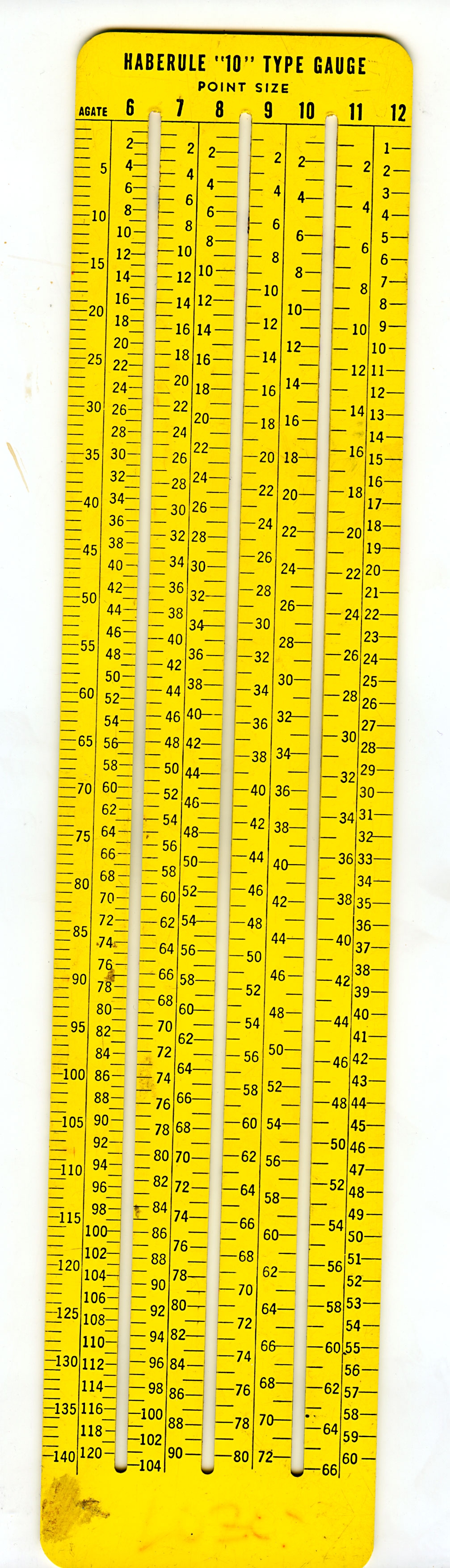
Back in the day:
Still have mine.
0


Categories
- All Categories
- 47 Introductions
- 4K Typeface Design
- 495 Type Design Critiques
- 577 Type Design Software
- 1.1K Type Design Technique & Theory
- 671 Type Business
- 885 Font Technology
- 29 Punchcutting
- 539 Typography
- 125 Type Education
- 333 Type History
- 81 Type Resources
- 113 Lettering and Calligraphy
- 33 Lettering Critiques
- 80 Lettering Technique & Theory
- 569 Announcements
- 100 Events
- 116 Job Postings
- 170 Type Releases
- 182 Miscellaneous News
- 270 About TypeDrawers
- 54 TypeDrawers Announcements
- 114 Suggestions and Bug Reports