Extend language support?

Now... If you were going to extend your latin typeface, in what languages do you think its wise to do it?
Arabic, Indic languages, Japanese, Cyrillic, Greek... And finally, do you think that it will be worth the cost?
Too many questions!
Thank you.
Comments
-
The user and all related content has been deleted.1
-
Fernando,
Google fonts has been doing nothing but extending fonts and making fresh ones with non-latin language support.
If you want to get a feel for what's involved and who's doing what, I can't think of a better place to dig around than the Google Web Fonts Forum
https://groups.google.com/forum/#!forum/googlefonts-discuss
And all the work is posted on Github repositories, so you can see exactly what's being done and how.
You didn't make it clear whether you wanted to do the work or contract it out, but certainly all of the designers working on those fonts are open for business.
0 -
Thank you, I will check it out, I want to outsource the language extensions.0
-
We don't see many foundries speculating on the creation of retail type for the scripts you mention because there isn't retail demand in those regions. This is a perplexing problem for aspiring type designers in those regions as well as established foundries, since - in contrast to the latin market, and I guess why you are raising this topic - there are so few type designs for these scripts when compared to Latin, and with those large and young populations, and capitalist expansion into foreign markets is a time honoured method of overcoming crises of overproduction.
Instead, we see both local up-starts and multinationals doing multiscript type projects on a commissioned basis from companies operating in those regions who benefit from new type being developed for those scripts. The most numerous projects are custom branding ones, although I suspect the most lucrative are those for the small number of mostly American software developers (Apple, Google, HP, Intel, Microsoft, Nokia, Samsung.)
The biggest winner from that trend is clearly Dalton Maag, who has stayed a rocketship trajectory in the last 10 years, winning the projects of many of those tech companies and a lot of brand work, taking Bruno from a cramped little office in London to a multinational powerhouse.
On the smaller side, I've been to those regions a little bit, preaching my sermons, and I'm happy with the work Mooniak in Sri Lanka has done to earn good money from local clients developing libre fonts. Pathum, one of the partners there, is now doing the MATD. I'm excited to see how far such foundries can go with the market development of libre fonts, rather than the single large patron approach I've been lucky to ride on the last few years. Anyway...
I believe the demand-side market jurisdictions for retail type are, in order: USA, Germany, UK, EU. I'm curious if your own sales data matches this") That being the case, I don't think it would be wise to speculate on other jurisdictions; I think you'd have more luck with researching your existing customers, identifying those that operate in MENA or SEA or whatever and upselling them.
That being the case, I don't think it would be wise to speculate on other jurisdictions; I think you'd have more luck with researching your existing customers, identifying those that operate in MENA or SEA or whatever and upselling them.
If someone wants to get into multiscript type design, the MATD is obviously the best path but its a big commitment (especially because you have to quit working for about year to focus on your studies.) To be more commercially aggressive, others have in the past got into this specialist area by seeking out internships at Monotype and Dalton Maag. Today there is the Reading TDi, and their upcoming part-time online course is very juicy.
But I suppose at this point in your career you yourself would be looking to collaborate with other designers in joint ventures. As Rich says, I have a long list of such designers I've commissioned type from, and I'm happy to provide recommendations.2 -
Dave Crossland said:
Today there is the Reading TDi, and their upcoming part-time online course is very juicy.If you're talking about the MRes TD, the course description suggests this is more about research for teaching than about gaining multiscript experience. (If you're talking about something else, sign me up now!)
In response to the original question: Not Japanese. To add Japanese to a font it is not enough to add hiragana and katakana syllabaries and call it done. One of my pet peeves as a user is discovering that a "Japanese font" just contains the kana, because a kana without a matching kanji set is practically useless. And adding a full kanji set to a font requires a large team and many years; even having a restricted set means that if my document contains a character you haven't provided, I can't use that font.
Basically, if you are wondering how much work it is to add Japanese to a font, you shouldn't be doing it.
0 -
Doing Greek and Cyrillic pays off for some designers because it helps their work sell to ad agencies doing pan-European campaigns. It’s probably not going to help a font that isn’t already selling well.
As for other writing systems, retail sales generally aren’t going to make back the cost of developing them. For starters, non-Latin is expensive. You have to hire a type designer with experience, expert consultants/native readers to check the work, and maybe pay for days or weeks of testing and debugging when stuff doesn’t work and nobody knows why. Despite some of those writing systems having hundreds of millions of readers those markets are tiny. And marketing fonts to designers working with “…Arabic, Indic languages, Japanese…” is going to be expensive. Unless you’re independently wealthy non-Latin isn’t a retail market to chase after.1 -
The "basic" Japanese character set - if I remember correctly, JIS 0212, the government standard - contains about 6000 characters, and is divided into level 1 and level 2, about half each. Level 1 is considered sufficient for "daily" use, while level 2 is for "scholarly" (i.e. technical writing) use.
So to claim "basic" Japanese support you have to do about 3000 kanji's for an absolute minimum, I think.
The requirement for Japanese is quantifiable in that you absolutely must support JIS level 1 at least.
I think the pan-CJK requirement is in the 20,000+ glyph region.1 -
Yes, while typefacedesign.net/courses/mrestd is marketing itself on the research for teaching thing, I am proposing that folks like Fernando who might have a primary focus on expanding their practical type design skills into multiscript design and only secondarily on humanities scholarship will not go wrong by attending it.Simon Cozens said:Dave Crossland said: Today there is the Reading TDi, and their upcoming part-time online course is very juicy.If you're talking about the MRes TD, the course description suggests this is more about research for teaching than about gaining multiscript experience. (If you're talking about something else, sign me up now!)
0 -
@Dave Crossland Thanks for your insight!
It seems weird to me that languages like Arabic, Hindi, Bengali, Russian, etc... that have a lot over 100 million speakers, are not an interesting target for type retail.
Do you think that the whole new bunch of libre fonts affect the market for this kind of languages? After all If I have a lot of great quality fonts for Devanagari, and they are fairly new, I wouldn't want to spend 100 dollars in a new font with similar quality. Specially if I don't have the habit of buying fonts.
So do you think this is really an issue? I'm not saying that retail is better than libre, they are just two different approaches (I use both of them), but they surely are bonded and affect each other.
And about your question about my customers, yes, most of them are in USA, Germany, UK, Canada, Switzerland, Poland, Australia, etc...
Last year we've got an email of a foundry that wanted to extend some of our fonts to Thai but the model they proposed was not very good (or clear, for that matter).
The ideal for me would be someone that is willing to extend a typeface to lets say, Arabic, and gets a reasonable % of the earnings of that font. Is that too crazy?
1 -
It seems weird to me that languages like Arabic, Hindi, Bengali, Russian, etc... that have a lot over 100 million speakers, are not an interesting target for type retail.
These places have different design cultures and economies. They often do not respect IP, they have very different design cultures, many people live in extreme poverty, and in the case of India, the local languages and writing systems are rarely prestige languages.0 -
Yes James, I'm aware of the situation. But don't you think that on some countries this is changing? For example in Saudi Arabia and India, the design industry there is growing very rapidly.
0 -
Rapid growth from almost nothing still doesn’t make for a big market. And just because a design industry is growing doesn’t mean that their design culture is obsessed with chasing seasonal font trends the way much of the Latin typography world is. In some cases the designers are just trying to get the few fonts they have to work correctly with what software they have on the computers they can afford.
0 -
Ah, dear Fernando, libre fonts are not the villain you are looking for
In India specifically, the 'vernacular language' graphic design market is still ruled by "pre-postscript style" or "70s style" vendors whose complete packages - word processors, spell checkers, etc etc - that end-to-end use their own proprietary encodings, not unicode, and who bundle 100s or 1,000s of fonts as part of their solutions. And this is, I think, what James is saying about the design culture being disinterested in new type designs; these software solutions people almost all just copied pre-digital designs and left it at that, 20 years ago. Here is just one example:
http://www.summitindia.com/content/indica-fonts-devanagari.html
Much amusing for me - careful what you wish for and all that - is that, in a similar way to the contribution libre fonts have had on establishing a mass web font market boom, the reason the high profile Indian foundries such as ITF and Ek are eager to work on libre fonts is because they believe that only libre fonts have a chance of unseating these incumbents and creating a "post-postscript style" retail market in the future.
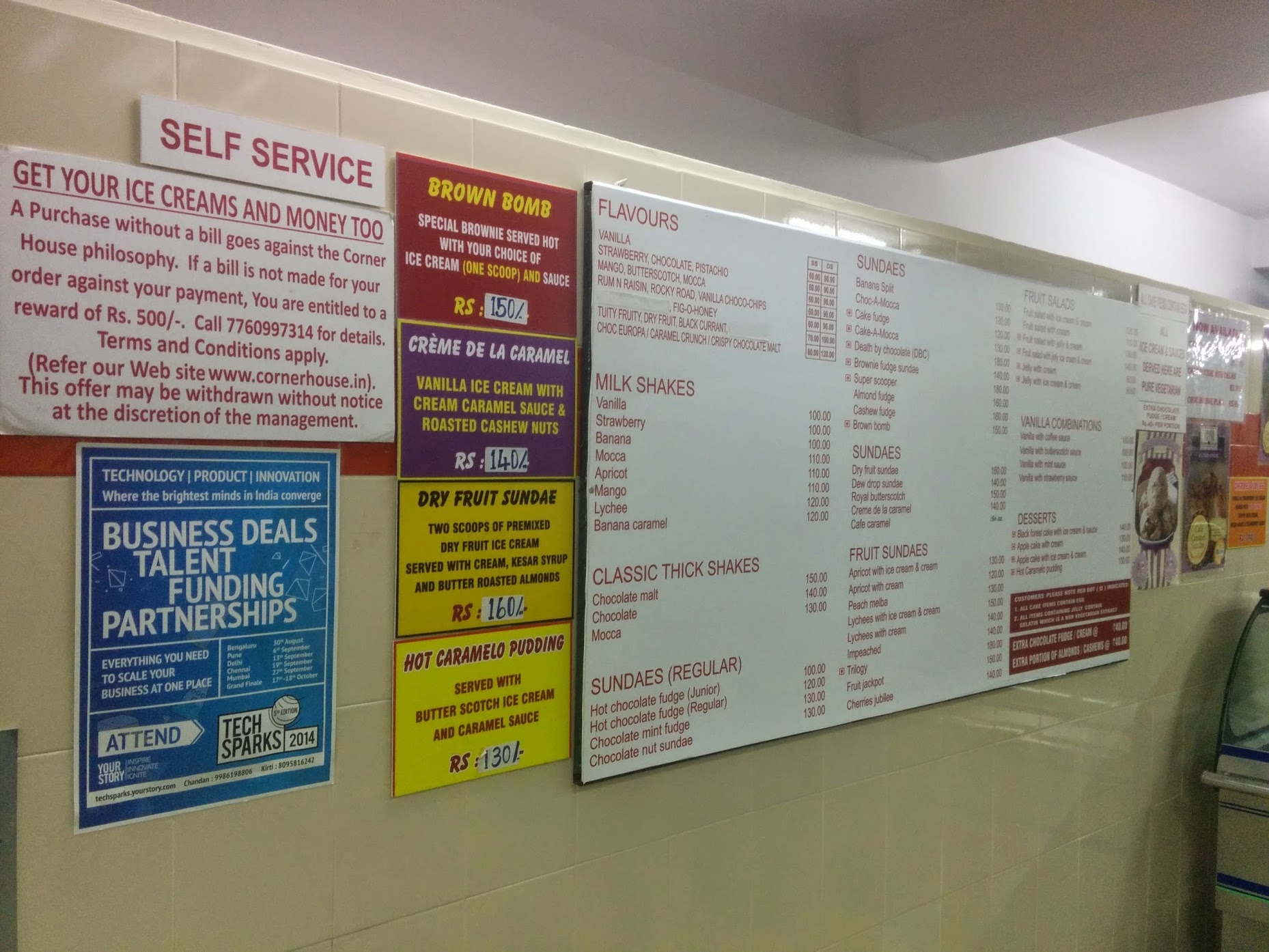
What James said about the 'prestige' language is also something I found remarkable. I was absolutely astonished about this when I first visited India. For example, here is an afterhours icecream shop in a hip part of Bangalore, which I would have presumed to be serving a market larger than those who are fluent in English.
But no, all the menus and signage (somewhat important, ahem) are all and only in English, with the sole exception of the shop name itself on the signage outside.

I can't find the photo quickly, but when I first arrived I took some photos of the flyposters around, which were for super low-rent services - say, barbershops - that were also mostly in English.
While some official stats put the English literacy rate at around 10% nationally, in the cities it is surely much higher; and this is because of its aspirational nature.
So you are far more likely to have luck earning money selling Latin fonts in India than those Indian scripts, at least in 2016.
In Cambodia, the type designers there told me the government refuses to recognise fonts as subject to copyright, so they are rather pessimistic about their chances of establishing a retail market.
Thailand does have a small retail market, so that might work, although local prices won't add up to as much USD as they do in Europe or the Anglosphere... the glyph set is comparatively small, and when I arrived there in November for BITS last year, I was surprised at how much more well developed Thailand was compared to other countries in SEA I'd visited before. I read somewhere (maybe Luc Devroye's site, not sure) that the 'loopless' style of Thai script has been disparaged as too radical and 'westernised,' but I saw a lot of it there.
The middle eastern markets I am much less familiar with. You were at ATypI in Brasil to see the launch of TPTQ Arabic, and we'll see if ends up taking a similar route to TPTQ India, ahem, ITF, in seeking to establish itself as a publisher of Latin only families.
Anyway, yes, I think your partner-venture model is ideal, and with dozens of MATD graduates arriving on the labour market each year, and there also being plenty of local type designers in these regions eager to apprentice, I think you'll be able to find someone willing to extend your typefaces to other scripts with no trouble at all - if your % is good and, as you say, clear enough.
(Also, thanks for confirming and not forgetting as I did the Commonwealth markets, those are indeed important
1 -
@Dave Crossland on the contrary! If it wasn't for my font Fenix being part of Google Web Fonts I probably wouldn't have thought of type designer as a serious carrer.
So don't worry, I'm not against libre fonts! (and I've got that to thank you for") )
)
Thank you guys for your comments, very insightful indeed!
1 -
Thai character set is quite small - I think iso8859-15 ? is the 8-bit English + thai encoding, and is the same as their national standard.
India is historically rather fragmented language wise so English because the "universal" language from colonial times across tribes.0 -
However, India has been independent long before mainframe computers were widely sold.Hin-Tak Leung said: India is historically rather fragmented language wise so English [became] the "universal" language from colonial times across tribes.
English continues to be the most widely used business language nationally because all the others have regional biases; eg national communication in English is preferred over Hindi by Tamil speakers.
0 -
I came back to this thread to advise giving a lot of weight to Dave's opinion because he's done the traveling. Until you go and take a look for yourself, email and Skype just isn't going give you the true picture. But I see he's taken care of that by expanding his reporting. Fascinating.
I worked side by side with three Indian guys when I was in the Internet Technologies department at the New York Metropolitan Transit Authority and they were all from different parts of India and their native languages were all different. Each identified totally as Indian but they could not communicate with each other without knowing English as a bridge language.
0 -
I agree the market isn't there now, but I thought I should make this point:I work for an international publisher. The current and future needs of the business are best met by centralized solutions, that work across locations and distributions. Proprietary encodings and non-standard font formats cause headaches to the overall workflow, that are best avoided wherever possible.Author manuscripts in English may include a wide range characters, that may be distributed across several mediums. We also have projects that venture into new markets. The licensing models that we consider are generally quickly accessible / off-the-shelf, and reflect pricing structures of Latin script or OpenSource/Libre solutions.Our licensing depends on the use, distribution, overall workflow and allocated budget. Is there an identified business need for a new font or licensing extension? For text designs the overall licensing – in terms of what the font vendor sees – is rarely limited to a single CPU, location and organization. We require proof-of-purchase from any stakeholder that uses a font, including suppliers, freelancers, co-publishers and sometimes authors.1
-
I remember that when Bruno Maag said at Granshan 2015 in Reading last August that he retails multiscript products at the same price as latin ones, there was a lot of debate about it... there seemed to be two positions, this demand-side one (the extremist position being that the prices should be radically lower than Latin - $1-5 - in order to sell into a script's local market at scale) and then a supply-side one: That since there is obviously more labour in drawing more glyphs, and more prior preparatory labour in learning the script for non-native-readers, the prices must be higher.Katy Mawhood said: reflect pricing structures of Latin script1 -
I'm interested in this topic too. How about Vietnamese? I'm a native speaker of Vietnamese and have special interest in Vietnamese as well. I did insert Vietnamese characters to some open source fonts and find this is not very hard to do, and not very time-consuming as you might think. Especially with a native speaker like me. I know all about Vietnamese and the some about the production process of type.
Well, you need an average of 92 more characters to add to fully support Vietnamese, and they can all be composed from existing Latin characters, except for 2 diacritics you must design is “horn” and “hookabove”. As I can see Vietnam is a growing design market, there's a lot of demands to new typefaces, especially in branding. But fonts hardly support Vietnamese, so, once Samsung Vietnam contacted me and ask if I can add Vietnamese support to their brand font. I did it for them and they seemed to still use it until now. At that time I don't even know if I can do that legally, or illegally. It seems like they don't have enough budget to hire the professionals to customize the font, instead.
I knew some people just get the commercial font file from internet and then add characters to it. Then distributes it freely for Vietnamese, and they're getting a lot of attentions. Some even getting money reselling it as they say, they're getting money for their effort of adding characters only (as for personal use, not for commercial use). They doesn't sell lisence and still encourage people to buy it from the author.
But, yes, Vietnam is a poor South East Asia country, I love my country but that's the truth. And there might be just a few companies interested in purchasing commercial fonts, since in Vietnam, as I can see they're still using Arial/Times new roman/system fonts in some of printing books, newspaper and mostly all of the documents, because they don't even be aware of “commercial fonts” and “typography”. Not to mention that there're just very small amount of fonts support Vietnamese. Typography is hardly educated in school, even in art school. But in recent years, typograhy is somehow the rising trend among Vietnamese teenagers/art students and in design industry. Many young people are interested in it.
Sorry for the rants, I just want to say that, even Vietnam is a poor country and might not be an effective retail market for now, nevertheless I'm pretty sure it will change in the near future, if it's getting enough attention. I noticed the new typeface release often got discounted, the price got decreased to the amount of $40-$100 each family. It's totally possible for 90% of the design companies or even normal companies to purchase it with this price. But they didn't because, they're not aware of it and those typefaces don't support Vietnamese.
Well, that's very much my point.
About me, if you're interested to know, I'm a self-study person, I teached myself most of the time, so I don't really have any diploma. And there's no type design course/school in Vietnam anyway. I want to go study aboard, but I don't even finish high school, because the education industry in Vietnamese is just too bad. They teach too many specialized-stuffs in high school. For example, you're not even interested in becoming a mathematician but you must study all the stuffs about intergral. I'm bored of studying useless stuffs so I abandon high school and now work as a freelancer.
I'm interested in helping you adding Vietnamese support, or fully do it for you. But I don't really know I should be charging for that. I did add Vietnamese character for Montserrat for my own use, with fully functioning opentype feature and Vietnamese kerning pair. This is a sample of it.
 5
5 -
Agree with all of the above. I think there is also an economic argument here: even if Vietnam is a poor country now, there are about four million Vietnamese outside of Vietnam. There's three thousand restaurants in the US alone which is basically a captive market for design, and many others worldwide.Nguyen Mai An said:
Sorry for the rants, I just want to say that, even Vietnam is a poor country and might not be an effective retail market for now, nevertheless I'm pretty sure it will change in the near future, if it's getting enough attentions.
1 -
I used to occasionally add Vietnamese characters when commissioned, but now I include them in my standard set. When I started adding Vietnamese characters, I didn't know how to deal with the accent stacking. I felt like a college student piling suitcases on a car and hoping they're not going to fall off!
At the time (15 years ago), there weren't a lot of examples of typefaces with a Vietnamese set. I've got a handle on it now, but I think designers who haven't tried it before might be intimidated by the tall accent stacking. I used to try to cram the capital accent stacks so they didn't go past the top of the emsquare (highest point). Now I just let the high accents hang over the top. Some system fonts do that so I figure it's not an egregious strategy.
What would really be helpful is a guide for type designers who are unfamiliar with the Vietnamese language. Have you seen Adam Twardoch's guide for Polish diacritics? A guide like that for Vietnamese would be helpful. Looking to other fonts as an example isn't a good idea if we don't know which fonts are incorrect.
http://www.fileformat.info/info/unicode/char/1ea7/fontsupport.htm
If you click on View All, you can see how the grave is on the top, on the left and on the right. Which way is correct? Are there certain common accent collision pairs? How do we deal with Extra-Bold and Heavy? Can we tuck the hook into the breve?
Perhaps you could create a guide to encourage designers all over the world to add Vietnamese characters.Vietnam is a poor South East Asia country...
That's not much of an issue. When a typeface supports more languages it becomes more useful for localization. If a designer is making an international instructional manual or a phone application that's used internationally, the more languages a font supports, the more valuable it becomes.
3 -
You're looking for Donny Trương's Vietnamese Typography. There you go: one fewer excuse!Ray Larabie said:
Have you seen Adam Twardoch's guide for Polish diacritics? A guide like that for Vietnamese would be helpful.6 -
What? Oh man...how did I miss that?0
-
Yes, Donny Truong's guide is pretty much everything that covers the basic rule of the stacked diacritics and Vietnamese typography. In my opinion, it's basically the knowledge of every single people that can write in Vietnamese. But I think a few rules written in there could be bypass/ignored, depends on the stroke contrast and design of the typeface. You can tweak it as you please, but indeed they're the basic rule that all Vietnamese accept.
But there's indeed more problems with Vietnamese than the guide covered. A lot of people that I worked for often make me scale down the diacritics because they find it too large. Especially at display size. One more problem is the line height, it's often must be loose due to the stacked diacritics in capitals. But in all caps display size, if the line height is too loose, it's not a good idea. It could affect the whole design and not looking very good.
But, there's a lot more ways to design how diacritics should be placed, especially at display size. You can see more of it here: http://luuchu.com. It's indeed a creative way to effectively adding Vietnamese diacritics, without losing legibility. But only at display size. They came from the early 1900s Vietnamese typography that are haven't been used in recent years, due to the available of the computers and printing industry. They don't have to write the letter themselves anymore. This kind of adding diacritics for Vietnamese is a long lost.
Tl;dr aside, in short, there's more freedom for you to choose how diacritics should be placed, don't just base everything on the guide Donny Truong gives you.
Oh, I saw some of your work too. Yes, it's indeed shouldn't be cramed. Instead scale should be the better solution. As long as you can maintain the weight of the scaled diacritics. Actually, I think that system font is a bad example, especially Arial. Well It's covered on Donny Truong's Vietnamese typography guide.Ray Larabie said:I used to try to cram the capital accent stacks so they didn't go past the top of the emsquare (highest point). Now I just let the high accents hang over the top. Some system fonts do that so I figure it's not an egregious strategy.
And I totally agree with you about the mobile application side. Indeed a lot of mobile companies demand Vietnamese fonts.
Well I'm really glad to help anyone that interested in adding Vietnamese to their typeface. If anyone need my assistance, I can act as a freelancer, I can even do the entire work for you. Hope to see more and more people interested in Vietnamese!4 -
I think more and more designers/foundries are starting to consider Vietnamese support for larger extended language sets. More companies are commissioning extensions for brand faces.
Information like Trương’s site goes a long way toward making it more practical for non-native designers to consider.
Nguyen Mai An — If you have additional perspective, I encourage you to continue to share, so that there is a more holistic view than just one person’s guide.
I would suggest a new thread for everyone’s questions about Vietnamese design, just so that it doesn’t all get buried in this one and will be easier for future reference.
5 -
Nguyen, it's really excellent to hear a native Vietnamese speaker. Your information is very valuable. I included Vietnamese in my projects long ago and always found the language and its history very interesting.
Do you have any sample of U+A796/U+A797? I know it is an ancient character and needed just in very specific situations, but I like to dive into antiquities. What I got so far is the Michael Everson proposal to include both into Unicode. But Everson presented few samples of U+A797 and none of U+A796, supposing the uppercase would be made similarly. I just found an image of Alexandro de Rhodes' catechism, where U+A797 is used.
Besides stacked diacritics, I also see the hook poorly designed in most fonts, many times with different height/size between o/u. The way I made them:
0 -
Thank you, sir Freiberger, I'm so happy to hear that. About your concern, do you mean the letter B with flourish? It has disappeared from the modern Vietnamese language. It doesn't included in the basic Vietnamese alphabets, and mostly all of us don't know that character even once existed in our language. I guess you should focus on other aspect instead.
About your design of the horn, yes, I find it important to keep the horn in both o/u consistent, especially in height. Your design is indeed very nice. You managed to keep the height and stroke contrast be the same and in consistency with the whole design, but I think it's a little, just a little, over extended to the right. It might affect the metrics and/or kerning between the basic u/o and for example, the lowercase t.
And just one more notice, in Vietnamese, we never use o before u, but u before o instead. I think you should reposition them that way. Feel free to ask more here: http://typedrawers.com/discussion/1446/faq-vietnamese?new=1
2 -
HiFernando Díaz said:Do you know any good designers/foundries that specialize in extending languages for a typeface?
Now... If you were going to extend your latin typeface, in what languages do you think its wise to do it?
Arabic, Indic languages, Japanese, Cyrillic, Greek... And finally, do you think that it will be worth the cost?
Too many questions!
Thank you.I have experience as a Designer/Typeface developer, Logo Design with expertise in Latin, Sinhala, Urdu and All Indian Language Fonts development.To develop my career as a Designer/Font Designer where I will be a valuable team member, contributing quality ideas and work for an organization where there is an ample scope for individual as well as organization growth in Font Design and Development.
kaarambir singh rohilla
fontdesigner@gmail.com
New delhi (India)0 -
Nguyen,
I included Vietnamese in Andron and I will do so in my forthcoming new Sans family project.
Just my 2¢s …
For western display faces I hardly see a case for supporting Vietnamese, mostly. But, as a designer, I would be extremely keen to get real interesting vietnamese vernacular decorative ideas, maybe from signpainting, old posters, packaging whatsoever. Decorated types always reflect a particular region’s character.
1
![[Deleted User]](https://secure.gravatar.com/avatar/4a64fb71566d0b4e56fb2a244524664c/?default=https%3A%2F%2Fvanillicon.com%2F83f6992ca487b67bd3dd7df96e236fc1_200.png&rating=g&size=200)


Categories
- All Categories
- 46 Introductions
- 3.9K Typeface Design
- 491 Type Design Critiques
- 572 Type Design Software
- 1.1K Type Design Technique & Theory
- 666 Type Business
- 878 Font Technology
- 29 Punchcutting
- 532 Typography
- 121 Type Education
- 330 Type History
- 81 Type Resources
- 111 Lettering and Calligraphy
- 32 Lettering Critiques
- 79 Lettering Technique & Theory
- 563 Announcements
- 97 Events
- 116 Job Postings
- 169 Type Releases
- 180 Miscellaneous News
- 270 About TypeDrawers
- 54 TypeDrawers Announcements
- 114 Suggestions and Bug Reports