Shape Of Cedilla

Michael Jarboe
Posts: 265
Something I've been curious about, what are your thoughts on the more traditional cedilla accent shape vs. cedilla accents that are more of a minimal, almost 'inverted grave' accent shape?
Tagged:
0
Comments
-
I like the modern designs because they save space. But I don’t use them because I only want one cedilla design in a font and in the past Eastern European users have complained that only the traditional design is acceptable in their culture.1
-
I always use the traditional shape, probably because it is quite interesting to make, but not too difficult. I mean, let’s face it, adding accents to a font is incredibly tedious.2
-
I think portuguese typographers prefer the traditional one.1
-
I mean, let’s face it, adding accents to a font is incredibly tedious.
You must not be using Glyphs, then! ;o) I find it one of the most rewarding jobs, since it gives you so many new glyphs for such little effort.
(What I find tedious is the host of niche glyphs that still need to be drawn specifically, like the eth, the pound, and the logical not.)1 -
I think you’ll find a whole country of Icelanders who do not consider the ð to be a “niche” glyph.
And I imagine many Eastern European type designers might make the “niche” glyph complaint about that annoying x, for example.6 -
Challenging is a good thing.1
-
Eastern European users have complained that only the traditional design is acceptable
Eastern European cedilla? Do you mean its use in Turkish, or the comma accent?0 -
And I imagine many Eastern European type designers might make the “niche” glyph complaint about that annoying x, for example.
I do, in fact, find the x rather annoying to make, at least in a serif font...0 -
Given how tiny Iceland's population is I agree that eth qualifies as an annoying niche letter. In the time it takes to draw eth I could probably add support for several African languages and support millions more users. But neither Iceland nor Africa but enough fonts to justify expending any more intellectual effort on niche letters, so I just let inertia guide me to eth.1
-
Interesting, thanks for the replies, whenever I see the non-traditional cedilla it seems off to me, but it does makes sense that it would work better at very small sizes and/or low resolution.0
-
Christian, how does Glyphs differ from Fontlab in creating accented glyphs? Fontlab has the auto-build for accented glyphs where it automatically combines components for any given accented glyph you create.0
-
I don't know FontLab, but it sounds similar to Glyphs in that respect.
Like James, I largely let my glyph coverage be defined by inertia, where in my case that's the easy-to-fill Latin language categories in Glyphs. Pinyin is pretty easy to satisfy, so I did it for Traction. For Vietnamese, IPA, and Pan-African I'd have to add 80–200 new glyphs each, many of which would need to be designed from scratch. I'm not saying it's an effort I'd never go through, but I'd need some more incentive than sheer humanitarianism. (Maybe a nice commission from Google Fonts? ;o)0 -
The user and all related content has been deleted.0
-
Michael, if you are interested how adding accents works in Glyphs: http://www.glyphsapp.com/tutorials/diacritics0
-
Christian, how does Glyphs differ from Fontlab in creating accented glyphs?
Most importantly Glyphs can correctly interpolate anchor positions. I don’t know if Fontlab ever fixed that bug.0 -
This is how it's done with Fontark
 http://youtu.be/1dxlK4X-ULw 0
 -
I was talking about how uninteresting the shape of most accents is, and thus tedious to produce, not positioning methods. I like the ogonek too, as well as the old-school cedilla.1
-
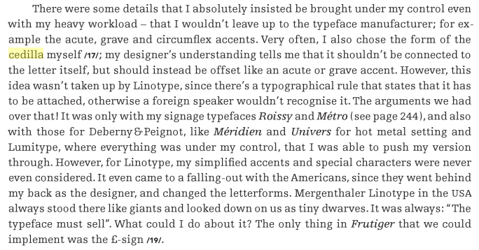
Could anyone shed some light on how the bottom one was more convenient? Unless I've misunderstood this:
From Adrian Frutiger - Typefaces
Edit: elsewhere in the book...
1 -
I can say that the bottom-one looks way more like what French speakers are used to.3
-
It is a language issue more than a style issue. I always include both with a language tag substitution in locl.
0 -
For multilingual folks, some may find it disturbing to have a cedilla that looks the same as a comma accent. (Does anybody know a language that has both under letters?)1
-
As far as I know, many Linotype designs used the same standard set of accents, they weren't drawn to match each typeface.1
-
From my experience of seeing cedillas in Catalan, Portuguese and French it doesn't matter if the shape does not join the main character, but it is rather a close shape not an open one, more like the counter of lining 5 instead of old-style 5.4
-
I'm a native portuguese speaker. To me, cedillas shouldn't be a straight line, they ought to look like a hook. I also find it very odd and distracting when they don't connect to the base character, but even that is tolerable so long as the actual shape of it isn't just a straight line.3
-
Cedilla was originated from Visigothic z. Its design corresponds to a small Ezh where the top bar is cut off to link with c. Variations on the stem angle or how open is the bottom curve are usual.
Although not strictly correct, non-linked, comma-like shapes could be used and still understood as cedillas. None of the languages which have cedillas also use the comma bellow diacritic, so no confusion would arise. But this only fits less traditional designs and is hardly an improvement.
The safer practice is to use the traditional shape, especially in fonts with larger language support where the comma bellow is also present.
1 -
I see, which languages? Are locl useful to put these features in? Are there often situations where they don't get activated for some reason?Chris Lozos said:It is a language issue more than a style issue. I always include both with a language tag substitution in locl.0 -
feature locl { # Localized Forms
# Latin
language ROM exclude_dflt; # Romanian
lookup locl_ROM {
sub [Scedilla scedilla] by [uni0218 uni0219];
sub [uni0162 uni0163] by [uni021A uni021B];
} locl_ROM;
language MOL exclude_dflt; # Moldavian
lookup locl_ROM;
} locl;
0 -
So here's a question I asked at this year's Granshan conference but I didn't really have the vocabulary to express it well at the time: Is there a shared, public repository of this kind of localization (or other) OpenType recipe? If not, would it make sense for there to be one? It seems a lot of people have to reinvent the same wheels.2
-
Just search the Typophile archives, it's all in there.Simon Cozens said:Is there a shared, public repository of this kind of localization (or other) OpenType recipe? If not, would it make sense for there to be one? It seems a lot of people have to reinvent the same wheels.
Oh wait. 2
2 -
My experience is that comments such as ‘only the traditional design is acceptable’ may be given for every glyph, including all accents. When Paul Renner would have listened to such comments we would probably never had Futura.James Puckett said:I like the modern designs because they save space. But I don’t use them because I only want one cedilla design in a font and in the past Eastern European users have complained that only the traditional design is acceptable in their culture.2
Categories
- All Categories
- 46 Introductions
- 3.9K Typeface Design
- 489 Type Design Critiques
- 572 Type Design Software
- 1.1K Type Design Technique & Theory
- 664 Type Business
- 877 Font Technology
- 29 Punchcutting
- 530 Typography
- 121 Type Education
- 328 Type History
- 81 Type Resources
- 111 Lettering and Calligraphy
- 32 Lettering Critiques
- 79 Lettering Technique & Theory
- 562 Announcements
- 97 Events
- 116 Job Postings
- 169 Type Releases
- 179 Miscellaneous News
- 269 About TypeDrawers
- 53 TypeDrawers Announcements
- 114 Suggestions and Bug Reports


