Legibility

Evie S.
Posts: 84
First off:
Is it common to think that humanists are more legible than grotesks? Is it just something I made up in my head?
If not,
As I have recently discovered, if I take a grotesk and put a humanistic end on it, it doesn't lose any aperture size, if not decreases. Even when blurring, the grotesk /a holds together well.
0
Comments
-
I think that is the common idea, yeah. Legibility research is a difficult subject, though.1
-
Is it common to think that humanists are more legible than grotesks?
Apocryphal wisdom is that open apertures and varied terminal styles better differentiate letters than close apertures and regular terminals. By this wisdom a humanist typeface like Lucida is on the very legible end of the spectrum and a neo-grotesk like San Francisco is on the other.
As to whether or not science backs this up, that’s another rabbit hole.
2 -
There may be some difference in the kind of legibility you mean. Wayfinding signage seems to more often use open terminals. I don't know if this is also true for print reading at text sizes.
0 -
With bad eyesight, unless you are using Interstate, grotesks are generally still legible.
It still is a bit harder to read, but it's still as badly mutilated.
Supplemental image:
1 -
Matthew Carter’s London Airport Lettering, Margaret Calvert’s Rail Alphabet, and Transport, and the DIN 1451 seemed to work fine on directional signs, as did Helvetica in NYC subway. And they all are grotesque sans-serifs.Is it common to think that humanists are more legible than grotesks?0 -
What about the research project on the typeface Clearview? As far as I remember, one of the outcomes was that larger apertures contributed to higher legibility. I wonder wether Helvetica as used in the NYC subway ever been scientifically tested against a humanist sans serif typeface. By that time, Gill Sans was probably the only serious alternative in the style of the humanist sans serif. When it comes to talk about ‘grotesque sans serifs’, I think it has to be noted that the apertures of a, e and s in DIN 1451 Mittelschrift are fairly larger than those of Helvetica, but smaller than in Frutiger, Lucida and Verdana (when compared at the same x-height). I am not aware of any research project having tested this thoroughly. Still, I think that most serious research shows a clear tendency towards humanist sans serif typefaces with larger apertures being more legible. Checking Ralf Herrmann’s findings while designing his Wayfinding Sans may be of interest too, I think.0
-
A very unscientific observation: I recently found a small toy car that had some numbers in maybe 10pt on the bottom. It was three digits but I don't know if it where 6es or 8s.
The problem is not with the two story a (it is distinct enough to ge legible in quite bad conditions) but with the more similar letters. Like 689, oec and so forth. Both groups are clearly distinct with humanist letters but can be a problem with grotesk shapes and bad conditions.1 -
I don't think Helvetica was the best choice for the NYC subway. They had fewer options then so Helvetica was understandable. Today, we have many choices and pages of research which attempts to tell us what we think we might be seeing [but not clearly enough]. When Frutiger was doing was doing De Gaulle, he drew a letterform with open stems.
0 -
Still legible, yes, but still there are differences that are relevant when it comes to legibility. Last year, I experimented with some Photoshop filters until I got results that were very close to those of Frutigerss. In the 1970s Frutiger compared the effect of distortion (by using a photocopying machine) on his own Univers and his new typeface which would later become Frutiger. I applied the same set of filters to a range of typefaces. My findings are that it is not just ‘sans’ against ‘serif’ when it comes to legibility. It is mainly a matter of the amount of stroke contrast and spacing. And once you do these properly, it turns out that it is the kind of stroke contrast i.e. Didone/Modern/klassizistische Antiqua/pointed nib /expansion versus Garalde/humanist/Renaissance Antiqua/broad nib/translation which is the main key to legibility.Evan S. said:With bad eyesight, unless you are using Interstate, grotesks are generally still legible.
http://www.designmadeingermany.de/2014/2564/
Klick on the diagram to get the enlarged version.2 -
Of course one can ‘tweak Helvetica’ and thus improve legibility. But as long as design (here: a preference for a Helvetica look and feel) reigns over functionality, it is not likely that optimal legibility is reached for.1
-
The typical representations of blurriness are misleading.
That’s not how we see, nor how we think we see.
In the first place, the image that falls on the retina, during immersive reading, is not perceived with uniform sharpness, but is sharp for only about five characters, in a fixation in the fovea.
Secondly, the idea that characters which are outside the fovea are perceived as more blurry is incorrect. Certainly, their image on the retina there may be unfocused, but it is low resolution, more like a coarse halftone, perhaps something like this: (Pardon the grid screen, I don’t know the retinal pattern, it may well be stochastic.)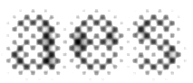
But this is not what we think we see. In processing visual images, the brain does a certain amount of guesswork, most notably in “cloning” over the blind spot from its adjacent area. Therefore it is reasonable to suppose that what readers think they see in areas of text outside the fovea is neither blurriness, nor low-res granularity, but a more refined proto-signifier, having both the quality of “lorem ipsum” pseudo-textual meaning (although in the language of the document), and generic glyphic “type-y-ness”, which is related to their experience with similar documents: in other words, the reader is anticipating a continuation of the same language, in the same typeface.
I propose the following “probability model” for Helvetica a-e-s decoding.
The three glyphs have been superimposed, each with a 35% opacity, the levels are tweaked, and there is only a slight blur. Remember, this is a representation of a stage in a mental process, because there is no homunculus inside us that can capture an image of what we perceive.
This image represents a momentary heuristic model that might be used in reading Helvetica, assuming the same probability for all these three letters as first perceived in words outside the fovea. Then, when we fixate on these letters in the fovea, we run a series of feedback loops involving letter details and possible words, refining disambiguation until closure on final signification occurs.
3 -
Nick, what's the source for the '“cloning” over the blind spot from its adjacent area' to which you refer?0
-
Its scientific name is “filling in” (!)
Here’s a scientific paper which discusses it:
http://www.sciencedirect.com/science/article/pii/S0042698906003932
2 -
Thanks. Oddly, perhaps, I agree with your supposition that 'what readers think they see in areas of text outside the fovea is neither blurriness, nor low-res granularity, but a more refined proto-signifier', but think the phenomenon of cloning or mentally filling in the 'blind spot' of the receptorless area of the retina isn't really compelling as a reason for the supposition, except insofar as it provides an example of the brain compensating for deficiencies in vision. It seems at once too particular a mechanism, vis à vis the blind spot, and too general a mechanism—it's present whatever we're looking at—, from which to extrapolate a kind of pseudo signification in the parafovea during reading.
To put it another way, I think your supposition is reasonable, but not for the reason you suppose. 0
0 -
It is common to think that humanist type is more legible than grotesk, and there is considerable evidence to back it up. The difference depends primarily on aperture size.
That is not to say that there are no other variables relevant to legibility, of course. Also, "more legible" is only important in the situations where that degree of difference matters. In many situations and sizes, either will be legible enough.
The thing is, not everyone and all situations are equal. Why deliberately choose something that is going to fail more often?
On my little iPhone screen, when I tried to read numbers at small sizes in a moving car (such as the time at the top in small print, while the maps are in use), I cursed Apple for using Helvetica. I curse them only slightly less for San Francisco today.
0 -
With Nick's thinking, I would assume Interstate is actually a bit illegible. The bowl of /a is the same size as the eye of /e. The tops and bottoms are similar.
Is this thinking true? (I don't have the typeface on my computer.)
0 -
Here's Wayfinding Sans in comparison. Yeah, I'd expect those to be easier to tell apart than Interstate. But then I'm biased; I can't forgive Interstate for that /g.

0 -
With Nick's thinking, I would assume Interstate is actually a bit illegible. The bowl of /a is the same size as the eye of /e. The tops and bottoms are similar.
Is this thinking true?Yes. Interstate is based on the old FHWA (Highway Gothic) fonts. Those fonts were designed for legibility at high speed, but not especially well. A better example of good highway signage would be James Montalbano’s ClearviewHwy, which is replacing old highway typefaces around the world.
1 -
Also relative x-height, and just overall height on the body (sometimes one typeface is just 10% or more bigger than another in all regards, at the same size), and not being too light, nor too bold, and... etc.Frode Bo Helland said:That is not to say that there are no other variables relevant to legibility
Such as horizontal proportions.0


Categories
- All Categories
- 47 Introductions
- 4K Typeface Design
- 495 Type Design Critiques
- 577 Type Design Software
- 1.1K Type Design Technique & Theory
- 671 Type Business
- 885 Font Technology
- 29 Punchcutting
- 539 Typography
- 125 Type Education
- 333 Type History
- 81 Type Resources
- 113 Lettering and Calligraphy
- 33 Lettering Critiques
- 80 Lettering Technique & Theory
- 569 Announcements
- 100 Events
- 116 Job Postings
- 170 Type Releases
- 182 Miscellaneous News
- 270 About TypeDrawers
- 54 TypeDrawers Announcements
- 114 Suggestions and Bug Reports