Better Curves -- Advice?

As anybody who' seen my "Critique" threads knows, I have lumpy curves. Really lumpy, bumpy, awkward curves -- sometimes flat, sometimes sharp. Awkward transitions, too. And figgy bowls. I'm starting to correct them one by one as they're pointed out, but I'm still not quite grasping the concept very well. ("Hi, my name is Mike and...") A few other people have hinted lately that they're having similar issues. Maybe it's a lack of art training?
Lately I've been getting much better results by deleting on on-curve point, adjusting the off-curve points if necessary, and letting my editor recreate the on-curve point. This definitely gives me smoother curves, but I still have issues with pointy -- "figgy" -- bowls. I often take the off-curve handles out a bit, but it's too easy to overdo it (or underdo!).
Another issue which I run into over and over is harmonizing inner and outer portions of a curve -- the bowl of /b, for example. In a face with angular stress, the extrema are not aligned (inner lower, outer higher for the afore-mentioned /b), and I always end up with weird shapes that don't fit together. (This may be why horizontal stress is so popular.)
Transitions between curve and flat, such as in /h, is another difficult task. (Although I think I'm pretty good with serifs.)
Anyhoo, does anybody have advice? techniques? words of encouragement or hope? I've reshaped /h/p/o/v so many times that I see them in my sleep, and switching to Morse code starts to look like a good idea. What should I look for?
Comments
-
I wish I could tell you an easy answer. The truth is, it just takes a lot of work and time to train your eye to "see" rather than just look. Just take yourself off of the hook and don't assume this is quite simple to learn. Relax and draw many curves, then put them aside and look at them again in a few days. You will see errors. Fix the most egregious of them first. Don't be surprised if a few weeks later, you begin to see more flaws. If you keep at it, without assuming there is a quick trick, you will learn to see. Later, you will see even better and will look on your previous work as intolerable. Enjoy this time! It is good for you!
1 -
Also, endash is – not --.
0 -
Generally, moving the points toward the center of your control points works well.
Demonstration (top is better) 0
0 -
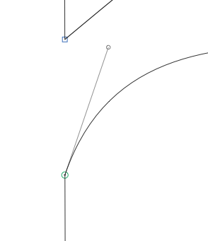
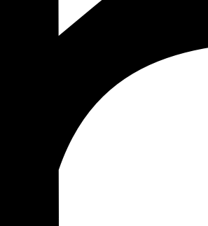
I am but an egg, so this may be totally obvious to everyone, but (1) in general try to keep your handles at 0º or 90º, (as shown neatly in the illustration above) and (2) Here is how I deal with curve/flat transitions. Here's an ugly transition at the leg of a /h:


First bring the handle up to 0º:
Now drop the control point down and lengthen the handle to compensate:

And the ugly transition is gone. You can put your initial curve into the background (if your font editor supports that) to help make the compensation.0 -
Here is how I deal with curve/flat transitions.
Your examples are two different kinds of stroke intersection. The top is News Gothic, the Bottom is Helvetica. This is a much bigger issue than how to draw a nice curve.
Back to the topic at hand, like Chris said, it takes lots of practice. And look for good curves in everything—not just type—will help there. Study the way a top-notch figure illustrator like Frank Cho draws curves. Check out old streamlined cars. Etc. etc..
2 -
Your "ugly" transition doesn't look right because the bottom part is too low, not because it's not smooth. Both are totally valid approaches to a stem transition.2
-
study the gesture drawings of Matisse as well. They will show you "life" in a line.
3 -
Adrien Tétar said:Also, endash is – not --.
Blame it on TeX… Or on the awkwardness of Windows, perhaps — alt+150 with a NumLock is a PitA to get /endash (much easier to use Word with a shortcut key, then copy/paste). I understand Mac and Linux guys have it easier.
Hmm, it’s probably worth designing hyphens that automatically kern or sub into proper dashes. (Or even just have no whitespace to the sides.)
Anyway…
Too bad there’s no shortcut. But on the bright side, I get to look at Matisse and such without guilt. 1
1 -
Oh, and Evan brings up a good point about control points (pun unintended). Adobe recommends moving handles to about a third of the distance, but many of their fonts (Minion, Utopia, Source Sans) often break the rule. Doing some math on a circle puts the handles at 55% or so. Not worth losing sleep over, I guess.
0 -
Also, I had a question about… diagonal points? I’m not sure what to call them, but it’s the extra points put at NW, NW, SW, SE of a curve. Minion’s /c and /f have them in their upper lefts, for example. Is this an artifact of digitization, or are these points functional? Merging them into the curves doesn’t make a large difference. Perhaps it’s to help with rendering?
0 -
They are functional. What you see as a "small distance" is a huge breakthrough. These points are used for tension loading and allowing better transitions from curve to straight or curve to curve without that dishcloth limpness that can happen otherwise.
1 -
Michael, draw a spline for one side of the stroke you are happy with, and then duplicate the spline, select the entire duplicate, and move it so that one end's control point is where you want it to be (such as perpendicular to the corresponding end point of the original.)
Then use the "Free Scale" tool with the origin of the transformation at the duplicate's positioned control point, and scale the spline so that the other end lands where you want it.
Then 'stitch' the 2 pieces together into a closed contour and see how it looks. Likely it won't be lumpy, but create a convincing illusion that there was a single stroke, not 2 edges that are out of sync in some way.0 -
Chris, can you show an example with and without tension loading? Sounds fascinating.0
-
Or a keyboard layout – it’s what I did. Many type designers want to fix things in the design but, Unicode is not our enemy.Michael Vokits said:Hmm, it’s probably worth designing hyphens that automatically kern or sub into proper dashes. (Or even just have no whitespace to the sides.)
Back on topic… I think two things helped me improve in doing good curves. First RMX Harmonizer which I use less nowadays but kind of show you what a perfectly fluid curvature looks like. It’s not always what you’re going to want to do, but it really helps in the beginning.
Also I feel like practising calligraphy helped gain a better sense of how strokes play out. You might think it’s only tangent to the subject at hand, but I think it’s not. Drawing good curves and making good strokes (i.e. both sides of your stroke are coherent in their thickness, contrast and how they curve) are imho related.0 -
At the beginning of learning to draw with bezier you get the impression that you can draw any shape with one segment. But that is not true. Sometimes you need two spices to get a certain curvature. A small exercise: draw a circle. Slant it by 15 degree. Put the path in the background. Then add the two missing extreme points (on the left and right) and delete the two diagonal nodes. Then try to get the same shape as the original outline in the background.0
-
Some time ago I wrapped up my findings on the transitions of curves to straight lines. You may find them on pp 16 to 23. http://issuu.com/fontfont/docs/ff_din_round Hope this gets you any further! My lesson from this: When adding points on 45°, you’ll have to make sure that the BCP’s are exactly in line. When this does not lead to the desired curvature, one should either choose a higher resolution (e.g. PPEM at 2048). Or make sure that you work with PostScript curves and that your font software is capable of exporting CFF flavored OpenType fonts with points that are specified using fraction divisions (ask Georg, he knows more about this than I do :–).1
-
Any better? This is my best effort; I’m at the edge of what I can even see. Grumble grumble… still looks figgy and lumpy.

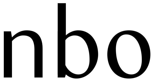
/O and /o both have the same 18 degree counterclockwise rotation, but their angles look different. /O has thicker blackspace than /o, but looks thinner. Weird.
Yeah, the more I look at that /b, the more I hate it. Funny; I added it here to show that I can draw a decent letter. Well, better to fail with dignity. Yeesh.
/b looks just wrong… methinketh the control handles on the rightmost edge of its inner bowl (properly vertical, both) are too long - and that may be the least of its worries. Its bowl leans rightward, is top-heavy, its stem needs a bit of optical correction inside the curve, and so forth. Even I can see it now.
0 -
Nothing is more humbling than looking at something you were proud of last week. Be heartened though, this is the Type God's way of letting you know that you are beginning to be able to see. The cure is to keep drawing. Keep looking. Keep fixing. Mostly, not to look on it as a failure in drawing, look at it as a victory in learning to see. If you want to design type, get used to that feeling, and even take pride in redoing, it means you are growing.
6 -
Couldn't agree more, Chris, and I think acknowledging this is the first step on the road to make type (2 weeks old type designers selling on MyFonts are doing it wrong). Also, I'd say it takes ~2yrs or practise to gain some fluency — I'm at 1yr and 4 months right now.0
-
Have been reading and following this without commenting, but Chris just nailed it there. Keep trying, keep experimenting, keep going. This takes a lot of time and there's no shortcut. You're getting closer.
I think why your /b is looking wrong is because it's bowl is too much the same shape as the /o. To make them look similar in shape and consistency, you'll always have to cheat a bit. Optical similarity isn't factual similarity... Keep trying!0 -
I can only agree — being unhappy with one's curves is a sign of learning. You're making progress.

On figginess: Try making the tops and bottoms flatter, i.e., draw apart the handles of the top and bottom vertices.
On color: Yes, that's why capitals need heavier strokes than lowercase. If the /O is still too light, make it heavier...
On /b: As a first step, try moving the top vertices of the inner and outer curves of the bowl to the right. Due to the stem's presence, the /b's bowl cannot afford to be build symmetrically. In the extreme case of an italic, the bowl is triangular and connects to the stem only at the very bottom.
At first sight, though, the stem of /b bothers me more than the bowl. The horizontal cut and the mechanical angle at the bottom are at odds with the calligraphic nature of the diagonally stressed bowl. Maybe you could move some weight from the spur to the bowl's connection (it's the bowl's strong diagonal, after all) and consider a warmer approach to the stem top.
0 -
Michael, what about starting with completely symmetrical (horizontally and vertically) letterforms? Give it 90° vertical stress then slowly introduce the stress angle to the letterform in multiple variants for comparison.
I think what it comes down to is it's just drawing, black and white, positive and negative, shape and counter shape. If you can't 'see' the areas that need work, what needs to be smoothed through elongation or retraction of curves etc. you might be in trouble.
Looking at your most recent image post I can immediately see what areas to work on and could work it out intuitively on paper, which means I can make the same adjustments on screen using mouse and keyboard (the tool is irrelevant), but only because I'm just as comfortable with drawing with the computer as without it.
If you're having trouble identifying what to correct and how to do it, maybe step back like someone suggested and work on some excercises exploring the fundamentals of art/design with basic foundational shapes. Drawing, contrast, and composition excercises could really be helpful.
Maybe for curves you just need to step away from the technical hurdle of working with points and handles and work out your curves on paper?
Also, generally speaking, be prepared to give it time, there's no substitution for endless hours of practice and experience with this type of thing.0 -
Agreed. If I think about my own history of learning to draw and illustrate, it might also help to draw curves in a more general sense. Look at nature, curves in trees, leaves, the shape of a head of hand, the body, and so on. Drawing organic curves from view can and will train your eye, head and hand in drawing them on other occasions as well. Not saying you should do that, it's just what worked for me.Maybe for curves you just need to step away from the technical hurdle of working with points and handles and work out your curves on paper?
Also, generally speaking, be prepared to give it time, there's no substitution for endless hours of practice and experience with this type of thing.0 -
Take it for what its worth, I have had no end of trouble trying to integrate the shapes of primitives. So I've given them up.
One other bit which has been helpful is to work with a brush and to keep in mind its position when it comes to a vertice. By that method it tends to be true that the on curve points are positioned at the corners of the brush.
Finally even in the case of the cap O, none of the classical models have a symmetrical form. The O is almost always weighted, narrower at the top with a swelling counter at the baseline.0 -
On the bowl of the b, the outer contour, the top vertex needs to move right; partly with its control points, and then partly without moving them. Afterwards, the control point to its right may still need to move slightly left.
That's just advice about smoothness; ignoring broader type design issues for the moment.
0 -
Super, super busy right now, but I wanted to take the time to thank everybody – you have been very helpful and kind.
Quick snapshot of recent work:
Much more consistent (although the top and bottom of the bowl of /o are too wide), but methinketh that calligraphic slant and sans conflict. This is probably a better choice:
Which at least works. Sort of. Really, I should probably just acknowledge that a sans cannot do what I want it to.
0 -
Hello Michael—It takes time to train your eyes to appreciate good shapes and curves. It's an instinct developed over time and with much practice. Don't despair—with time, as with everything, it will become second nature. A picture is worth a thousand words, so I adjusted the curves on your lower case b. These are the subtle changes I felt would improve your design. What makes shapes look particularly bad or wrong is when curves on the inside counters do not follow with the outside. Try to find the best parts of your glyph visually, for example, the inside bowl of your b looks pretty good. The outside shape was not following visually. So. if you concentrate on the outer parts and adjust, as I've done here, the entire shape improves. General rule, use as few points as necessary, at extremes, and keep the problem glyph in the background layer so that you can see what you are doing as you go. Then, slap the original next to the new outline and see if you like the changes. If not, keep adjusting until you are pleased with the results. One last point, if you cannot get the shape to work correctly, do not hesitate to add an additional point, between extremes, to force the shape to follow correctly. Less is more, but in some cases an extra point, here and there, can really help. I hope you find this helpful and I hope you finish your design. All the best!
 1
1
Categories
- All Categories
- 46 Introductions
- 3.9K Typeface Design
- 489 Type Design Critiques
- 572 Type Design Software
- 1.1K Type Design Technique & Theory
- 663 Type Business
- 876 Font Technology
- 29 Punchcutting
- 530 Typography
- 121 Type Education
- 328 Type History
- 81 Type Resources
- 111 Lettering and Calligraphy
- 32 Lettering Critiques
- 79 Lettering Technique & Theory
- 561 Announcements
- 96 Events
- 116 Job Postings
- 169 Type Releases
- 179 Miscellaneous News
- 269 About TypeDrawers
- 53 TypeDrawers Announcements
- 114 Suggestions and Bug Reports


