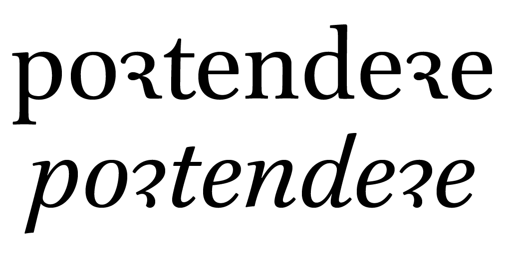
r rotunda in inscriptions

Nina StössingerNina Stössinger Posts: 151
edited September 2015 in Technique and Theory
Hi – Looking at some ~18th century inscriptions recently got me wondering about the alternate “round” form of the lowercase r in blackletter inscriptions. Wikipedia calls this the “r rotunda” and says that it is a calligraphic variant (rather than an orthographic distinction, such as between the long and short s) that basically appears after letters that are round on the right.
The particular examples I was looking at have prompted two questions that I wanted to bring up here:
  • Was it generally considered permissible to not be consistent about the use of the round r but just basically use whichever form worked better in a given context? (See example below – excuse the bad quality – which uses standard r forms in “Eltern”, “Abraham” but then the round form in “Jahr” and “hieher”)
  • I’m particularly intrigued about the disconnected/stencil-y form of the round r shown in the example below, whose first half can then be connected to e.g. a preceding e, as seen in “hieher”. Is there some bigger [hi]story behind this disconnected form of the r rotunda? The Wiki article linked to above mentions some variant forms, not sure that’s what this is.

Comments

  • I was under the impression that the rules for the special r where like for the s/longs. The 'round' form would be used at the end of a word (syllable?).
  • Florian HardwigFlorian Hardwig Posts: 262
    edited September 2015
    Nina, I’ve shared a few photos of inscriptions that show the r rotunda on Flickr. If there ever were strict rules about when to use it, not every letter carver got the memo. In this 18th century epitaph from Hall, the round r appears 27 times, after e (17×), h (6×), u/ü (2×), a (1×), i (1×). The standard blackletter r appears 42 times, after e (16×), h (4×), a (4×), f (3×), FPꝛ (2× each), Kbogpuü (1× each), and in initial position (2×)

    My finds are rather anecdotal than significant, but at least in this regional, temporal and technological context, it sometimes looks like r vs. ꝛ were used in a similar way as ſ vs. s – round variants when in final position, like Georg suggested. In the aforementioned example, 10 out of 27 are in absolute final position, and another 8 at the end of morphemes. See also these examples. A double r almost always contains one r rotunda – variatio delectat –, but the order is not set in stone: sometimes it is rꝛ, sometimes ꝛr.

    In another epitaph from Hall, there are 12 instances of ꝛ, of which 11 are in final position and one in ‘Herꝛn’. The standard r appears 22 times, of which 2 are at the end of words. One r is hybrid. In this epitaph in the Brunswick Cathedral, the ꝛ looks like an interrupted standard r, with hook at the top right.

    An inscription at Castle Raabs from the 16th century includes both a(n angular) capital R rotunda and an ‘et cetera’ rendered as (rounder) Ꝛ + C. In the latter, the glyph is not really an R rotunda, but goes back to the to the Tironian et (⁊).


  • Florian HardwigFlorian Hardwig Posts: 262
    edited September 2015
    Did you see the ꝛ in Albrecht Dürer’s Textura?
    http://digital.slub-dresden.de/werkansicht/dlf/17139/140/


  • Thank you all. Ha Georg, Florian, that’s really interesting – I went back to my photos and indeed from these couple of 18th-century inscriptions that I photographed in Basel, too, there appears to be a tendency to put the ꝛ at the end of words or morphemes. I wonder if there is regional/historical variance in the rules/patterns governing use of ꝛ, or whether wikipedia is just plain wrong. Or both. Anyway, if anyone has further info or sources, I’m all ears.

    (And Florian, that cap R rotunda from Raabs is nuts!)
  • Florian HardwigFlorian Hardwig Posts: 262
    edited September 2015
    Frank is right about the origin of the r rotunda (or “half r”), of course. If you look at the text of Dürer’s book from 1525, you’ll see that the letter variants were used according to these rules: ar, er, fr, gr, ir, jr, kr, tr, ur; but bꝛ, dꝛ, hꝛ, oꝛ, pꝛ, rꝛ, vꝛ. This is what you find in books and in typographic context. My first comment was intended as a hint that such rules don’t necessarily apply to inscriptions.
  • Albert_Jan_Pool Albert_Jan_Pool Posts: 79
    edited September 2015
    The Bayerische Staatsbibliothek in Munich has a copy of Wolfgang Fugger’s Ein nutzlich vnd wolgegrundt Formular Manncherley schöner schriefften. Nürnberg 1553. http://daten.digitale-sammlungen.de/~db/0005/bsb00058604/images/

    On the plate of his showing of Fraktur, Fugger presents a variation of r where the two strokes slightly overlap. On the preceding plate he tells the reader that it is allowed to mix the Fraktur with characters from other scripts. In the art line he says ‘Hie gege[n] hastu dreyerley Alphabeth einer Fractur schriefft, lern und schreyb, welche du wilt’. Which translates as: Here you have three kinds alphabets of Fraktur script, learn and write whichever you want. Obviously, Fugger does not want to bother his audience with any rules. I think it may be relevant for this discussion about rules that Fugger shows his Fraktur in display sizes only. He shows both his Canzley and the variations of Current in smaller sizes. Thus it seems that Current is taught as the running hand (text) and that Canzley and Fractur are rather used for shorter texts and headlines in larger sizes (display). I have not checked wether Fugger gives or applies rules for the use of the variants of a, r, s etc. as shown in his examples of Canzley and Current though. Also it would be interesting to check the manuals of Neudörffer the younger on this, because Fugger was his student. You may find digital versions of these in the BSB as well.
  • Florian HardwigFlorian Hardwig Posts: 262
    edited September 2015
    Fugger is not a proponent of “anything goes”. He says mixing Fraktur with letters from other scripts is akin to patching a velvet bavaroy with old rags, and that one should stick to one kind. Within Fraktur however, one may mix the presented variants at will – which means that he considers all of them as Fraktur letterforms.

    His r #3 is an interesting hybrid: it could be written using the same returning construction as in #1, just without the covering horizontal stroke at the base. On the other hand, when made with two downstrokes, it has a similar pattern as in #4 (ꝛ).


  • edited September 2015
    Hi John,

    This protogothic book hand from the 12th century (England) shows for instance an r rotunda that looks a bit like a 2.


  • The knot is a feature of the Brill design:

Sign In or Register to comment.