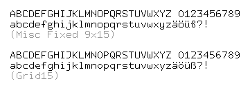
Grid15 – futuristic, geometric monospace

Hi all. I will first introduce myself, because this is my first post. I have been a Typophile member since 2005 (account name “Joshua K.”), but I have not been posting a lot, mostly because of being busy with real life things. Some facts about me:
- 26 years old, male, German
- love for books, reading and typefaces instilled in me by my mother, which is a typesetter, when I was a child
- blackletter enthusiast, member of the executive board in the Bund für deutsche Schrift und Sprache (a German blackletter and language association)
- medical student
- UNIX and open source enthusiast, hobby coder
- other hobbies: kickboxing, playing the piano, kart racing
I have lots of drafts and even more ideas for new typefaces, and I have started to digitize some of them over the years, but never managed to finalize and publish a typeface. Some typefaces are at least in a limited usable state, you can find samples of those on my website http://deutscheschrift.info/en/.
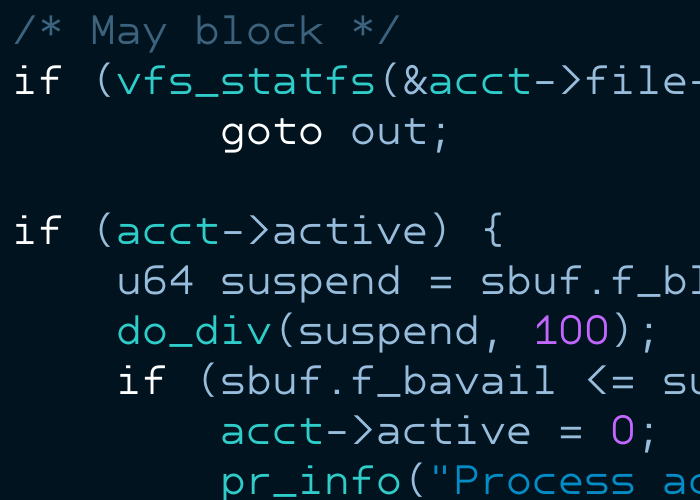
Back to topic. For some time, my favourite screen (terminal/coding) typeface has been Misc Fixed 9x15, one of the classic X Window System bitmap fonts. However, I did not like the closed counters of some letters and some other inconsistencies and quirks. Thus, I have created a bitmap font with the same proportions as the Misc Fixed 9x15 font, but with a more consistent style and strictly open counters, called “Grid15”.
I am now in the process of creating a vector/outline version of Grid15. My goals are:
- usability as a screen (terminal/coding) font
- futuristic/geometric appearance
- three weights: light, medium, bold
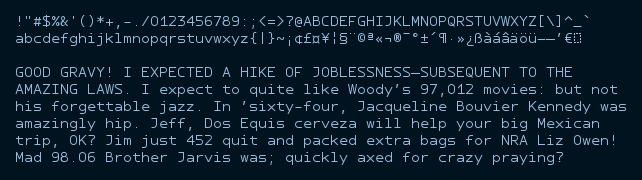
PDF specimen with all letters: http://deutscheschrift.info/Dateien/Grid15_2015-05-19.pdf.
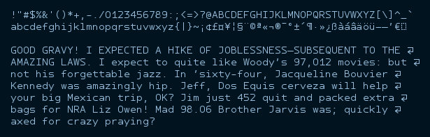
Regarding screen usability, I think I will have to compromise, because I want to employ PS hinting only (no TT instructions). Here are some rendering examples (font size = 15px):
▴ Gimp, medium hinting
▴ Freetype renderer in the text editor Textadept (bowls in 8 and ß problematic)
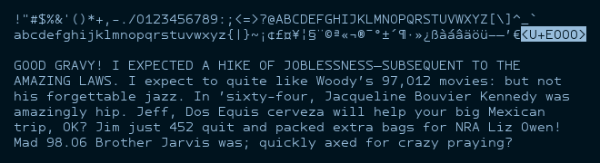
▴ terminal emulator Xterm (lowercase right stems problematic: a, d, g etc.)
Known problems:
- a needs some overshoot at the bottom
- small characters like (C) are too bold
- accents are too bold
Your comments are appreciated.
Comments
-
Your test text should use snippets of code rather than text is you're trying to target programming environments. Pay close attention to control characters like
<=>{}[]$and others. These may want to stand out from text somehow, since they become important characters that convey extra meaning in programming contexts..-1 -
@Frode Bo Helland said:
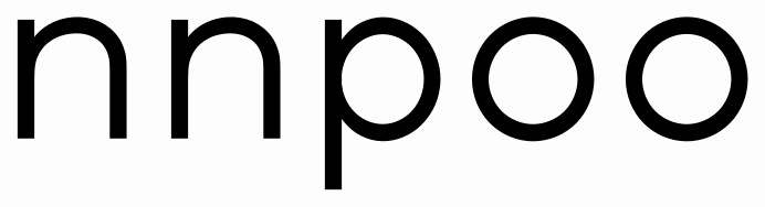
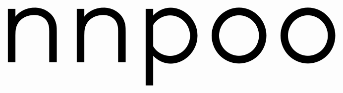
The difference between grotesque-style characters (like n/p+derivates) and the open counters and straight segments is somewhat jarring.
Thank you for pointing this out. All letters are meant to look as if they were made of circle parts and straight lines. The circle in b, d etc. is compressed to get the side-bearings right. I agree that this does not look right. I can think of two alternatives:
(1) Compressed circle (current solution):
(2) Cut-off circle:
(3) Full circle, reduced sidebearings:

I am leaning towards solution 3 or something between 1 and 3 (a slightly compressed circle). What do you think?
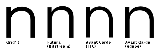
Regarding the n, I will try to make it more symmetric. But it needs to be a bit asymmetric to look right, of course. Here is a little font comparison (ITC’s Avant Garde does not look right in my eyes):
@Jack Jennings, I will provide more code samples in my next specimen.
0 -
@Frode Bo Helland, thanks for your comment, but I regret I cannot really grasp your point. My o looks like a perfect circle to me.
That Typographica article only covers the basics. I am aware of those. Is there something particular you wanted to point me to?0 -
0
-
I do not have as much time as I wish I had, but I keep working on this project. Here you can see new drawings of b and n (old version on top, new version on bottom):

I experimented with the “ttfautohint” tool, which looks promising. Thus, I have changed my mind and will switch to TrueType curves.
I will also change the grid size from 1000 units/em to 4096 units/em to reduce rounding artefacts.
Regarding optical corrections: I intentionally did not follow the common practice of making horizontal strokes thinner than vertical strokes. Without doubt, that practice is a nice trick to make letters appear more stable. But I think it is arguable if that trick is really necessary to make letters look geometrically correct, and I want to keep optical corrections to a minimum.
Before you think I am crazy, check out those typefaces featuring identical (or nearly identical) vertical and horizontal stroke widths:
(Johnston Sans)
(Courier)
(Horatio)
(Sofia)0 -
I think it is arguable if that trick is really necessary to make letters look geometrically correct
No, I don’t think it is arguable, it’s just hard to see at first. I can see clearly the difference between your uncorrected horizontals (which look unrefined and “wrong”, frankly) and really any well made geometric typeface*. The compensation can be very subtle, but it is needed. Here is a good read on the subject, from Tobias Frere-Jones. (Edit: Woops, just noticed David Berlow already pointed to this. Really, it’s good.)
*Also I would note that you should be very discerning about what typefaces you look at for guidance, and pick some professionally-made ones. That Horatio for instance looks quite badly drawn to my eye. If you pick some good examples, you can learn a lot just looking at those really closely.
4 -
No, I don’t think it is arguable, it’s just hard to see at first. I can see clearly the difference between your uncorrected horizontals (which look unrefined and “wrong”, frankly) and really any well made geometric typeface*.
Those “well made”, hyper-corrected geometric typefaces look kind of “wrong” to me actually. For example Futura’s o: it looks nice—but not like a circle. It does not look geometrically correct to me. (Size matters of course.)

*Also I would note that you should be very discerning about what typefaces you look at for guidance, and pick some professionally-made ones. That Horatio for instance looks quite badly drawn to my eye.
I do not use those typefaces for guidance, I just found them when looking for typefaces without thinned horizontals.
Regarding the other examples, do you really think Johnston Sans or Courier are not professionally made or look unrefined? You may have seen Courier a thousand times before. Have you ever thought it looks wrong?0 -
The o of Monotype’s “Courier New” is nearly a perfect circle:
Line width is 84 units on the left side and on the bottom, and 85 units on the top and on the right side.
Modesto’s (noticeable) contrast looks fine to me. But Modesto does not pretend to be geometric, so any contrast would be fine.
0 -
Courier is probably one of the first fonts that were ported to the digital medium, along with other “core Postscript fonts”. It’s IMHO risky to take ancient system fonts as references, many of these are rushed.1
-
I agree with Adrien. If it weren't rushed, the line widths would be probably uniform and be optically adjusted. I think you could try 5 units to add a slight contrast. To me (and many others) Modesto has an almost imperceptible contrast. It only manifests its contrast at point sizes that are huge.0
-
Courier was a stroke font. So you would apply a (circular) pen with custom line width. Some conversions to postscript would just do that, apply the stroke and be done – to ensure the same result as the stoke based version.2
-
@Georg%20Seifert It was tweaked after that. Notice the bottom of /v and a lot of other letters.
I think it was really rushed. The uppercase /C has bad kinks. They didn't have time to improve anything, so there's a lack of balance.0


Categories
- All Categories
- 47 Introductions
- 4K Typeface Design
- 493 Type Design Critiques
- 575 Type Design Software
- 1.1K Type Design Technique & Theory
- 669 Type Business
- 884 Font Technology
- 29 Punchcutting
- 537 Typography
- 124 Type Education
- 332 Type History
- 81 Type Resources
- 113 Lettering and Calligraphy
- 33 Lettering Critiques
- 80 Lettering Technique & Theory
- 569 Announcements
- 100 Events
- 116 Job Postings
- 170 Type Releases
- 182 Miscellaneous News
- 270 About TypeDrawers
- 54 TypeDrawers Announcements
- 114 Suggestions and Bug Reports