Mid-70s Lettering Effects Service

Max Phillips
Posts: 475
in Type History
I could swear I remember leafing thru Graphis and Modern Publicity back in the 70s and seeing full-page ads for a service that applied fancy lettering effects to typositor type: complex combinations of outlines, dropshadows, extrusions, hatching, even dimensional outlines à la the Rolling Stone logo. But when I go thru my old magazines and annuals, I can't find a trace. This was not PLINC, btw, and as I recall, the offering went well beyond their optical slanting and reproportioning.
False memory? Drug damage? Can anyone help?
False memory? Drug damage? Can anyone help?
0
Comments
-
Perhaps Dan Solo and his SoloType company?
http://www.printmag.com/interviews/dan-x-solo-type-revivalist-dies/0 -
Thanks, but this was a type house that modified plain letters—I think their samples were based on Helvetica Bold—not a foundry that published fancy letters.0
-
Headliners International? When I drew a type for them c.1980, they produced outline and outline-dropshadow versions by camera modifications (although some clean-up/sharpening was still required), and I would imagine that they had common equipment and methods throughout their chain of 50+ type shops.0
-
Many phototype companies offered services like this. My PLINC, Lettergraphics, Headliners, Andresen, and Phil's catalogs all have sections dedicated to effects. Smaller type shops offered them too. You might find the particular ads you remember in the U&lc archives.1
-
Thanks, Nick and Stephen.
Not sure they advertised in U&lc—or even that they were American—but, boy, those scans of old U&lcs are great. Thanks, Stephen!0 -
If I am remembering correctly, similar services were offered by Handsetzerei Ernst Gloor (Switzerland), Dr. Böger Photosatz GmbH (Germany), Visutek (UK), and Typo Gabor (France).

2 -

1 -
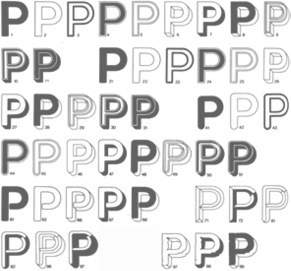
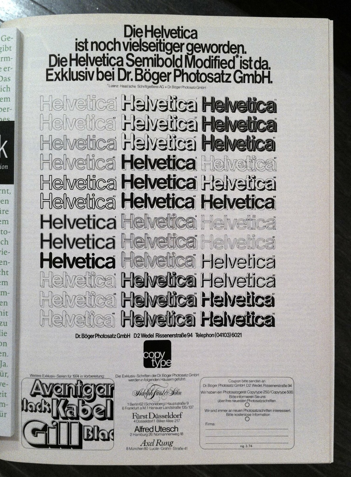
Photo source: https://www.flickr.com/photos/kupfers/8257985061/5
-
I love the “caveman” effect. Don’t think I’ve seen that one before. I wonder how it was done? I’m guessing they had some kind of pitted filter for that.
I remember learning that the outline effects were achieved by sandwiching positive and negative transparencies and moving one of them in a circular fashion. The larger the movement, the thicker the outline. This explains why such outline effects always had rounded corners.
Many of the other effects, for things like shadows and bevels, were basically photomechanical versions of tricks we use in Photoshop to get similar results.2 -
Photo source: https://www.flickr.com/photos/kupfers/8257985061/
Of course. Sorry I have not indicated it, Indra. The source of the other image is Matérialité de la lettre, by Sébastien Degeilh (p. S-05); the caption says,fig. 13 — Dans les années soixante-dix, la firme Dr. Böger Photosatz GmbH et Dymo-Visutek propose des variantes décoratives du Helvetica.
1 -
@Mark -- In the later years of phototype that would have been the Byers Graphic Modifier. You can still buy one here: http://tinyurl.com/pfgpaly
2 -
-
The distressed one. Lower right on the P’s; middle right on the Helveticas. “Caveman” might not be the correct term, but that’s what it makes me think of. :-)1
-
Max, this article has some references for you: http://creativepro.com/scanning-around-with-gene-part-2-of-that-70s-type/
Dan Solo was truly a master of this craft, which was accomplished largely through creative lens work and copy board movement, but often completed with hand retouching. He published a small catalog of this work entitled "Solotype Special Effects." The work done by Dr. Böger (which later became Scangraphic, if I'm not mistaken) was relatively simple compared to much of the Solotype work.4 -
Maxim, thanks so much! That's exactly the ad I was trying to call to mind.
George, Scott-Martin, Mark, thank you for your insights as well.
0 -
URW introduced lots of these effects for their Ikarus software in the late 70s0
-
Here is a link to article ‘Modifications in Modern Photocomposition’ in Graphis on modifications of ITC Avant Garde Gothic as once available for the Copytype system. The modifications are numbered exactly the same those for Helvetica as can be seen in the ad shown by Indra and Maxim. Copytype was an opto-mechanical headline-system which was produced by Dr. Böger Photosatz in Wedel near Hamburg, Germany. It was developed in close collaboration with the British company Visutek.https://www.graphis.com/archives/publication/issue-172/
0 -
Dan Solo used a cam-driven masking setup to produce the outline and drop shadows. Back in the 80s, when I was working in broadcast television, I faked it with manual manipulation in the darkroom, using stripped-up registered flats of film positives and negatives. I moved outline type in a circular orbit and drop-shadows in an elliptical orbit. The results weren't A Number One pro level, but they workrd for ads in TV Guide magazine.
2 -
From one of our catalogs at Phil's Photo
 2
2
Categories
- All Categories
- 46 Introductions
- 3.9K Typeface Design
- 489 Type Design Critiques
- 572 Type Design Software
- 1.1K Type Design Technique & Theory
- 664 Type Business
- 877 Font Technology
- 29 Punchcutting
- 530 Typography
- 121 Type Education
- 328 Type History
- 81 Type Resources
- 111 Lettering and Calligraphy
- 32 Lettering Critiques
- 79 Lettering Technique & Theory
- 562 Announcements
- 97 Events
- 116 Job Postings
- 169 Type Releases
- 179 Miscellaneous News
- 269 About TypeDrawers
- 53 TypeDrawers Announcements
- 114 Suggestions and Bug Reports


