Aidar (working title)

Hi everyone.
This is my first post here, and also my first sans serif font, so would like to introduce myself. I'm from Ukraine. My native language is Ukrainian. I'm relatively new to typeface design and basically self-taught.
Sometime back (in May) I tried creating my own font, inspired by the classic geometric typefaces (like Futura, Erbar-Grotesk, Journal Sans).
Up until recently, I was quite satisfied with the prospect of making a geometric style font for my final project. Yet, somehow, everything has changed. I felt that I need something slightly different.
I decided to create a more humanistic appearance than that of traditional geometric typefaces.
Right now there is the Latin uppercase and lowercase characters, numerals, diacritical and punctuation marks etc. No ligatures, no old-style numbers, no small caps and no kerning yet.
Please let me know what you think. I would greatly appreciate your thoughts.

link to pdf file: http://alexanderlazard.com/download/aidar.pdf
Thanks!
Comments
-
Are /q/ and /d/ too different from /b/ and /p/?
The loop of /g/ seems out of character with the rounder bowls everywhere else.
Baseline outstroke of ampersand might be better straighter and/or shorter.
Shoulders of /m/n/h/u/ look thicker than stems.2 -
Very nice! Really like what you've done here, Alexander. I see Dwiggins and Journal Sans as you said, blended with sans like Segoe UI/Myriad. A tad surprising at first but I think it works really well.
I am myself a self-taught designer form this year so, take the following with a pinch of salt I guess.
Maybe the tail of the Q could be a bit more curved and a bit more leaning downwards. Right now, and seeing how the tail ends it looks too calligraphic to me, something that isn't elsewhere in the font.
I'd probably not diminish the spacing around v,w,y to compensate with round letters, this can be done with kerning. It makes pairs with square letters (e.g., the word 'lazy' in your specimen) a bit sloppy. It is an old trick of T1 fonts at the time kerning pairs were limited but I do not think we need it today.
The section mark could probably be slightly bigger on the inside. Also, why is it 'rotated'?
The ampersand looks nice. Perhaps the same curvature of the outstroke could be used for the tail of the Q.
The cedilla (a character of my main language – French) has to look more like a sickle, with a half circle. E.g., here is Segoe UI:
Also, the cedilla stroke looks a bit too thick.
acute, grave and hungarumlaut could have some slight contrast (slightly thicker on the upper part), as has apostrophe. This would help stabilizing the accents, right now acutes seem like they're a bit too much towards the left and vice versa for the grave.
Speaking of apostrophe; it has inverted contrast right now, it's its top part that should be thicker.
I would decrease right sidebearing spacing of the c a tad, and increase a tad on the left side of the a. Compared to the e, the c is "cut-off" and needs slightly less spacing on the right side.
'zz' pairing shouldn't be completely touching.
Letters like M,A have really tight spacing in comparison to the other uppercase letters. I agree that they should be spaced tighter with this design but I think it is too much. Try to look at how Matthew Butterick's Concourse is spaced e.g. with HAMBURGEFONSTIV, it is more evenly done.1 -
I looked at the outlines; there is way too much anchor points for PostScript curves, which besides increasing the file size also forces your curves to go by a certain number of integer coordinates along their way.
But maybe your design process involves cleaning extra points at the end.0 -
Very nice!
Some feedback, feel free to ignore:
The tail in Q takes the humanist thing too far, it's too swashy.
It seems like diagonals in northeastern direction are the same thickness as diagonals in northwestern direction. For them to appear equally thick, the northeastern one should be slightly thinner. Avenir does this and it makes all the difference.
X could be wider
The top of f seems too narrow.
The g needs rethinking. It looks a bit clunky, out of sink with the cleanliness of the rest. Maybe try a simpler version.
The middle top of W and w could be brought down a bit. The middle bottom of M could be pulled up.
The cedilla indeed needs some work.
I think all the accented lowercase could use some more vertical space between the letter and the accent.
ø looks too wide. Change the angle of the straight stroke.
For the u to appear the same width as the n, it needs to be slightly narrower. m could narrowed down a bit. Now that I come to think of it, maybe mnhu could all be a little narrower.
The top of M and N is cut off before it reaches a sharp tip. Maybe try the same with the diagonal in z.
I don't know how Adrien (above) got hold of your outlines, but they look fine to me when I look at the contours of glyphs in the pdf. It is usually true that fewer nodes make for better curves, as a general rule.
Maybe the tittles on i and j could be raised a little.
Good luck, and keep going!
1 -
Hey everyone. Thank for the help and good wishes!
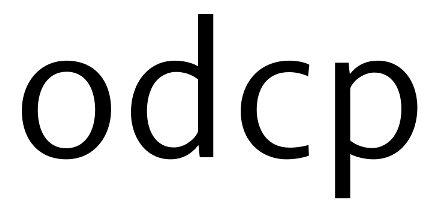
@ Craig This difference between the letters is not intentional. I was considering which glyphs that I should use by default. I like the calligraphic /q/ (without the upper spur), but I don’t like the same /b/ very much. Of course, in the end, they are brought to one and the same style.

Letter /g/ was the hardest to work with for me. The problem is that it is hard to balance it in the limited space, for the loop especially. I will leave it as it is for now and replace it with the single-story /g/, which I made out of the /q/.

I changed the form of the ampersand. I don’t know why, but I like the previous variant better. Does this one look too “mechanical/geometric”? Of course, it is the matter of taste.

I'm making the /n/, /m/, /h/ shoulders thicker so that the external curve doesn't seem “flat”. Does it look wrong? I reduced thickness a little bit so that their stems would visually be the same.

Adrien Yes, you've noticed it right: I have studied many fonts, both sans-serif and serif; and the fonts you have mentioned above as well. Of course, they had their influence in some way.
I increased the inner space of the section mark. Yeah, I rotated it, because looked like, it is sloping to the left. I've been trying to get a little bit of contrast to make it more clear.

And yes, the cedilla is terrible. This is my early experiment. I have made a completely new design.

Thank you for the explanations on /w/ v/ y/ sidebearings. I felt that the space could be increased further, but all the instructions I have read say that the sidebearings for these letters should be as little as possible. Now I know.
I've been working on the diacritics; increased the contrast, some other glyphs have changed and placed them a little higher, just as Jasper recommended. I aligned acute and grave relative to the base character.

Yes, I am using the additional points which I will erase later. Moreover, I'm locating the additional points on the vectorial curve in order to have more control over the curvatures: in /n/m/’s shoulders etc.
I didn’t get it as for the apostrophe – it is impossible to make it thicker in the lower part.
0 -
@ Jasper
I changed the /Q/’s tail, as Adrien recommended. I used the ampersand’s outstroke to do it.

I do agree with you about the contrasts. I truly did set the diagonals' thickness in such a way that they would seem identical. Still, if you measure it with a ruler, it is different. Now I have increased the contrast. I made the cut (miter) of the sharp tip larger and got rid of the overshoot.


Collisions between f and dieresis

I have agreed to your suggestion as for the width of /n/. Although at first I couldn't figure out how wide it should be, so I changed the width just a little bit. Still, later I noticed it was not sufficient. The longer I looked at the text, the more misproportioned (too wide, I mean) it seemed to me. That's why I made /n/ even more narrow, having balanced it's inner space with the inner space of /o/. I have changed the width of /h/, /u/, /m/ accordingly. Except for /n/ I have also changed the width of some other letters - /s/, for instance.


Thanks to all of you!
0 -
Alexander: If you're going to use your "calligraphic" /q as the basis of /p/b, I would recommend you to rotate the bowl by 180° rather than mirroring it. In calligraphy, the bowl of /q often ends up teardrop-shaped, with a low center of gravity like the one you have there, but for /p/b, the heavy end of the teardrop should be on the top. Thus, if you're not too happy with your /b, try mirroring its bowl along the vertical axis and see if you like it better that way.
If you don't like the /g, how about a two-storey design?
The ink traps in the diagonal letters strike me as exaggerated.
Your old tildes were pretty, but the new ones look pointy and angry.
Your /v/w are leaning to the right.
2 -
Agree with Christian. Purely in terms of design choices, I liked the old /q, and the shorter-tailed f, e, a (eventually they can be kept under a stylistic set me thinks).
Some others comments, part of them is just my liking:
The double-storey g as default was a good element too imo, it just needs a couple of tweaks as you noted.
The new ampersand could be a tad less heavy at the edge of the bottom-right stroke.
The new /a looks less balanced between the loop and the top-left part.
The lower stroke of the e goes really too far on the right and is a bit too heavy, imo.
The slight curviness in the spur of /a, /u and similar too wasn't bad imo.
I find it a bit odd that the stroke that attaches the cedilla to the letter is curved. Maybe it works fine, it's just that it's unusual.
You could soften the straight corner of letters like the ø or the straight-legged Q you've drawn with additional corner points, e.g:
BTW that's a rather high slant you've got on the oslash bar.
> I didn’t get it as for the apostrophe – it is impossible to make it thicker in the lower part.
I was saying that it is the top part of the apostrophe that should be thicker, not the lower part of it.
> Yes, I am using the additional points which I will erase later. Moreover, I'm locating the additional points on the vectorial curve in order to have more control over the curvatures: in /n/m/’s shoulders etc.
I can see it, and often type designers use extra points during the design, I just think that at times there is really a lot of points in your WIP outlines and it must be a pain to adjust everytime you move the curves – but do what works best for you, of course.
1 -
Thanks guys for the feedback. I think you're both right on all points.
Here's what has been done so far. I changed /f/a/e /w/v/y and added new /b/p/q/d and two-story /g. Christian, your advice really helped me make /b.


And I made several variants of /g (quick and dirty):

I haven't yet decided which glyphs to choose.
Adrien, I personally like the /e in Granby (metal in 1930 by Stephenson Blake) and Johnston, and thought it might work well for this typeface. But, I think you're right about /e/a. So, I shortened the tail.
1 -
Form a micro perspective, it looks a bit weird to me that the horizontal line gets thicker on the right:

In text setting I think it looks pretty good. You could try to make the upper loop wider eventually, it doesn't necessarily have to be a perfect circle.
> Adrien, I personally like the /e in Granby (metal in 1930 by Stephenson Blake) and Johnston, and thought it might work well for this typeface. But, I think you're right about /e/a. So, I shortened the tail.
In terms of design I think it is better with shortened tail, but I was essentially saying that the drawing wasn't balanced (unlike the references you mention which are perfectly fine), see below: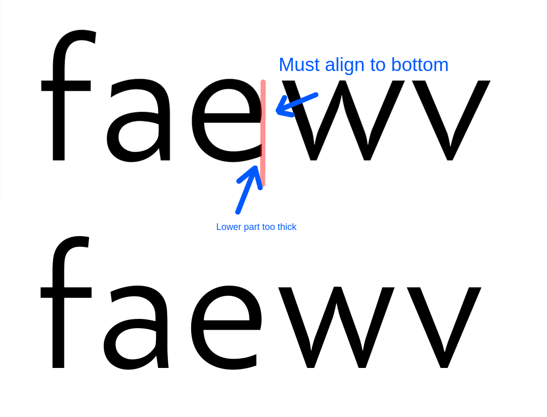
But I like the newer e better overall w.r.t consistency. Maybe you could have the tail extend further in the Bold weight, I did that with my current font.0 -
The less acute angle of the /a's top stroke cut is an improvement IMHO. Have you tried making it perpendicular to the stroke, Myriad-style? Currently I still get the feeling that the stroke slightly widens again just before it ends, and that it would look better if it didn't... A perpendicular cut might also look good on other letters then, for consistency...
I liked the old /f better. A strong flag is good for aesthetics and readability; you can always make a narrow contextual alternate and/or ligatures to avoid collisions. The horizontal stroke is too dominant at the moment.
I like the new /b/d/p/q. Are /d/q getting just a bit too heavy in their lower left curve, though? There seems to be something wrong with the sidebearings, too; I believe it is the left sidebearing of /d that's too wide in particular.
The apices of /w/v are still a bit to the left of the characters' overall span.
The two-storey /g designs don't work for me. They have a certain cooked-spaghetti-like consistency at odds with the springy tension in the other characters. Maybe try out a simpler geometry with tenser curves?
1 -
Read warning below.
I am sick and out of my brain so this may not make sense. Viewer discretion advised.
That last alternative is the best, although as Christian said- it's too soft. I think you should try something a little more simple. The ends of /a/e/r/s (and old/f) (especially /a) are reminescient of Verdana (ugh) in the flared ending sort of way, and slightly feels like you cut off a circle at the wrong angle and didn't correct it.0 -
Thanks for the comments, I'll update as soon as possible.
Philip and Christian,
Well, I thought it would look better if the curves of the letters e’s (and c, f, s’s etc) flares out a bit at the end.
>Have you tried making it perpendicular to the stroke, Myriad-style?
Yes, in the beginning. But, after a while, I changed it. You mean that the ends of the stroke on the /C/c/G/S/s/a (and maybe on the /r/f as well) would look better if they were perpendicular to the angle of the stroke, rather than oblique (or vertical) to it? I do not know ... I personally do not like it *subjectivism*.
0 -
Hi all! Here is an updated version of our show: http://alexanderlazard.com/download/aidar.pdf
0 -
/G/ could be wider. Bottom of /S/ feels too limp. Ascenders may be too tall. Otherwise proportions look good to me.0
-
The /g's link is too light. With the /g, it's best to leave the upper bowl flat with the asymmetry on the right, in my opinion, and maybe tame the ear. (It's distracting even at text sizes.) I love the ink traps, like a mild Bell Centennial.1
-
Thanks for the comments, Craig and Philip.
>Philip,
I’ve re-worked link, ear and the upper bowl of /g/. What do you think? Does it work better? Personally, I have some reservations about the upper bowl, but I'm not sure.

 0
0 -
The kinks in both counters of /g strike me as jarring and out of character.
0 -
1

2
0 -
Those two are nice. The best thing is to put it as a stylistic set for me. The first is elegant and better for larger sizes, and the second is more sturdy like a workhorse for smaller sizes. Seeing that now fonts are used at any size, I recommend the second one and then keep the first as a possible alternate. The top bowl looks very slightly heavy.1
-
-
I think it's fine. If you use the same shape over and over again, it becomes bland. See also Cambria, which uses the exact same serif too many times.0
-
I think you should keep working on "k, g, C", on large texts they stand out.
• The "g" because of the lower ring, the lower and upper ring seem to be too close together (other people also commented on that).
• The "k" has a very big white space on the right, perhaps you should narrow it a little?.
• The "C" hast too much white space.
That being said, I would encourage you to work on other weights while you design the regular version. Some times when you are working on the heavy weights you have to go back to the regular and change letterforms/space because it cannot be done properly in heavy weights.
I think is going to be a great typeface, congrats")
0 -
Thank you, Fernando. This is the old version, but your comments and suggestions are still helpful. I began drawing the glyphs in bold weights, which is something I've never done before.0


Categories
- All Categories
- 47 Introductions
- 4K Typeface Design
- 493 Type Design Critiques
- 576 Type Design Software
- 1.1K Type Design Technique & Theory
- 669 Type Business
- 884 Font Technology
- 29 Punchcutting
- 537 Typography
- 124 Type Education
- 332 Type History
- 81 Type Resources
- 113 Lettering and Calligraphy
- 33 Lettering Critiques
- 80 Lettering Technique & Theory
- 569 Announcements
- 100 Events
- 116 Job Postings
- 170 Type Releases
- 182 Miscellaneous News
- 270 About TypeDrawers
- 54 TypeDrawers Announcements
- 114 Suggestions and Bug Reports