Awesome OpenType examples?

Matt Heximer
Posts: 17
Greetings Discerning Type Aficionados,
I am currently in the process of pulling together an informal visual presentation to casual type users about fonts, type design and untapped potential. I am wanting to highlight some of the impressive and unexpected things that type designers are doing with OpenType. The more great examples I can show, the better. I'm asking for your assistance to help me track down some of the better examples of what people are doing with OpenType programming beyond the typical glyph replacement (i.e. /f/ + /i/ = /fi ligature/).
Things like complex FF Chartwell, the fun Sans Bullshit Sans, and Symbolset (word replacement with icons).
Please share your favourites and help me show the world the mind-bending things that Type Designers are doing.
(Thanks in advance for your help)
0
Comments
-
Will you post this on youtube/speakerdeck?
 0
0 -
@Nick%20Shinn - Thanks for the link. I remember running across that article a while ago while scouring the web looking for some OpenType help!
@DaveCrossland - Ha! Depends on the final result! If I don't come across like too much of a bumbling idiot, then I'll throw something up online somewhere.1 -
Cavatina is a font for musical notation I developed, whose functionality and formatting is based on (OpenType) contextual substitutions.0
-
Speaking of fonts for music, I think this one is pretty cool: http://manneschlaier.com
And I have been putting games into OpenType features. Nothing online yet, but I will present some of it at TypeCon this year.0 -
Already many years ago Erhard Kaiser designed a range of PDF’s displaying DTL typefaces, like this one for DTL Fleischmann. These were made with PS Type1 fonts and required manual positioning of all ligatures. It is perhaps not ‘beyond the typical glyph replacement’, but some work was needed for this back then.
If you tell your audience that the substitution in the presentation was done via OT Layout features, everyone will instantly believe you, I reckon (as long as they don’t have access to the guts of the PDF).
0 -
I am expanding my ILT article into a talk at TypeCon—if you have done something interesting with <calt>, please let me know, and I will add it to the presentation.
So yes, Dave, a video of this will be posted online.1 -
I am expanding my ILT article into a talk at TypeCon—if you have done something interesting with <calt>, please let me know, and I will add it to the presentation.
At Typecon, I’ll do a Type-in-Twenty about the games I mentioned above.
0 -
I am not sure if this falls into your topic. This is a video showing how to design a layout using alternates.
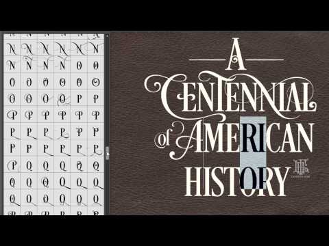 https://www.youtube.com/watch?v=t4Rb6_qC5tk
0 -
Microsoft's Gabriola font is now ten years old, but still performs some tricks that I've not seen elsewhere, e.g. ignoring base glyphs to contextually avoid repetition of ornaments.0


Categories
- All Categories
- 47 Introductions
- 4K Typeface Design
- 495 Type Design Critiques
- 577 Type Design Software
- 1.1K Type Design Technique & Theory
- 670 Type Business
- 885 Font Technology
- 29 Punchcutting
- 539 Typography
- 125 Type Education
- 333 Type History
- 81 Type Resources
- 113 Lettering and Calligraphy
- 33 Lettering Critiques
- 80 Lettering Technique & Theory
- 569 Announcements
- 100 Events
- 116 Job Postings
- 170 Type Releases
- 182 Miscellaneous News
- 270 About TypeDrawers
- 54 TypeDrawers Announcements
- 114 Suggestions and Bug Reports