Spright

Michael Vokits
Posts: 214
Ever so slight Venetian influence on this one... Half-hanging tabular numerals (probably inappropriate), lots and lots of kerning, and an attempt at irregular and organic shapes. Rather light. Maybe better as a display face. Very much in progress. (Where did my friggin' verbs go?!)
0
Comments
-
I don't think I could ever get used to that stress pattern on the /M/. I think the periods and tittles look too sharp and geometric for this face.0
-
Eep, thanks for pointing out the flaw in the /M -- I knew there was something wrong, but I couldn't put my mouse on it. As for the periods and tittles, you're probably right, but it's a really tough call... Jenson used exactly that shape (kind of a rounded cross), faithfully copied in Centaur and (no surprise) Adobe Jenson. Maybe I'll keep them as a stylistic alternative. I think a perfect circle would also be too geometric, so maybe a subtle diamond. Circles are pointless anyway.0
-
Jenson used exactly that shape
Not for his tittles.0 -
-
Aren't the tittles hanging too low?
I just noticed something peculiar. Up to 300% I can see the elements the letters consist of, for some letters. I see this white overlap within the letter shapes in many letters, but when I zoom in to 400% or more, the letter shapes are solid black. Is this normal behavior for letter shapes which haven't been merged yet? 0
0 -
Martin: yes rasterizers sometimes behave like so. On XP I have already seen blank parts displayed only at smaller sizes.0
-
It is a good idea to keep the overlaps in your master files (there was a quite long discussion about this a few weeks ago on this forum). But the exported fonts should always have overlaps removed. In Glyphs this is done automatically.0
-
I think I saw that discussion recently. Was that the one where this twist technique is used? So far I've been working with solid shapes throughout the process. I do the design in Illustrator though, which at least gives me the feeling I have more control.0
-
I'm pretty sure that you have much more control in a font editor.
- You can do the spacing while you draw and export a font early to check results.
- moving handles is a pain in Illustrator.
- it is difficult to measure
I can go on like this for some time") 0
0 -
I drew a manicule recently as I was digitizing a drawing and Illustrator seemed much inferior to a font editor: handles are a pain to move, you dont have a font preview (obviously), there is this direct selection thing you have to deal with… overall I hardly see how it can be better at making letterforms than a font editor tbh.0
-
I was careful to state it gives me the feeling of having more control, rather than actually having more control. Honestly I find moving handles in font editors to be a pain. Perhaps I just need to get into a proper workflow with a font editor, but right now there is too much I can't do regarding the design in a font editor.
I have a few specific reasons why I do the design in Illustrator. First off, it allows me to set all the dimensions and many guidelines while seeing all letters together. In a font editor as far as I know I can see the dimensions of one letter and I can see letters side by side, but not both. Illustrator allows me to have superior insight into the typeface as a whole. However, the fact I can't immediately test my design is obviously a big disturbance in my workflow. On my very first typeface I spent over 120 hours on the design and it never reached a font editor so I never saw it in context, other than the previews I made by manually constructing sentences and doing kerning. In hindsight it was ludicrous, though I suppose it did allow me to focus purely on design and learn a lot from it.
These days I move my design to a font editor as fast as possible. I no longer try to complete a whole set in Illustrator. Now, when I have half an alphabet I move the design to the font editor. Years ago I would also make every accented character individually, so in Illustrator I essentially had the whole extended set that would eventually become a font. Last year I had a similar method of working, though I wouldn't complete the whole set in Illustrator. During this time I learned a lot more about FontLab so I allocated more work to FontLab. However, it wasn't until early this year that I learned once you have the accent glyphs in FontLab, it can create the accented characters automatically using composites. So now I only do the basic design in Illustrator and complete the set in FontLab.
The second reason why I use Illustrator is because I require the ability to zoom in on levels to an extreme degree. In fact, I started to work at much bigger pt sizes to effectively increase my zoom level, as depending on the size you work in, even zooming in to 6400% is not enough. Sans typefaces I can do at 200pt, but serif typefaces I tend to do at 800pt.- moving handles is a pain in Illustrator.
Could you tell me why you feel that way, and why you think a font editor is better in this regard?- it is difficult to measure
To measure what? The dimensions are proportional. I have a separate Illustrator file where all the guidelines can be set according to a grid that is based on the dimensions in FontLab. For each typeface I have such a document, where I first calculate how much I need to scale the design up from my design document to the conversion document, then I set all the dimensions accordingly, I apply the same settings to FontLab and then it's a matter of copy/pasting all letters from the design document to the conversion document, scale and then copy/paste into FontLab. It's a terrible workflow I have to admit. As long as I'm just focusing on design, I have a great workflow, but after that it takes me 10 minutes to set everything right in the conversion document and FontLab and it takes me up to half a minute per letter to scale and move each letter to FontLab while you guys were working in a font editor from the beginning, I'm wasting time. However, unless my font editor allows me to zoom in to the same degree as I can in Illustrator, I feel forced to maintain my current workflow. Doing the design in FontLab will negatively affect the quality of my work severely.you dont have a font preview (obviously),
You have a font preview by default, though indeed you can't test it, type with your font and properly see it in context. Hence these days I move my design to FontLab as soon as possible and I work with FontLab and Illustrator in parallel.there is this direct selection thing you have to deal with…
What do you mean?0 -
Well, I suppose it is something to "worry" about. I'm not so concerned with having to conform to some industry standards, but I'm aware my workflow could be a lot smoother. But as I said, as long as font editors will restrict me in ways I feel Illustrator doesn't restrict me in, I think I don't really have much of an option. Besides, if it takes me longer than you guys to achieve the results I require from myself, that's fine. I don't think we all work at the same pace anyway, regardless of workflow.0
-
The M is much better now.
") 0
0 -
Honestly I find moving handles in font editors to be a pain.
Clearly you haven't tried Glyphs yet! Just check out these neat tricks for a start:
http://www.glyphsapp.com/tutorials/5-things-you-did-not-know-about-your-edit-tool
I also find the RMX tools for Glyphs a big time saver in fine-tuning curve quality.
Can you name any specific editing feature you have in Illustrator that you're missing in your font editors? I bet Glyphs has an equivalent or better solution.
0 -
Can you name any specific editing feature you have in Illustrator that you're missing in your font editors?
Well, I have to admit I didn't take a proper effort to get familiar with the editing features in FontLab. For example, when a bezier has two handles and I want to move only one without the one on the other end moving with it, I have no idea how to do that. I experienced this a few days ago. I tried moving the handle while pressing Cntrl but it didn't do anything. The reason I didn't bother to look up how it's done is because I get a claustrophobic feeling when designing in FontLab anyway. It has a lot to do with the small windows and the fact that there are so many different things you can do within FontLab. It feels a lot more free to have all the design features in one program and use the other for spacing and such. Besides, Illustrator has a very open look when compared to FontLab.
And I know a lot of features in FontLab are hidden in menus. In Illustrator I have immediate access to all design features I need, like Pathfinder. I can also deactivate layers and superimpose letters. I find this particularly handy when designing alternate weights. Really, when it comes to design Illustrator is a lot faster for me and offers everything I need—except for interpolation.I also find the RMX tools for Glyphs a big time saver in fine-tuning curve quality.
What do you mean by fine-tuning curve quality, and how do these tools work?0 -
Looks like your issues are mostly FontLab-specific.
I'm not sure I understand your problem with Bézier handles. I'm assuming you're talking about the two handles belonging to the same node? You edit one and the other one moves? In Glyphs, nodes are either green (curve points; both handles have to lie on the same line) or blue (corner points; handles are completely independent of each other), and you can easily switch between the two modes by double-clicking the node (or selecting a bunch of nodes and hitting enter). So switching a node to blue will allow you to edit one handle without moving the other one. On the other hand, if you want the point to remain a curve point and you want to edit one side without changing the slope of the other side, just move the handle while pressing the alt key. That will allow the handle only to move along the pre-established tangent of the node, and leave the other handle in peace. It's one of the five tricks demonstrated in the link I posted in the previous post.
As for having too many small windows, well... in Glyphs, you basically do all of your work in the same window. Bézier editing, spacing, kerning, all of it.What do you mean by fine-tuning curve quality, and how do these tools work?
The RMX tools for Glyphs help you make curves harmonious. You can select one or several nodes and trigger one of the tool's functions, which will then reposition the nodes and handles such as to keep the overall shape of the curve intact while removing kinks and discontinuities from the curvature profile. You can choose the degree of invasiveness of the procedure, from the simple "Dekink" to the more extensive "Supersmooth All".
(Thanks to this tool, I've learned to spot inharmonious curves myself, but it still saves me time.)0 -
Looks like your issues are mostly FontLab-specific.
Yes, they are. I tried Glyphs a while ago while working on a typeface for a client, but I had no time to properly get into it and since apparently you can't open the same files in both programs, I decided to stick with FontLab as I worked with that before in 2009. There was also more documentation on FontLab at the time, but I think that's no longer the case. But I guess a major issue is that I have autism and don't handle new things well. I can learn something new if there isn't much going on in my life, but I'm actually stressed all the time because there is too much going on in my life. Too many obsessions, too. It's hard to maintain it all, so I usually stick to what I'm used to. I need to keep my world small or I break down. It happened in 2011 and I'm still recovering from it. I still don't dare to get back to websites like Facebook or deviantart because it's too much pressure. Right now TypeDrawers and Typophile are my only safe havens.I'm not sure I understand your problem with Bézier handles. I'm assuming you're talking about the two handles belonging to the same node? You edit one and the other one moves?
Yes. By default when you move one handle, the one on the other end moves with it like it's one long bar rotating around the node as the center point. In Illustrator when you hold down Alt, you can move one handle. I haven't figured out yet how to do that in FontLab, which seems to be one of the most basic editing functions.and you can easily switch between the two modes by double-clicking the node
I guess I will have to try double clicking in FontLab. I'm not going to do the whole design in FontLab, but it will be handy if I can work in FontLab to do minor adjustments instead of editing the shape in Illustrator, moving it to a secondary Illustrator file to scale it and then move it into FontLab again.
Can you adjust curves in Glyphs without touching the handles? In Illustrator when you select a curve with the white arrow, you can use your arrow keys to adjust the length of the handles. I often define a specific keyboard increment so I can adjust curves by the same amount for each letter. I don't think this is possible in FontLab. I tried it, but the curves only change by adjusting the handles.As for having too many small windows, well... in Glyphs, you basically do all of your work in the same window. Bézier editing, spacing, kerning, all of it.
Yes, I noticed the workflow is a lot better in Glyphs. That's what initially attracted me to Glyphs. If I could open my fonts with both FontLab and Glyphs while keeping everything intact, I'm sure I would have tried to work with Glyphs more. Right now I have way too much going on to learn a new program and essentially put my type designs on pause. Well, I often put my typefaces on pause to focus on my other interests, but I don't want to delay everything further.You can choose the degree of invasiveness of the procedure, from the simple "Dekink" to the more extensive "Supersmooth All".
I believe Illustrator has a similar feature, but based on what you told me it doesn't seem to be as accurate; I never use it. Sometimes it does take a bit to get a kink out of a curve or to balance the curves with the direction of the contrast, though I enjoy trying. Since I design serif typefaces at 800pt I have a lot of control over the curves. One thing I have learned though is that the béziers are more stable in FontLab, and I imagine in Glyphs too. When you delete a node in Illustrator, the shape collapses. In FontLab the shape is still half intact. It doesn't slow me down though. I have a background in graphic design so I've been using Illustrator for logos and other designs for many years.0 -
> I tried Glyphs a while ago while working on a typeface for a client, but I had no time to properly get into it and since apparently you can't open the same files in both programs,
Both support UFO. FontLab through the use of a script or the just-released vfb2ufo program.
Also, check out this video for a presentation of Glyphs drawing tools:
FontLab VI can't come soon enough, getting access to a Macintosh computer is difficult for me.
> I still don't dare to get back to websites like Facebook or deviantart because it's too much pressure.
Do you mean that when you care about things they stick in your head or something?0 -
Both support UFO. FontLab through the use of a script or the just-released vfb2ufo program.
A while ago people told me it messes the tables up, or whatever they said. I forgot what it was, but they made it clear I shouldn't work in both programs. So it does work flawlessly now? I might try Glyphs again later, though I don't think soon.
I have to admit though, the drawing tools in Glyphs are a bit more advanced than in Illustrator. Editing curves goes a little bit faster. In Illustrator you have to click on a node first to adjust the béziers and align the handles horizontally or vertically. In Glyphs apparently you can skip that step.FontLab VI can't come soon enough, getting access to a Macintosh computer is difficult for me.
Why would you need access to a Macintosh? I work on a PC and I'm not switching anytime soon. We use Macs at school, but I find it rather uncomfortable.Do you mean that when you care about things they stick in your head or something?
Not exactly. Usually at age 4 certain neurological pathways will die off to make the system more efficient. In case of autistic people that doesn't happen, so a lot more neurons are active at a time. It allows me to associate more freely as I have more neurological pathways that communicate with each other, but it also means my brain is always active and working inefficiently. There is no filter, so it constantly picks up too many signals.
And it's not that things stick in my head if I care. It's that I care too much about everything and I can't let things go. A week ago I had a conversation with a classmate and I'm still stressing about it, as I keep analyzing the situation and make considerations of what I should have said differently. I acknowledge it shouldn't matter, but I can't stop caring. I have a very obsessive personality. It also has major benefits though. I score high academically speaking and I'm constantly reading articles about my various obsessions, so I learn a lot.
Also, I reckon all of us are rather obsessed with type and notice a lot of mistakes in typography on the streets. So do I, but whereas you probably notice it and go on with your life, I get frustrated and I can't let it go. In order to properly deal with that information I keep a visual diary; I take pictures of every typographic error that frustrates me, because once I've taken a picture of it, it's easier to let it go. If I don't, I keep thinking about how I should have taken a picture and that gives me stress as well.
But I feel I'm hijacking this thread. I find it hard to differentiate between the main story and minor details, so I tend to give too much information. I'm introverted and quiet, but once someone shows interest I will talk your ears off. If you have any questions send me a personal message.1 -
> So it does work flawlessly now?
vfb2ufo just came out and it's supposed to be great so I'd say yes. I haven't used it though.
> Why would you need access to a Macintosh? I work on a PC and I'm not switching anytime soon. We use Macs at school, but I find it rather uncomfortable.
Glyphs is Mac-only, much like robofont.
> So do I, but whereas you probably notice it and go on with your life, I get frustrated and I can't let it go.
These days when a teacher gives me a paper at school I often start by drawing bars over pairs with bad kerning (Comic Sans has some really bad pairs even though it is "intentional", same for the fake bold italic Arial small caps one of my teachers serves me), but I've been kerning a lot lately so I see that as an exercise somehow.
That was an interesting read – I'm guilty of hijacking this thread, too.0 -
Glyphs is Mac-only, much like robofont.
Hmm I thought I tried it at my home computer but I realize now I tried it at a Mac at the company I worked for at the time. In that case there is no reason for me to consider using Glyphs at all at this point. It's frustrating the Mac gets all the typography tools though. Superpolator also looks attractive. I've never done interpolation before though, so FontLab may work just fine.0 -
Spotty Internet connection here, so I'm not sure this will go through. I hate finalized things, so overlaps tend to stick around for a very long time -- the disjoints are due to my doubts and insecurities, not your rasterizer. Removing overlaps should be explicitly done by the designer rather than implicitly by the machine, since the result often needs to be adjusted.
Glyphs, RoboFont and Superpolator seem insanely great... almost enough to give me Mac envy, until I remember how much I hate one-button mice. Until then, TypeTool and FontForge are pretty awesome, if not quite as stable as Windows 3.1 yet.0 -
...one-button mice.
Mac mice are not just one-button. They are as efficient as their PC counterpart.
0 -
Martin: Thanks for sharing your personal perspective; it's fascinating!
Michael: Actually, the trackpad on a MacBook is so multifunctional and intuitive that I feel crippled when I have to use my desktop Mac's five-button mouse at work.
0 -
"Mac mice are not just one-button."
I stand corrected. The last Mac I touched -- one of those weird mutant hemispheres with the round mouse and the integrated monitor out of '50s science fiction -- was in 2008, which was quite a long time ago. You kids get off my lawn!
"They are as efficient as their PC counterpart."
Not without a scroll wheel, they aren't... manipulating scroll bars with a mouse is clumsy. Although it'd be cool to use a trackball to move things around freely, as opposed to the scroll wheel, which only works along one axis at a time. My ignorance of Macs being what it is, they've probably had such trackballs for years!
Anyway, I don't mind my thread being derailed, but could a I get a couple of font critiques?
0 -
Not without a scroll wheel, they aren't... manipulating scroll bars with a mouse is clumsy
The Mac trackpads are so much better than all the scroll wheels and trackballs combined. Please don't judge them if you only used PC trackpads, because most of those are not working.0 -
my thread being derailed
Ehm, you can actually plug in just about any Microsoft mouse into any Mac these days.0 -
Well, since this thread also deals with type design workflow I'd like to point Fontark.net as one tool that suggests a completely different workflow with great advantages especially in the early and experimental design stages.
It is unique in it's multiple character editing and real-time glyph synchronization approach.
It has a flexible cross glyphs fluid grid - the Matrix: http://youtu.be/bMDeH3WHue8
A most simple and sophisticated cross glyphs partial path synchronization - the SmartX system: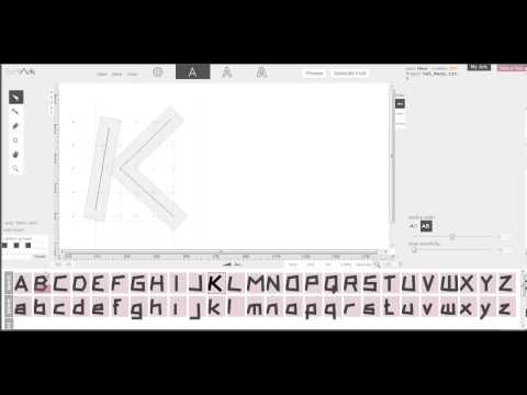 http://youtu.be/GYtWNi1Xyw4
Now even supports variable Outline width: http://youtu.be/dLHr1s3gZGY
Accented characters automation, Logotype mode(!), preview, one click font generation and a simple designer oriented UI (all in reach, no hidden menus and technical complexity).
Served straight to your browser (Chrome recommended), no download or installation required.
It still doesn't have all the "Illustrator" vector editing tools but we're gapping up.1 -
This is very interesting. I personally don't like or use programs that can't be installed on the computer though. A tool like this would be excellent to use on the computer with the ability to modify local fonts. It's a rather fascinating tool in any case.0
-
" I personally don't like or use programs that can't be installed on the computer"
Is it for privacy/accessibility reasons?
"It's a rather fascinating tool"
It really is
0


Categories
- All Categories
- 46 Introductions
- 3.9K Typeface Design
- 493 Type Design Critiques
- 572 Type Design Software
- 1.1K Type Design Technique & Theory
- 668 Type Business
- 879 Font Technology
- 29 Punchcutting
- 534 Typography
- 122 Type Education
- 331 Type History
- 81 Type Resources
- 112 Lettering and Calligraphy
- 32 Lettering Critiques
- 80 Lettering Technique & Theory
- 563 Announcements
- 97 Events
- 116 Job Postings
- 169 Type Releases
- 180 Miscellaneous News
- 270 About TypeDrawers
- 54 TypeDrawers Announcements
- 114 Suggestions and Bug Reports