The Twist

Ray Larabie
Posts: 1,495

Does anyone else use twists for designing glyphs with diagonals? It's something I gradually added to my font development over the years but I didn't pick it up from anyone else. It's something that naturally developed in an attempt to reduce distortion in blends, obliques and MM interpolation. It has the added benefit of allowing for quick adjustment of the slant without having to reposition the apices.
Of course, later on in the design process, I remove the overlaps and add ink/light traps if needed. Recently I saw a screenshot of someone else using this method. Is this a thing?
2
Comments
-
I do this for every overlap in a font that doesn’t have a trap. It’s a habit I picked up from Rob Keller and Attila Korap in a workshop at Typecon 2008. I used to remove all the overlaps before moving on to final production files. But Glyphs removes overlaps and corrects path directions reliably, so now I can keep my overlaps and not have to maintain two sets of files.4
-
In fact in Glyphs there's an "Open corner" command available from context menus that facilitates making these handy triangles.1
-
Recently I saw a screenshot of someone else using this method. Is this a thing?
Yeah, kinda. I believe all the kids are doing it these days.1 -
Yep, it's considered good practice in Glyphs. This is from the glyphsapp.com front page:
 1
1 -
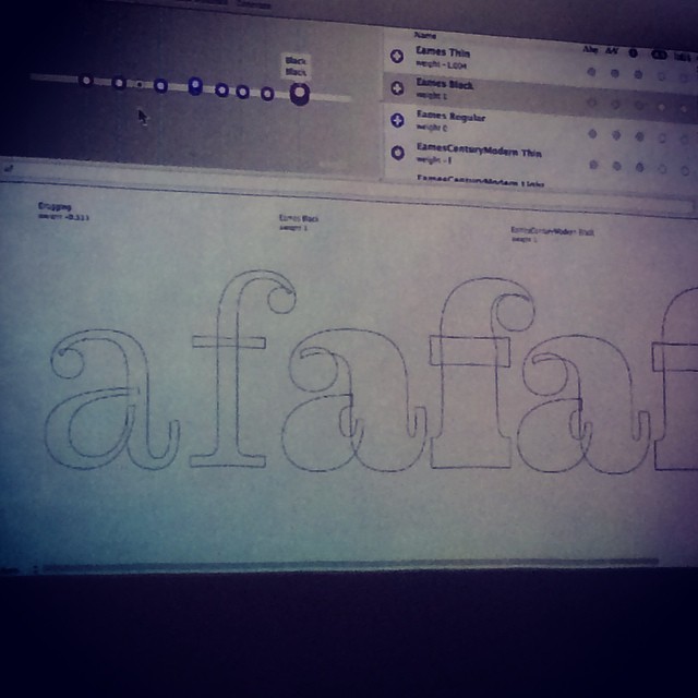
See also this pic by Nina:
Sp3 workshop with @letterror. Clever interpolatable ball terminal point structure (Eames) #atypi2014
 4
4 -
There's a screenshot of this in the Microsoft Cleartype 'orange book' which is where I learned it from
") 1
1 -
Erik van Blokland has been advising about using this trick for quite a long time: http://new.superpolator.com/documentation/rules/
Take also a look to this cool graphic:
http://superpolator.com/files/drawingForInterpolation.pdf1 -
For completeness, here's the RoboFont extension (written by Alexandre Saumier Demers): https://github.com/asaumierdemers/AddOverlap0
-
I like this technique because to helps when adding weight.0
-
I would "draw " the character first with the originating "tool" otherwise it is the tail wagging the dog. Coming from my background, "automated forms" are exactly that. Ray, depending on what the rest of this font looks like, the weights look like they could be "mis"-distributed to me. There are thinner strokes in this W, that you did, which would mean it was "borderline humanist" which would indicate to me that it should be "heavy-thinner-heavy-thinner" instead of "heavy-thinner-thinner-heavy." Does that make sense?-2
-
Hi Michael, I know what you mean. The style is gonzo-historical 80's/steampunk mashup so it works in context with other constructed forms. Kind of a Frutifranklirailway style. But it's been changed a bit since I took that screenshot. The weight doesn't look right yet but I haven't done my printouts yet. I'm not sure why the second stroke is less parallel that the third but in solid shapes and in context, it looks balanced.

In the links, posted above, I've seen instances of right angle shapes with overlaps. Foe example, T, E and F. I've tested a T, E and F with and without overlaps removed and I can see no difference in the interpolation. I also interpolated obliques and got the same results. Why leave overlaps on right angled forms? It seems like an E with 4 shapes, each with their own start points is more error prone than one shape: 4 start points to get wrong and object order to verify. Is there an advantage to leaving overlaps on those types of forms?0 -
Why is it off topic Craig? I thought it was a reasonable response and it does not seem to have offended/bothered Ray.0
-
I suspect with strictly perpendicular contours, there may be no difference in interpolation. But even so, some operations are still easier with separate contours--for example, deciding that the middle arm of an /E/ should move a little up and a little in.0
-
And I ask again why it is off topic?0
-
Sorry, didn't see your question before.
As I understand it, the topic of this thread is the use of "opened corners" in constructing shapes in a font editor. It seemed to me like your reply, however reasonable, didn't relate to that at all. Correct me if I'm mistaken.1 -
I was commenting on the weight distribution, as a result of the process he presented, which Ray understood. But then you opined. I was commenting on form and weight. You would have known that had you read, before you went judgmental. You would not have placed an off topic icon (which you have now conveniently deleted) had that been the case.1
-
Further argument only leads the thread further off topic, so I'll just leave it at agreeing to disagree.0
-
Amazing! You retract your "off topic" and then try and make it look I am the culprit. Ultimately it comes down to tools that make the best forms… and those forms, whether using this mechanical technique or another (originating tool), are best informed by a good eye and understanding. I was suggesting an alternative to his "mechanical" solution… if you think that is off-topic then so be it.1
-
Michael, the weight distribution is not “a result of the process presented.”
I get that you disagree with the weighting of the strokes, but the choice of weighting has nothing to do with the twists method being used; it is not a consequence of the process. Nor is the weighting you prefer a consequence of not using twists. They are simply unrelated choices. That's why several of us are saying your posts are off topic.
It is, however, much easier to change the weight distribution of the strokes when one is using the twists method. So if Ray agrees with you about the weighting, he will have an easier time adjusting things. So you actually ought to be in favor of twists, over the “old way.”2 -
Moving on...
When making lighter weights, it's important the length over your overlap is an even number. Otherwise the apex will round to the left or right when you eventually remove the overlap.
2 -
This is from the glyphsapp.com front page:
I've been wondering, why would someone construct an A like that, keeping the left side intact but not the right? I missing something or is this just a marketing graphic?1 -
left side intact but not the right?
One closed shape instead of two?0 -
Yes, you're missing an "Am." ;-)
It's possible the intention is show a "before" and "after" (or rather "after" and "before") of the Reconnect Nodes function.0 -
Craig is right.0
-
Sorry about the typo. Too much cold medicine this week.
Thanks for explaining, Craig/Georg.0


Categories
- All Categories
- 47 Introductions
- 4K Typeface Design
- 495 Type Design Critiques
- 577 Type Design Software
- 1.1K Type Design Technique & Theory
- 670 Type Business
- 885 Font Technology
- 29 Punchcutting
- 539 Typography
- 125 Type Education
- 333 Type History
- 81 Type Resources
- 113 Lettering and Calligraphy
- 33 Lettering Critiques
- 80 Lettering Technique & Theory
- 569 Announcements
- 100 Events
- 116 Job Postings
- 170 Type Releases
- 182 Miscellaneous News
- 270 About TypeDrawers
- 54 TypeDrawers Announcements
- 114 Suggestions and Bug Reports