Gong—how did they do this?

James Puckett
Posts: 2,052
in Type History
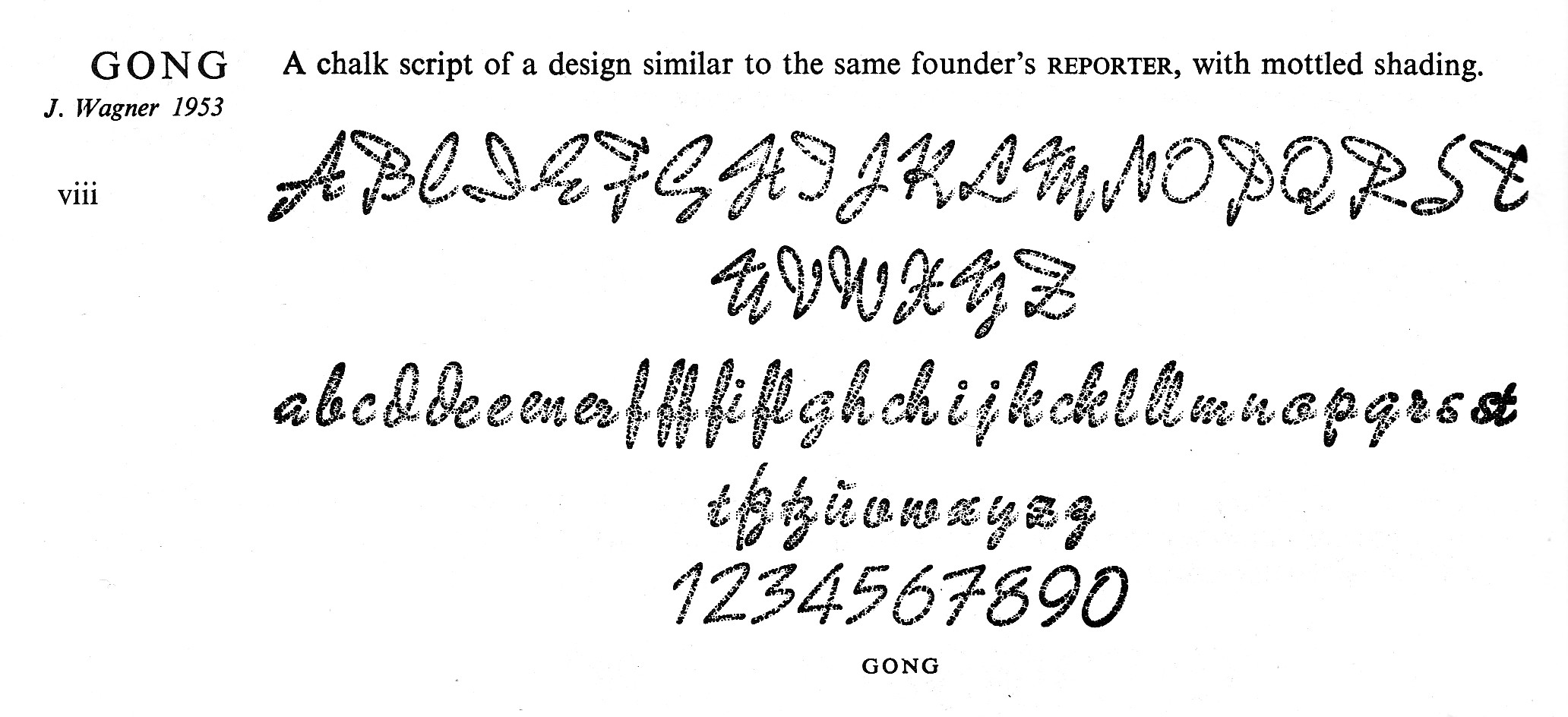
Today I came across an incredible typeface: Gong designed by Johannes Wagner, released 1953. Here’s a link to a scan; it has to be seen big to appreciate it: http://luc.devroye.org/gong.jpg
Gong has a fabulous chalk texture that looks fairly convincing in a first-generation print. I can’t figure out how they made this work as metal type. Did an autistic punchcutter actually engrave a chalk texture into punches? Did they have a machine that could engrave the pattern into the matrices the way the Bentons did with their shaded series?
Gong has a fabulous chalk texture that looks fairly convincing in a first-generation print. I can’t figure out how they made this work as metal type. Did an autistic punchcutter actually engrave a chalk texture into punches? Did they have a machine that could engrave the pattern into the matrices the way the Bentons did with their shaded series?
0
Comments
-
James, I would think there was some form of photoengraving involved with the making of Gong. It's very unlikely there would have been punches involved, though it could have been cut into soft metal from which electrotyped matrices would be made. But even that seems farfetched. Photoengraving from artwork would have been the way to go; it was 1953, after all.
The Wagner foundry, of Leipzig, had been pretty much destroyed during World War II and reopened in another part of town after the war. (It eventually became part of the GDR state type foundry, Typoart.) I think Wagner himself managed to get to the West.
Gong was designed by Carlos Winkow, the creator of Reporter (1938)—surely the most free-spirited font of the Nazi era. (It foreshadows the beautiful Mistral.) Winkow lived in Spain for much of his career, though I don't know when he settled there. (He seems to have been a connoisseur of fascist regimes.) Reporter could have been cut as punches or mechanically engraved into matrices. There must be someone out there who has made a study of the Wagner foundry.
I'll make some inquiries.1 -
James, are you sure this wasn't done in cold type? By 1953 cold type/photo type was well established . . .0
-
I doubt it was photo. I saw Gong today in a huge two-volume metal specimen book. If this was photo type it was the only photo type out of thousands.
There is a matching design, Jowa, without the texture. Could they have used photoengraving on cast Jowa and produced matrices with electrotyping?0 -
From a quick search, here are some photos of Kreideschrift Gong in metal: http://www.blog.druckerey.de/?s=tag&t=gong
mentioned in this thread:
http://www.typografie.info/3/topic/23770-font-der-nach-tafel-kreide-schrift-aussieht/page-25 -
There were many people and companies called (something with) Wagner; not all were foundries. Johannes Wagner, a son of Ludwig Wagner (Leipzig), had his foundry first in Berlin, then moved it to Ingolstadt after the war. Gong was issued in 1945 by the Norddeutsche Schriftgießerei, the earlier Berlin name of JW’s foundry.1
-
Oh and re Jowa (Johannes Wagner), yes, that was a solid, rather light script version from later, 1966.0
-
My question would be: Since you could easily dig out little pits that would produce the cavities in the ultimate printed text, was that done individually for every instant block of metal (making every block custom-crafted) or was a complex mould developed that produced absolutely consistent voids (creating identical mass-produced type)?0
-
I would just drop something like salt into the matrix, cast, then wash the grains away?0
-
-
Maybe something like:
1) Make a negative film of the solid untextured glyphs.
2) Create via ink spatters or similar an overall block of texture and make a negative film of that.
3) Sandwich the two and make a positive contact print.
4) Shoot the contact print out of focus to soften the edges of the spatters where they intersect the edge of the glyphs and make a new negative film.
5) Opaque out a few extra bits by hand and make a new positive contact print.
6) Photoengrave your block from it.2 -
BTW, there is a digital version by Peter Wiegel available0
-
Unique features of Gong are that the stroke thickness and “chalk sprinkle resolution” are the same for all sizes, not scaled. Like in real handwriting, you could combine different sizes in one word because all fonts had the hight of the connections in common, not the baseline. All things that make it hard to digitize properly.
https://www.flickr.com/photos/kupfers/15990134165/6 -
Indra, that's an important observation and it jibes perfectly with Max's plan. There would have been one more step, though: to "grow" electrotyped matrices from the photoengraved plate(s). Electrotyping was invented in 1838 and it was the technique by which the great profusion of decorated types were made in the 19th century. Cutting hard punches took too much time, whereas engraving types into soft metal was much faster and took less skill. So rather than making strikes into copper, matrices could be grown onto the soft metal (some American typefounders referred to these at "patrices.") Electrotyping also enabled the widespread piracy of types, as new matrices could be created from cast type. Later on, photography would play a role, eliminating the need to cut anything into metal.
So, you see, type piracy is about 175 years old--not a new phenomenon of the digital era.0 -
Yes, almost all foundry type by that time (at least in Germany) was cut into soft metal with electrotyped matrices. This was standard practice and enabled different, more delicate designs or innovations like this, not only piracy, and not because of less skill but because the matrix did not have to be struck or pressed with tons of pressure during which thin parts could break. Only if your product were matrices — e.g. Wagner & Schmidt, Linotype, Monotype — you needed hard steel punches (and for the latter preferably machine cut because they needed several identical punches).
Off topic: is it just me or did the misuse of two hyphens for a dash got much more common recently. Why?0 -
Why?
iPhone users switching to Android?0 -
Indra, I don't think you've got that right. When photoengraving became the common practice, there was no need to cut soft metal "patrices." Monotype and Linotype matrices were engraved from enlarged brass tracing masters using a Benton-style machine. Photography was also used in some foundries to transfer designs from artwork onto blank punches, as Frank Blokland recently reminded me.
As to your off-topic remark: The use of double hyphens for an em dash is an old habit from typewriter days, when it was the only way an em dash could be represented. For a long time, em dashes typed into a Mac would come out incorrectly when read into Microsoft applications, so it was still necessary to use the double hyphens.0 -
Not sure what you mean in your first paragraph. I am referring to type making practices in Germany in the 20th century which I am pretty familiar with, also with production for Linotype and Monotype. Perhaps some foundries used photoengraving, but many used Zeugschnitt (cutting of soft metal) or engraving of matrices, e.g. Stempel. Not saying that Gong was not made with the help of photoengraving, just talking in general as Scott did, too.0
-
Thanks for that information, Indra. I had seen the word Zeugschnitt before, but I had assumed it was a kind of throw-away trial cut, as in dummes Zeug.0
-
Found this similar effect today in the 1910 Keystone specimen. They picked samples with few repeating characters, and used lots of alternate forms, but you can clearly see the repeating texture on a few letters. Interestingly, the texture gets finer as the size gets smaller.


 5
5 -
Fantastic! Also not the ~same stroke width throughout the series. That the texture scales is interesting, but not linear I guess? Might still hint at a photo-engraving process.1
-
More photos of Gong in metal, found at the print shop at the industrial museum in Ghent. Unlike the somewhat worn type linked to above, this one looks like it's never been printed.


8 -
Thanks. From the same Ghent Gong, here a photo of the different sizes next to each other: https://www.flickr.com/photos/kupfers/167107084320


Categories
- All Categories
- 47 Introductions
- 4K Typeface Design
- 495 Type Design Critiques
- 577 Type Design Software
- 1.1K Type Design Technique & Theory
- 670 Type Business
- 885 Font Technology
- 29 Punchcutting
- 539 Typography
- 125 Type Education
- 333 Type History
- 81 Type Resources
- 113 Lettering and Calligraphy
- 33 Lettering Critiques
- 80 Lettering Technique & Theory
- 569 Announcements
- 100 Events
- 116 Job Postings
- 170 Type Releases
- 182 Miscellaneous News
- 270 About TypeDrawers
- 54 TypeDrawers Announcements
- 114 Suggestions and Bug Reports