Scamp -- a Smallcap Sans with Angular Stress

Michael Vokits
Posts: 214

Comments
-
Crap, didn't have kerning on in the screenshot. Ah well.1
-
I'm getting a pretty uneven, hand-drawn vibe from it. Is that by design?
The characters that most break the harmony seem to be /g/q/u. Namely, /g is the only character to have sharp details compressed in a small space; /u is too wide and wobbly; /q's tail doesn't work for me.1 -
I’m seeing what Christian pointed out too,
- could use more contrast on /G/’s throat and /E/’s bars.
- /S/ is very pretty but slightly right leaning compared to the rest of the typeface.
- lowercase /N/ has issues in colour and proportion when compared to uppercase /N/ and lowercase /H/.
- lining figure /6/ and /9/ are a little to dark on the thicks and lining figure /2/ needs more weight on the cross bar.0 -
Hi Michael,
Your design seems to contain many options for different directions; hence, it could be considered a template for a couple of typefaces. Looking at your figures, you seem to be inspired by the days that tabular figures were designed on half the em and some of these figures were directly used for the old-style variants, like in Times New Roman.
What strikes me most, is the lack of serifs in combination with the high contrast. You know that serifs represent the complete flow of contrast; i.e., from thick to thin. Actually serifs contain the DNA of a typeface and one can distill weight, contrast, contrast-sort and contrast-flow from them. For years now I’m planning a blockbuster film named Serif Park, in which a serif-fossil of an extinct type species is excavated and used to rebuild the origin. Subsequently the outcome is presented as a tourist attraction.
The lower the contrast, the more the stroke-endings are emphasized. In case of a very low contrast the serifs become basically obsolete, because their thickness becomes (optically) equal to the stem thickness. As you know, low-contrast variants with serifs are called ‘slab serif’ or ‘egyptian’. The removal of the serifs results in a sans serif.
The consequence of this that one cannot remove a serif ‘just like that’. If that would possible, the present-day typographer would have many more typefaces on his palette, like Times Sans, Garamond Sans, Bodoni Sans, et cetera.
The diagram above shows that the contrast in the serif-less e has to be represented in the i. Only two options are correct here.
One can remove the serifs from a slab serif though, and also it’s possible to attach serifs to a typeface like Gill Sans. Typefaces like Optima and DTL Argo are on the edge of the model. In Optima Hermann Zapf widened the stroke endings, but it’s a vulnerable design (which becomes especially obvious when technology is too limited to represent the details –but that is another story).
Best, Frank5 -
Frank, I find that Times Sans sample up there oddly compelling. Bring that oogly /e under control and sharpen the terminal on the /a and you'd basically reinvent Rotis Semi-Sans. ;o)1
-

Serif Park, sneak preview: In 2002 a tiny part of a serif from around 10,000 BC was excavated in the Eastern Gobi desert.1 -
Lots to process; thanks to all.
@LeMo; Many thanks for the insights. And I thought a sans would be easier!0 -
Gee, my lack of art training is showing... maybe a bit more playful would be good?
 1
1 -
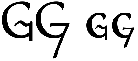
The tilde-shaped /G/g version does not really solve the "finicky detailing" problem of the original version, and instead also imports the original /q's problem.
I find the second /G/g quite attractive, but I fear it might look strange in text, being the only letter with a descender.
In general, it would be good to decide whether you want the typeface to be brushy and calligraphic (like the /s) or angular and glyphic (like the /e). The current mix feels inconsistent to me. If you like both aspects, maybe develop two cuts of the typeface in parallel...?
Michael, don't worry about lack of training. If anything, it's lack of experience, and you can get that through the "learning by doing" approach.0 -
Christian: ‘[…] don't worry about lack of training. […] you can get that through the "learning by doing" approach.’
Personally I definitely would worry about a lack of training if one wants to take one’s métier seriously and if one wants it to be taken seriously by the rest of the world. Perhaps in the type world one sometimes can get away by making pictures of things, as Gill depicted it, but designing type seriously requires a thorough training and in-depth knowledge IMHO.
Just like for instance plumbing, and I hope I’ll never get a plumber in the house who will tell me not to worry, because he will ‘learn by doing’.
2 -
Actually, I'm sure one could become a reasonably accomplished plumber if one were to have a passionate interest in the topic, practice in a safe environment and receive a lot of constructive feedback. Ultimately, that's just another form of training. You might get wet more often than if you went to plumber school, but maybe that would help you remember your lessons. ;o)3
-
plumber school
Not to mention that you could learn something wrong there …0 -
Slight update; more consistent in shape and less scampy, alas, but the color and rhythm are better. Alternates for /ampersand and /at.
I might use stylistic sets for the more colorful glyphs, but they're different enough that I think they'd be best in another font entirely. I should probably develop a sense of proportion and harmony before going ape with shapes!0 -
-
There is certainly a lot more consistency between the letters now!
I find the large size contrast between caps and "lowercase" a bit irritating. I would consider make the "x-height" significantly larger, maybe 0.75 of the cap height.
As for letter shapes, the /q and, to a lesser degree, the /Q still don't work for me at all. The tail looks like a disconnected scribble. The /B looks perhaps a bit too aerodynamic for this kind of font; I would relax the uppermost and lowermost curves a bit and allow the bowls to be rounder. /a and /v look rather asymmetric, but that may be intentional.1 -
@Kent: Ack, the dreaded name conflict... 'twas just a placeholder anyway. Thanks for the heads-up.
@Christian: Excellent points/advice indeed! Many thanks. I may have raised the x-height a bit too much with this new version, but I like the new shapes much better.0 -
Added half-hanging numerals to contrast with UC and lc numerals. I think this may be final once I find a fitting name (barring adding even more glyphs).0
-
As for adding glyphs, how about all those international letters...?
Still not too fond of the /Q/q, but it's certainly better than before. How about a solution that connects with the bowl but doesn't cross it? Roman style.
And do fix that path orientation problem in /A/a...0 -
Just added a few more glyphs... if only TypeTool recognized things like /Gcommaaccent and /Mdotbelow, it'd be a lot less of a pain to do so. (I need them for linguistics work, so hey...)
I think the /Q/q are better. Amazing how often Roman forms and proportions are still dominant.
"path orientation problem"? Oh! It's an issue with overlaps, actually... the crossbar wasn't merged with the tent. None of my pdf viewers (SimplePDF and TeXWorks) ever detect this sort of thing, so I forgot it's an issue.
Now for a name...0 -
Great typeface so far in the last post.
C/O/Q are falling backwards a bit too much for my taste. S (small-cap) is falling forwards.
A/U/V (capitals) seem a bit light. There is a higher variety in contrast in the capitals than there is in the small-caps.
The P (cap & small-cap) could use a bigger bowl I think. I would also bring the part where the bowl of P goes towards the stem a tiny bit closer to the stem in the capital and make the bowl go inwards very slightly compared to the small-cap P.
Here's a picture where I exaggerated what I'm talking about:
Also, isn't the dot placed too low?0 -
@Martin: Excellent points, all -- thanks. Color contrast is a big concern; I wanted the UC and lc to have identical stroke widths ('cause I hate scaled small caps), but I think I will need to thin the lc down a bit.
Yeesh, and I thought a smallcap sans would be an easy place to start!0 -
Ok, this might work. I increased the contrast in the lc, but I wonder if decreasing it in the UC might not have been a better strategy -- as Frank said above, low contrast is best in a sans.0
-
This is a tough one. Especially with the disconnected bar in /A it looks more refined and classical but loses a bit of its power. The new UC /P is also a good example of this. I think it's more elegant which in some sense equates to being more classical, but the previous /P with the smaller bowl had more power and character. I don't know which UC /P I prefer, but the new lc /P is definitely better.
All in all, I think I prefer the new version of the typeface but I still have mixed feelings about it. I wonder to which extent this is merely personal taste.
If you stick with the higher contrast, I might connect the bar of the lc /A again because right now it's a bit too light.0 -
Hmm, much to consider...0
-


Categories
- All Categories
- 47 Introductions
- 4K Typeface Design
- 493 Type Design Critiques
- 575 Type Design Software
- 1.1K Type Design Technique & Theory
- 669 Type Business
- 884 Font Technology
- 29 Punchcutting
- 537 Typography
- 124 Type Education
- 332 Type History
- 81 Type Resources
- 113 Lettering and Calligraphy
- 33 Lettering Critiques
- 80 Lettering Technique & Theory
- 569 Announcements
- 100 Events
- 116 Job Postings
- 170 Type Releases
- 182 Miscellaneous News
- 270 About TypeDrawers
- 54 TypeDrawers Announcements
- 114 Suggestions and Bug Reports