LULU bifurcated serif (based on a french biscuit...)

Pascal Barry
Posts: 31
Hello
I recently posted another type critique discussion (Cephalonia), where more info on myself and why I'm posting these typefaces can be found, so I won't repeat myself here.
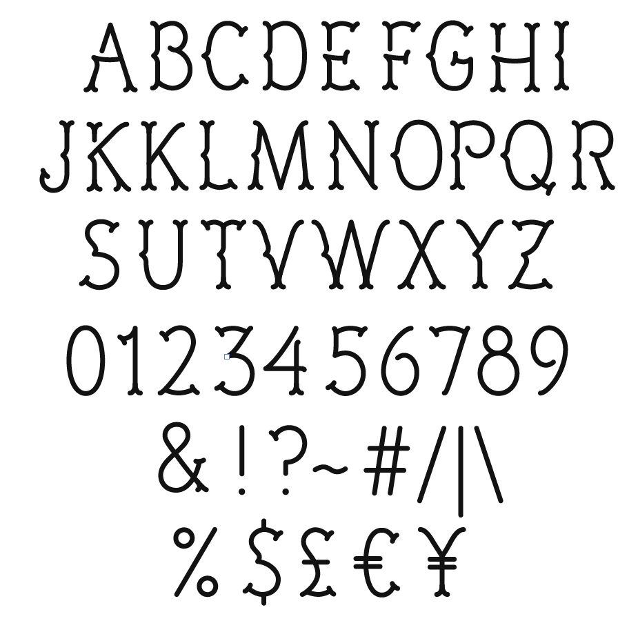
The attached file shows where I'm at with a bifurcated serif display design, based of the LU petit beurre biscuit of my childhood!
I'm now hoping I can get some feedback to improve the design in general. I've constructed the glyphs from mono weight lines drawn in illustrator and one thing I'm wondering is whether I should taper the junctions with subtle ink traps on, for example, the V and W.
Myfonts have suggested a lowercase design, so I was also hoping for any thoughts people had on that. Places to start, stylistic elements to carry across etc?
All comments and suggestions are much appreciated!
Thank you
Pascal
I recently posted another type critique discussion (Cephalonia), where more info on myself and why I'm posting these typefaces can be found, so I won't repeat myself here.
The attached file shows where I'm at with a bifurcated serif display design, based of the LU petit beurre biscuit of my childhood!
I'm now hoping I can get some feedback to improve the design in general. I've constructed the glyphs from mono weight lines drawn in illustrator and one thing I'm wondering is whether I should taper the junctions with subtle ink traps on, for example, the V and W.
Myfonts have suggested a lowercase design, so I was also hoping for any thoughts people had on that. Places to start, stylistic elements to carry across etc?
All comments and suggestions are much appreciated!
Thank you
Pascal
2
Comments
-
Seeing these lovely letters makes me smile. They're sunny, friendly, and charmingly fussy.
I think that you've got the right idea about tapering the junctions and so forth; doing so will subtly improve the color and add a touch more grace -- not that this is lacking in either.
A lowercase is definitely in order, but I'm not sure how to pull it off, since the UC relies on large, open spaces that would be hard to achieve in a lowercase set. But I think you'll make it happen.
I love oldstyle figures, but I don't think they would be appropriate, since they were more or less phased out by the era this face evokes. Drat; I'm an OSF junkie. Anyway, the numerals and money signs may be a touch large, but that's probably just my anti-capitalist bias speaking.
Definitely keep the open bowls on /P, /R, /six and /nine... and now that I think of it, maybe you could try open bowls on /b, /d, /p, /q and /g -- but hey, Scala is one of my favorite designs, and I'm always coming back to it (even if stodgy Minion clones are what I tend to produce...).
As for kerning, I'd keep it light -- you wouldn't want to cramp up those sunny spaces.
1 -
I'm in agreement with Michael and FWIW I've released many typefaces caps only or used the lowercase slots for alternate Cap forms. To be honest, lowercase aren't appropriate and a shortcap version would lose the charm. My Turnpike font is caps only and does just fine!1
-
Thanks for the comments and kind words... Yeah, I'm also finding it hard to see how the lowercase would look. There's something in Scala sans, imagining opening the bowls on b,p,d,q. But two storey a and g doesn't feel right, I don't think.
I'm going to try the lowercase but also agree it's not essential to what is really always going to be a display face.
I'll look to post some initial ideas soon.0 -
It seems a bit odd they want you to add lowercase. This typeface works well in all-caps.
I don't think you should follow these humanist proportions for your capitals. Either some of the letters are too wide or a lot of the letters are too condensed. I would probably widen C/E/F/G/L/N/S/T/X/Y/Z and H/J/K/O/Q to a lesser extent. Lower the join in X and Y, extend the horizontal in 2, lower the horizontal in 4 and make sure 5/6/7/9 aren't falling to the right. The currency symbols should also be wider. Either that, or condense the wider characters.1 -
Yeah, I'm starting to think maybe it's best to just concentrate on nailing the uppercase.
I really see what you're saying about widening/condensing, that's a great point. I think I'll look to widen the characters as I think the lighter look is the way to go.
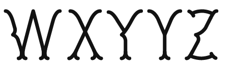
With the X & Y, I had the join higher as I wanted to avoid crossing over the middle kink/arrow. I can't see how this would work if I lowered the join and it went through that. Could you describe how you'd see that working?
Thanks0 -
I see what you did now. In that case I suspect there is no way to lower the joins on these characters. Widening the characters may compensate for the white space at the top being too small compared to the bottom. It might also make it worse though considering the bottom part will relatively grow more than the top part the more you widen the character.1
-

After being inspired by type designers who were inspired by biscuits from their childhood, fashion designers had another look at the rocking horses dating from the time that they were little themselves, while following humanist proportions and concentrating on nailing the horseshoes.
2 -
The X was definitely the problem character. I think the join on the Y could still go a bit lower and had an idea for a possible different design on the X that may solve the problem. WIll let you know, Martin, when I have something to show.
Cheers0 -
Hi Martin, I've worked on this in light of your comments. What do you think?
 Thanks 0
 -
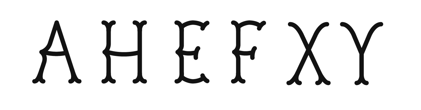
Have you considered removing the kink from letters in which it conflicts with a stroke (K X)? I don't think you need to force it on every letter to get the spirit of the face across the whole set. The numbers do fine without kinks.4
-
Letters with crossbars (A E F H) would also fare better if the kink flowed more naturally into the crossbar. Maybe even consider a stencil break above it.1
-
Yeah I had considered that with the X especially, but I think I've just been stuck in a mind set of trying to get the kink working on all letters.. I hadn't considered the K. I will try both.
A and H crossbars are definitely awkward and I think you're probably right, if I draw them flowing into the kink instead of tacked on that could help.
The issue with the E and F would be if I draw the arms flowing into the bottom of the kink they'll be too low and I think the crossbars and arms need that bend to work into the kink. Will experiment though.
Thanks for the feedback.0 -
The X is definitely better without the kink. Wondering about the Y now? I've tried the other letters similarly and also with a crossbar without the bend going straight into the curve. What do you think?


0 -
Maybe you can try with lower crossbar A and kink on it? And kink on the crossbar on H?0
-
Not sure if this is what you mean, but think I'm settling on this - losing the kink on X and Y and a slight bend on A, E, F and H as the bar flows into the kink...
 0
0 -
Naw, that just gets too heavy there at the join. For AHEF, I was suggesting the stroke coming down from the top stops before the kink, creating a break. Then the crossbar flows smoothly into the kink shape and down to finish the the stroke.0
-
Boom. That was it! Missed your stencil comment first time round. Tried it on the K as well but not sure, there's more white space above with the angle of the arm below...
0 -
Hi all, Lu Lu was recently accepted on to myfonts. Thanks to all for your comments - they greatly improved the design and helped me learn an incredible amount. If you'd like a copy just drop me a message with your email address.
Thanks
Pascal0 -
Congrats!0
-
@Pascal Barry, I just wanted to say congratulations; I love Lulu and am so glad that it's now up for sale at MyFonts. I look forward to seeing it in use!
0 -
0


Categories
- All Categories
- 47 Introductions
- 4K Typeface Design
- 493 Type Design Critiques
- 575 Type Design Software
- 1.1K Type Design Technique & Theory
- 669 Type Business
- 884 Font Technology
- 29 Punchcutting
- 537 Typography
- 124 Type Education
- 332 Type History
- 81 Type Resources
- 113 Lettering and Calligraphy
- 33 Lettering Critiques
- 80 Lettering Technique & Theory
- 569 Announcements
- 100 Events
- 116 Job Postings
- 170 Type Releases
- 182 Miscellaneous News
- 270 About TypeDrawers
- 54 TypeDrawers Announcements
- 114 Suggestions and Bug Reports