Millennial Oldstyle

Questions:
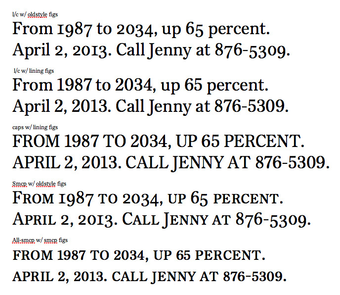
- Are the oldstyle figures too tall with the lowercase (first setting in the pic), or are they okay? (Their "x"-height is currently at small-cap height.) I had them at lowercase x-height and they were certainly too small, and too up-and-down.
- The font is presently configured so that lining figs are default. If the user sets small-caps, the lining figs turn into oldstyle figs (see second to last setting in the pic). If the user sets all-small-caps, small-cap-lining figs appear. An okay arrangement?
- Not about figures, but... Would you want a nondescending /J/ form as default in small caps?
(Note that there's no kerning here--including the kerning that will eventually space out that all-caps setting.)
Comments
-
Feel free to disregard all of this.
Personally, I like the oldstyle figures at that height. I did the same with Garvis (and nearly everything else), as I've found the figures to be both "too small and too up-and-down".
The fact that they are numbers will set them apart from the text, regardless of the height, I think this solution allows the numbers to fit nicely with the lower case and small caps. I also think your OT solution makes the most sense.
Regarding the nondescending /J/, it would be nice to have as no other smallcap characters descend and, as someone who uses the /J/ a lot, I like when there is the non-descending option. It would be nice if you could handle the /J/ in the same manner as the smcp figures (non-descending when "all-small-caps" are selected).0 -
The user and all related content has been deleted.0
-
Despite the fact that I can hardly imagine a situation where, as a typographer, I would want to use lining figures with small caps, I have always felt that it is a bit presumptious of a font producer to have the Small Caps feature(s) force oldstyle figures.
There are specific, separate features for the typographer to select his/her desired figure style. If I specify Lining Figures, then dammit I want lining figures.
That said, if small cap figures are present, I think that the best way to provide them is with {c2sc} + {lnum}. That is, if I have specified Lining Figures (or left the default, in this case) and specified All Small Caps, then it is reasonable to expect that those lining figures would “line” with the small caps — i.e., SC figs.
But if I’ve specified Oldstyle Figures, then dammit I want oldstyle figures.
My humble opinion.
3 -
Thanks for the input guys.
@kentlew, what about this: if oldstyle figures were default, would you feel it presumptuous to have {case} trigger lining figures?
@JMontalbano, thanks for the advice. I had only recently conceded that my monoline zero shouldn't be default.") It's now a stylistic alternate, as is a one-sided /1/. Would you push me to make the one-sided /1/ the default and the I-form version the alternate? 0
It's now a stylistic alternate, as is a one-sided /1/. Would you push me to make the one-sided /1/ the default and the I-form version the alternate? 0 -
if oldstyle figures were default, would you feel it presumptuous to have {case} trigger lining figures?
Good question. And yes, I kinda do.
I realize that to most others this may sound unnecessarily purist.
1 -
The user and all related content has been deleted.0
-
Right. They go together.
My practice is to:
1. Omit figures from the smcp feature
2. Provide small-cap-lining figures in c2sc (both tab and prop)
3. Where the font’s lining figures are 3/4 height, also provide cap height lining figures in the case feature. If the lining figures are already cap height, use those. (If the default figures are oldstyle, case figures should still be lining, because an all cap setting with OSF is wack.)
As your default figures are lining, so should your small cap figures be.
The reason is that small caps are generally combined with U&lc setting, and it would be strange to have figures in your small caps text differ from those in the main U&lc text—small caps are different in size from caps, not in kind. Also, small cap lining figures are really small looking, due to their narrowness in comparison with small capitals.
BTW, why are you redoing Century Oldstyle?1 -
As your default figures are lining, so should your small cap figures be.
You've changed your mind, then? Typophile comment
I'm lately thinking of making the osf's default because I like them better in more circumstances.BTW, why are you redoing Century Oldstyle?
Because I wanted to try a text face, found I needed a model, and thought it an excellent one.0 -
Well, I do try to keep a consistent practice, and advocate a consistent best practice, but it doesn’t always work out that way!
Checking back on the OpenType faces I’ve published with small caps, only one of six, Beaufort Pro, has small caps with figures that differ from the default.
0 -
3. Where the font’s lining figures are 3/4 height, also provide cap height lining figures in the case feature.
Yes, this is a situation where I might agree. Although, I would still be inclined to make the {case} substitutions act only upon lining figures and to arrange the feature order so that if, for whatever reason, oldstyle figures have been explicitly specified, then that specification will be respected.
0 -
Craig — It was recently brought to my attention that the official spec for {case} actually explicitly mentions the inclusion of lining figures, even to the extent of overriding {onum}. I had always thought it was a matter of different foundry interpretations and implementations; but apparently not.
So, while I always realized that my general opinion might be a minority one, it seems now that I might need to concede the point altogether.
0 -
Thanks for the update Kent.
I've pretty much settled on default oldstyle figures that...
... change to lining figs with LNUM or CASE
... stay the same with SMCP
... change to lining smallcaps with C2SC0 -
To my eye, the oldstyle figures with a bottom curve (6 and 8) don't seem to line up well with the baseline. Is it just me?0
-
Here's where the oldstyle figs sit now (can't remember if I've moved them since the first post).

Do you think the 6 and 8 need a touch more overshoot? My eyes go back and forth on it.0 -
When I enlarge the top two lines I get almost no overshoot, and the /e climbs up on the /i too.0
-
I still see the problem with the 6 and 8 as well as all glyphs that have a bottom curve although I think it's a bit better on the last line.0
-
Okay, thanks for the input. I think I'll have to boost the overshoot on the curves throughout the typeface (e.g. shoulder of /h/ definitely looks shorter than top of /x/ in the above image too).0
-
Yes, I think increased undershoot would help.
I wouldn’t boost overshoot by raising curves and arches; I would just pull down the few straight x-height glyphs — k v w x y z and maybe f t crossbars: much less work ;-)
The perceived x-height is really more about the curves and arches, since they’re much more prevalent. I don’t think this face needs any larger ‘arch-height.’
1 -
I'm seeking some comments on these /f/s. (Right click and open in new window to embiggen.)

In the lighter roman cuts, I was aiming for a workable narrow hook at the top, but I wonder if it looks too narrow.
In the heavier roman cuts, I included a cutaway of the stem north of the crossbar. Does that work?
In the italics I'm trying this trailing lachrymal tail. I like it, but does it get too funky in the bolder weights? And is it consonant with the rest of the face?0 -
Your treatment in the Bold is unnecessarily tentative. The counter need not be so open, and you could lean back more. Look at Windsor and Cooper Black.0
-
An interesting idea. I was conceiving of the effect above the crossbar as a cut into the stem on the right side rather than a leaning back of the whole thing, but I suppose optically the whole thing is already leaning back. I don't want to get too gimmicky (I certainly don't intend this face to be as cartoony as Windsor or Cooper Black) but I'll take a look at that possibility.0
-

I think that's a good direction. That former "yin-yang" counter (above) was creating a white spot that this revision (below) solves.1

![[Deleted User]](https://secure.gravatar.com/avatar/4a64fb71566d0b4e56fb2a244524664c/?default=https%3A%2F%2Fvanillicon.com%2F83f6992ca487b67bd3dd7df96e236fc1_200.png&rating=g&size=200)


Categories
- All Categories
- 47 Introductions
- 4K Typeface Design
- 495 Type Design Critiques
- 577 Type Design Software
- 1.1K Type Design Technique & Theory
- 671 Type Business
- 885 Font Technology
- 29 Punchcutting
- 539 Typography
- 125 Type Education
- 333 Type History
- 81 Type Resources
- 113 Lettering and Calligraphy
- 33 Lettering Critiques
- 80 Lettering Technique & Theory
- 569 Announcements
- 100 Events
- 116 Job Postings
- 170 Type Releases
- 182 Miscellaneous News
- 270 About TypeDrawers
- 54 TypeDrawers Announcements
- 114 Suggestions and Bug Reports