Neology: a type design experiment in readability

Nick Shinn
Posts: 2,362
(See PDF document here for type images.)
The goal was to address readability through type design as empirical process.
I sought to isolate letter form as a variable. That is to say, fundamental “topographic” letter construction, not proportion or curve shape. I wanted to see what effect variation in letter form has on readability.
The experiment was informed by three design factors I’ve engaged in the past:
1. Pseudo-random mixing of variant glyphs for the same character. (In Duffy Script and Fontesque Pro.)
2. The stylistic design axis. (Sense and Sensibility, and Handsome.)
3. The limits of perception. In particular relating to the size of the fovea and how many characters may be perceived with acuity, concurrently, during a saccadic rest.
Putting these together, I designed a sans serif typeface, Neology, comprising two full subsets—a geometric and a grotesque—in which the glyph for each character in text is chosen from either subset by pseudo-random code, via the Contextual Alternates feature.
The premise to be tested is that the reader only registers such information, within a saccadic rest, as is necessary to identify a character. Variance in character shape will not be perceived if it occurs across a saccade, because it has no significance to the task of decoding text. Consequently, mixing geometric and grotesque glyphs in a kind of massive wrong-font setting should not effect readability.
In order to isolate topographic letter distinctions, the glyph shapes of characters which only differ in proportion between geometric and grotesque style were made common. That’s about half the characters. To harmonize these, the geometric glyphs were made more consistent in width than is normal, and the grotesque glyphs were made rounder with less full curves than typical.
What I discovered
In my assessment, the premise is correct. Whether a passage of text is set in all geometric glyphs, all grotesque, or mixed, readability is the same. “Even color” appears to be the key to smooth reading.
What then is the purpose of typeface style? Two theories:
Firstly, because in typography aesthetics is function, each type design is a strategy for achieving functionality, and there must necessarily be many different strategies, at least as many as there are different type designers.
Secondly, typeface style provides usability to the typographer, not the reader. Typeface style informs the design of the page and document as a whole, establishing a semantic tone for expressing a concept of form by various syntactic means: narrative, philosophical and associative. No doubt the reader is aware of typeface qualities at the level of the document, but they do not impact on the immediate decoding of text, which is the concern of readability.
Furthermore…
The idea that a character should always be represented by a single glyph (except for the occasional ligature) is an economy originating in the foundry type era, with no basis in science. It also expresses the reductive ideology of modernism and its reverence for uniformity. As Giambattista Bodoni (1740-1813) stated, “It is an intrinsic advantage of the printer’s art that each letter is always the same… exact regularity is so pleasing to the eye that it is in itself almost sufficient to make any script appear beautiful.” Part of the allure for Bodoni was the difficulty of duplicating detail, “It depends on the skill of the punch-cutter whether or not such dimensions and component parts as may be common to several letters are precisely and exactly the same in them all.” But all that is in the past. New technology makes possible new challenges, new theories and new practicalities.
Variety is favored in many areas, particularly for activities which extend over time. Humanity balks at the prospect of the straight road, the assembly line, the prison cell—we are designed to respond to stimuli which vary; inertia generates invisibility. Perhaps this is why the old style types, with their lively complexities, are still preferred for extended reading.
Therefore, it may be that the principal of controlled glyph variation can provide improved readability.
4
Comments
-
the reader only registers such information, within a saccadic rest, as is necessary to identify a character. Variance in character shape will not be perceived if it occurs across a saccade, because it has no significance to the task of decoding text.
How does the mere alternation of styles relate to this? In, say, the word "addresses," are you presuming the first and second esses are likely to fall in different saccades?
It occurs to me that this pseudo-random coding is used in a pseudo-handwritten font to prevent doubled letters from looking identical, but in this case perhaps insuring, rather than preventing, doubled glyphs would be appropriate.
The other wrench in the works is the inability to control characters that are proximate though in different lines: in the headlines on p. 8ff, for example, the /y/ at the end of the first line almost looks like it has a broken-off tail since it sits more or less just above a curvier /y/ in "styles."0 -
Concerning the first and second esses in addresses, according to the theory, it is noticeable that they are different, as they occur in the same saccadic rest. Therefore I added a feature to double adjacent glyphs (Stylistic Set 2). I didn’t make this a default behavior though.
As for glyphs on different lines, even if they are close, I don’t believe these would be noticed, because one only reads one line at a time. In extended text, that is. In headlines, that kind of thing is noticeable—if one is looking for it. But bear in mind most people aren’t. For instance, it is quite acceptable to have rough script with only one set of glyphs, so that adjacent glyphs are identical, when this is impossible to write, and it doesn’t strike anybody as strange (except some type designers).0 -
Hi Nick,
‘Firstly, because in typography aesthetics is function, each type design is a strategy for achieving functionality […]. ’
You’re familiar with G.W. Ovink’s PhD dissertation, Legibility, atmosphere-value and forms of printing types (Leiden, 1938), I reckon? Ovink discusses the ‘two systems of value’ that governs ‘form-giving’ in arts and crafts: ‘utility’ and ‘beauty’. Utility comprises according to Ovink not only the legibility factor, but also the ‘atmosphere-value’. Legibility can be measured objectively, but the atmosphere-value is more difficult to define. When it comes to ‘beauty’ it is all in the eye of the beholder.
‘Secondly, typeface style provides usability to the typographer, not the reader.’
I’m not sure whether Ovink would have agreed: ‘[…] experiments prove that the reader feels clearly the atmosphere of a type […].’ (p.222)
Best, Frank0 -
Firstly, I don’t believe that aesthetics in type design is a question of “beauty”. As a craft, drawing-designing a set of glyphs relies on the type-maker’s sense of how best to create even color when the glyphs are combined in words (i.e. smooth flow when read in text, harmonious pattern when seen in display). This is essentially a very personal strategy based on aesthetic judgement in mark making. Le style c’est l’homme. So aesthetics and function are one. Decoding text is an entirely visual process, this visuality not being one of several design criteria which combine in use, as in a garment, building or appliance.
One can describe text that reads smoothly as “beautiful”—but also text that looks attractive, yet is impossible to read (for instance in a script and language that one does not understand).
Secondly, I would agree with Ovink, but only a little. The “atmosphere of a type” is to a large part determined by how it has been set in the document. Just showing a single word at display size, as Erik Spiekermann does in Stop Stealing Sheep, calls for rather obvious conclusions.
Also, while there are certain broad categories of typeface which can perhaps create “atmospheres” for the reader when read en masse, this does not explain the vast proliferation of typefaces, which I was attempting to do. I very much doubt that readers experience any distinction of atmosphere between Helvetica and Arial, or Frutiger and Myriad, and yet such distinctions are crucial to typographers, in terms of usability, because of our expert knowledge.0 -
I think it looks groovy.3
-
Somewhat related: Peter van Lancker's experiments posted on Flickr (and the ensuing discussions)
Mixed fonts
Another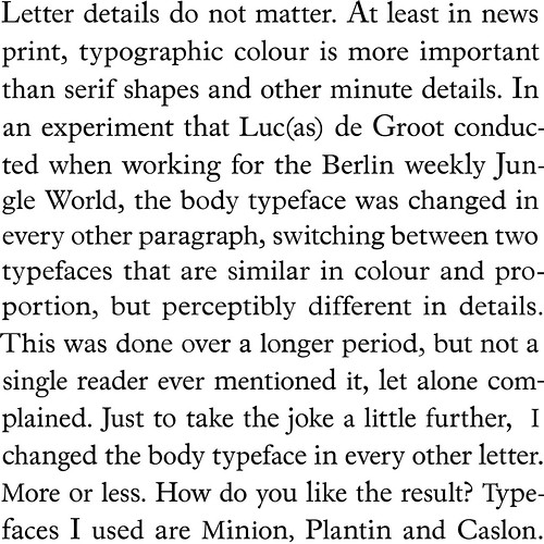
Mixed widths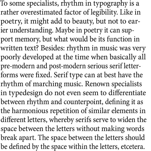
Also a preview of a design I started in 2012, kind of like a 'Font of Babel (Sans)'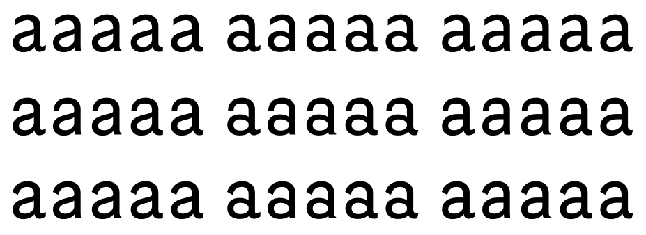 1
1 -
Thanks, WH (Will Hill?) I wasn’t aware of that van Lancker experiment.
Same paths of thought, indeed.
I’ve often considered producing a face along the lines of your “Font of Babel”, a serif though, kind of like Founders’ Caslon but keeping the variant impressions.
What’s put me off is that it would be such a chore making all those glyphs, for commercial fonts.
Neology required two complete typeface glyph sets in each font (with some common glyphs, but even things like punctuation had to be taken care of), and I gave up on italics.
For the “Babel” effect, I do have a 4-variant pseudo-random font structure already (Duffy Script), so I suppose I could generate the variants for a “Caslon Random” using some kind of glyph outline randomizer, which would cut down on the work. But rather than a revival I would be more interested in developing an original style in the old-style genre first, and apply the technique to that—although that might not interest potential customers as much.
Alternatively, I could out-source the production of the glyph randomization..0 -
1. I take it that here your point is that these variations don't hurt readability. I agree with your take on it. But to confirm it so that it's not just anecdotal among type designers, you'd need to test it on a statistically big enough sample, e.g. by reading speed.
2. To me this activity of mixing styles is interesting to see what *does* cause readability problems. Below is a slide (tiff) from my talk two years ago on readability, which I do think shows degraded readability with mixing of styles.
3. What I was struck by was how much the italic/roman aspect of the mix disrupted reading. Here you'd get a definite slow down in reading, I think.
4. Overall, I think that this shows that Kevin Larson's focus on letter legibility is barking up the wrong tree. The questions of weight, evenness of color, and phase alignment are more important. And here it isn't absolute uniformity that is good for reading, but some range of deviation from uniformity—a bit away from uniformity, but not chaotic.
5. Finally, I think that the fine points of readable type design will not be shown by reading speed tests, but that blink rate tests, which reflect fatigue, will be much more sensitive. This follows the work that Matthew Luckiesh did in collaboration with Linotype in the late '30s, as Peter Enneson and I describe in our paper, 'Readability: Discovery and Disputation,' published in Typography Papers 9.
Here is the link to the US edition: http://www.papress.com/html/book.details.page.tpl?isbn=9780907259480
And here's the talk about readability that the slide is taken from (my bit starts at 16:25 and is 7 minutes): https://www.youtube.com/watch?v=z2hhkfUzZtw 0
 -
1. I don’t believe that readability is necessarily a scientist-owned concept, or defined by laboratory tests. It’s not “anecdotal” when type designers have an opinion or express judgement, but professional. Nonetheless, I do think that neuroculture could employ critical design in the manner I have here, rather than just, for instance, compare off-the-shelf products such as Arial and Times.
2. Yes, when you push it that far, wrong-fonting and pi-fonting will effect readability, but that is typography, not type design.
4. Absolutely agree.
5. No doubt, but I still don’t think that things like speed or tiring are the measure of readability, or even that it can be measured. That is my philosophy. But perhaps I should get Neology tested in a lab, because I doubt anybody will be interested in licensing it for its theoretical efficiency, most people will think that anything other than one glyph per character is silly and unnecessary. And like Bodoni, admire exact repetition.
0 -
An interesting experiment. Variety may be favored in many areas, but I don’t believe a workhorse typeface is one of them. Even when the theory is true that readers would prefer a text set in type with some kind of random variation of letter shapes—I don’t believe the market of typographers will, for workhorse use, want to adopt typefaces in which the shape of letters does not stay the same.0
-
Unless it involves optimizing specific glyph-to-glyph combinations, i.e. ligatures.0
-
Nick, your concept of scientists claiming to "own" any concept I think is a misunderstanding of science. Scientific methods are just about making a theory, such as of readability, clear enough to be testable by observation of reader experience or by readers' reports, and then doing the testing. Anybody can define what they mean by readability, and if they can are clear enough about it for testing, and then test in a way that others can repeat, then it's scientific. In any case, neither you nor I nor a scientist can claim authority—the authority is reality.
If it turns out with honest and well-designed testing that a particular design + layout can be read consistently faster, or with less fatigue, it is what it is. And what readers report about their subjective experience is what it is as well. In my view current reading theories are not very strong, and as a result testing not very informative. I think that will eventually change, but how soon, I don't know.0 -
Bill, I was replying to your comment that the assessment of type designers as to what constitutes readability is merely anecdotal, and that laboratory testing is needed for confirmation. Scientific testing as the only valid affirmation of readability—that sounds like ownership of the term.
“…the question is, which is to be master…” —as Humpty Dumpty put it.
I’ve proposed a theory of readability, via this typeface, which is partly informed by scientific knowledge I’ve gleaned, and it could be tested in a lab. But the results of my experiment are plain to see in the specimen comparisons‚ and were also discovered by Peter van Lancker slightly earlier, although he didn’t refine his experiment by making a dedicated font.
Isn’t it obvious that, as van Lancker discovered, “typographic color is more important than serif shapes and other minute details”, and as I also deduced, “Even color appears to be the key to smooth reading”? I assume this is tacit knowledge in the trade. Why is lab testing of reading speed necessary to confirm it?
Having said that, I do think it would be possible to use my method of isolating a variable through font design, and testing it in a lab. (After all, this has been done already with weight.) Might lead to interesting new theories.
0 -
Nick, the term 'anecdotal' in reference to empirical evidence simply means not experimentally reproducible. It isn't a pejorative, and it doesn't imply 'merely' anecdotal. Anecdotal evidence can be a useful starting place for hypotheses, and hence for experiment design. But anecdotal evidence by itself cannot be put forward as a basis for conclusions, because by it's nature it is not the result of controlled circumstances so may reflect any number of unidentified factors. The business of science isn't to 'own' a field of study, but to identify and restrict the number of factors affecting experimental outcomes.0
-
With regard to mixing of styles while maintaining even texture ('colour') within text, see also my 'Same Difference' presentation slides, particularly pp.14–15
http://www.tiro.com/John/SameDifference-slides.pdf
The point I made here is that weight and proportion, which together with spacing constitute texture, are the most crucial aspects of 'sameness' in text typeface design. [Beatrice Warde Memorial Lecture, St Bride's, 2009.]
From this observation, I went on to propose that Majaj and Pelli's work on spatial frequency suggested a reason why designing for even texture is important in text type design.0 -
John, an anecdote is a tall tale told in a pub.
That is why the term has been coupled with “evidence” in law and science, to undermine the credibility of statements not supported by hard fact, and bolster the sway of those disciplines which prize that quality.
Bill described my conclusion as “just anecdotal”, and requiring confirmation in laboratory testing. I would say that’s pejorative—although he did also submit himself to the barb!
Of course, groups cannot literally “own” words and meanings, or licence them, for that matter. But they do acquire them and apply their own meanings. For instance, “readability” started out as being a concept in the social sciences, related to text—concerning vocabulary and grammar. It was based on the premise that statistical analysis could be applied to literature. As “the ease with which text may be read” also describes visual qualities, neurologists subsequently adopted the word for their studies of the physiology of reading. And now the design world is engaged, typically contrasting readability with legibility. Here is an example of designer meaning (tuts+ web design site):
“Readability refers to the way in which words and blocks of type are arranged on a page. Legibility refers to how a typeface is designed and how well one individual character can be distinguished from another.”
I like the idea expressed there, that readability is a quality of the document, a product of typographic layout. Readability can be used in non-scientific ways to describe a quality of a layout or a typeface. Science doesn’t have a monopoly on its meaning.
**
I agree with you that weight, proportion and spacing are crucial aspects of sameness, at least in a sans. I’m not so sure about serif styles—Bodoni made such a feature of reducing detail to a minimum of variants, and repeating those identically, that in his types (and also slab serifs), one feels that the detail becomes an element of spatial frequency.
0 -
Nick, while I agree with your motivation to “address readability through type design as empirical process” and while I am sympathetic to your conclusion that “it may be that the principal of controlled glyph variation can provide improved readability,” I think that what your tests show is that normal everyday judgments of readability by qualified practitioners arising from immersive reading of extended texts are insensitive to the differences in readability — if they even exist — of your variations when even colour — as gauged by expert type designers — is kept constant. I’m not sure this is a sufficient basis for saying “readability is the same.”
To find if real differences in readability per se between your alternative settings exist we might need to: 1) develop a concept of readability that takes it from a concept in the wild to a construct that is capable of operational definition; 2) find a gauge for colour that will tell us if colour is kept constant.
For example, we could see if fourier transforms could do service to provide a gauge for even colour, and we could tie readability to the "efficiency of cortical integration routines" in the visual cortex — as Matthew Luckiesh seemed to be at the brink of doing — and develop a test for that — as Matthew Luckiesh tried to do. I will grant that the differences in readability found by following this path might not amount to much in small samples of extended text, but with “time-on-task” the differences might make a difference as — as Luckiesh appears to have confirmed.
Some other observations on what you did and said.
A) It looks to me like most of the differences between the variants are in the terminals, some are in the junctions between stroke-units, and only a few are genuinely topological differences. This is of interest to me because Eva Rosa, Manuel Perea and I have just submitted a paper that shows that delaying terminals in lexical decision tasks for 50 ms has less of an impact than delaying junctions and mid-segments. Mid-segments establish the identities of stroke units, and junctions their local combinations. Between junctions and mid-segments, delaying mid-segments has the most effect.") In your samples I saw many more double-story lower case g’s than single-counter g’s (9 versus 2). You might want to control this distribution more rigourously.
In your samples I saw many more double-story lower case g’s than single-counter g’s (9 versus 2). You might want to control this distribution more rigourously.
C) You state as your premise that the reader processes only as much detail of a glyph as is necessary to decode it, and that in your assessment, based on your results, this premise is correct. I’m not sure your premise isn’t a truism. On the matter of decoding, your tests do appear to show that within the uncrowded span surrounding the point of fixation — where processing appears to occur in parallel — switching adjacent g’s — topological alternatives — has a greater impact than switching them in words separated in reading by saccadic jumps. And presumably switching topological alternatives within an uncrowded span has a greater impact than switching termination and junction alternatives within-span. So: what levels and types of glyph variation can provide improved readability, if they can.
Peter
0 -
Nick, your "tall tale" aspect of "anecdote" is not part of the usual definitions. The primary definitions given in all the dictionaries I looked at are either silent on the question, or specifically say that it's a true story. (I did find one that had a primary definition of a true story, and a secondary definition of a speculative or unreliable story.)
On the side, I am these days skeptical of lack of major or significant reduction in sustained reading speed as a measure of something being equally legible. There is increasing evidence that plenty of things that matter, and have other effects, do not much impact reading speed. This is unfortunate, as reading speed is just about the easiest thing to measure, but there you go.0 -
You’re right Thomas. An anecdote is primarily a tale told for amusement. I got carried away with alliteration.0
-
Peter, thank you for your analysis.
Firstly, I think the main point for typographers is that to all practical intents and purposes the readability of the three variants is the same—or at least so minor as to be far less significant than changing size or leading or tracking by a small amount—or in comparison to choosing another typeface with different vertical proportions, weight or color.
That is why lab measurement is irrelevant, because a typographer would choose one or other of these styles not for readability qualities (knowing that there is little if anything to choose between them in that regard) and nuance the setting according to other qualities of the chosen style.
A) By topological differences, I mean letter forms in which the differences between a typical Geo and a typical Grot are not a matter of proportion or the fullness of curves. I categorized and designed the contrasting variants in terms of established type style, pretty much Futura vs. Helvetica. The distribution is pseudo-random. Every other letter is the alternate, with the refinement that when a character repeats on the third or fifth subsequent letter, the glyph is also switched. So the ratio of /g’s you observed is just the way they occur in the text, more odd than even.
C) This is the great mystery. I would like to explain why a combination of adjacent variants (especially /g’s) disrupt reading, whereas if the alternates are separated by a saccade, it doesn’t. Perhaps there is a mental glitch to identifying a character correctly when there are two different glyphs purporting to represent it, side by side in the same foveal grab.
The musing about improved readability was philosophical. I would imagine that there are many ways to mitigate dullness.0 -
Nick, like others, I react to the unproductive way you juxtapose the decision-making prerogatives of seasoned craft practitioners and the perspectives opened up by systematic scientific evaluation. I don't know what benefit there is in this.
I think this is unfortunate, because I find your project of “addressing readability through type design as empirical process” exemplary. Why do you want to stop short of what can be learned from systematic scientific evaluation?
Anecdotal evidence is "evidence based on personal observation, case study reports, or random investigations rather than systematic scientific evaluation."
My observations were an attempt to show the way from your worthwhile investigations to systematic scientific evaluation.
Lab measurement…
Beyond showing minor differences in cut-off points, lab measurement reveals there are ample fluent ranges that relate to affordance, and optimums that relate to efficiency. Your investigation reveals a tolerance to glyph variation if a central determinant of the optimum — even colour — is kept constant. (The differences in cut-off points relate to size or distance thresholds, but have little impact on normal everyday judgements about setting well within the fluent range of sizes and weights for the distances involved.)
Systematic scientific evaluation would entail trying to determine what types of glyph variation are tolerated: 1) glyph variations that involve the positioning and featural composition of terminals? 2) glyph variations that involve the combinatorial logic of strokes within letters? 3) glyph variations that involve internal differences in stroke-unit composition, as between the g's.
Irrelevant?
If evidence-based facts about cut-offs and fluent ranges and optimums were included in the bumff on type claiming to be suitable for text, the legibility / readability profile that emerges might enhance decisional processes, surrounded as it is by countervailing pressures — especially if that bumff includes information about type-historic or type-cultural reference, economies of space, and gestural_atmospheric force ("personality") .
I like to think my decisional processes are informed or conditioned by awareness of reference, personality, and the fact that there are fluent ranges, and within these fluent ranges, optimums. Though I may not know exactly where the thresholds, ranges and optimums fall, I am helped by knowing they exist, and that, for instance optimums are reached by, among other things, a specific type of phase alignment that registers as even colour.0 -
Peter, the knowledge I’ve gleaned from studying and discussing scientific research into reading has certainly opened up perspectives, and not merely by replenishing my stock of metaphors, as Coleridge said of Davy’s experiments. While I might have considered combining my explorations of the themes of pseudo-randomness and the stylistic axes of type families, to produce an effect like Neology, the idea that it also engages the issue of readability has helped focus and realize this project.
I’m not averse to researchers licensing this typeface and testing it, and would willingly collaborate otherwise by designing types to test principles of scientific readability.
However, while I am interested in the insights that science provides into the mechanics of reading, I am wary of scientific evaluation of published typefaces. It’s product testing, market research, and when it gets in the hands of well-meaning bureacrats… One reason I produced Neology was to demonstrate that variables can be isolated by design, as part of an experiment, because such a method might firm up reading science. But this was an experiment in typographic readability, not scientific readability.
What I object to is not new perspectives, but the idea that the judgement of type professionals (a.k.a. seasoned craft practitioners) may be, as Bill said, “confirmed so it’s not just anecdotal” by lab tests of reading speed or blink rate, as if one’s judgement is merely an amusing tale. Yes, I know, “anecdotal evidence” has a posh technical meaning, but anecdotal is here nothing more than a euphemism for hearsay. To be really dispassionate and scientific, why isn’t it called “non-scientific evidence”?
There are significant cultural differences between how readability may be addressed in type design experiments, and how it may be done in neurological, physiological and sociological research.
Why does my work in designing for readability, even when it is partly informed by scientific ideas, have to follow the path “from… worthwhile investigations to systematic scientific evaluation”? Why is it “a concept in the wild” in need of taming, so that “real differences” can be determined? I react to this manner of description, finding it an unproductive juxtaposition!
Although I acknowledged the physiological process of reading in the introduction to this discussion, there was no mention of laboratory font testing. If there are two things I would like to juxtapose, they are research into the process of reading and laboratory testing of commercially published fonts.
Also, scientific readability and typographic readability—with neither playing second fiddle to the other.
Certainly, it would be possible to try to determine what types of glyph variation are tolerated in a laboratory experiment. But that is not the approach I have taken, or would take. I think there is a serious problem with designing alternates from constraints-based vocabularies—your 1), 2) and 3). It’s exhaustive, for a start. As a designer, one has to bite the bullet and exclude certain options, otherwise the totality becomes overwhelming. It’s how type style works, despite Stylistic Sets. I based my variables on an axis of cultural archetypes (“Futura” vs. “Helvetica”). That is the kind of readability experimentation that will be most fruitful, in my opinion, and the route I prefer to take.
Prove me wrong by doing otherwise!—I would be interested to see performance tables for constraints-based fonts, derived from systematic scientific evaluation.
0 -
Well, I think there is typographic readability as judged by seasoned craft practitioners like yourself, and typographic readability as assessed by men and women of science.
I trust the former more than the latter, because the latter hasn't gone far enough. For example, Miles Tinker arranged types in a "rank" order based on the knees of performance curves drawn from small differences in reading speed of pairs of sentences some of which had a potentially confounding factor touted as a control. The knee indicates a threshold or inflection point in performance, but doesn't gauge the "fluent range." And reading speed, which measures affordance, is largely insensitive to efficiency. The same goes for studies of spacing: simple affordance is measured, but the importance of narrow phase alignment (typographic rhythm) for efficiency is not considered.
I trust the former more, because I know these judgements are often based on the perception of even colour, the visual gauging of rhythmic spacing and a gauging of the cohesive equilibrium in the shaping of the strokes. Rhythmic spacing and cohesive equilibrium produces even colour in text blocks and narrow phase alignment in spatial frequency space. And I'm convinced — though it hasn't been shown conclusively— narrow phase alignment is a key to efficient processing. So I trust judgements of typographic readability by seasoned craft practitioners more, if I see they are made on this basis.
So I don't accept the distinction you make between typographic readability and scientific readability. I see — or see the possibility of — complimentary approaches to gauging readability.
I recognize you based your variables on an axis of cultural archetypes. But don't you see that when you look at the impact this has on terminations versus joins versus stroke topography there are asymmetries. This wasn't a criticism, but an observation. The impact on terminations is across the alphabet, but minor; the impact on joins where stroke topologies are the same is minor as well. The impact on stroke topologies is restricted to a few letters, and in those it can be quite large. This might be a reason why no decisive differences in readability was found, not a reason to shut down the experiment or consider it invalid, or the type not usable.0 -
Nick, first on the nature of scientific evidence. You write "I still don’t think that things like speed or tiring are the measure of readability, or even that it can be measured. That is my philosophy."
The point of scientific testing is that it is *inter-subjective" as Popper put it. That means that others can in principle check the data, often by repeating an experiment and getting the same observable result. That is the difference between having a personal opinion, whose report even when true is an "anecdote" and evidence that is recognized as having weight in science.
You or I can express our "philosophies", but they just don't have the weight of evidence that can be seen and repeated.
The other part of scientific method is having theories that are sufficiently clear that they are refutable: they predict some events and exclude others. And you can check on whether or not the predicted and excluded events actually occur.
As Peter put it, expert craft opinion is important, and has weight of a training and experience. However, practitioners disagree with one another. That is why when you can formulate an idea with sufficient clarity that it is testable by repeatable observations, and then actually test them, it is a real advance in knowledge—of readability or any other issue. More on readability itself later.
1 -
I wish people would stop explaining what science is to me.
I don’t believe readability can be measured.
Like beauty, happiness, meaning.
This is a philosophical issue.
No measurement, no science.
Reading is more than decoding text.
This narrow definition has proven useful for scientific research into literacy and neurology, but why should typography be limited in such a manner?
0 -
To be quite clear, I am talking about typographic research as agency, not subject.0
-
There's a sizable literature out there on this subject, much of it in journals of educational psychology, though I can't claim to have read very much of it. What I have read, though, struck me as either primitive or painfully obvious. That some of the research appeared to be well-funded and offered so little in return was painful.
The problem, I think, is that the variables are very many, some of them a matter of type design, but just as many a matter of typography and reproduction. Some, such as ink density, contrast, surface reflectivity and ambient light, often work together and have to be in balance for the testing to be meaningful. Add to that well-balanced side bearings and counters, good kerning, design-appropriate x-heights, well-considered stroke weight and thick-thin balance--one could go on and on. There are also factors of acculturation: familiar styles vs. unfamiliar and any number of steps in between.
Can each of these variables be isolated for purposes of testing? I think not. But I do think that the best type designers are performing thousands of these calculations at once, all by cultivated instinct. When the result of their work is in the hands of capable typographers, it all works out for a good reader experience. One important false step and it's all down the drain.
It ain't science—at least not yet. For now, it's too sophisticated for science. I have no doubt that, over time, someone might accurately assess some of the variables—perhaps some have done so already. But there are just so many factors to consider at once that it isn't likely to match the caliber of seasoned expertise.
I'm remind of a story. There was a great, early-20th century pianist named Leopold Godowsky, who was approached by one of the most highly-regarded makers of player pianos, asking if he would consider recording rolls for them. They mentioned all of his great colleagues who had done so, and touted that their instruments could reproduce seventeen different nuances of touch. He declined their offer, saying, "That's too bad; I play with eighteen nuances."2 -
I think the brain is too fluid in how it functions and adapts to bother trying to nail much of this down "with science".
As suggested the variables are many and varied and are largely in the realm of good or bad design, type setting, printing, choice of paper, screen resolution and so on (... and lighting, and if the reader's glasses prescription is up to date or not) - so that if a (truly) scientifically certified typeface comes along ,you could be pretty certain it would seldom, if ever be correctly used.1 -
There is a lot of confusion about the concept of readability, including in comments here. To get a clear understanding of the different issues—and there are different issues—it helps to understand the history of the concept.
The current muddled usage of the terms ‘legibility’ and ‘readability’ in typography is an unintended outcome of the work of two reading researchers in the middle of the last century and their dispute. As I mentioned earlier, Peter Enneson and I have related this history in our long article: ‘Readability: Discovery and Disputation,’ in Typography Papers 9. I will post a brief summary later.
First, let me clarify the state of the terminology before the research and debate—and the terms as still understood today outside the fields of typography and type design. The term “illegible” has a clear meaning. If something is ‘illegible,’ it means that people can’t decipher the letters and words, and so can’t understand the meaning of what is written, printed, or on screen. The concept of degrees of legibility is not well defined in ordinary language. ‘Readable’ is sometimes used to mean the same thing as 'legible,' but most commonly it means a quality of written language or rhetoric: that the author’s language is easy or pleasant to read. “A well-written article is highly readable.”
So if anyone wants to talk about degrees of legibility or readability of the visual aspects of print (and screen), it is up to them to explain their concept, and to demonstrate its usefulness by saying something interesting and informative about reader experience. There is no one “correct” meaning.
0 -
You can define readability any way you want, but that doesn’t mean your definition is logical. As far as I am concerned, readability cannot be measured, and what scientists have been measuring is something else. And readability is most certainly not a metric that can be applied to a typeface.
To read is to comprehend, to understand.
How is it possible to measure the degree of understanding of anything but the simplest text?
How is it possible to know what the writer intended?
How is it possible to know what the typographer intended?
The text is a cultural document with many meanings.
Machines can scan and decode text alphabetically, but that is all.
Reading is a process of individual interpretation.
Readability is thus only possible by way of individual human judgement, or a consensus of assessments.1


Categories
- All Categories
- 47 Introductions
- 4K Typeface Design
- 493 Type Design Critiques
- 575 Type Design Software
- 1.1K Type Design Technique & Theory
- 669 Type Business
- 884 Font Technology
- 29 Punchcutting
- 537 Typography
- 124 Type Education
- 332 Type History
- 81 Type Resources
- 113 Lettering and Calligraphy
- 33 Lettering Critiques
- 80 Lettering Technique & Theory
- 569 Announcements
- 100 Events
- 116 Job Postings
- 170 Type Releases
- 182 Miscellaneous News
- 270 About TypeDrawers
- 54 TypeDrawers Announcements
- 114 Suggestions and Bug Reports