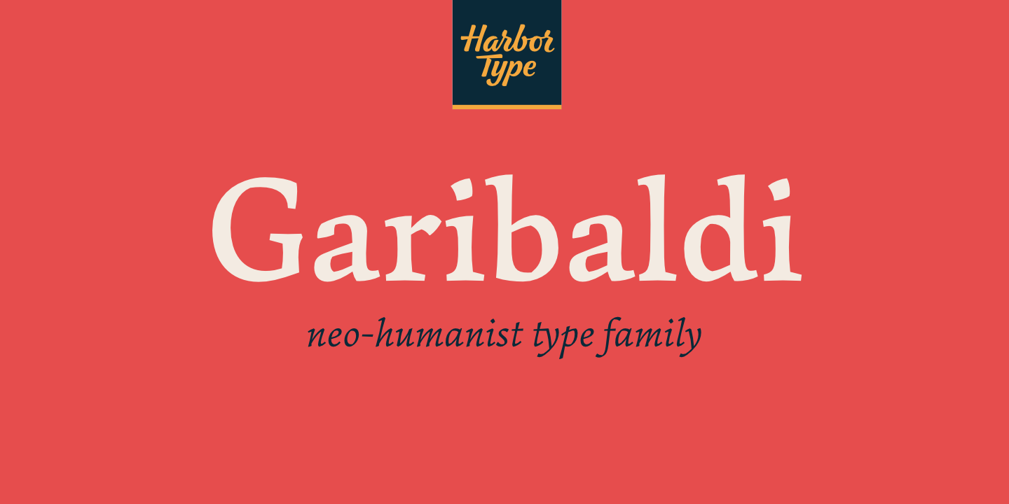
Garibaldi: a neo-humanist type family

Henrique Beier
Posts: 11
Hello, TypeDrawers!
I’m please to announce Garibaldi, a typeface I started 2 years ago as my undergraduate final project. My goal was to explore the role of humanist calligraphy on type design, creating a legible serif typeface without resorting to a purely calligraphic solution. Garibaldi features a 20° axis, medium contrast based on translation and expansion, asymmetric serifs, and terminals related to the broad nib stroke.
I’m please to announce Garibaldi, a typeface I started 2 years ago as my undergraduate final project. My goal was to explore the role of humanist calligraphy on type design, creating a legible serif typeface without resorting to a purely calligraphic solution. Garibaldi features a 20° axis, medium contrast based on translation and expansion, asymmetric serifs, and terminals related to the broad nib stroke.
Garibaldi Regular was selected for Tipos Latinos 2014. Since then, the family was expanded with more weights and matching italics. It is now available at http://www.harbortype.com/garibaldi/ and selected retailers (MyFonts, Fontspring and YWFT).


0
Categories
- All Categories
- 46 Introductions
- 3.9K Typeface Design
- 489 Type Design Critiques
- 572 Type Design Software
- 1.1K Type Design Technique & Theory
- 663 Type Business
- 875 Font Technology
- 29 Punchcutting
- 530 Typography
- 121 Type Education
- 328 Type History
- 81 Type Resources
- 111 Lettering and Calligraphy
- 32 Lettering Critiques
- 79 Lettering Technique & Theory
- 561 Announcements
- 96 Events
- 116 Job Postings
- 169 Type Releases
- 179 Miscellaneous News
- 269 About TypeDrawers
- 53 TypeDrawers Announcements
- 114 Suggestions and Bug Reports