Display face with no curves

Austin Stahl
Posts: 55
Hi folks: Newbie here, hoping to get a little feedback on my first typeface.
Just to briefly introduce myself: I'm a graphic designer (my day job is in publication design) who's always been interested in type design, but I'm only now getting serious about it. I've been drawing letters most of my life and do some lettering here and there, so I'm no stranger to constructing characters and words — but I'm basically teaching myself the technical side of how to make typefaces, through trial and error and a lot of reading. I'm at a point where I could use some outside eyes on what I'm up to!
Anyway, the basic idea with this was a typeface with no curves, but in no way college-y or sports-y — so it's got some contrast and some asymmetry. Definitely a display face. I'm pretty happy with where it's going.
My current struggles are:
1) starting to second-guess myself on the spacing, so if there's anything that jumps out as weird, that'd be good to know (see PDF)
2) trying to decide between a more-pointy and a less-pointy version of the "round" characters. (I might include both as stylistic alternates, but not sure if the default should be more quirky or less.)
Thanks!


Tagged:
0
Comments
-
Cf. Klang; ITC Machine; London Olympics typeface (note the o).0
-
Machine is a perfect example of what I was trying to stay away from: that's what I mean by "college-y/sports-y"... all based on symmetrical octagons. My thought was, can I do something with all straight lines that is not that?
Always thought it a little weird that the London typeface's O was a perfect circle and the only round character. A reference to the Olympic rings?
0 -
Hi, and welcome.
I think your doing a good job avoiding the college-y/sports-y flavors, and your typeface is interesting.
Not such an expert myself but here are few things I've noticed...
The contrast is not very consistent,. While it's clear among the horizontal-vertical lines it get lost on the diagonals specially in the /K/M/V/W/X. I think that applying the classic rule of left diagons - thick, right diagons - thin (exception Z) might harmonize things a bit.
I'm not feeling too comfortable with all the diagonal endings/finals/tips, there are too much on the same direction (as in the /N). The /A for example feels more "stable" since it's left leg is chopped with the baseline. The /M looks like it is distorted and influence the "stability" of the line.
The /G's right bottom is "stabbing", maybe consider chopping it's tip.
Spacing - /C/E/G's right bearing can be reduced a little, it's not the distance between the characters that matters but the black and white balance, or as @Frode Bo Helland said: "The amount of white inside and between letters should be optically equal." and since these letters are open on the right it should be compensated by a smaller bearing.
Maybe the spacing of the /H and /o (as reference to all straights and octagons) should be checked accordingly as well, they might not need to share the same spacing.
0 -
I agree with Ofir above for the most part. In particular M leans a bit to the left, due at least partially to the angled terminals. Z also leans, though to the right. Overall the design seems solid. A few more suggestions.
The counters of the ampersand are quite small as is the upper B counter. Also, do the numerals, containing more angles, appear more refined than the latin glyphs?
With regard to spacing, the round characters, which normally have reduced sidebearings, are in this type flat-sided. They do probably require some optical correction just less than is typical.
Finally, where strokes converge, as in K, they may be slimmed to decrease the darkness of the join.
Congrats on putting this together, Austin.0 -
Thanks, guys!
Wes, I made the numerals that way to differentiate them a bit — At first 5 was looking too much like S, 2 too much like Z, etc.
Re: spacing the "round" characters, you're saying they currently look a little too tight? Their sidebearings are currently a bit less than fully straight-sided characters, but you're saying I've reduced them more than necessary?
Anyone have a preference on the two different versions of the round characters?
0 -
I like the less pointy one more than the other0
-
You won’t get far looking at alphabets. You need to set some headlines or wordmarks.
AWKWARD words like LAWYERS, HILLTOP, ALWAYS and SWIMMINGLY.0 -
Also words like WAVY SPOTTY SNAPPY LATIN0
-
Look at the PDF, there are some words in there. (on pages 2 and 3)
0 -
I like where this font is going a lot. It's got a nice blackletter / woodcut thing going without it being too old fashioned. I don't have much else to add other than that
 0
0 -
Hi Austin, You might find Algo FY (http://shop.fontyou.com/shop/family/Algo_FY/) an interesting source of inspiration.0
-
Very cool, thanks Steve. I'm liking the sense of playfulness Algo has. What a crazy /W that is!
0 -
Also OTTAWA PAYAWAY.
I see no one here has talked about blackletter. A more obvious antecedent?0 -
Hi folks: I've tweaked a bunch of things, mostly fairly subtle. Bowing out the M made a big difference I think.
Also, even though I'd conceived this as an all-caps face, I decided to draw a lowercase just to see what happened... and I like it! So now I'm wondering, does this deserve an italic?
Any feedback appreciated. (Kerning isn't finished on the caps; lowercase is not kerned at all yet.) Thanks!
0 -
I don't know about the italic but I would make a thin and an extra bold.1
-
Also, if interpolating, use a medium weight to balance the stems. I think interpolating would really be simple because of the lack of curves. If you continue the more-pointy version, I reccomend maybe sharpening the top of /A and /M and the top of N and do the same for bottoms on /M /N /V /W. If not, I would like a stylistic set. Simplifying the left of /6 and the like would be welcome, too. One more thing — I think this would range in the medium(-ish) weight. More like bold, if you will, so cross of the medium interpolation weight.
0 -
For some reason it's hard for me to imagine this as a family with several weights (Georg, I'd be interested to hear your reasoning for a thin & extra bold but no italics!). Maybe because its "chunkiness" seems like such an important part of its personality. I can barely visualize what a thin version would look like!
Only one way to find out, I suppose. 0
0 -
To make your life easier, how about using another either thinner or bolder weight and start by extrapolating. Not the best but it works.0
-
I'm not sure I understand what you mean — you're saying to extrapolate versions thinner or bolder than I really want and then use those to interpolate?
0 -
I think he means create just one extreme weight to start, then use that plus the weight you have to extrapolate the other extreme as a starting point to its design.0
-
Ah, I see. I'm new to extrapolating/interpolating. I'll probably give it a shot even if I don't end up using additional weights, just to use this as an opportunity to learn.
Craig, I don't know if you noticed, but I've been using a few of your pangrams as test text!
1 -
I didn't mean to use interpolation. You might need a few more lines to draw a nice Light. I just thought it might be more useful to have contrast like that.0
-
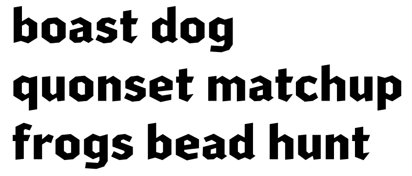
Hi folks: Bumping this thread to show some changes I've made, after letting this sit for a couple months. Most changes are in the lowercase, in order to make the shapes more consistent — previously, most lc characters had their curved sections described by only two "facets" on the top and/or bottom, sorta blackletter-style, except for /c/o/s because I liked them better with three:

But I realized that this made for a weird mix, so I tried to make things much more consistent throughout, with the "three-facet" style of curve. Also tweaked the widths of a few characters and altered some details here and there. I think it feels much more refined:
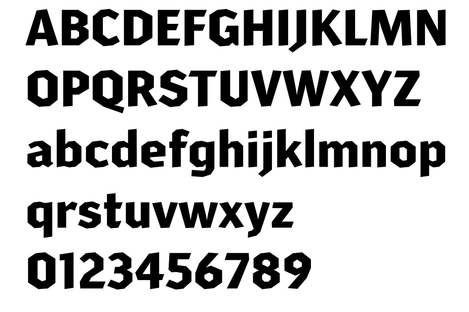
I'd hugely appreciate any other feedback about anything else odd or problematic — I've been messing with a lighter weight, as some have suggested, but I want to work out any bigger changes to glyph shapes (in this weight) before getting too far into that. Here's the full alphabet as it stands now:
I’m realizing I created a pretty difficult challenge for myself for my first typeface. Figuring out how to handle the overshoots on these asymmetrical “round” characters is rough!
(Also not sure about the angled stroke endings on the baseline — I've made them a little less pronounced than they were at first, and I flattened them in a few places where it was affecting stability. Not sure if the lack of complete consistency in that regard is strange, but I like that the angled endings impart an unusual character, and would hate to lose that.)
Thanks for your insights!
0
Categories
- All Categories
- 46 Introductions
- 3.9K Typeface Design
- 489 Type Design Critiques
- 572 Type Design Software
- 1.1K Type Design Technique & Theory
- 662 Type Business
- 875 Font Technology
- 29 Punchcutting
- 529 Typography
- 121 Type Education
- 328 Type History
- 80 Type Resources
- 111 Lettering and Calligraphy
- 32 Lettering Critiques
- 79 Lettering Technique & Theory
- 561 Announcements
- 96 Events
- 116 Job Postings
- 169 Type Releases
- 179 Miscellaneous News
- 269 About TypeDrawers
- 53 TypeDrawers Announcements
- 114 Suggestions and Bug Reports


