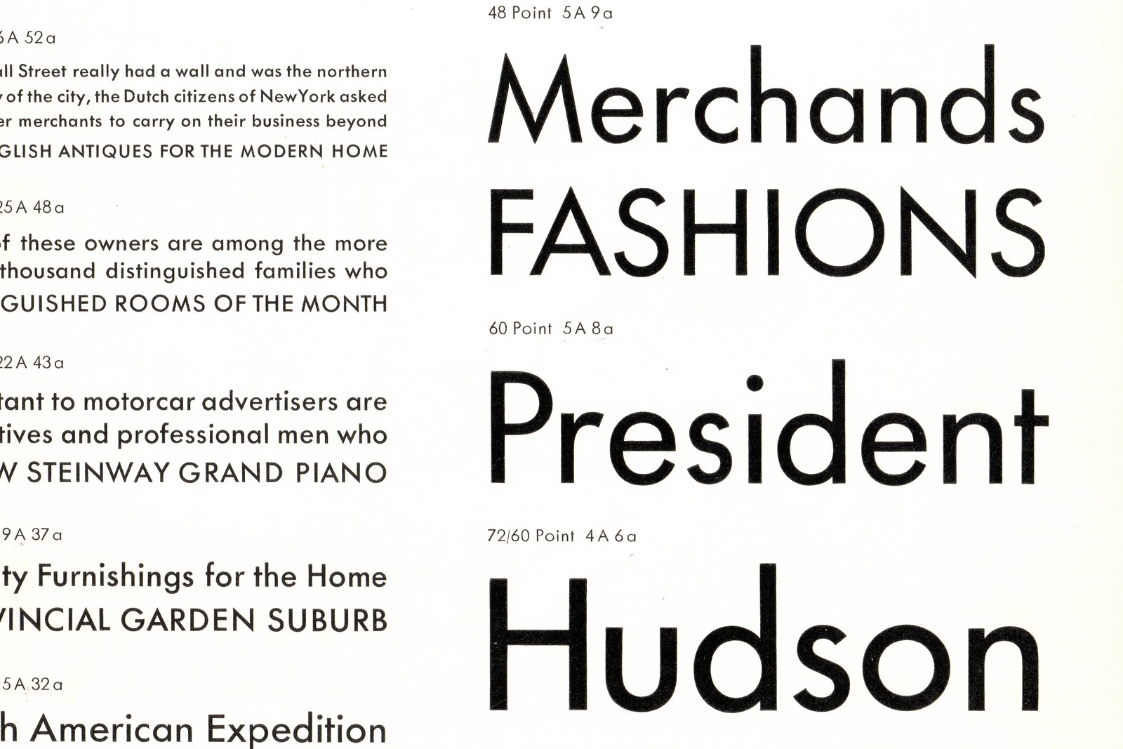
Design variation between metal sizes of the same typeface

Stephen Coles
Posts: 1,039

Above: Futura Medium 48, 60, and 72. Specimen Book of Bauer Types, New York, 2nd Edition (undated, circa 1935).
It’s commonly known that proportions, weight, and spacing varied between metal typeface sizes as small text type has different requirements than display type. But this Futura specimen clearly illustrates how the overall design of lettershapes themselves could differ widely between various sizes of a single face. Your impression of a typeface can change depending on the size you’re seeing. The lowercase ‘s’ is especially unique in each size.

At 48pt its upper half is much smaller than the lower — it leads with its belly. At 60pt it becomes more vertically symmetrical, and its spine and terminals are much more horizontal. At 72pt the stroke endings point outward again.
I initially posted this at Flickr to show digital natives why there is no digital Futura that is a true reproduction of “the original”. The original was many things, depending on the size. But I also wonder about this particular case. Why are there such clear differences between these ‘s’ shapes? (This doesn’t seem to be an optical compensation and there was no need for it at these large sizes.) Perhaps the differences weren’t even intentional. Perhaps the sizes were drawn by different people. I welcome your insight.
Tagged:
1
Comments
-
This is also very much true for the original Caslon types. Geometry, joins and proportions vary wildly, even in minor variations of the display sizes.

Just the /a is fertile grounds for debate. Caslon was a business man as much as a type founder – my lack of research can’t support or debunk my theory that he had a few cutters on the job, explaining the differences. I think the same goes for Futura. I don’t expect Renner to have drawn every point size. He certainly didn’t carve them.2 -
That s is a bit curious and the differences are subtle enough to be explained by there being multiple cutters. Resizing the type one might feel compelled to correct it. The JAF book you reference suggests another perceptual reason for making type different at large sizes; that when very large, the finishing details gain visual importance over the base proportions. This is would be a separate criteria from the technical limitations of ink trapping and production.
It could also be that the 42 type was intended to be used for large, bold headlines at reading distance whereas the 72 point, which is really quite large, may have been intended for a display or signage context. At a distance, its optical size would be smaller and a case could be made for small adjustments back towards basic legibility. So you might explain a reduction in prominence of the idiosyncratic features: alteration of the back-leaning upper counter (which is also much smaller) and an opening up both counters via the angle of the terminals.0 -
In the case of the Caslon, where the types were cut without the likely aid of a pantograph, its a bit easier to imagine that the modifications were made on more stylistic grounds. Also as the work was conducted manually, I wonder if it wasn't a way of avoiding the somewhat difficult task of exactly scaling a design.
There is also less difference between them in size, Canon being around 50 US/UK points and the Two-line Double Pica about 42 pt. Perhaps they would have been largely interchangeable and the variations served to differentiate.0
Categories
- All Categories
- 46 Introductions
- 3.9K Typeface Design
- 489 Type Design Critiques
- 572 Type Design Software
- 1.1K Type Design Technique & Theory
- 663 Type Business
- 875 Font Technology
- 29 Punchcutting
- 529 Typography
- 121 Type Education
- 328 Type History
- 80 Type Resources
- 111 Lettering and Calligraphy
- 32 Lettering Critiques
- 79 Lettering Technique & Theory
- 561 Announcements
- 96 Events
- 116 Job Postings
- 169 Type Releases
- 179 Miscellaneous News
- 269 About TypeDrawers
- 53 TypeDrawers Announcements
- 114 Suggestions and Bug Reports

