Bookerly
Dave Crossland
Posts: 1,527
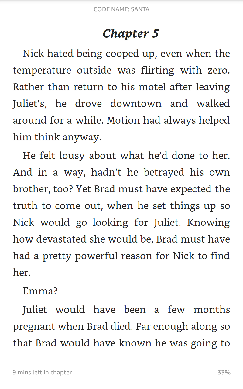
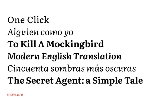
Amazon just released a new book reading type developed by Dalton Maag, available on the Fire HD6 (images via mobileread thread)


2
Comments
-
Designed with the assumption of default full justification, default nonhyphenation, and other Bezosian Aspergerian crimes against typography?4
-
Google just released a similarly-briefed type, commissioned from Type Together: Literata
http://www.type-together.com/literata
https://www.flickr.com/photos/typetogether/sets/72157652433541065/
1 -
The small, floating ‘aeo’ (due to lack of overshoot) are distracting to me here, but perhaps they are less obvious on the device itself.2
-
Very nice, great to see a typeface with an interesting texture on an eBook app.0
-
I’d happily fast-forward to the times where people would make some more text typefaces with uninteresting textures. Glad David Berlow is still making them. In times where everything is trying to grab my attention, I’d much rather the book typeface didn’t.1
-
This trend reminds me of the 1980s when musicians during concert were trying to show me how cool their instruments looked like.0
-
1. I wonder who thinks having such tiny quotation marks and appstrophes in Literata is a good idea? (Judging by http://www.type-together.com/resources_production/big/galeria_de_contenidos/_galleries/_custom_type/literata//literata_26.gif )
2. I wonder who thinks that the phrases “T o sit staring” and “T here was something” in the image linked above look very odd?
3. I wonder who thinks that “Literata” is just way too similar a name to “Litteratra” ( http://kltf.de/kltf_litteratra.shtml )?3 -
1. Not me.
2. Obviously a non-kerning environment. Which might have prompted a different spacing strategy. (But probably only if it was destined for a closed system, which I guess this was not?)
3. I had a similar first impression.
0 -
http://m.fastcompany.com/3046678/the-kindle-finally-gets-typography-that-doesnt-suck
Bookerly is now accompanies by a better text engine on Kindle
Stephen, the overshoot in the actual files is okay, it looks this way in the low resolution images which show the letters after hinting has been applied
Adam,
1. The quotation marks are not so tiny according to the designers.
2. Unlike Kindle, the Play Books text environment is based on Android's web renderer, so doesn't apply kerning, although it is in the font.
Ken, TT have tried their best to space the design to work reasonable in such environments. Do you think you could do better?
3. I think the names are not too similar.
0 -
Just dropped Literata v1.001 in the Testing page. Although the kerning is in the font, it's not working in Firefox neither. Maybe a bug?
1
Categories
- All Categories
- 46 Introductions
- 3.9K Typeface Design
- 489 Type Design Critiques
- 572 Type Design Software
- 1.1K Type Design Technique & Theory
- 663 Type Business
- 876 Font Technology
- 29 Punchcutting
- 530 Typography
- 121 Type Education
- 328 Type History
- 81 Type Resources
- 111 Lettering and Calligraphy
- 32 Lettering Critiques
- 79 Lettering Technique & Theory
- 561 Announcements
- 96 Events
- 116 Job Postings
- 169 Type Releases
- 179 Miscellaneous News
- 269 About TypeDrawers
- 53 TypeDrawers Announcements
- 114 Suggestions and Bug Reports


