One's RSB
Kyle Wayne Benson
Posts: 14
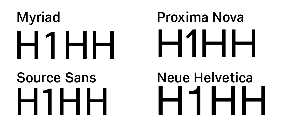
With a sans, I've always spaced the right side of my 1's like I would any straight. But I recently noticed the 1's RSB on a lot of well drawn families is massive (or at the least, a bit more). What's the reasoning behind that?
Tagged:
0
Comments
-
Perhaps you’re looking at tabular figures, in which all the numerals have the same set width.1
-
In my (fairly recently developed) opinion and practice, the sidebearings of /1 are part of the glyph, just as the “sidebearings” of the vertical stem of /T are. here are some possible explanations:
- The stem of /1 should appear to be centred, when it occurs between other figures, because /1 is mostly that vertical stem.
- Double /1, with narrow sidebearings, creates a very squished effect, quite unlike any other figure combination, and thus erroneous and distracting from reading.
- Double /l never appears as a discrete word, its tightness is subsumed as part of a spectrum of tightness in longer words; however, 11 does happen, and if it’s tight, that can appear strange.
- All the other figures (except perhaps /7) are pretty much the same width, therefore a narrow /1 seems odd, and potentially distracting.
- There is also some expectation, based on the commonness of tabular figure layouts, that figures should be similar in width.
4 -
I should have included this earlier, but here are some examples:

Not tabular, Stephen, but your comment got me thinking that the spacing might be in that school of thought. Nick, your points make sense. Especially number 4. I was thinking of /1 within the context of letters, and not numbers. It is odd among its group.0 -
In proportionally spaced sans serif numerals, the right side of the one can look tight if it has the same sidebearing as the H. It's a similar effect to what happens to the right side of the lowercase j.1
-
Is it an issue of kerning proportional lining figures to caps or is it the sidebearing of the figure one? Pick which issue is of more importance to you.0
-
In general, it is my practice to see what glyphs look like in context, and try to remove any oddity that makes them obtrusive—rather than follow abstract principles such as “straight sides should all have the same sidebearing for consistency’s sake”.
4 -
Nick,
just a formal remark. IMO, to most people, the "/" convention (as introduced by FontLab and now used by many other tools) implies that what follows is a glyph name. So /one would be "more proper" than /1. (I'm just saying this, because when I saw your "/1", I was confused for a moment, and perhaps others were as well.)1 -
Right, I make that mistake in Fontlab too.
It tricks me that /A is a glyph name, but /1 isn’t.0
Categories
- All Categories
- 46 Introductions
- 3.9K Typeface Design
- 489 Type Design Critiques
- 572 Type Design Software
- 1.1K Type Design Technique & Theory
- 663 Type Business
- 877 Font Technology
- 29 Punchcutting
- 530 Typography
- 121 Type Education
- 328 Type History
- 81 Type Resources
- 111 Lettering and Calligraphy
- 32 Lettering Critiques
- 79 Lettering Technique & Theory
- 561 Announcements
- 96 Events
- 116 Job Postings
- 169 Type Releases
- 179 Miscellaneous News
- 269 About TypeDrawers
- 53 TypeDrawers Announcements
- 114 Suggestions and Bug Reports


