Fontsleuth: Lego instructions from the 1970s?

Maurice Meilleur
Posts: 58
in Type History
2
Comments
-
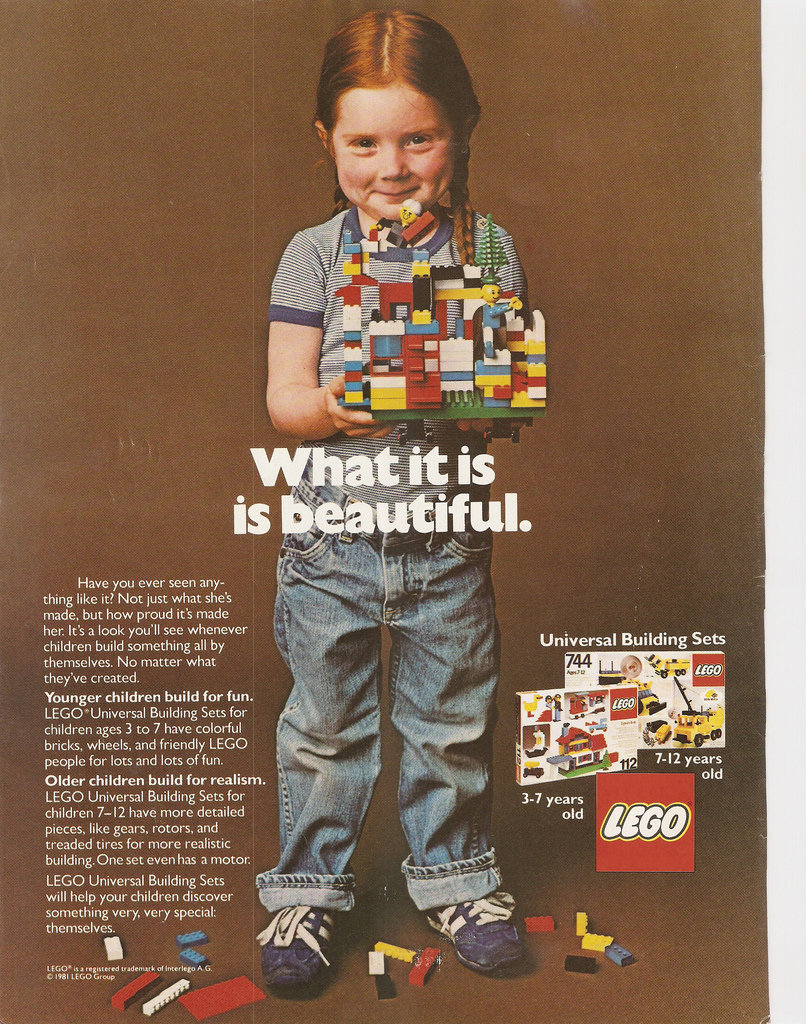
The typesetting is weird, but the spirit of the copy is certainly in keeping with LEGO ads from 1980–82.
 2
2 -
Evidence and opinions are converging on 'legit', apparently. And Stephen, that is one of my favorite ads ever.1
-
Times was not unusual in ads of the period. The version of the Lego logo shown was used from 1972-1998 (the current logo is just slightly tweaked from that one).
There is nothing about it that seems out of period to me, aside from the gender-progressive sentiment. But they are a Scandinavian company, and circa 1974 was a high-water point for such thinking.0 -
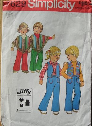
Gender-progressive ideology is typical of the era. For instance, it was a time of unisex fashion (not perhaps for the majority, but a strong trend), in the UK and North America as well as Scandinavia. This from 1976:

Like that /t in Simplicity?3 -
One of the baffling things for me as I've gotten older, having come of age in that era, is how much certain things have regressed culturally. You imagine that trends will keep going in the same direction, but they don't always.4
-
One thing remains constant: it’s hard to kill the undead (Helvetica).1
-
-
The tl;dr version of that ridiculously in-depth post: “There were several good arguments for questioning the photo of the ‘LEGO letter to parents’. They just all happened to be mistaken.”1
-
Some of those supposedly good arguments, weren't.3
Categories
- All Categories
- 46 Introductions
- 3.9K Typeface Design
- 489 Type Design Critiques
- 572 Type Design Software
- 1.1K Type Design Technique & Theory
- 663 Type Business
- 875 Font Technology
- 29 Punchcutting
- 529 Typography
- 121 Type Education
- 328 Type History
- 80 Type Resources
- 111 Lettering and Calligraphy
- 32 Lettering Critiques
- 79 Lettering Technique & Theory
- 561 Announcements
- 96 Events
- 116 Job Postings
- 169 Type Releases
- 179 Miscellaneous News
- 269 About TypeDrawers
- 53 TypeDrawers Announcements
- 114 Suggestions and Bug Reports


