On the Origin of (Latin) Type Species
Comments
-
Isn't that Bill's point? Regular rhythm in writing requires training and practice...
Right, but my (admittedly easily misunderstood) point was that the training and practice are required in shapes/forms, not rhythm — since calligraphic/scribal forms seem to have a natural way of inviting rhythm to the party, which normal handwriting doesn't. I understood Nick's comment to mean that it is easier than not to "write" rhythmically within a scribing context.
In my experience, people who learn cursive, therefore try to emulate some kind of calligraphic form, write with a clear rhythm, and their forms stay within a small set of consistency/parameters, while people whose individual alphabet forms vary considerably show a lack of rhythm in their handwriting. Does this mean that rhythm is determined not only by counterspace, but also by a degree of shape uniformity? And if so, are we really talking about handwriting, or a specific kind of writing done by hand?0 -
Bill, surely it is logical to expect that the chief scribe would exercise his taste over the output of his shop? And that being a practised calligrapher, he would insist upon a unified style amongst his charges, organized upon the foundation of a regular rhythm?
Speaking from experience, as a practised calligrapher of our times, if I am writing out a piece of work that takes account of the layout of a page, then I will execute it more carefully then rough notes, giving it rhythmic base and trying to keep the lines even. This relationship to the page is important, because if one is conscientious, then one wants the whole page to look good.
Of course, it is possible to make an irregular script look balanced, but it is way more work.0 -
Matthew Carter already did a narration for the film.
Somehow, I've seen this and I don't remember the sounds of a 16mm projector. I'm sure of it, because when we went to document what we were doing with gx in the early 90s, I studied its screen play.The client, too, would have favored a nice-looking document
This is the key, I think, in unlocking the mystery of repeating metrics as Frank pursues. we have been force-fed times roman, this is what we are used to, give us a design on times' widths, we are comfortable. Nice looking, is really familiar, not requiring work to read.
So, time travel. There is no times. If some master hits on, and popularizes a font that makes nice looking documents clients get used to, changing the metrics radically, given the process of manufacture, would be a very risky business.
So risky, I think, if you squint real hard, at the whole history of Latin metrics n beat, it goes: black letter, roman letter, mono spaced letter, times, all hell breaks loose. One cool thing about this, is that when we put a class of metrics aside, we stop immersively reading them, they seem to end up as display faces.0 -
Nick, the question is whether 'looking good' is devoid of readability considerations. When it comes to reading continuous text, the 'usability' part of the text I think is a large component, though not the only one, of 'looking good.' Do you think that irregular hand writing is as easy to read as a good scribal hand? As a good text type? Really? And do you think that ease of reading has nothing to do with 'looking good?'?
You seem to want to wall off aesthetics as a pure domain that has nothing to do with utility. But as Don Norman has argued convincingly in his book Emotional Design, this is not the case. He has usability as one of three factors on which design needs to succeed to be 'good'. I think he's right.
And the usability demand enters differently for different purposes. For a wedding invitation 'looking good' isn't going to mean maximizing quick and easy readability. Other things are going to be more important. On a 'good' road sign readability in terms this time of quick decoding become paramount.
David, as I said, I think there are ranges on regularity. Different alphabets, like black letter and roman and italic, may demand that the regularity be set up in different ways. Cultural factors is one of the other three in Don Norman's list—the other one is visceral emotional reaction. So I think acknowledging the importance of cultural and familiarity considerations doesn't contradict the role of working functionally for the human perceptual apparatus.
When I look at paintings considered beautiful, or a still of a movie, I don't usually see the kind of regularity that I see in all kinds of alphabetic texts. So it seems to me that the demand for regularity comes not from pure aesthetics, but partly from the fact that alphabetic text is a visual code, and it is easier for the eye and brain to decode if the text has a marked degree of regular rhythm.0 -
Regarding the ‘creative director’ in the scriptorium context, Leiden book historian Erik Kwakkel has written on how there is a lot of talk of ‘industrial’ writing rooms, but very little proof.
It seems given knowledge, but there is little data to corroborate the idea of en masse copy work.1 -
For a wedding invitation [or] road sign
!?
Who cares? I am talking about immersive reading. For "design" everything I said is the opposite, or much so, as the designer has the job of breaking the rhythm for attention's sake in the non text. I agree with everything else.:)0 -
David, maybe I wasn't clear. I mentioned wedding invitations and road signs to contrast with reading continuous text. It is to meet the demands on the eye and brain of decoding continuous text that I think resulted in the regularity of scribal hands, and then in the still more regular and readable early type designs of Jenson and Griffo, which Frank is studying.0
-
David, in 2008 or 2009 Carter did a digitally recorded narration for the Dair film. He basically watched the 16mm and "storyfied" what's happening in it. After that, Rod McDonald did an interview with him, also captured digitally. What we're trying to do now is digitize the film, and couple it with Carter's commentary. We just have to patiently wade through estate and university paperwork/red tape, and we're almost there.0
-
Patrick, does the film show him arriving to work and having his outer clothes carefully taken by an assistant to start the day?
William, I see.0 -
First, this thread is a discussion of types intended for texts. Bill, I agree with David in saying, essentially, that you're casting far too large a net for the subject at hand.
A big thing is being missed here by setting the paradigm between writing and type cutting. By the 16th century, engraving became far and away the greater outside influence on punch cutters. The Lowlands cartographers had a big influence on 16th-century type design, just as the English writing masters, especially the remarkable John Pine, had on Baskerville and eventually Richard Austin. Engraving has its own tool set in which the roman letterforms were built quite differently than they were by penmen. An engraver first sets out the parallel stem strokes, which set the rhythm(!), then makes the connectors, then the serifs. It is still done that way, to the extent anyone still engraves letters by hand.
What Frank and I have been discussing is bound to a specific manufacturing process, one whose influence on our reading culture is very large. The process itself is somewhat rigid, not altogether because it had to be, but that keeping it so made it faster and more easily manageable. Obviously, they made some very good types that influence us to this day; whether they did so in spite of the restrictions or because of them is a matter for debate.1 -
David, that's the one. It starts with Rädisch leaving his apartment.0
-
Perhaps Nick's suggestion is that regular rhythm in writing is easier for a practised writer than deliberately arhythmic writing?
In any case, since Bill mentioned it, here is Zapf's quotidian handwriting, July 1967. [Sorry about the heavy show-through; I need a piece of dark card to put behind thin paper in the scanner.]
0 -
@Bill: You seem to want to wall off aesthetics as a pure domain that has nothing to do with utility.
That’s not what I said.
I proposed that the client (a Renaissance Prince or Bishop, perhaps) wanted a professionally “good looking” document, one which looked like some care and attention had gone into it. I proposed that the chief scribe wanted the same from his workers.
These are very good reasons to have neat and tidy writing, with order and rhythm, as good a reason for regularity as any in the manufacture of foundry type where unit-based design produced econonomies.
That was the parallel I was drawing, to counteract the idea that wriitng and type look the way they do because that is what is best suited to physiology.
Your usability theory of regularity—that it was something which Renaissance readers (a category which includes writers) required for readability—cannot be deduced from the evidence. Scribal writing and early type had rhythm and usability, but the connection is circumstantial.
Aren’t you the fellow who has derided the readability of Didone and Scotch typefaces? —Do you therefore deduce that human perceptual apparatus was different in the 19th century, when that genre of type was so popular?!
The impetus to systematize the graphic representation of the alphabetic system of shapes by means of proportion is exactly the kind of thing that a professional craftsman would do, because it is pattern material. Such organization may perhaps be useful to the human perceptual apparatus in decoding text, but that was not the main reason it was done. The type designer’s goal has long been the pleasant appearance of “even color” (think of a page by Jenson), but that does not necessarily mean regularity (compare a standard halftone screen with a stochastic screen).
I would also point out that there was a demand for order in Renaissance painting, most notably in the engagement with linear perspective.
0 -
@John: Perhaps Nick's suggestion is that regular rhythm in writing is easier for a practised writer than deliberately arhythmic writing?
Yes, in the sense that it’s unpleasant to be crass, and you’d have to force yourself to lower your standards, when it’s such fun to do something demanding with style and fluency.0 -
David makes some very good points about type metrics and time travel. What I think he's saying is that we have a deeply embedded, acculturated sense of what's acceptable in the proportions and spacing of letters intended for extended reading. I fully agree, and I think there are aspects of it that probably tie to human brain functions, though most of the studies I've seen along those lines are tiresome and at least three-quarters-ignorant. I'd rather trust my own self-analysis, which I suppose is what's called "personal taste."
Nick raises, via Bill, the readability of Didone/Scotch letters. If you grew up on oldstyle revivals, I can imagine they take some getting used to. But let's not forget that there was an entire century of major literature published in those types, during a time when a growing world population had become widely literate. I grew up near an old branch library that had a lot of 19th-century books, and most of what I read as a kid was set in those types. All of my family's Russian, Hebrew, and Yiddish books looked like that, too. I still feel at home with them, though I recognize how far they are from most everything I've read since. It's really a matter of acculturation, though William Morris and D.B. Updike grew up with them, too, and they professed nothing but disdain for them, though I think that had more to do with their hatred of industrialized printing, with which the types were accidentally associated, than with the types themselves.
And Patrick, very glad to hear you're working on saving and making available the van Krimpen film.0 -
On 23 March 2014 I wrote that one of my Plantin students is making a Granjon-revival and is measuring and photographing (with a digital microscope) the matrices and punches in question. For the upcoming Expert class Type Design exhibition at the Museum Plantin-Moretus from 17 May till 31 August 2014, Nicolas Portnoï made this panel with an introduction on his research and the resulting revival.

The design of Granjon’s Gros-parangon or Double Pica Roman seems highly systematized, but the matrices in the museum’s collection are not justified for casting with fixed registers. Remarkably, Plantin ordered a more condensed lowercase m for the set from Van den Keere. So far I have not seen this m applied in text, but the relatively tight fitting of the type seems to be based on the stem-interval of the condensed m. Perhaps this letter was only used for casting in the manner described by Fournier: ‘The letter m of every fount is taken first, and when this is right it is used as a pattern for the others. Three m’s are put in the lining-stick and the first to be cast of every sort is put between them and made to tally with them. The necessary alterations are then made in the mould and the matrix’.*
It’s not impossible that it was for Plantin less expensive in this case to let an experienced caster work ‘on the eye’ and to order an extra m for this purpose, than to finish the matrices for fixed registers. This requires more investigation, of course. On 22 May Guy Hutsebaut and I will use VdK’s m as bases for casting from the original matrices in the presence of my students at the Museum Plantin-Moretus.
*Harry Carter, Fournier on typefounding (New York, 1973) p.106.
0 -
On 21 May 2014 a small range of letters was cast from the two sets of matrices for Granjon’s Gros-parangon in the collection of the Museum Plantin-Moretus. The set indexed as MA8 was probably justified by Van den Keere in 1569–1570. The MA7 set was perhaps justified by Conrad Bernard in 1601. Nicolas Portnoï, Expert class Type design (EcTd) student who is working on a wonderful revival of Granjon’s type, found out during measuring that the MA7 set was justified for fixed registers and the older MA8 set was not.
Van den Keere made a more condensed lower-case m for the MA8 set, which was possibly especially made for casting, because the cast type is tightly set according to the stem interval of this m. One can cast all letters first by optically positioning the matrices in relation to both registers (first one register and then the other one), this way producing a set pattern, i.e., a collection of pre-cast letters that can be used for positioning the matrices, for further casting. On the 17th of May Guy Hutsebaut and I tested this theory during an EcTd lesson at the Museum Plantin-Moretus. Type & Media students from The Hague joined my EcTd students that day.
Guy used an original mould from Van den Keere (GI [‘Giet-Instrument’] 43), described by Mike Parker in Early Typefounders’ Moulds at the Plantin-Moretus Museum (London, 1974) as follows: ‘[…] It’s present body is Ascendonica, so that it may be the mould van den Keere made for Granjon’s roman on that body […]. However, the width of the registers and one male gauge indicate that the mould may once have been smaller […].’ The mould did not fit the Gros-parangon perfectly, but well enough for testing the widths though.
Nicolas made great photos and just placed these on Flickr:
https://www.flickr.com/photos/124917741@N05/sets/72157644882211911/
Unfortunately it was not possible to cast precisely enough from the MA7 set, because the ‘[…] two elaborate and ornamental screws […]’ (Parker) could not keep the somewhat loose registers perfectly in place after releasing the first matrix, which was used for determining the position of the registers. Anyway, the casting with fixed registers was already done last year with matrices from Garamont: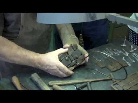 http://www.youtube.com/watch?v=tZKQslge32Y
0 -
It was only after unravelling the technical secrets of Tolbert Lanston’s mechanical typesetting device that Otto Frederick Rohwedder of Davenport, Iowa, suddenly realized in 1912 that the unitization of loaves could become his bread and butter.
 1
1


Categories
- All Categories
- 47 Introductions
- 4K Typeface Design
- 495 Type Design Critiques
- 577 Type Design Software
- 1.1K Type Design Technique & Theory
- 670 Type Business
- 885 Font Technology
- 29 Punchcutting
- 539 Typography
- 125 Type Education
- 333 Type History
- 81 Type Resources
- 113 Lettering and Calligraphy
- 33 Lettering Critiques
- 80 Lettering Technique & Theory
- 569 Announcements
- 100 Events
- 116 Job Postings
- 170 Type Releases
- 182 Miscellaneous News
- 270 About TypeDrawers
- 54 TypeDrawers Announcements
- 114 Suggestions and Bug Reports