Nor Nakhijevan — from a 1931 tram substation sign to Cyrillic and Armenian

Літеропад has begun in Ukraine. I decided to take part, so I’d like to introduce my typeface, Nor Nakhijevan.
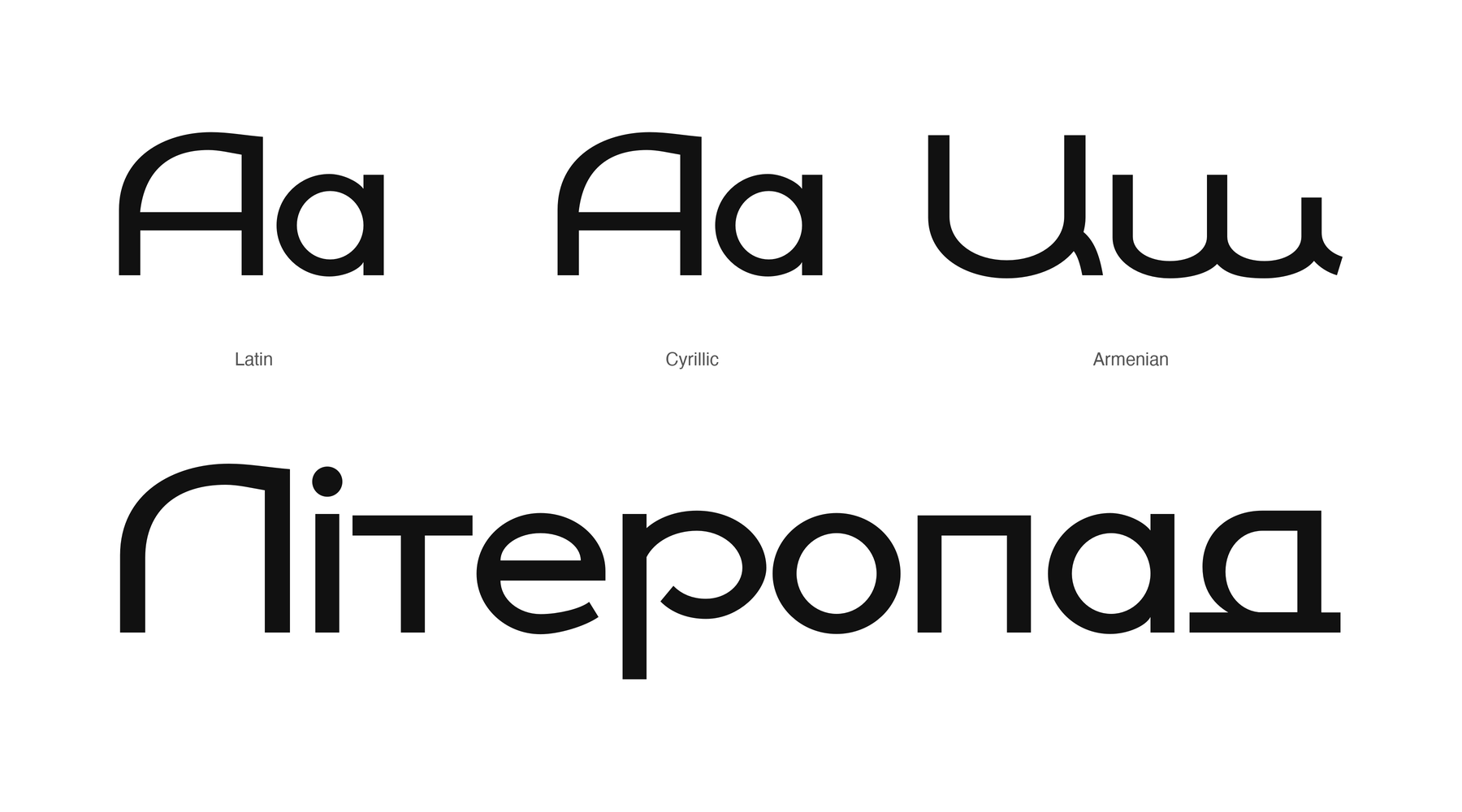
The typeface began with the lettering on a tram substation in Rostov-on-Don. The inscription is dated 1931. I shared the sign on my Telegram channel this summer, and the typeface is now approaching its final refinements.
The source has a distinctive mixture of geometric construction and unexpected letterforms. My task has been to develop that small set of letters into a usable typeface, keeping the character that made me stop and photograph it.
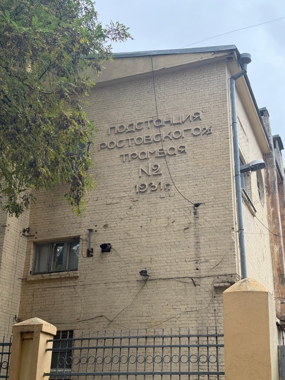
The starting point: Rostov tram substation No. 2.
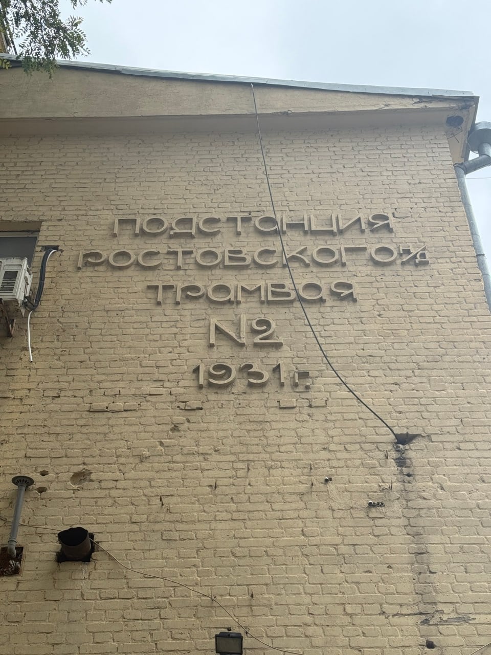
A closer look at the original lettering.
Here are a few details from the current Cyrillic drawings. The relationship between the unusual capitals and the lowercase is one of the things I’m refining.
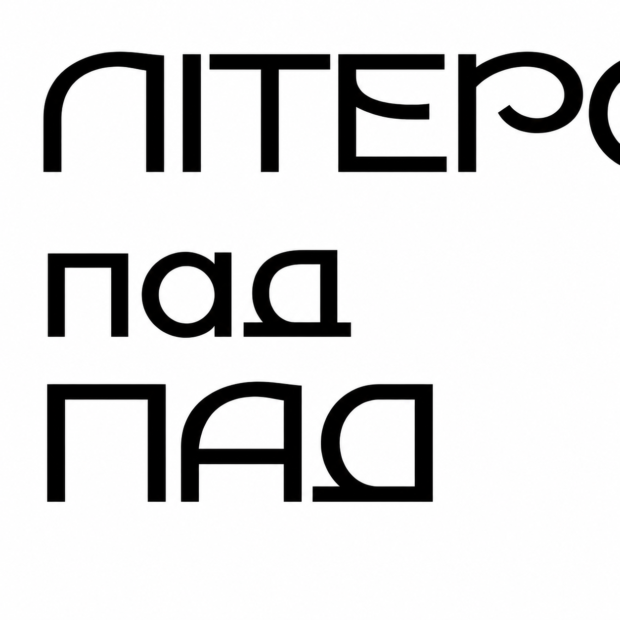
Cyrillic forms in progress.
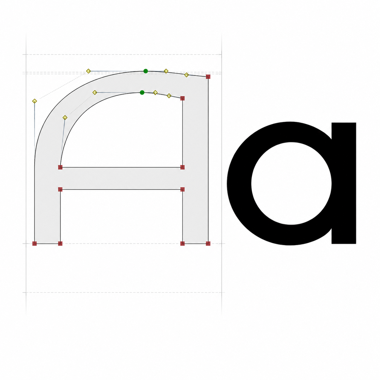
The capital A and lowercase a.
The Armenian part brings up a different question: how should the design relate to the people whose language it will serve? I decided to ask speakers of the Nor Nakhichevan dialect how they write Armenian letters, and use their handwriting as a starting point for developing the forms.
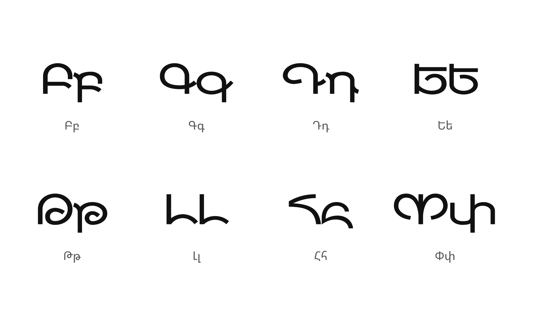
I’m interested in what those everyday written forms can contribute to the design. The Armenian drawings below are still work in progress.
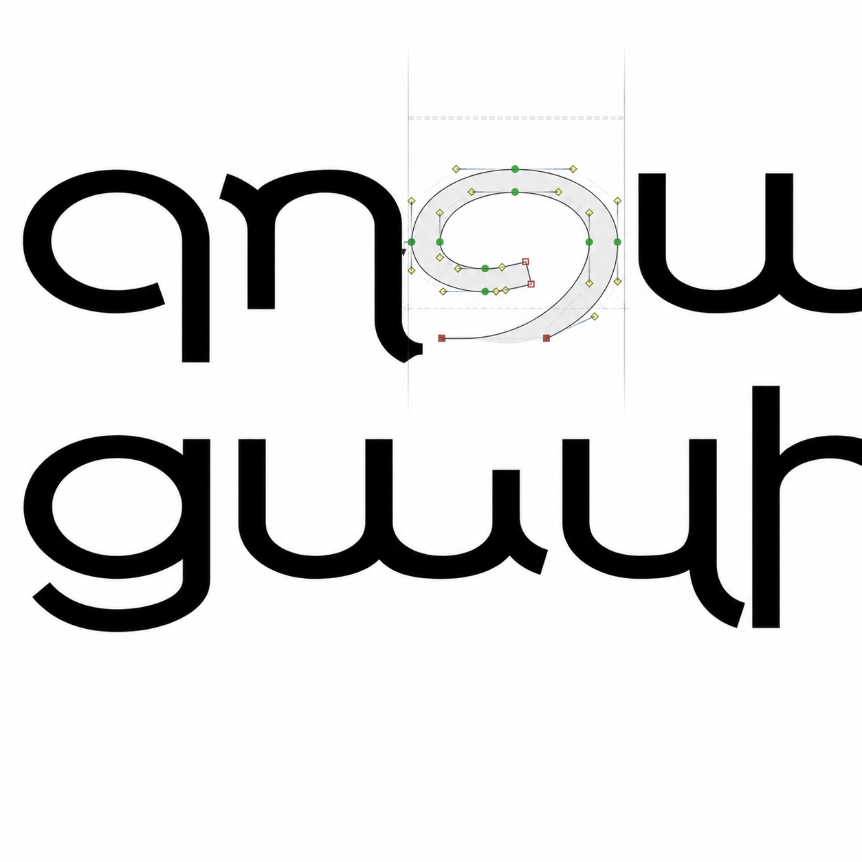
Armenian lowercase studies, including ջ.
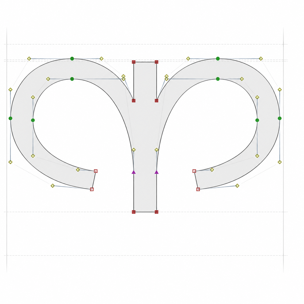
Armenian Փ, shown in outline.
I’d welcome feedback on the letterforms and on the relationship between the two scripts. For Armenian readers in particular: which forms feel natural, and where does the geometry get in the way of recognition? I’d also be interested to hear from anyone who has used a local community’s handwriting as a source for a typeface.
Translated & edited via AI
Categories
- All Categories
- 47 Introductions
- 4K Typeface Design
- 504 Type Design Critiques
- 594 Type Design Software
- 1.1K Type Design Technique & Theory
- 675 Type Business
- 910 Font Technology
- 29 Punchcutting
- 544 Typography
- 129 Type Education
- 333 Type History
- 82 Type Resources
- 114 Lettering and Calligraphy
- 33 Lettering Critiques
- 81 Lettering Technique & Theory
- 584 Announcements
- 101 Events
- 117 Job Postings
- 179 Type Releases
- 186 Miscellaneous News
- 270 About TypeDrawers
- 54 TypeDrawers Announcements
- 114 Suggestions and Bug Reports