New Release: Parling

Kent Lew
Posts: 1,075
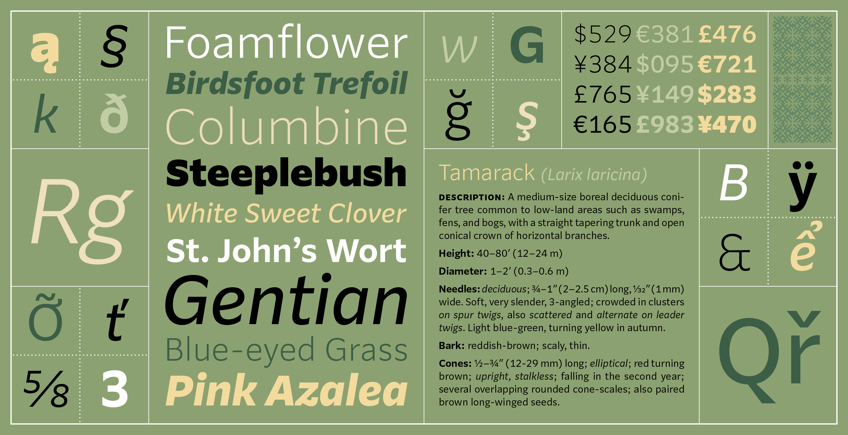
I am pleased to announce the release of my new sans serif: Parling.
Parling is my idea of a foundational sans serif. I think of it as a sort of Benton-meets-Verdana, and it serves as my homage to quintessentially American gothics, like Morris Fuller Benton’s News Gothic and Lightline Gothic, as well as to that classic webfont Verdana, with a few humanist touches. Frankly, it’s my counterbalance to the plethora of neo-grots strewn across the landscape these days.https://kltype.com/fonts/parling
Parling was designed to be an everyday, workhorse sans — made to handle typographic heavy-lifting with versatility and dependability, while also evincing a familiar, affable personality. This is my first typeface design conceived to be largely digital-first for onscreen use. And you can see me put it through those paces on my website, as the primary UI face.
It is outfitted with a wide range of weights, also available as variable fonts. The default numerals are clear & distinct and tabular, multiplexed across all weights & styles, in order to behave reliably in price lists, dates, times, and other data displays. My standard retail character set supports the typical Extended Latin languages, plus Vietnamese, as well as Arabic and Indic transliteration.
Full-featured trial fonts are available.
0
Categories
- All Categories
- 47 Introductions
- 4K Typeface Design
- 505 Type Design Critiques
- 597 Type Design Software
- 1.1K Type Design Technique & Theory
- 679 Type Business
- 912 Font Technology
- 29 Punchcutting
- 546 Typography
- 130 Type Education
- 334 Type History
- 82 Type Resources
- 114 Lettering and Calligraphy
- 33 Lettering Critiques
- 81 Lettering Technique & Theory
- 592 Announcements
- 102 Events
- 119 Job Postings
- 181 Type Releases
- 189 Miscellaneous News
- 270 About TypeDrawers
- 54 TypeDrawers Announcements
- 114 Suggestions and Bug Reports