The hand on the Night Watch shield: what is it, and is there a font like it (with Cyrillic)?

Hi all,
I'm a designer, and when it comes to italics and calligraphy I'm a beginner, so please bear with me and correct me where I'm wrong.
For the past weeks I've been building a 3D reproduction of Rembrandt's The Night Watch (1642) that runs in the browser. It has all the figures, the gate and the staircase, and the lighting follows the painting. I tried to keep close to the picture and its history, and to keep the scene light enough to open on an ordinary laptop. You can try it here: https://pavljenko.ru/blogs/tools/night_watch_3d?lang=en
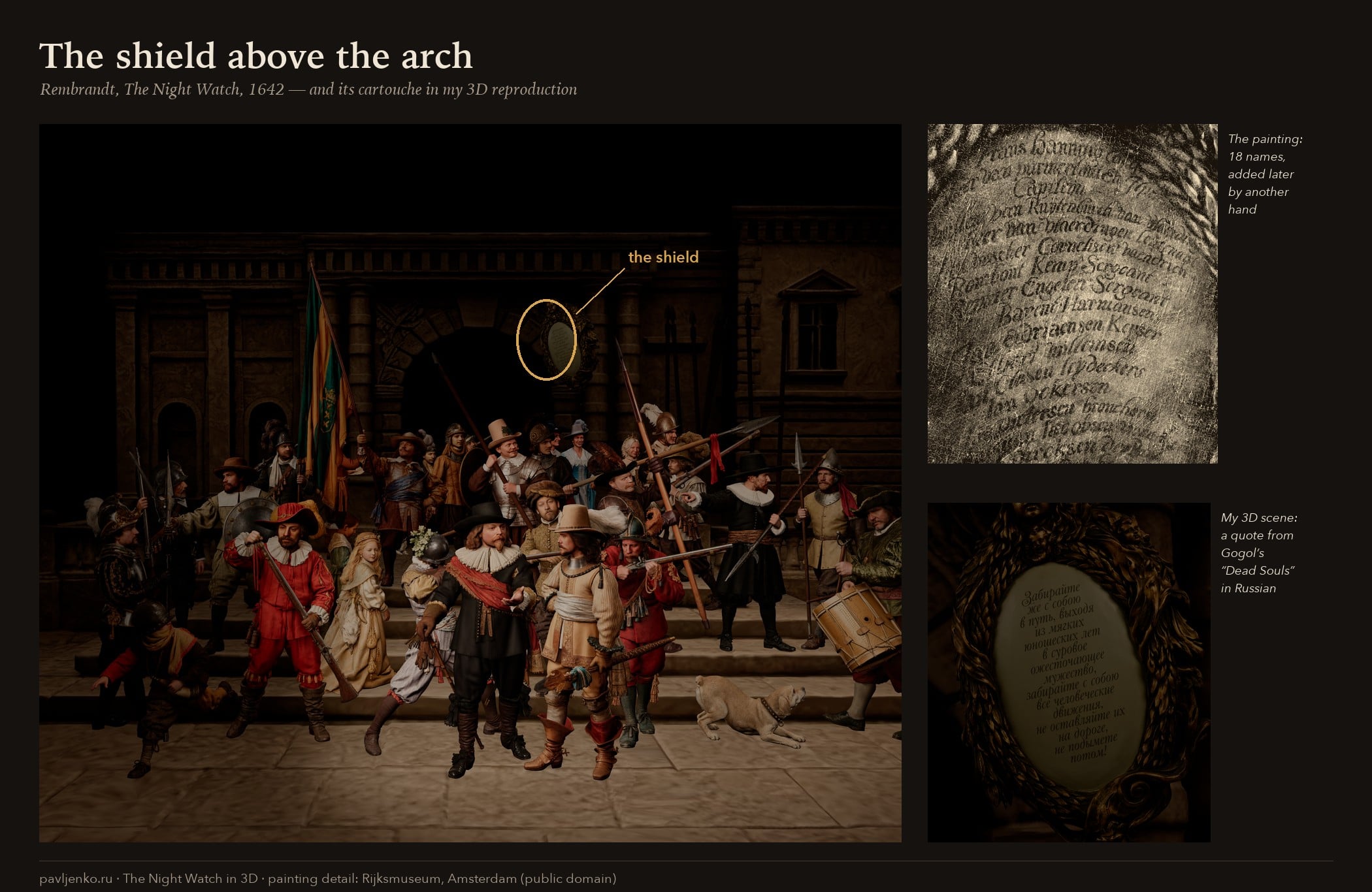
The shield
Above the arch, to the right, hangs an oval shield with eighteen names: the captain, the lieutenant, the ensign, two sergeants and thirteen guardsmen. These are the men who paid to be painted. According to a statement from 1659, the guardsmen paid about 100 guilders each.
Rembrandt didn't paint it. For the Corpus of Rembrandt Paintings, samples were taken during the 1975–76 restoration, and they show a layer of varnish between Rembrandt's masonry and the paint of the shield. So the whole cartouche, frame and names, was painted over the finished picture.
It was still added early. Gerrit Lundens' small copy doesn't show the shield. However, infrared images show that he drew it in his underdrawing and then painted the pilaster over it. Scholars date the shield to around 1650 (Haverkamp-Begemann) or about 1653 (Dudok van Heel, 2009). The "c. 1715" you'll often see online seems to go back to a 2009 news item that contradicts the study it was reporting on.
No one knows who painted the shield and its lettering. In the 18th century a restorer believed Rembrandt had written the names himself. Today that is ruled out on technical grounds and by the brushwork.
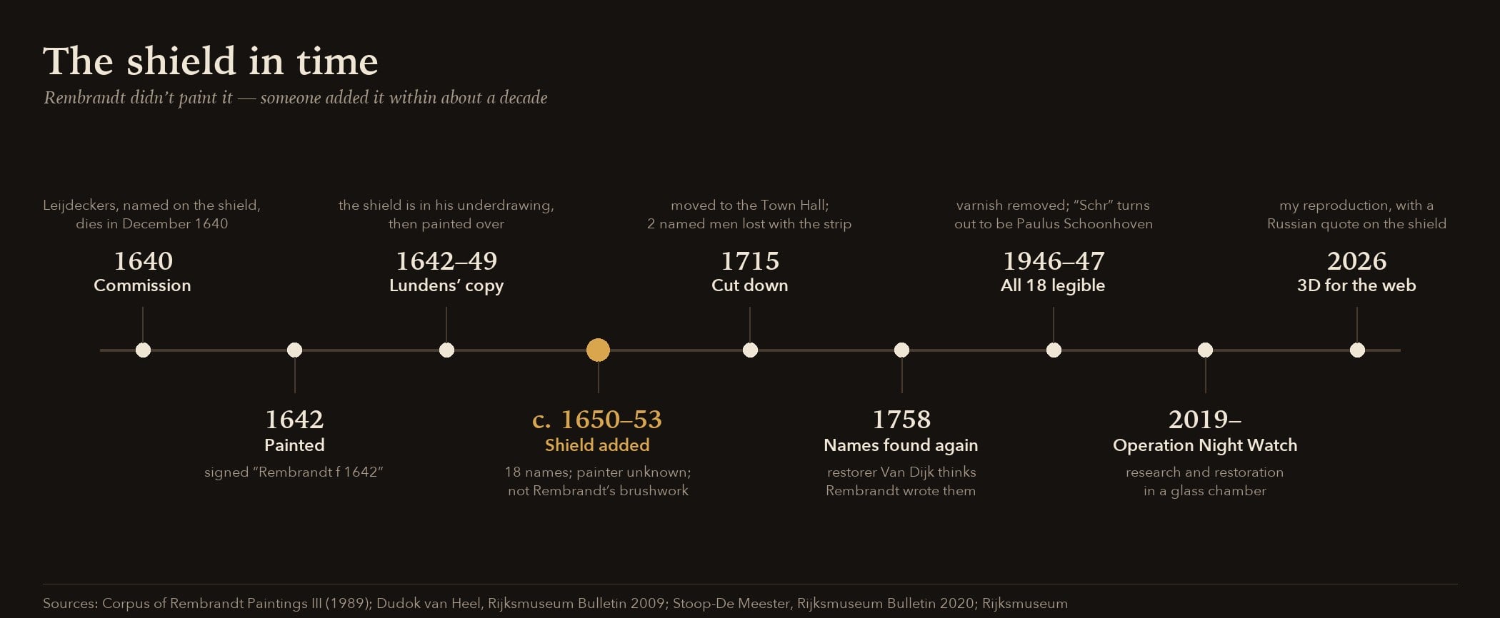
What I did with it
In my scene the shield doesn't carry the names. It carries a quote from Gogol's Dead Souls, in Russian. By coincidence, the book came out in 1842, exactly two hundred years after the painting. In my own rough translation:
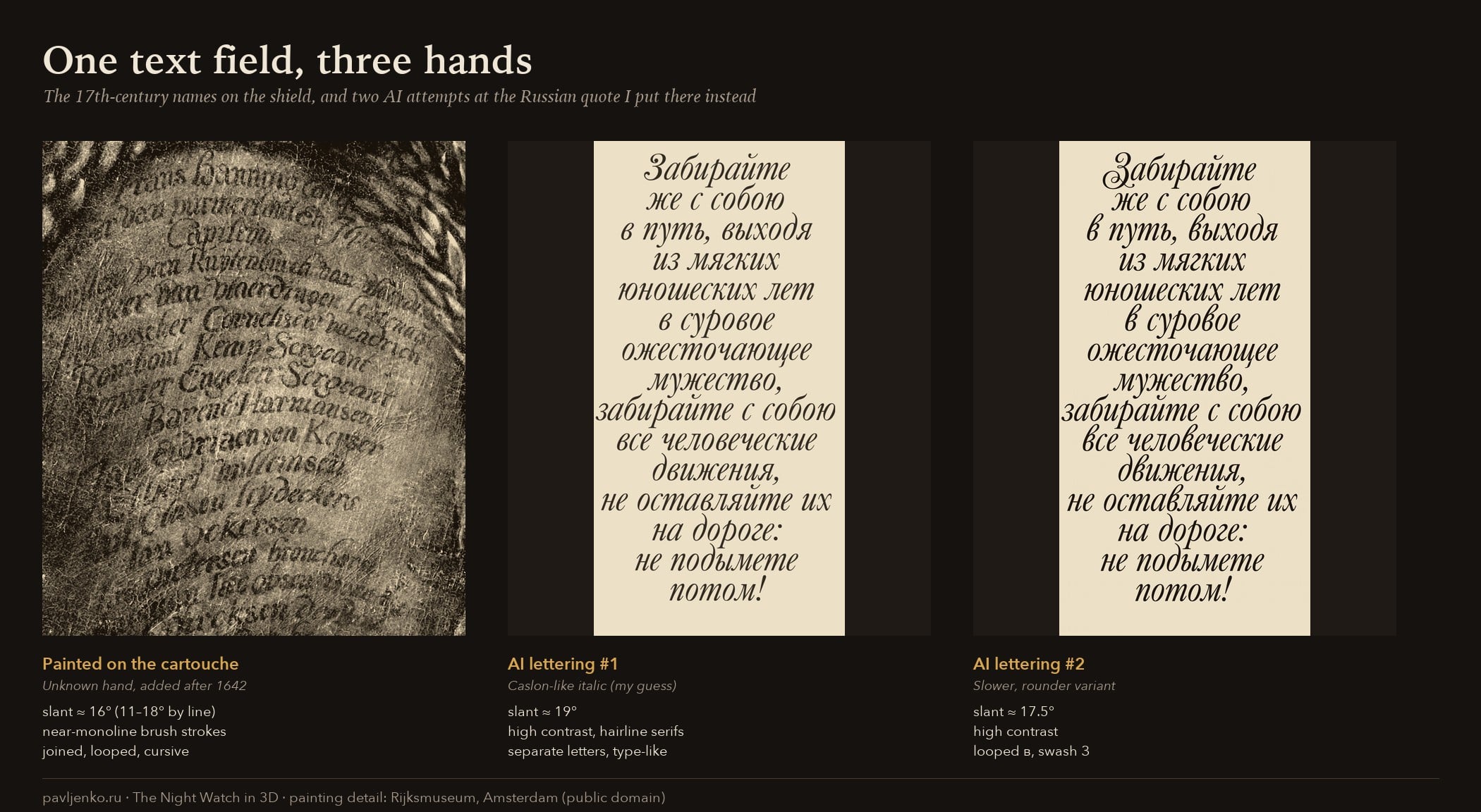
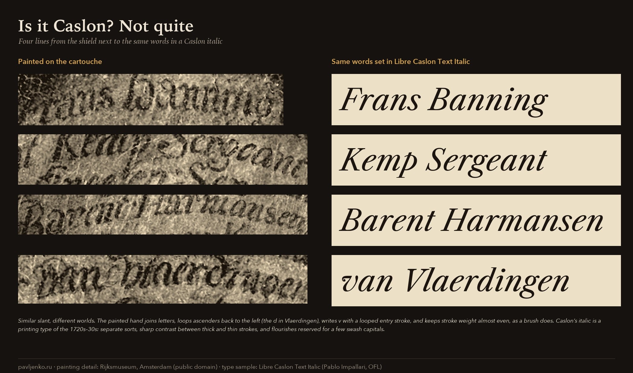
I lettered it with AI tools, and that's where my question starts. The first version looked like a Caslon-ish italic to me, though its hairlines are finer than Caslon's. The second one is slower and rounder, with a looped в and a swash З. Neither looks like the original.
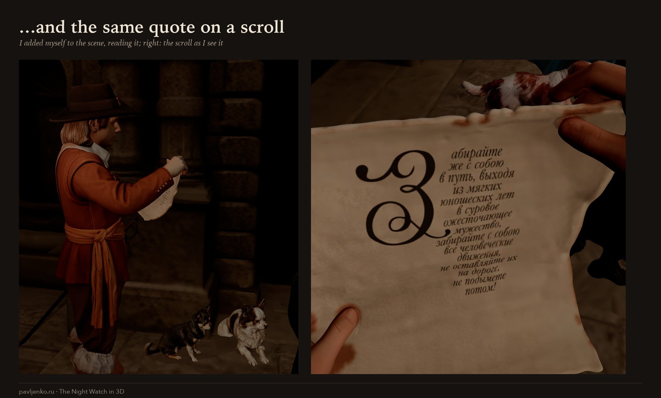
I also put myself into the scene 😅 reading the same quote from a scroll:
What I've found so far (beginner's notes)
I couldn't find any published description of this hand. My reading, after some digging, is below. Please treat it as a guess.
- It looks like the 17th-century "Italian hand" (Italiaanse letter) taught by Dutch writing masters. That was a rounder, faster descendant of the Renaissance humanist cursive. Features I can see:
- looped or club-headed ascenders, and a d that curls back to the left;
- a looped g;
- a v with a looped entry stroke;
- large, loosely flourished capitals (B, C, K, S, E);
- letters only partly joined.
- It was painted with a brush rather than written with a pen. So the strokes are almost even in weight.
- It is not the gothic Dutch hand that people used for everyday Dutch at the time. Writing Dutch names in the Italian hand around 1650 would have been a deliberate choice (that's an inference on my part).
- This hand appears in the model books of the period. For example: Jan van de Velde's Spieghel der Schrijfkonste (1605), Maria Strick, who was famous for her Italian hand, and Felix van Sambix.
My AI letterings drift toward a typographic italic. The slant is similar: I measured about 16° on the shield (11–18° from line to line), and about 19° and 17.5° on the two AI versions. Everything else is different. The shield hand is joined, nearly monoline and loopy. Caslon's italic is a printing type: separate letters, more contrast, flourishes only on a few swash capitals.
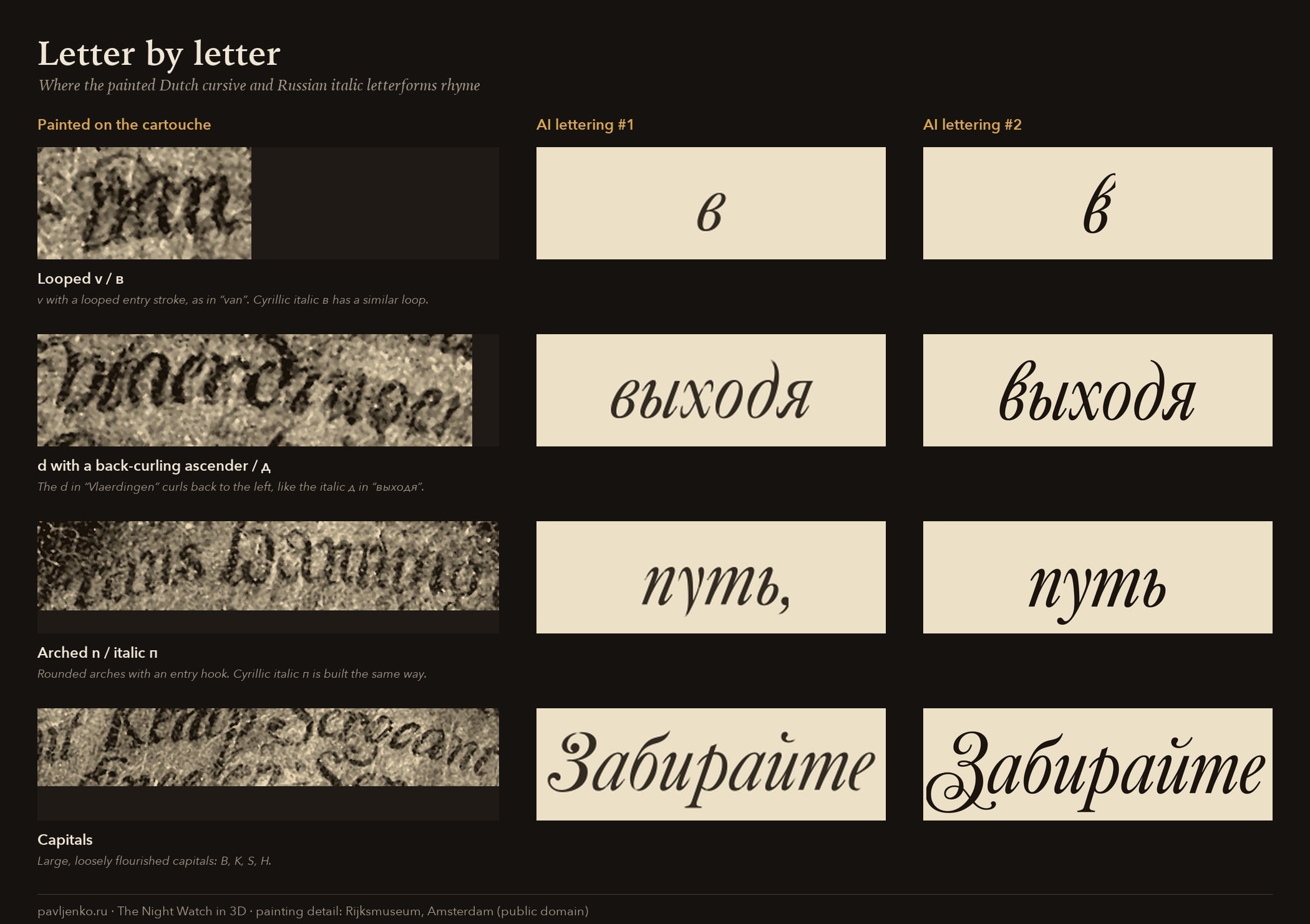
What surprised me is how well some Dutch forms rhyme with Russian italic letters. The looped v in "van" sits close to the italic в (exclusively due to additional flourishes), and the back-curling d to the italic д.
Fonts I've looked at (please correct me)
Scripts linked to Dutch writing masters:
- Van den Velde Script (Intellecta Design) is an interpretation of Van de Velde's Spieghel. It is much more flourished than the shield, and Latin only.
- Krul (Ramiro Espinoza, Re-Type) is based on the Amsterdam krulletter, a sign-painters' style, and on research into 17th-century Dutch writing masters. It is Latin only.
Dutch printing italics of the period: DTL Elzevir, Monotype Van Dijck and Custodia. As far as I can tell, they are Latin only.
With Cyrillic:
- Printing italics: Kis (ParaType, Cyrillic by Vladimir Yefimov), William Text (Maria Doreuli, Typotheque; a Caslon interpretation), Garamond Premier and EB Garamond.
- Scripts: Veljovic Script and PF Champion Script, but they are modern, or English roundhand.
- Peter Skoropis (ParaType) is a Russian hand from Peter the Great's time, so roughly the right era but a different tradition.
A side note: the punches and matrices for Peter the Great's civil type were made in Amsterdam in 1707. So a Dutch-flavoured Cyrillic isn't as far-fetched as it sounds.
My questions
- What would you call this hand? Is "a Dutch Italian hand, painted with a brush" a fair description? Is anything known about who painted shields like this one?
- Is there a font close to it, ideally with Cyrillic? Or a typographic italic that would sit well on the shield?
- Would anyone like to letter the quote, or any other text, in this style? I would credit you by name, with links to your work, in the shield's info card in the scene (click the shield to open it) and on the project page.
Thank you! Any pointers are very welcome, including "you're looking at it the wrong way".
Painting details: Rijksmuseum, Amsterdam (public domain). Type sample: Libre Caslon Text Italic (Pablo Impallari, OFL). Sources for the history are listed below.
Sources
- A Corpus of Rembrandt Paintings, vol. III (1989), cat. A 146 — paint samples, X-ray and infrared, "certainly a later addition": https://rembrandtdatabase.org/images/corpus/CorpusRembrandt_3.pdf
- S.A.C. Dudok van Heel, "Frans Banninck Cocq's Troop in Rembrandt's Night Watch: The Identification of the Guardsmen", Rijksmuseum Bulletin 57 (2009), pp. 42–87 — shield "added … in about 1653", the 1659 payment statement: https://bulletin.rijksmuseum.nl/article/view/11665
- H. Stoop-De Meester, "Gerrit Lundens, His Copy after The Night Watch…", Rijksmuseum Bulletin 68 (2020), note 16 — the shield in Lundens' underdrawing: https://bulletin.rijksmuseum.nl/article/view/9684
- Rijksmuseum object page with the full transcription of the names: https://www.rijksmuseum.nl/en/collection/object/The-Night-Watch-Militia-Company-of-District-II-under-the-Command-of-Captain-Frans-Banninck-Cocq--3137deb45cd7765f9a76084a16c99544
- D.C. Meijer Jr. (1886), English translation in JHNA — the 18th-century restorer and the name lists: https://jhna.org/articles/amsterdam-civic-guard-portraits-within-outside-new-rijksmuseum-part-ii/
- Penna Volans on the Italian hand: https://pennavolans.com/the-italian-hand/
Comments
-
Wonderful 3D work !
2 small omissions in the back rows:- the man behind Claes van Cruijsbergen
- the cat on the back of one dog
0 -
Correction: you mentioned the cat !
Again, an impressive work!0 -
Thank you, and good eye! The half-hidden man in a helmet behind Claes van Cruijsbergen is in the scene, but I hadn't labelled him. As far as I can tell he's one of the unidentified heads: Dudok van Heel (2009) assigns all 18 names on the shield to other figures. I'll add a card for him as an unknown guardsman.Yves Michel said:Wonderful 3D work !
2 small omissions in the back rows:- the man behind Claes van Cruijsbergen
- the cat on the back of one dog
And the cat riding on the dog's back in this scene is an homage to the Brothers Grimm (The Town Musicians of Bremen) and Anton Chekhov (Kashtanka), and also my way of adding a bit of humor to the piece 0
0 -
It seems to me that, in terms of mood, František Štorm’s Serapion typeface would be a better fit here. Yuri Gordon designed the Cyrillic version (though I’m not sure if it’s available for purchase).2


Categories
- All Categories
- 47 Introductions
- 4K Typeface Design
- 501 Type Design Critiques
- 591 Type Design Software
- 1.1K Type Design Technique & Theory
- 675 Type Business
- 908 Font Technology
- 29 Punchcutting
- 544 Typography
- 129 Type Education
- 333 Type History
- 82 Type Resources
- 114 Lettering and Calligraphy
- 33 Lettering Critiques
- 81 Lettering Technique & Theory
- 580 Announcements
- 101 Events
- 116 Job Postings
- 176 Type Releases
- 186 Miscellaneous News
- 270 About TypeDrawers
- 54 TypeDrawers Announcements
- 114 Suggestions and Bug Reports