Glyphs thickness
mauro sacchetto
Posts: 379
While fixing an old font (a Simoncini), I'm having a lot of doubts about how to establish a harmonious proportion in the small caps between the lateral thickness of the curved glyphs (|O|, but also |D| or |P|) and that of the oblique strokes with different angles (|N|, |V|, |W|).
Which ones do you find too discontinuous in this test?
Already here, the thick right diagonal stroke of |M| appears much thinner than that of |N|.
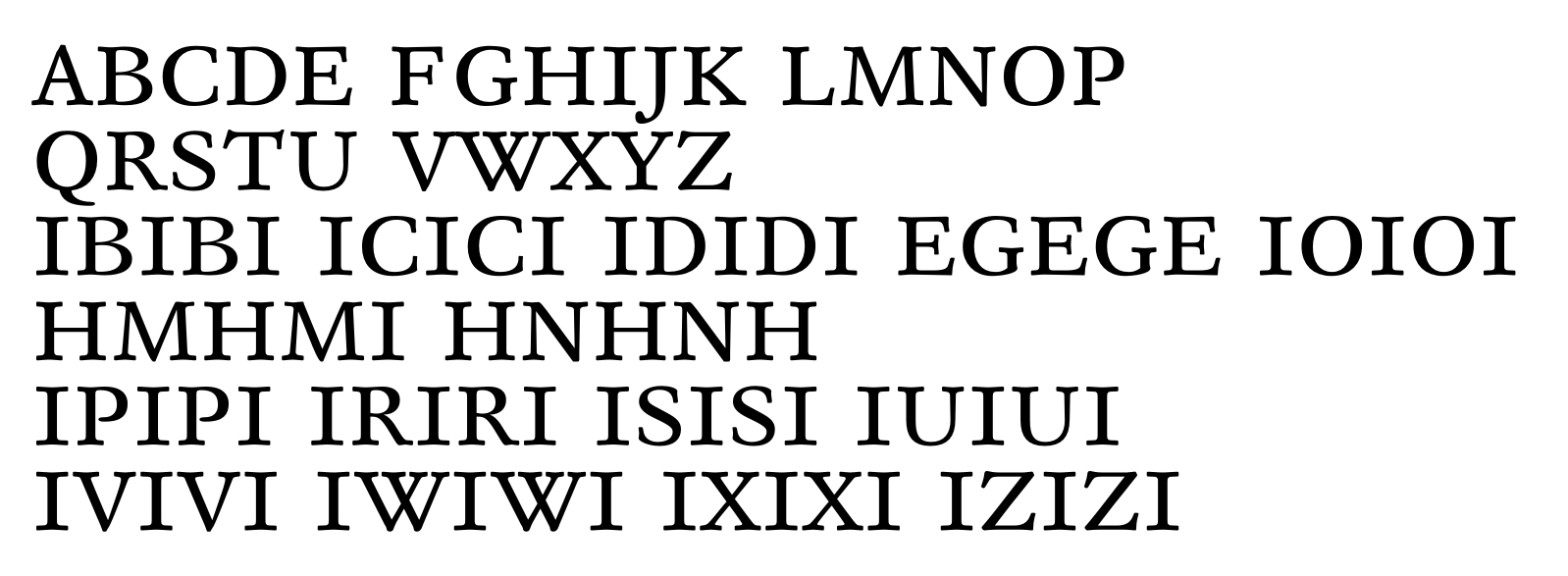
Is the only final criterion the eye (because, moreover, when printing a .pdf, the appearance changes a bit depending on the zoom...)?
Thanks
m
0
Answers
-
You should read Karen Cheng's "Designing Type". This 'invaluable book' as the editor qualifies it (and he's absolutely right) will answer your questions and many others.
And, as you mention, don't base your design only on calculations but trust your eyes.1 -
Thanks for the tip; I’ll be sure to get hold of that text.In the meantime, what are the most obvious flaws that your expert eyes spot?0
-
As this is small caps, I suggest you examine it at small cap size, in text settings combined with capitals, lower case, and numerals. Especially italic lower case.
In other words, you won’t know how well the automobile will perform unless you take it out of the garage.2 -
yes. true of everything in type designIs the only final criterion the eye but there are principles to explain this.. when you slant a vertical stroke, its horizontal width stays the same, but the shortest distance between its edges gets smaller, so you need to compensate for that. as yves suggests, going mechanically by the cosine of the slant angle won't always look right, though - you need to use your eye and consider the broader context. the diagonal of the N stroke might become a bit heavier because it's uncrowded in a field of white, for example, while W might be lighter due to its density. also agree with nick! since small caps can set a little wide, you might make different choices, it will be helpful to look at a few pages set the way you imagine the letters being used 0
 -
To my eyes, second stroke of /M, first stroke of /W, thick stroke of /X, and tail of /R feel a little thin. Big rounds /C/G/O/Q might get a touch too dark.2
-
@mauro sacchetto
Another good reference for your library: "Type Tricks" by Sophie Beier. (www.bispublishers.com)0 -
For the printing inconsistency issue, you could consider printing the font at a larger size (so rasterization is less apt to cause distortion) and viewing it from farther away. (Nick Sherman's Size Calculator can even calculate how to reproduce a conventional text-font perceived size at different distances!)1
-
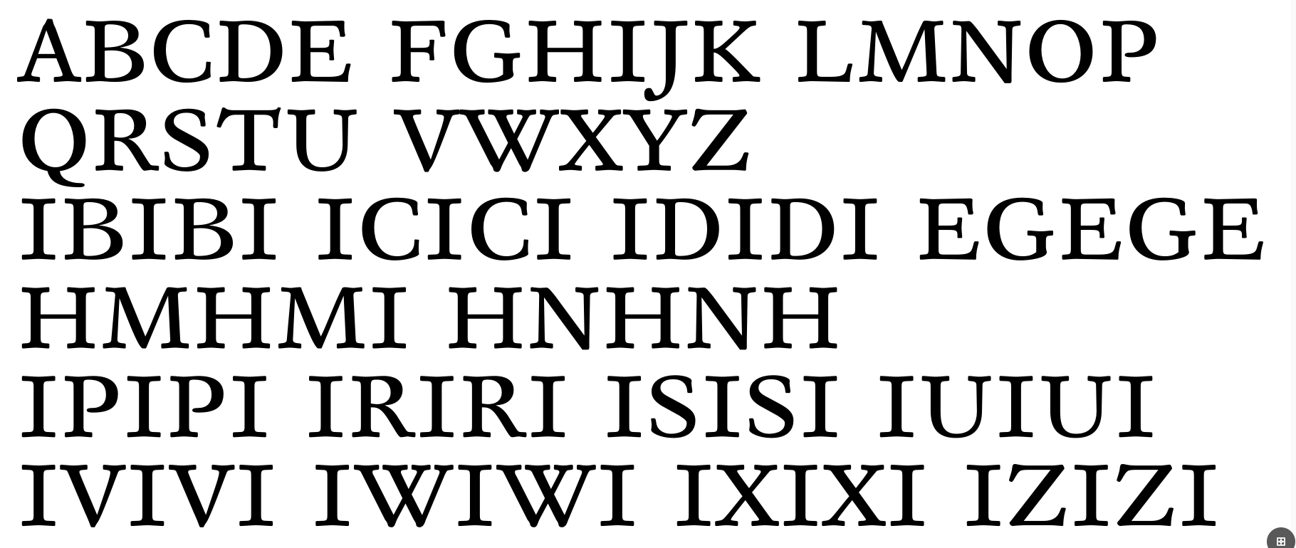
Thanks for the bibliographic references.Cheng's text can be downloaded from the Internet, but it is the first edition.I have ordered the more comprehensive second edition and Beier's text.This is a second draft with some corrections:
 0
0 -
I still think the big curves read as darker than the stems.5
-
They are 95pt at the widestpoint vs 78 of the stems.Thanks for the opinion, now I do some retouching and then I also check optically
0 -
The bowl of /D looks fairly balanced with the stem. I would aim to get /O, /C, /G, /Q looking similarly weighted. (Which might or might not be a matter of the same actual measure.)1
-
The thickness is the same for all the large curves; therefore, if some glyphs appear darker, it is not a matter of actual measurement, but rather the resulting optical effect.
0 -
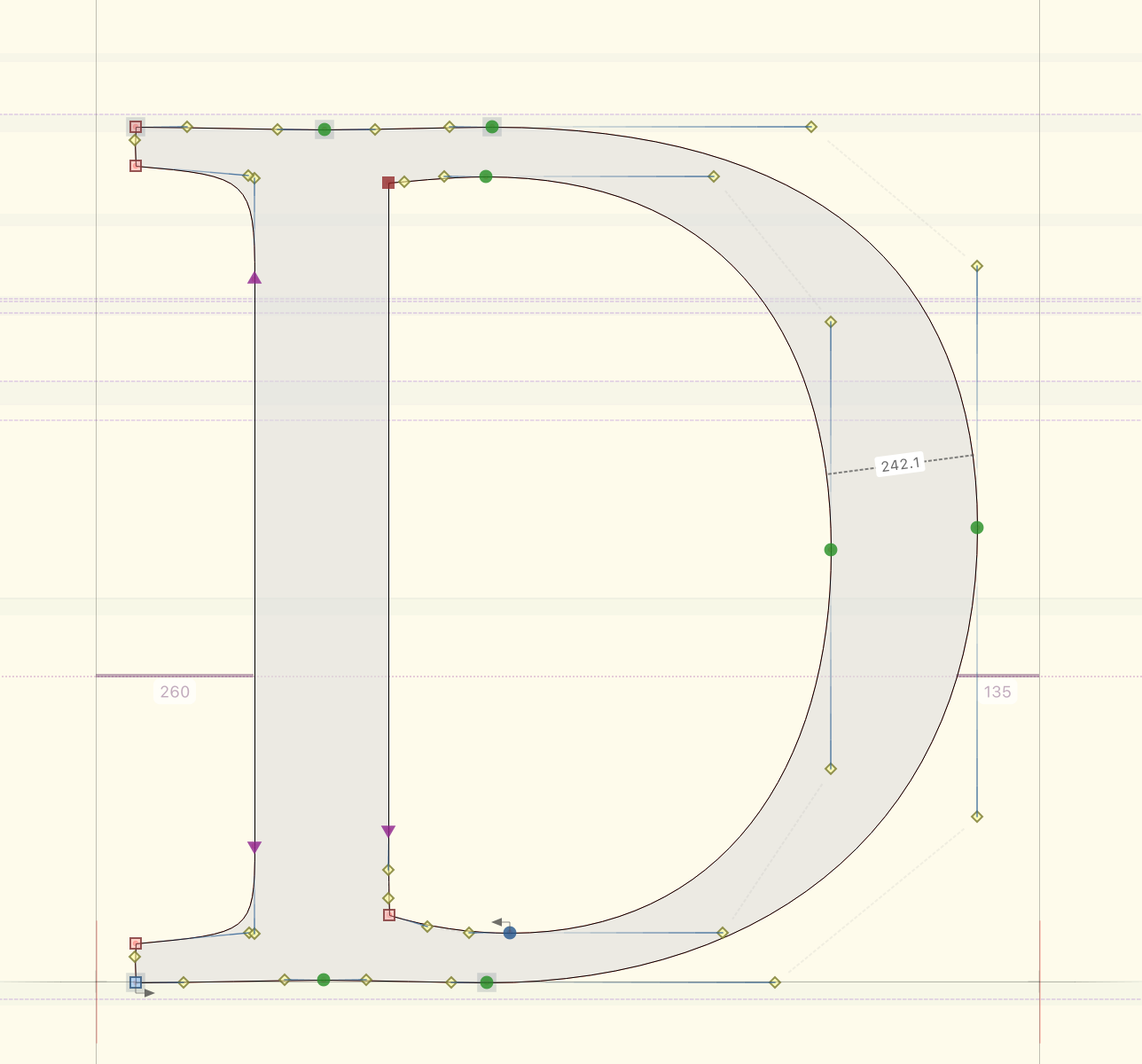
I usually start by making the thickest part of my bowls about 110% of the thickness of my straight stems.In this example, the straight stem is 220 units (on a 2000 UPM) and the thickest part of the bowl is approx. 242 units.
 3
3 -
John Hudson said:I usually start by making the thickest part of my bowls about 110% of the thickness of my straight stems.In this example, the straight stem is 202 units (on a 2000 UPM) and the thickest part of the bowl is approx. 242 units.
Isn't that closer to 120%?0 -
Mistyped stem thickness, which is actually 220, not 202. Fixed in the edit.0
-
mauro sacchetto said:The thickness is the same for all the large curves; therefore, if some glyphs appear darker, it is not a matter of actual measurement, but rather the resulting optical effect.The nominal thickness might be the same at the widest point. But that doesn’t mean that the weight is equal in all. It may be a matter of how the two bounding curves interact.In the /D the transition from horizontal to vertical seems about right, and thus the weight feels balanced. With the other rounds mentioned, it seems like more weight accumulating in the “corners”, leading to an overall heavier feeling.So either adjust the interaction of curves through adjusting control points; or if you want such broader curves in these glyphs, then adjust the overall thickness from the heaviest point to reduce the overall feeling of weight relative to stems.
1 -
Thanks for the very useful observations. I’m working on it.PSToday I received Cheng’s book; to me—a "font designer" in the loosest sense, not a professional and quite inexperienced—it seems really useful. Beier’s book is on its way.If you have any other titles like these ones, I’d appreciate it if you could let me know.0
-
How to create typefaces: from sketch to screen, by Cristóbal Henestrosa, Laura Meseguer and José Scaglione, is a very good book.1
-
Hi John,
"How to create typefaces" seems unavailable. I searched Amazon FR, US, UK and Googled the name.
Do you know a reliable source?0 -
Disclaimer: Iʼm not John, nor do I play him on TV. —But Iʼm curious as to how you concluded the book is unavailable. Did you try the Item.zero shop (whose link is buried in the page John linked to)?Yves Michel said:Hi John,
"How to create typefaces" seems unavailable.1 -
0
-
📺👍0
-
How to Create Typefaces is just back in print with a second edition, after a long break. I bought five copies to save on shipping to the USA, because I can sell or gift them, and the original was already my favorite type design book.1
-
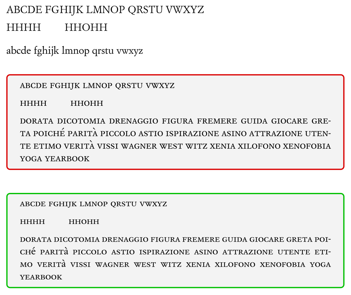
From what I’ve seen, the second edition of the book is available only in the English version, not in the original Spanish.I am posting a further, more extensive draft, incorporating the initial corrections:
 0
0




Categories
- All Categories
- 47 Introductions
- 4K Typeface Design
- 497 Type Design Critiques
- 590 Type Design Software
- 1.1K Type Design Technique & Theory
- 674 Type Business
- 904 Font Technology
- 29 Punchcutting
- 543 Typography
- 128 Type Education
- 333 Type History
- 82 Type Resources
- 114 Lettering and Calligraphy
- 33 Lettering Critiques
- 81 Lettering Technique & Theory
- 577 Announcements
- 101 Events
- 116 Job Postings
- 174 Type Releases
- 185 Miscellaneous News
- 270 About TypeDrawers
- 54 TypeDrawers Announcements
- 114 Suggestions and Bug Reports