








Where there is artistic excellence, there is human dignity.
Google Pics

Dave Crossland
Posts: 1,582
(While I am an employee at Google and work on the Google Fonts team, I am posting the below as a member of the public with no special knowledge of anything to do with the below or any involvement; personal opinion only, not a company communication, etc)
pics.google.com just launched
Sizzle video: https://www.youtube.com/watch?v=S18L1NFTda8
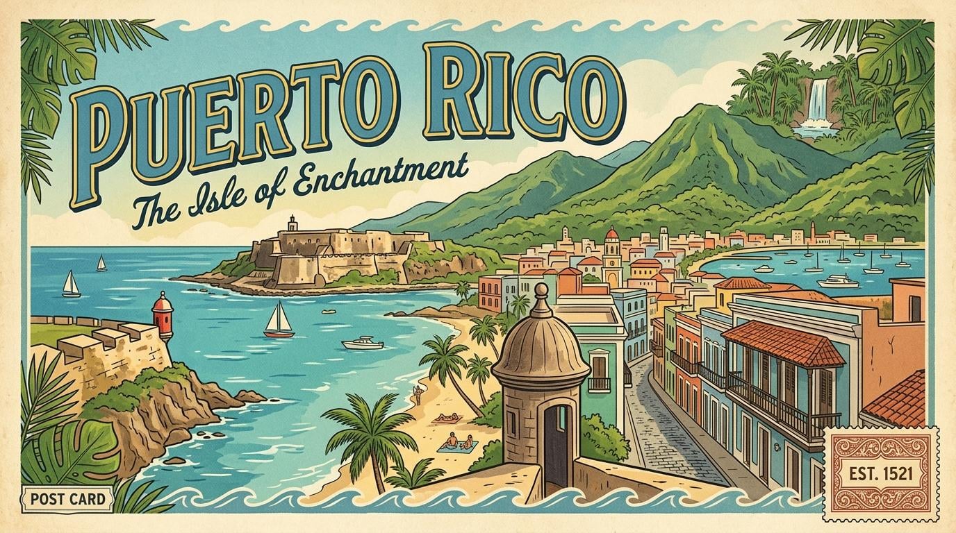
I asked it to make a simple postcard, and it offered 4 responses, three of a front and one of a back – and I think this is the first time I've seen the full "post fonts typography" world that we've discussed coming over the horizon on this forum for a few years now, due to the "text editing" feature.
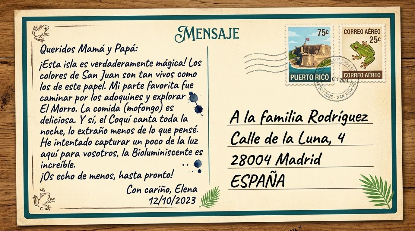
The 'back' of the postcard with "lots" of text is striking since the lettering looks very similar to Pablo Impallari's Caveat typeface (Google Fonts specimen of Caveat), but on close inspection each glyph is slightly unique and therefore, academically defined, is lettering, not type.
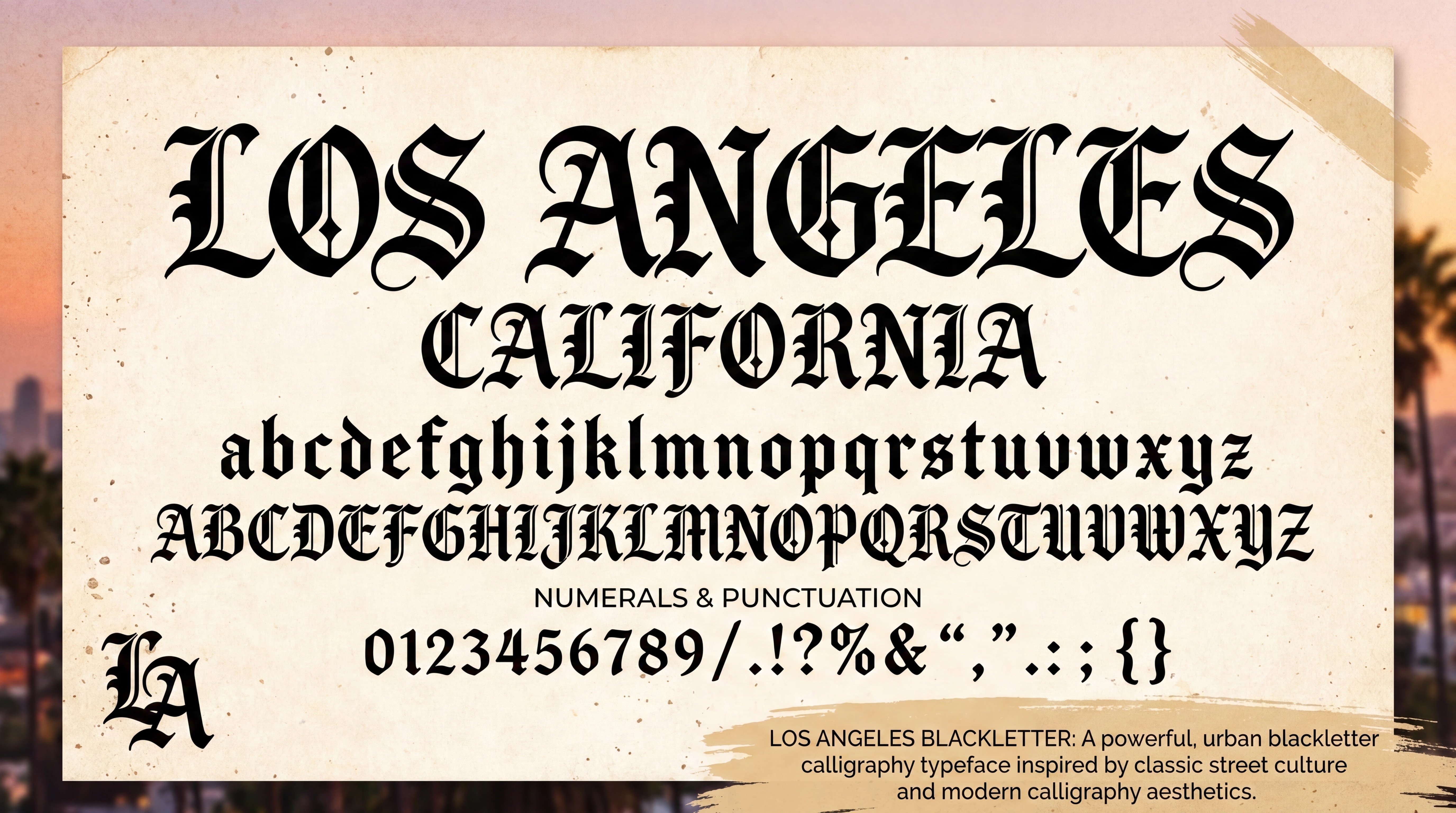
I then asked it to give me a couple of Los Angeles inspired type specimens, and this is what I immediate got, exported using the 4x scale up feature:
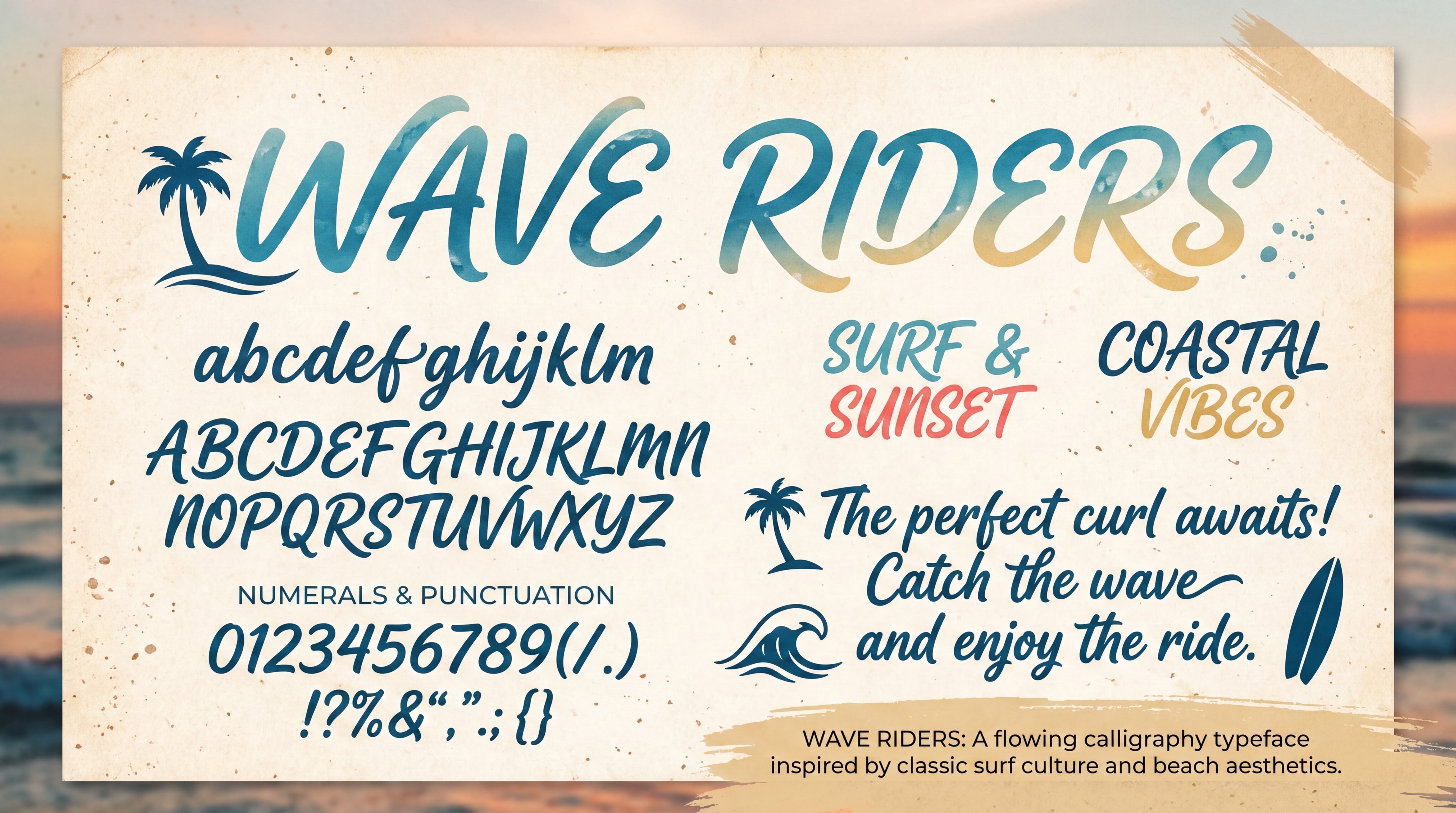
I wonder what Ray Larabie and John Hudson will make of it, and everyone.
pics.google.com just launched
Sizzle video:
https://www.youtube.com/watch?v=S18L1NFTda8I asked it to make a simple postcard, and it offered 4 responses, three of a front and one of a back – and I think this is the first time I've seen the full "post fonts typography" world that we've discussed coming over the horizon on this forum for a few years now, due to the "text editing" feature.
The 'back' of the postcard with "lots" of text is striking since the lettering looks very similar to Pablo Impallari's Caveat typeface (Google Fonts specimen of Caveat), but on close inspection each glyph is slightly unique and therefore, academically defined, is lettering, not type.
I then asked it to give me a couple of Los Angeles inspired type specimens, and this is what I immediate got, exported using the 4x scale up feature:
I wonder what Ray Larabie and John Hudson will make of it, and everyone.
Tagged:
1
Comments
-
I'm interested in what you think of it, Dave, as someone who has invested a lot of energy and (Google) money into original type development. Is this what you hoped for?12
-
I find it difficult not to make a cynical remark.2
-
Mid.
While it's technically very impressive when we compare it to what AI could previously do, it has no soul and unfortunately falls straight into the slop category. Perhaps it's slop due to the simplicity of your prompts but there's no originality here and it has that unfortunate uncanny valleyesque AI quality to it. Why would I use these fonts over preexisting mid ones?
Wake me up when AI can one shot something like Klimax, draw a Cyrillic from just a Latin, or generate me a font from Hamburgevons. I'm guessing we're around 2-3 years away from that.2 -
Marc Foley said:I'm guessing we're around 2-3 years away from that.It seems to me that, in reality, no one has even properly posed the task for AI yet. What we see today under the guise of "artificial letters" is a byproduct, a dust from the polishing of other tasks (images in the broad sense).But I would say the potential here is enormous. Artificial lettering impressed me a year ago and continues to do so today.Perhaps, when products entirely focused on working with fonts appear, we will achieve the holy grail of truly parametric fonts, when all possible (and some impossible) relationships of thickness, axis inclinations, terminal shapes, and everything else will change with the ease of a breath throughout the font.Let's say I've prepared the following inscription:
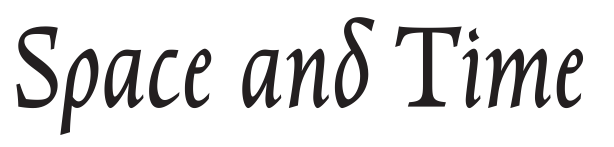
Ai transformed it in a second as follows: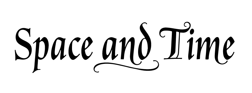
(Yes, this second includes about ten minutes with several iterations of retouching, enlargement, and vectorization, but it still didn't take much time)
We see a “live” hand, an acceptable imperfection, and at the same time, the font that has appeared before our eyes is stylistically consistent. I find this quite interesting.
Although I don't like the postcards in the top post either.0 -
Hi Dave. Not sure what you’re expecting I might say that I have not already said. The technical quality of the output in terms of cleanness and consistency continues to improve, which I always assumed it would. But it remains uninteresting for all the reasons I have previously stated. Human creativity is about creating humans, not creating things and products. This stuff isn’t contributing anything to human culture, it is just taking from that culture and contributing to the wealth of the billionaire class. I think the better the technology gets, the more starkly evident that is becoming.I think AI does have some useful applications, particularly in the area of coding. And one of the reasons I think that is because the creative aspect of software is in the functionality of software —what it does —, not in the lines of code through which it does it. [As an aside, this also throws into relief my oft-repeated point about where value resides in software, and why treating code as a literary work for copyright purposes is dumb. You buy a book to read the text; you don’t buy a software license to read the code.]Earlier this week, someone showed me the app he had made with Claude to help him run his business, and it was very impressive: it did all the things he wanted it to do in the ways in which he wanted them done, and is something that wouldn’t have existed otherwise because he wouldn’t have had enough money to pay someone to write that software, and if he had to use someone else’s app or service it would not have worked the way he wanted.I don’t think making pretty pictures over which you have effectively no control is even in the same realm, despite employing similar AI models behind it. It may become more interesting if/when the user can start instructing the AI agent how to edit aspects of the image — including the text in the image — in quite precise ways that do not suffer from the instability inherent in the current AI generation. That implies tools that are a lot more directly interactive than text prompts: at some stage, you need to be able to point at something and say ‘Change that bit there’, rather than trying to describe in words what you want changed. [AI agents are often presented as being like assistants sitting beside you to help you with tasks, but can you imagine trying to communicate with a human assistant only via text prompts without being able to use your hands?] If AI provided that precise kind of control, it would be functioning more like a tool — like a pen or a paintbrush or a chisel —, and then it would be something through which human creativity could find expression.on close inspection each glyph is slightly unique and therefore, academically defined, is lettering, not typeIronically, this is an effect I am seeking in a project I am working on, but of course what I want this variation in lettering applied to is some letterforms I have made myself, so having AI be able to generate what it thinks I want based on something it was fed from the Internet remains useless.3
-
Stephen:
I didn't hope for this, and wasn't aware it was happening any sooner than anyone else in the public... I'm not involved it in any more than self driving cars. It is happening, and I think it's important to discuss it happening despite us all here having no agency in it.
We have been having threads like this for a few years. Every 6 months? And I've been, I hope, fairly clear about what I think: This is the biggest change in visual communication since the introduction of PostScript around the time I was born in the early 80s, and it's important to me to have a clear understanding of what is happening, which I think only comes from forum discussion/debate like this, and which is why I have participated in these threads and started this one.
Each cycle the output gets better, and it seems the trend will continue. I forsee the future is one in which fonts become more and more an obsolete and unused technology. Personally on some level this isn't good news, but I want to know what is happening.
Ray and John have been evaluating these systems more than I have, and have a better sense than me about the rate of improvement. Maybe this iteration is a dud, no real change in output except for the editing which John and I had discussed maybe 2 years ago. To me it looks like a step up in quality, detail, maybe even originality. I'll continue to play with it.
Last time the thread was started by a previously unknown developer who appeared to put together stock components wired all the way through to generate OpenType files; this time it's one of the tech mega corporations doing it as a stand alone app that's image file output only. Neither are making OpenType files obsolete just yet, by themselves.
The next milestone I'm seeing ahead is when Adobe and Canva and Microsoft - and Google - each get around to putting generated lettering directly into their document authoring applications. I don't think that will be unique or novel. The editable text of Google Pics is a step towards that which I haven't seen before.
v-fonts.com/support shows 10 years of disinterest in variable fonts from Microsoft, Apple and Google's officeware teams, but I expect these image generation systems to be integrated in all such authoring apps over time, and from there is a small step to use them to do typography.
To Marc's point, asking "why would I use these fonts over preexisting mid ones?" presupposes your agency on choosing letter style; what I see happening is that the nature of the large language models is that they process the linguistic context of documents very well such that they also automate type selection, and so the reason your document doesn't ever touch an OpenType file is that you type in your content - be that a short prompt to expand or a long draft to condense, or use as is - and transform it from text to document, and you obtain a satisfactory result, and go on with the rest of what you were doing.
3 -
Congratulations, Dave. You’ve helped create the world’s largest font training data set. From your humble beginnings railing against the evils of the commercial type industry to now staring at your own obsolescence at the hands of your magnanimous employer, it’s been quite the journey!3
-
What, exactly, would be the advantages of typography without type? Explain it to me like I’m seven.
And, incidentally: raising the issue of how designers frame their ‘agency’ when they evaluate the operation and output of chat-based, generative models manifestly and intentionally designed by their developers to relieve them of agency makes me feel like I’m having a stroke.4 -
Bigger than DaFonts? Bigger than 100000_FONTS_WAREZ.zip? Yeah, nah.Kris Sowersby said:Congratulations, Dave. You’ve helped create the world’s largest font training data set.1 -
As an observation, from what I've seen in flyers for small events around town, birthday cards and images sent in WhatsApp groups, I don't think any of those people cared about exact letter forms, lettering vs. fonts, contributing to human culture, etc. But I think everybody here already knows that.
So that this will find an audience, I'm sure, regardless of my feelings about it.
What I wonder about though, while for this usecase I understand people won't (want to) work straight with font files anymore. But proper documents? Will business documents, letters, reports, etc. all become a stream of lettered JPGs? That will be completely repainted with each resize or edit?
4 -
Roel Nieskens said:But proper documents? Will business documents, letters, reports, etc. all become a stream of lettered JPGs? That will be completely repainted with each resize or edit?
A bit off topic, but I think it will end up as a more hybrid form; A font file(s) as a solid base for corporate identity and Ai used as add-on to create 'illustrations/typographic variations'. This way it'll keep its consistency but will have the flexibility Ai offers. It'll be far more environmentally friendly and, I think, less costly than re-creating each document over and over as an image. Ai won't be a free service forever I guess.
What I'm more concerned about is the effect Ai will have on new type designers. I'm afraid growth (read new arrivals) will dry up in the end. The new arrivals depend on those flyers, invitations etc. Replacing them in this stage by Ai will scare them off resulting in eroding the craft. This will have extending consequences in the long term. Sadly.0 -
I definitely think there will be an audience for this sort of thing, even an audience willing to pay for subscriptions or tokens to be able to churn this stuff.It is worth considering where the efficiency lies. In being able to generate images including text, the efficiency is in not requiring a human being to develop skills and then spend time applying those skills. The machine can do it faster. But that doesn’t mean that outputting bitmap images of text is in itself more efficient than using a font. At the moment, AI image models are bitmap focused, but if we start to imagine native vector AI graphic environments, where the machine is actually drawing shapes with Bézier or other outline formats, then using typfaces — prefabricated letter collections with built-in layout data — could be as much an efficiency gain as it was in AD 1450. The format might not be OpenType as we currently know it, but could very easily still be some flavour of sfnt.4
-
@John Hudson Where does the type designer fit in, in this scenario?
0 -
Ready-made fonts (what we think of today as fonts) can be used by either machines or humans.
Machines can use the ready-made fonts as is. Or they can use existing ready-made fonts as models to create their own lettering, as we are seeing with Google Pics.
For creating ready-made fonts… I expect the machines to soon get pretty good at expanding character sets, given some good inputs. This is nice insofar as it is more the “centaur” model where the machine serves us, rather than the other way around (the “reverse centaur” situation, which sucks). A human type designer can make a base font or a bunch of key characters and get the machine to expand on that. Maybe even work closely with the machine to reduce some of the drudgery.
Less fun is the scenario where machines generate the lettering, as in Google Pics, by using existing fonts as inputs. (And the same thing for machines generating fonts, of course.) This is concerning not only because the quality and creativity may be lacking, but also because it may eventually get into the problem of the machines eating their own output (or you may have a less complimentary name for it) and a degenerating quality spiral. Ugh.
The last might be better than I hope. I think research into it is interesting. I hope the results continue to get better and do not hit a wall or death spiral. (I say that because I think it is going to happen whether I will it or no, so I would prefer it suck less.)1 -
@C.FransenWhere does the type designer fit in, in this scenario?Doing design. I think we need to be aware that type design as an activity has always existed relative to particular typesetting technologies and formats, and the technical requirements of those technologies and formats have shaped what we think of as type design at different times and places. Since the 1980s, type design has come to be mostly thought of in terms of creating and manipulating Bézier curves in font editing tools, but that is very different from how e.g. Hermann Zapf and Adrian Frutiger worked and understood type design.Petr van Blokland likes to say that if a machine can automate what you are doing, what you are doing is not design. I don’t entirely agree with that or, rather, I worry that this way of identifying design might result in us one day concluding that there is no such thing — never was any such thing — as design. But even if the machine can automate everything I do, eventually up to and including generating genuinely novel designs, that doesn’t mean I suddenly lose the ability to do the same or that there isn’t any point in my continuing to do so.As I wrote in one of the other AI-related threads on this forum, I think typefaces are specific cultural products, which means that people —not all people, but enough people to constitute this culture —care about the specifics and want to present text in particular typefaces, not as images of generic categories of type (serif, sans) or as associative prompts (more friendly, more elegant). I don’t think that’s going to go away, which means that the way AI image models currently struggle with specificity and persistence isn’t good enough to participate in typographic culture.So let’s imagine a system within which AI typographic models are able to precisely and persistently present text in specific typefaces, such that a user can say as part of a magazine layout prompt ‘Set the article titles in Financier Display’ (or maybe the machine already knows that this is the house style for the publication). That implies a few necessary things. One is that the machine is actually able to accurately present the identified text in that particular typeface, and is able to do so repeatedly and without changing anything about it while other aspects of the layout are adjusted by further prompts. Another, of course, is that there has to be some way in which Kris Sowersby makes some money from that use of his typeface.Note that what I described there is use of a typeface, not a font. A font is a technical implementation of a typeface, and typefaces are (mostly) not tied to specific font formats. So we can imagine the possibility of some kind of AI-optimised or AI-native implementation of a typeface, even without knowing what that would look like in its technical details. Maybe it is something like the stored memory of all the examples of that typeface that the machine has learned from, or of the machine’s examination of the typeface in previous font formats. In that scenario, the type designer is someone creating new typefaces that the machine can learn, and it is possible that this could make type design a more varied activity than it is now in practical terms.6
-
A little glimpse of the future of this business for y'all. I had a customer yesterday that found the price of one of my fonts to be too high. They needed it especially because of its wide language coverage.I was able to use Claude Code to add the cyrillic characters to our existing fonts! I don't know how they do it, but basically it renders out letters, looks at them, uses "fonttool" to build new letters and there you go. A couple prompts later with feedback to fix any issues and it seems like it will work.5
-
Oh, I really, really want to see that ‘Cyrillic’, Ray.3
-
I'm curious: When mechanical printing was introduced in Europe (or elsewhere), were there professional scribes who considered what they did in producing manuscripts as having qualities and intrinsic "creative" value that was missing in the outputs of mechanical printing? Both manuscripts and printed sheets could convey information, though printing could generate artefacts faster and less expensively; but was something of important value compromised?2
-
I don’t know about scribes themselves but in 1492, the (controversial) abbot Johannes Trithemius wrote a book in praise of scribes, though it was distributed in print. I’m not sure how much Trithemius was bothered by type; it was the whole process that he questioned. Here is a small snippet, in translation. His prediction did not entirely come to pass:
“The printed book is made of paper and, like paper, will quickly disappear. But the scribe working with parchment ensures lasting remembrances for himself and for his text.”4 -
I visited an exhibition today. On the wall was this quote:He toi whakairo, he mana tangata.
There is no artistic excellence from AI. There is no human dignity with AI.9 -
So let’s imagine a system within which AI typographic models are able to precisely and persistently present text in specific typefaces, such that a user can say as part of a magazine layout prompt ‘Set the article titles in Financier Display’ (or maybe the machine already knows that this is the house style for the publication). That implies a few necessary things. One is that the machine is actually able to accurately present the identified text in that particular typeface, and is able to do so repeatedly and without changing anything about it while other aspects of the layout are adjusted by further prompts. Another, of course, is that there has to be some way in which Kris Sowersby makes some money from that use of his typeface.This is extremely unlikely to happen. There is next to zero chance of money flowing from these god awful systems to people like us that make things. The most likely thing will be, “set the article titles in something like Financier Display”. This will circumvent copyright, licensing problems any need to distribute money back into the creative ecosystem from which they’ve so thoroughly plundered.
Of course, if this happens then OP will be out of a job… because Google can simply self-populate its font catalogue with no real need for actual craft.2 -
Again, I am presuming a culture within which typography is something that people care about and insist on taking seriously, where artistic excellence and human dignity are valued. Specifically, a culture within which people insist on the exact and particular, in which ‘something like’ is not good enough.Yes, the forces of digital colonialism trying to loot the resources other people’s creative talents, skills, and labour are immense, and if the only thing people care about is the generative product at the lowest financial cost, the future looks bleak. But as I wrote elsewhere, we’ve sort of been here before: in the late 1980s, desktop publishing destroyed an entire industry and economic model, and there was also plenty of plundering at that time, with companies large and small helping themselves to existing typeface designs to make digital fonts without paying the original designers or manufacturers. ‘Something like’ described many of the results. A lot of value was lost and much more transferred to operating system and software makers.At that time, one might have assumed that the qualities of good typography were going to be lost, because many early desktop fonts were pretty poor and limited, lacking much of the things needed to set text well. And there was definitely an assumption among many people that computing was something that happened in English, and maybe a bit in some other western European languages.But it turns out that people care about things other than expedience and low prices. The economic models within which you and I have made our livings emerged very directly from the insistence that quality and creativity in typeface design mattered, just as being able to communicate typographically in one’s own script and language mattered.5
-
There’s a common myth that typographic printing was a revolution that put scribes out of work, which is not supported by the number of manuscripts produced in the later 15th and 16th Centuries. Printed book production replaced the hand-to-hand transmission of individual copies of certain kinds of texts, especially small format classical Greek and Latin volumes, but prestige volumes were still being produced in scriptoria, and professional scribes remained employed in a huge amount of text production until the invention of the typewriter. There is a shift away from literary and religious book production, to administrative and financial text, but this is accompanied by a massive surge in creativity in the development of new styles of writing, and proliferation of these styles and their association with particular kinds of texts — a professional scribe in the 17th and 18th Centuries needs to master a lot of different ways of writing —, accompanied by new methods of engraved and lithographic printing to reproduce these texts.Scribal letterforms influenced typography well after the initial transfer of medium, and type founders were continually looking to the creative culture of writing for models. A good example of this is the fashion for civilité types in the 17th Century.As late at the 18th Century, typography was still playing catch-up with the quality being produced by scribes and engravers. John Baskerville spent seven years getting his paper, type, and printing technique to the point where he could represent in typography the letterforms invented more than half a century earlier by London scribes.6
-
@John Hudson Do you think that “massive surge” of “new styles of writing” was motivated in some measure by scribes trying to stay ahead of typefounders, trying to preserve the value of their practice? Or perhaps the specialized document types were mostly one-offs that had little to gain from the economies of scale offered by type.0
-
@Craig Eliason A big factor in the development of new writing styles was the introduction of quill pens cut to a thin, flexible nib alongside the more rigid reed and broader nibs. This encouraged experimentation in writing dynamics and ornamentation, which really took off in the 17th and 18th Centuries (first in Italy and France). I think there is definitely an element of ‘Look what we can do!’, especially where the ornamentation is involved, but I don’t think the writing masters and scribes are really thinking about this contra typography, because their work exists mostly in a parallel textual world in which text reproduction is mostly limited to teaching manuals and copybooks. Some of those books are interesting because they are produced with a combination of engraved plates representing the writing and typographic matter describing it. It has to be said that the printing from type is often very poor in comparison to the engraving (although the writing masters also complain that the engraving doesn’t do their written pages justice).The difference in quality between engraving and type is shown here. The content of these pages, from Charles Snell addressing a competitor, also indicates that writing masters may have been too busy picking fights with each other to concern themselves with what type founders were doing.


5 -
I’ve been following AI discussions with interest, and I think there is another side that may be worth exploring in the area that AI helps building tools. I'm not sure that sharing this worth a new discussion post, so please let me off topic a bit in response to John Hudson said:
I think AI does have some useful applications, particularly in the area of coding. And one of the reasons I think that is because the creative aspect of software is in the functionality of software —what it does —I’m not a programmer, my knowledge in programming language is zero. But now, I can and have been intensly for the past two months, experimenting with AI-assisted coding to build a typographic tool of my own. What surprised me is not so much what AI can generate visually, but what it allows someone without a software-development background to actually make.
The tool I’m working on, I called it Typefex, is basically an experimental playground for manipulating typography. Bring in type or text and work with it through different processes. These process, which still been expanding and optimizing—are; Halftone, dithering, raster structures, stippling, edge tracing, broken (bad photocopy, ink bleed and others), charcoal, spray, structural deformation, contour manipulation, and more.
Here's link of a video of me using the tools:
https://www.kapwing.com/videos/6a9dffd2b233724a9b658aea
Here's the result of some typefaces which I've made with this tool. Creating one, generally, takes less than half an hour. Its a derivative from already existing fonts, which is my own fonts:


What interests me is that I still hold the control of the design decisions. I decide what the effect should do, how it should behave, what looks wrong, what needs to be rebuilt, which parameters are useful, and what kind of result I want. AI helps me translate those ideas into working software, then I test it visually, reject things, change the logic, and iterate.
Some of what I’m doing may already be possible in Photoshop, Illustrator, or other existing applications. These processes are not entirely new. The difference, for me, is that they often require multiple steps, combinations of effects, workarounds, or techniques that take time to learn and reproduce.
Now I can take those scattered processes, simplify them, combine them, and then elaborate on them specifically from a typographic point of view. Something that might normally require ten steps across several tools can become a single effect with a few meaningful controls. And once that basic process exists, I can push it further—asking what happens if it reacts differently to edges, counters, stroke weight, small details, or other characteristics that matter specifically to type.
I think this is the interesting possibilities for AI in typography, not “generate me a typeface.” But: “help me build the typographic instrument I wish existed.”
And perhaps this could go even further. AI might make it normal for me—and for many of us working in type and typography—to have our own tools, built around our own particular ways of thinking and making.
Most of us use roughly the same set of software. We may use those tools very differently, but the tools themselves are largely designed for everyone. Now, someone might easily create an instrument for a visual idea that is difficult to achieve with any existing software. These tools wouldn't necessarily need to become commercial products. Some might be extremely personal—made for one designer, one process, or even one project, it might also become very specific for one's artistic or typographic language.
1 -
I think people would be surprised how quickly they advanced if they actually made an honest attempt to learn how to code instead of approaching it with a defeatist mindset believing that they would need years of training to be able to achieve anything useful.
People often have blinders for anything outside of their own areas of expertise, but code generation presents almost all the same issues that AI-generated type (or lettering) has. It's trained on an enormous trove of code written by people who generally had no way of anticipating that sharing their code the way they did could have allowed for it, and as such did not have an opportunity to consent and the majority of whom would not have consented were they given the option. And it's putting those very same people it stole from out of work. The code that AI produces is often hideous and harebrained, but unfortunately, it's good enough; it produces things that work, even if they're inefficient and the code quality is awful.
I think people with little or no actual coding experience who habitually use AI coding tools like Claude Code or whatever would feel a lot more accomplished and happy with the results of their work if they tried doing it themselves, learning the things they needed to learn to make it happen, engaging with the passionate communities of people who want to help people learn because they recognize the beauty and joy of coding.
I'm just so tired of seeing people say "well AI is bad when used for my field of expertise/interest, but it's actually good if I use it for this other thing that I know little about but I find it useful for".14 -
Thank you for saying this. (Current) AI is just as good in programming as it is in creating the cards from OP. It works, it's fine for many. Experts will see the difference.Qwerasd said:
I'm just so tired of seeing people say "well AI is bad when used for my field of expertise/interest, but it's actually good if I use it for this other thing that I know little about but I find it useful for".1 -
Qwerasd said:The code that AI produces is often hideous and harebrained, but unfortunately, it's good enough; it produces things that work, even if they're inefficient and the code quality is awful.
I agree with you on this. But good enough is good enough. People don't want beautiful, efficient code; they want to solve a problem. I find photography a good analogy. There will always be professional photographers who have good training, good experience and good gear. If you want to take professional-level photos, those three things are what you need and professional photographers will not be put out of job by people who do not have them. But if you just want a picture of your auntie's cat, a point-and-shoot is perfectly adequate and I wouldn't shame anyone for using one.
(I'm aware of the "generated code is unmaintainable!" argument, often made by people who forget what happens when you come back to a human-coded codebase after a few months away...)
4 -
Some people don't care, perhaps it's even the majority of people, just like some people don't care about good typography or thoughtful design in any sort of discipline. However, I am people and I do want beautiful, efficient code. I care a great deal about it, and want to share that passion with others; I want people to see the beauty I see.
I'd like to clarify, in case it read that way, that the point of my post wasn't to shame anyone, it was to advocate for people who care about craft and artistry learning new skills and respecting the craft in other fields if they're so concerned about the craft in their own field being respected.Simon Cozens said:But if you just want a picture of your auntie's cat, a point-and-shoot is perfectly adequate and I wouldn't shame anyone for using one.
It's my personal opinion that things created by real human beings will always intrinsically have more value than anything designed by a machine; whether that machine be a statistical model distilled from a slice of the collective works of humanity, or a corporate organization hammering ideas and designs in to shape by a process of committee until the soul has been thoroughly beaten out of them. It's a problem that existed before modern generative AI, but it sure got a lot worse when it came along. I will always be saddened by the dis-humanization of art and design and the loss of craft in any field.6




Categories
- All Categories
- 47 Introductions
- 4K Typeface Design
- 497 Type Design Critiques
- 591 Type Design Software
- 1.1K Type Design Technique & Theory
- 674 Type Business
- 907 Font Technology
- 29 Punchcutting
- 544 Typography
- 129 Type Education
- 333 Type History
- 82 Type Resources
- 114 Lettering and Calligraphy
- 33 Lettering Critiques
- 81 Lettering Technique & Theory
- 580 Announcements
- 101 Events
- 116 Job Postings
- 176 Type Releases
- 186 Miscellaneous News
- 270 About TypeDrawers
- 54 TypeDrawers Announcements
- 114 Suggestions and Bug Reports