Circle in Font not completely round when font is used

Rae2J
Posts: 3
Hello there,
i am completely new to Font design. I work in IT and in my free time i am designing and producing adapted products for blind and visually impaired people. My wife is blind, so i have some experience in that field.
There is a Truetype font for wrtiting in Braille. That means i type the text like here and the font creates the dots according to the Braille dots.
I am based in Switzerland, so my native tongue is german and the font i use is the german standard Braille Truetype font.
The problem i am facing now, is that if i write with that font, the dots in the font are not perfectly round. If i want to use them in a 3D Software i face some problems.
So i thought i am a smart guy, and downladed FontForge. installed it, opened the Braille font and saw that the circles where not really exact circles. So i made a test with the letter A and replaced the dot (circle) with a circle i made, holding the shift key while drawing it. So i assume it must be precisely round. I checked it with the position coordinates i saw in Fontforge and it seemed very round. I made a Screenshot and tested it within a Vector Program with an overlayed circle and its completely round.
Then i saved the font and installed it.
When i now use the font in the vector program, the dot (circle) is not a 100% round anymore.
When i overlay it with a perfect round circle i see that there are (very tiny) differences between the font and my circle.
The picture shows the fonts circle in yellow and my reference circle in the back in red.

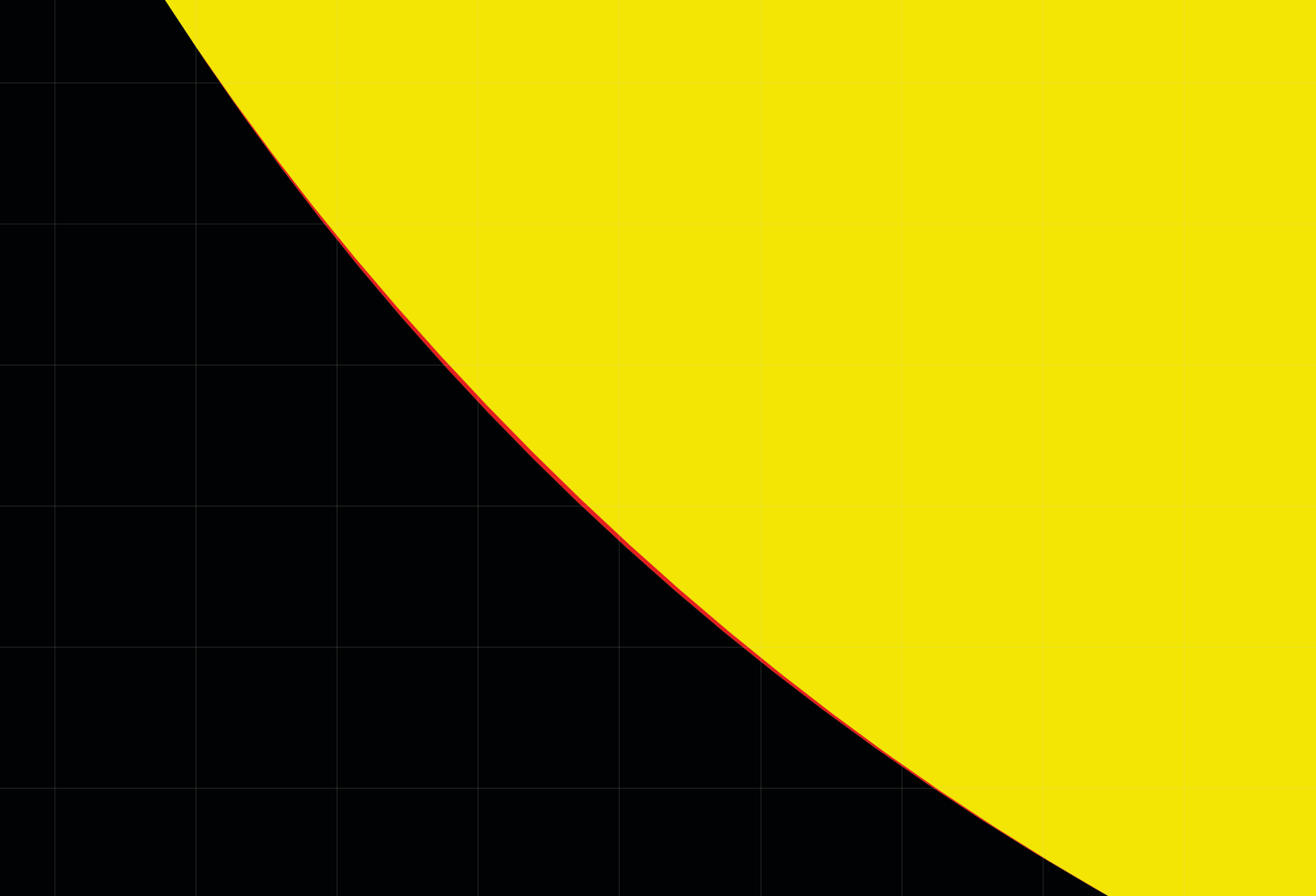
I know this is practically no difference, but to my workflow it really IS a big difference.
In other words - the 3D software still gives me a hard time using the font and much time of work to correct this.
So with no clue where to start i searched the net and found your page here.
And now i am hoping that you guys know whats wrong and how to correct it.
I am not bound to FontForge. If there is a program that does the job, that would be good too.
I only rather fix the font, than to fix every dot manually in the 3D software.
Thank you in advance for your help and your time. I really apreciate it!
Greetings
Reto
i am completely new to Font design. I work in IT and in my free time i am designing and producing adapted products for blind and visually impaired people. My wife is blind, so i have some experience in that field.
There is a Truetype font for wrtiting in Braille. That means i type the text like here and the font creates the dots according to the Braille dots.
I am based in Switzerland, so my native tongue is german and the font i use is the german standard Braille Truetype font.
The problem i am facing now, is that if i write with that font, the dots in the font are not perfectly round. If i want to use them in a 3D Software i face some problems.
So i thought i am a smart guy, and downladed FontForge. installed it, opened the Braille font and saw that the circles where not really exact circles. So i made a test with the letter A and replaced the dot (circle) with a circle i made, holding the shift key while drawing it. So i assume it must be precisely round. I checked it with the position coordinates i saw in Fontforge and it seemed very round. I made a Screenshot and tested it within a Vector Program with an overlayed circle and its completely round.
Then i saved the font and installed it.
When i now use the font in the vector program, the dot (circle) is not a 100% round anymore.
When i overlay it with a perfect round circle i see that there are (very tiny) differences between the font and my circle.
The picture shows the fonts circle in yellow and my reference circle in the back in red.

I know this is practically no difference, but to my workflow it really IS a big difference.
In other words - the 3D software still gives me a hard time using the font and much time of work to correct this.
So with no clue where to start i searched the net and found your page here.
And now i am hoping that you guys know whats wrong and how to correct it.
I am not bound to FontForge. If there is a program that does the job, that would be good too.
I only rather fix the font, than to fix every dot manually in the 3D software.
Thank you in advance for your help and your time. I really apreciate it!
Greetings
Reto
Tagged:
0
Answers
-
Try exporting as CFF based OpenType. You drew the circle using postscript curves and the conversion to TrueType curves will introduce those tiny changes.0
-
In addition to Georg’s suggestion, and in case your workflow requires a TrueType font: increase the font UPM value and scale your outline accordingly. This increases the native resolution of the outline geometry.In a CFF font, you also have the option to use fractional coordinates, but in TTF all coordinates are unitised so the higher the UPM the more accurate the geometry.2
-
It should also be noted that because True Type uses Bezier curves, it is impossible to draw a mathematically exact circle. I believe that's also true for the Adobe alternative that's fallen into disuse. If you need mathematically exact circles - and not a closer approximation, which more points can achieve, you may have to do something different.2
-
Both TrueType and CFF use Bézier curves. TrueType uses quadratic Béziers and CFF (like PostScript) uses cubic Bézier curves.
0 -
But it's true that the usual "circle" tools in font editors or other vector graphics apps don't produce an exact circle. Here the curvature is visualized by different hues (using the Speedpunk plugin in Glyphs). You can see that when you draw a circle using four cubic Bézier segments, the curve is slightly flat at the left, top, right, and bottom points, and at 45°.
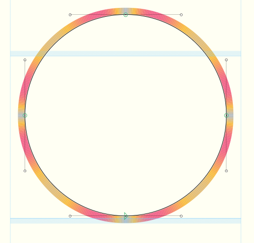
A 3d software works differently, by splitting a circle into a large number of straight line segment. By increasing the number of segments, a true circle can be approximated more exactly.
In a font editor, you could also increase the number of curve segments, but I don't know of any editor that supports that without manual fiddling.1 -
Hello there,
thank you all for your answers.
@Georg Seifert i tried this and the result was better but not enough for the 3D software
@John Hudson tried this too, the original value was 420 i dont know why. tried 4096 as this is the max Fontforge has in its dropdown and it didnt increase the acuracy in OTF nor in TTF
@John Savard yes i do something different. But thats very much work. i use the font, then in the 3D software i make 3 point circles above the original circles and with the middle point i get i make the real circles and delete the 3 point circles and the font circles. this means i have to do this for everything i create. which is triple the work for me.
@Thomas Phinney thanks for your answer too. Sometimes the truth kills the hope one can say reading your answer :-) But i like the truth more.
@Jens Kutilek thats EXACTLY what happens in my case. I can see this exactly at those 45° points. It also seems that the 3D software "knows" its a circle and doesnt care when applying new features to the circle and when it comes from anouther source like an external font it doesnt really know whats the intent of those curves. BUT when i do an svg with a circle in my vector program it also knows its round and it WORKS. When i do it with the font in the vector program, and then i convert it to curves it DOESNT work.... The problem stays with the font i guess.
It seems that what i want is not doable. So i got to stick to the workflow i wrote to John Savard some lines above here.
Or maybe someone has something else in mind?
I saw in Fontforge that one can export it to SVG font. But i dont know what this is and how it would work.
Thanks again to everyone reading and answering my question and i remain with some hope someone has an idea that could solve it.
Greetings
Reto
0 -
BUT when i do an svg with a circle in my vector program it also knows its round and it WORKS.You could experiment with making a font with an SVG table. That format was added to OpenType as one of the mechanisms to support colour fonts for emoji, but you could also use it for single colour shapes and in theory you could embed SVG circles directly in the font and avoid the glyf or CFF table bezier formats.0
-
How about replacing in the font file all the circles with single points* at their centers, and making the circles around them in the 3D software by adding a “stroke weight” or whatever it’s called there?Rae2J said:
Or maybe someone has something else in mind?
* Not sure if 1-point paths can be exported in a font format, but 2 or 3 at the same coordinate should work.0 -
Hello there,
thank you for yours answers.
i will try both suggestions when i can work on it again.
I need to figure out how to build svg tables. i saw that FontForge is not capable of doing so. So i need so time to find that out.
And maybe with the other program i am also able to better test the dot strategy.
Greetings
Reto
0 -
I could swear at one point there was a font editor that drew circles with eight points instead of the typical four—was it Ikarus/Fontmaster? For purposes of truer circles.0
-
I just played around with eight segments in a circle. It is not really helping. The overall roundness is slightly better but when the diagonal nodes aligned with the grid, it adds potentially half a unit to the diagonal diameter.3
-
I have long felt that the OpenType standard (well, actually, I felt this for so long that I felt it about TrueType before there was OpenType) should be extended to include the option of specifying curved segments in characters as conic sections instead of Bezier curves. The option of specifying a hyperellipse so as to get Melior right could even be thrown in. And then there are the Archimedian spirals of Ikarus.Because if you can specify a different mathematical basis for the curve, you can get the curve you actually want while specifying fewer points.It's well known that specifying lots of points has a tendency to produce ugly results. Or am I just imagining that I heard this somewhere?Anyways, if you could specify conic sections, the problem of drawing a mathematically exact circle would be solved.EDIT: I keep forgetting. It wasn't Ikarus, it was a digital font format for the Linofilm typesetter, that used Archimedian spirals.0
-
Since the OP is working in TrueType, a few numbers on the quadratic side.
The usual quadratic circle has 4 on-curve and 8 off-curve points, one segment per 45° with the control points on the tangents. Its maximum deviation from a true circle is 0.31% of the radius. For a Braille dot of any realistic size in a 2048 UPM font that's a fraction of a font unit, so the Bézier itself is not what makes the dots look off. The integer coordinates are: every point is rounded to the grid, which is a ±0.5 unit error, and on a small dot that is larger than the curve error and it's not symmetric, so the dot comes out slightly lopsided rather than just slightly flat.
That's why John's advice to raise the UPM is the right fix here: it doesn't change the curve, but it makes the rounding error smaller relative to the dot. Adding more off-curve points only pays off for circles approaching the size of the em, where the curve error starts to exceed the grid error (which is why FontCreator switches from 12 to 20 nodes at that point).4 -
Conic sections sounds like it could be a helpful idea. But keep in mind: there is a vast installed base of TrueType rasterizers, and it cannot be assumed that more than a limited portion of them would likely ever get updated to support new outline formats.0
-
Peter Constable said:Conic sections sounds like it could be a helpful idea. But keep in mind: there is a vast installed base of TrueType rasterizers,I am well aware of that.and it cannot be assumed that more than a limited portion of them would likely ever get updated to support new outline formats.But although that sounds reasonable, assuming any new OpenType standard included conic sections, I'd expect eventually the next version of Microsoft Windows and the next version of OS X to include support. Given that a computer with an out-of-support operating system can't safely be used on the Internet... while it would take years, it doesn't seem to me to be unrealistic to expect that an upgraded standard would eventually spread to most desktop computers, at least.Of course, there are also smartphones. And maybe some laser printers do rasterization internally?0





Categories
- All Categories
- 47 Introductions
- 4K Typeface Design
- 497 Type Design Critiques
- 591 Type Design Software
- 1.1K Type Design Technique & Theory
- 674 Type Business
- 907 Font Technology
- 29 Punchcutting
- 544 Typography
- 129 Type Education
- 333 Type History
- 82 Type Resources
- 114 Lettering and Calligraphy
- 33 Lettering Critiques
- 81 Lettering Technique & Theory
- 580 Announcements
- 101 Events
- 116 Job Postings
- 176 Type Releases
- 186 Miscellaneous News
- 270 About TypeDrawers
- 54 TypeDrawers Announcements
- 114 Suggestions and Bug Reports