Trade dress lawsuit for ice cream brands – question about fonts as logos

Adam Ladd
Posts: 295
https://www.yahoo.com/news/us/article/the-mistake-that-cost-rebel-creamery-238-million-and-pushed-it-into-bankruptcy-181438719.html
There are various articles discussing this recent event. Some expand on the point that it was the overall 'trade dress' that rendered the successful lawsuit.
If you look in comment sections on sites and social, a number of people just focused on comparing the 'fonts' part of the designs/logos—confused about what's ok or not, and if similar or not.
The case references the overall design executions/shelf presence and a lack of records to show a documented design process by the Rebel brand.
* A tangent, but it does make me consider again how fonts are handled with licensing and execution in terms of logo design/brand marks (e.g. permissions and how 'own-able' they can be).
Curious others thoughts on these matters.
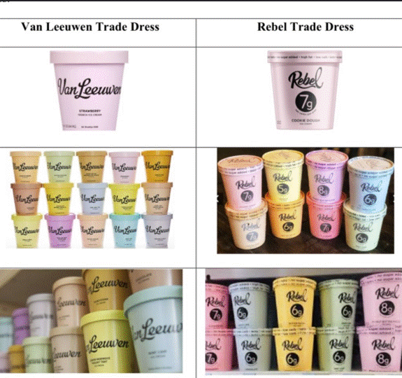
^ a better comparison image from https://www.loeb.com/en/insights/passle/2026/07/court-awards-238-million-over-trade-dress-infringement-claims
There are various articles discussing this recent event. Some expand on the point that it was the overall 'trade dress' that rendered the successful lawsuit.
If you look in comment sections on sites and social, a number of people just focused on comparing the 'fonts' part of the designs/logos—confused about what's ok or not, and if similar or not.
The case references the overall design executions/shelf presence and a lack of records to show a documented design process by the Rebel brand.
* A tangent, but it does make me consider again how fonts are handled with licensing and execution in terms of logo design/brand marks (e.g. permissions and how 'own-able' they can be).
Curious others thoughts on these matters.
^ a better comparison image from https://www.loeb.com/en/insights/passle/2026/07/court-awards-238-million-over-trade-dress-infringement-claims
0
Comments
-
I guess the judge assumed that shoppers are too lazy and/or stupid to notice that one says “Van Leeuwen” and the other says “Rebel” in big fucking letters so that anyone who is barely literate can tell the difference.1
-
The similar colour palette of the packaging is the most obvious problem in terms of ‘trade dress’.8
-
On face value I'm surprised that Rebel lost, but on reading a little this bit seems important:
Rebel asserted that it adopted its packaging in good faith and that any similarities between the products were coincidental. The court expressly rejected that argument after considering the evidence concerning the development of Rebel’s packaging and witness testimony offered at trial.3 -
I've worked in advertising for over 30 years, and with every new product, I had to find a balance: on the one hand, the brand had to stand out from the competition, while on the other, it was necessary to maintain familiar attributes to differentiate the different products in the line. For example, if everyone is accustomed to kefir having a green label and ayran having a blue one, then we should follow this rule, or at least be mindful of it.In the case described above, I see it more as intentional plagiarism of someone else's brand. Or perhaps it's just a tragic coincidence, but typically, a designer would study the brands that would be placed next to each other on the shelf and spot any excessive similarities.3
-
Note that Rebel’s founders designed the “trade dress” themselves, in Illustrator, and had no experience as professional graphic designers.
But this was in 2017, before massive AI use.
Nowadays, I would expect such hands-on/D-I-Y startups to ask their AI to not only design the branding, but also whether it might infringe on that of other brands in the same product sector.
0




Categories
- All Categories
- 47 Introductions
- 4K Typeface Design
- 501 Type Design Critiques
- 593 Type Design Software
- 1.1K Type Design Technique & Theory
- 675 Type Business
- 908 Font Technology
- 29 Punchcutting
- 544 Typography
- 129 Type Education
- 333 Type History
- 82 Type Resources
- 114 Lettering and Calligraphy
- 33 Lettering Critiques
- 81 Lettering Technique & Theory
- 580 Announcements
- 101 Events
- 116 Job Postings
- 176 Type Releases
- 186 Miscellaneous News
- 270 About TypeDrawers
- 54 TypeDrawers Announcements
- 114 Suggestions and Bug Reports