About line spacing
mauro sacchetto
Posts: 393
I did an experiment to adapt a Simoncini font; I'm currently working on Debian Linux with FontForge. But I'm pretty confused.
I've run into a problem with line spacing:
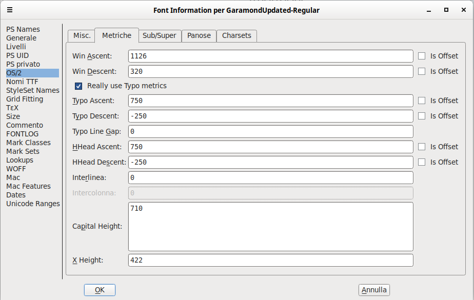
In the texts I type with LibreOffice, if I set the metrics as shown in the image, the lines are extremely narrow, to the point that the capital accents intersect with the descent glyphs. You can see this in the attached image.
However, everything works with other fonts, even though they have completely different settings: Adobe Text Pro sets Typo Line Gap: 200 and Line Spacing: 200, while EB Garamond sets Typo Line Gap: 0 and
Line Spacing: 0:
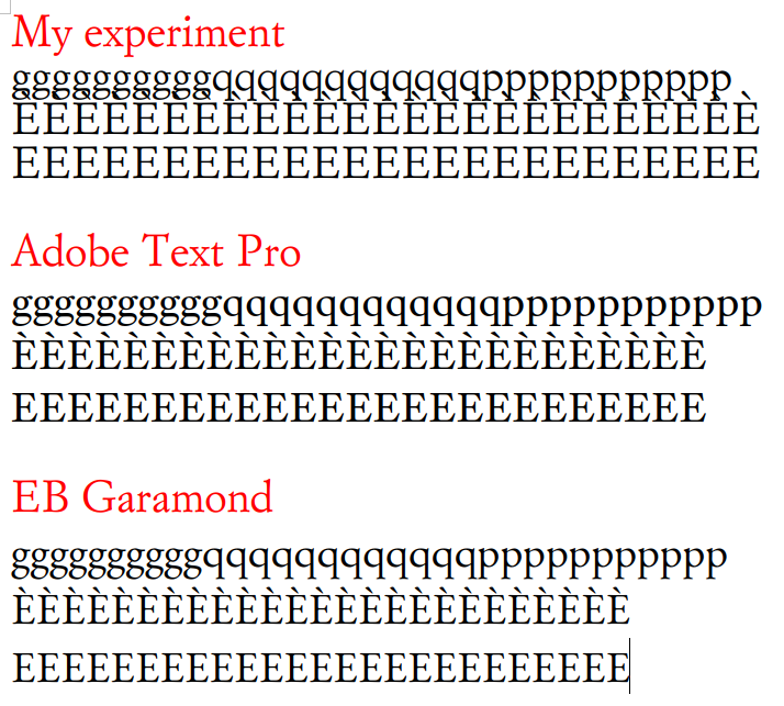
With LibreOffice, the lines are properly spaced only if I set the Typo Line Gap value to very high values (at least 300). If I use the same font with LaTeX with the above settings (and not big Typo Line Gap, but set to 0), however, there's no problem.
Is this problem due to some intrinsic feature of the font, or could it be caused by other incorrect or missing data?
Let me know if any other information might be helpful.
Thanks
m
Tagged:
0
Best Answers
-
I presume you font has a units per em value of 1000. Your metrics ascent and descent values sum to that total, meaning that your linespacing is ‘solid set’, i.e. without interline leading. Typical Latin text fonts usually have built in linespacing of 20% of the em, i.e. an extra 200 units (I prefer 25%).*There are a couple of ways you can address this.1. Add the extra units in the Type Line Gap and Interlinea fields (the former is for the Microsoft OS/2 table, and the latter for the Apple hhea table). This is my preferred way of doing it, because it is what the font spec says these fields are for, even if some software still gets it wrong.2. Leave the Typo Line Gap and Interlinia fields at 0, and add the extra units in the ascent and descent fields. This is what a lot of people do because it provides fairly good compatibility across software that interprets font metrics in different ways. If doing this, you can assign the extra units proportionally to the existing ascent and descent values, which in your case would be 150 units to the ascent and 50 to the descent, or stick them all in one or the other.*Another approach to defining default linespacing is to try to sum the three OS/2 and hhea table metrics to the same height as the combined Win Ascent and Win Descent values, which if accurately set encompass the tallest and deepest glyphs in the font. This is a good approach if you have some tall glyphs that should fit within the linespacing area and not intrude into the space of text above and below.0
-
For method 3, lets assume that your existing Win Ascent and Win Descent values are correct, i.e. that they define, at least, the height of the tallest glyph and deepest glyph in the font family. These values would actually be used for linespacing in some Windows applications if the box to use Typo metrics was not checked, and would be used for linespacing in older Windows GDI environments. So if you wanted to ensure a) that your linespacing provided adequate vertical space for those tallest and deepest glyphs, and/or b) wanted to ensure backwards compatible linespacing in GDI environments, then you would do one of these two things:1. Leave your Typo and hhea ascent at 750 and the corresponding descent at -250, and set the linegap values to 456. i.e. (1126+320)-(750+250).2. Leave your linegap values at zero, and instead add 456 units to your Typo/hhea ascent or descent value, or distribute it between them.456 units of linespacing is quite a lot, approx 17.5pt baseline-to-baseline distance for 12pt text, so it may be more than desired or practically needed if this is a typical Latin text face.Again, all these calculations are predicated on those Win Ascent and Win Descent values being correct.0
-
The xAvgCharWidth field in the OS/2 table is usually calculated by a tool when a font is exported. An incorrect value can mean that it has not been updated to reflect changes in spacing or additional glyphs, or that it has been incorrectly calculated, or that the calculation has not correctly taken into account the table version (the latter is unlikely today, but older versions of the table used a different calculation).0

Answers
-
If I use the same font with LaTeX with the above settings (and not big Typo Line Gap, but set to 0), however, there's no problem.I think LaTeX has its own default linespacing that overrides font metrics.0
-
Method 1) works; I've tried it before. However, this tutorial: https://www.high-logic.com/font-editor/fontcreator/tutorials/font-metrics-vertical-line-spacing advises against this procedure: "Set Typo Line Gap = 0. Rather than adding a separate line gap, fold the extra line spacing you want into the Typo Ascender / Descender values (the Google Fonts convention). Line spacing then equals Typo Ascender − Typo Descender, which is easy to reason about and reproduce."Method 2) also works, and now I understand that it's the one used in EB Garamond.Regarding method 3), I'm not sure what exactly I'm supposed to calculate
 Thanks a lot
 m0
m0 -
Very clear answer.The point is exactly this: is there an automatic way to calculate Win Ascent and Win Descent? Or is it enough to check the highest point of the highest glyph and the lowest point of the lowest glyph? FontForge doesn't do this calculation. As soon as my daughter hands me her Mac, I'll try Glyphs, which seems to automatically suggest these values.Finally, since from what I read, this is mostly a compatibility issue with older versions of Windows, some web pages give the advice (correct or ill-advised?) to skip these values and instead enter "is offset."Thanks!m
0 -
I don’t know what that ‘is offset’ option does. Is it specific to FontForge perhaps? What values gets output to the OS/2 table if you check that option?If getting the Win Ascent and Descent values automatically, bear in mind that you want to set them to cover the tallest and deepest glyphs in the font family, if using them as a reference for linespacing, since you want that to be consistent across the family.The Win Ascent and Descent values, if used correctly in software, define the height beyond which glyphs might get clipped. So it is important that these values do get set appropriately in the OS/2 table.0
-
fontspector will suggest values of winAscent/winDescent to cover the tallest and deepest glyphs. It will also check winAscent consistency across the family.1
-
I have been guilty of the occasional cheat—for instance having the Ascent line trim the top of certain cap accents in the boldest weights.0
-
I dont'k know if "offset" is a FontForge only option: it clears all visible values. I wait to control the .otf in Glyphs too. Unfortunately in Linux I am forced to use only FontForgeThank you, Fontspector seems very useful.It produces the following advice:
<div><br></div><div>WARNChecking OS/2 fsSelection value. <p></p><div>WARNxAvgCharWidth-wrong<p></p><p>OS/2 xAvgCharWidth is 542 but it should be 529 which corresponds to the average of the widths of all glyphs in the font. This may indicate a problem with the font editor or the font compiler.</p></div></div>
What does it mean? I don't find that number in any field! The trouble maybe derives from FF, not because of particular settings. In any case, I used the Fontspector automatic fix.Thank you!m
0 -
So, as Fontspector also warns, I fear this problem may be related to FF. I'll wait until my daughter returns from her trip and try Glyphs on Mac. Then, if necessary, I'll report the issue to the FF developers. Meanwhile, thank you so much for the replies, which were prompt and precise as always.
0 -
There are two different methods for computing the average char width, and I think fontforge uses the old one, not the new one. But I don't actually know of any problems caused by the wrong calculation.1
-
mauro sacchetto said:I dont'k know if "offset" is a FontForge only option: it clears all visible values.A minor note here, but the various "offset" flags here are indeed FontForge-only settings and, as I understand it from reading too much FontForge source, setting each such flag to True tells FontForge to treat the corresponding metric as an offset/delta to the internal metric within FontForge....Those internal metrics are also FontForge-only beasts; I have no idea when or why it was determined that there ought to be yet another ascent/descent value pair, but there we are. FontForge files have an `Ascent` field and a `Descent` that are separate from all of the `hhea` and `OS/2` fields. The only documentation of those fields I recall having seen is that they are "what FontForge thinks the metrics should be."
2 -
Nate: oh wow. I would never have guessed that. Thanks for sharing the info.0




Categories
- All Categories
- 47 Introductions
- 4K Typeface Design
- 501 Type Design Critiques
- 591 Type Design Software
- 1.1K Type Design Technique & Theory
- 675 Type Business
- 908 Font Technology
- 29 Punchcutting
- 544 Typography
- 129 Type Education
- 333 Type History
- 82 Type Resources
- 114 Lettering and Calligraphy
- 33 Lettering Critiques
- 81 Lettering Technique & Theory
- 580 Announcements
- 101 Events
- 116 Job Postings
- 176 Type Releases
- 186 Miscellaneous News
- 270 About TypeDrawers
- 54 TypeDrawers Announcements
- 114 Suggestions and Bug Reports