Mapping parametric font tooling

Carl Enlund
Posts: 20
Hi! I've spent the last few months deep in parametric type and wanted to map what tech is out there. I made a similar thread before about web tools and thought parametric type deserved one too.
I also recently saw this, where an existing font (Inter) is retroactively mapped to a new set of parameters:
https://x.com/DanHollick/status/2082838163605598632?s=20
What else belongs here?
By "parametric type" I mean fonts where changing a variable changes glyph shapes across the whole font.
Variable fonts are of course the standard way to distribute this kind of font, but on the editing side there's a much wider range of tools.
There are full parametric editors like Prototypo, Metafont/Metaflop, Metapolator, Burrowlab, and the more recent Symphonty https://typoland.com
Then there are things like LTTR/INK's engine, and specialized experiments like Spine Sans https://noacubestudio.github.io/spine-sans and Brutalita Sans https://brutalita.com
And local parametric systems inside normal editors, like smart components in Glyphs, and variable components in Fontra.
I also recently saw this, where an existing font (Inter) is retroactively mapped to a new set of parameters:
https://x.com/DanHollick/status/2082838163605598632?s=20
What else belongs here?
3
Comments
-
Possibly Harfbuzz WASM shapers, though I don’t know if that can extend to parameters.1
-
Putting WASM in a font is an enabling technology for full-on programming. So it could enable you to do damn near anything you want. But it is an enabling technology rather than the thing itself.John Butler said:Possibly Harfbuzz WASM shapers, though I don’t know if that can extend to parameters.
So, to make an especially extreme example, if you wanted to put MetaFont capabilities in OpenType, I expect you could actually stick the MetaFont support right inside a single font via WASM and then do the MetaFont stuff right in there alongside that.... Of course it would make for a bigger font.
Note: it would be a non-trivial task to set such a thing up. (Also a fine use case for AI assistance; this is the kind of thing a programmer could leverage AI on and probably do in just a few days instead of weeks or months.)1 -
Just to clarify, the WASM shaper in Harfbuzz only affects the shaping process (choosing glyphs for characters, advance widths and positioning). Its scope is roughly cmap, hmtx, GPOS/GSUB/GDEF. You cannot use it to change the glyph outlines or generate new ones. As such what it can do with parametric fonts is very very limited (apart from my experiments in putting axis variation deltas into the buffer).1
-
I forgot this classic:
LetterModeller
https://www.lettermodel.org/downloads.html
Also found this research, apparently from 1998, that I haven't seen much discussion about.
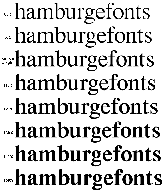
They present a method for extracting parameters from an existing font. Stems, crossbars, bowls, etc.
After which they can derive weight, width and contrast transformations.
https://lspwww.epfl.ch/research/typography/compofont/
https://lspwww.epfl.ch/publications/typography/awmfatpe.pdf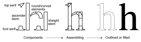
 1
1 -
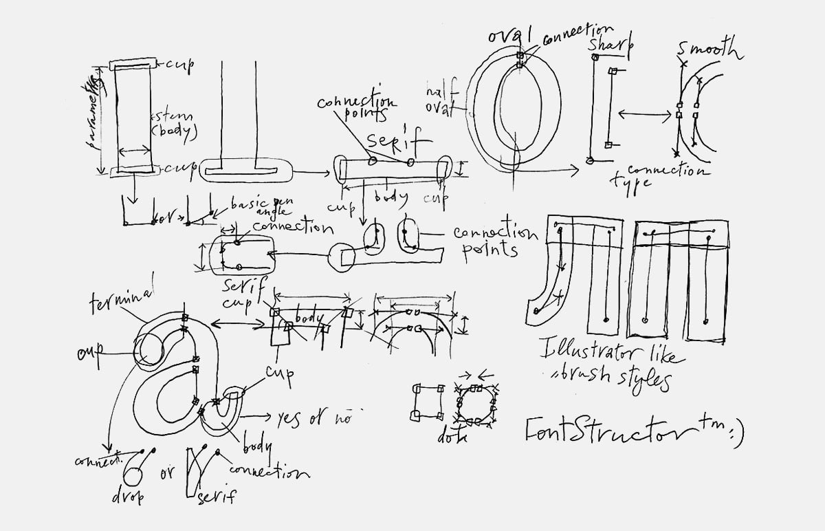
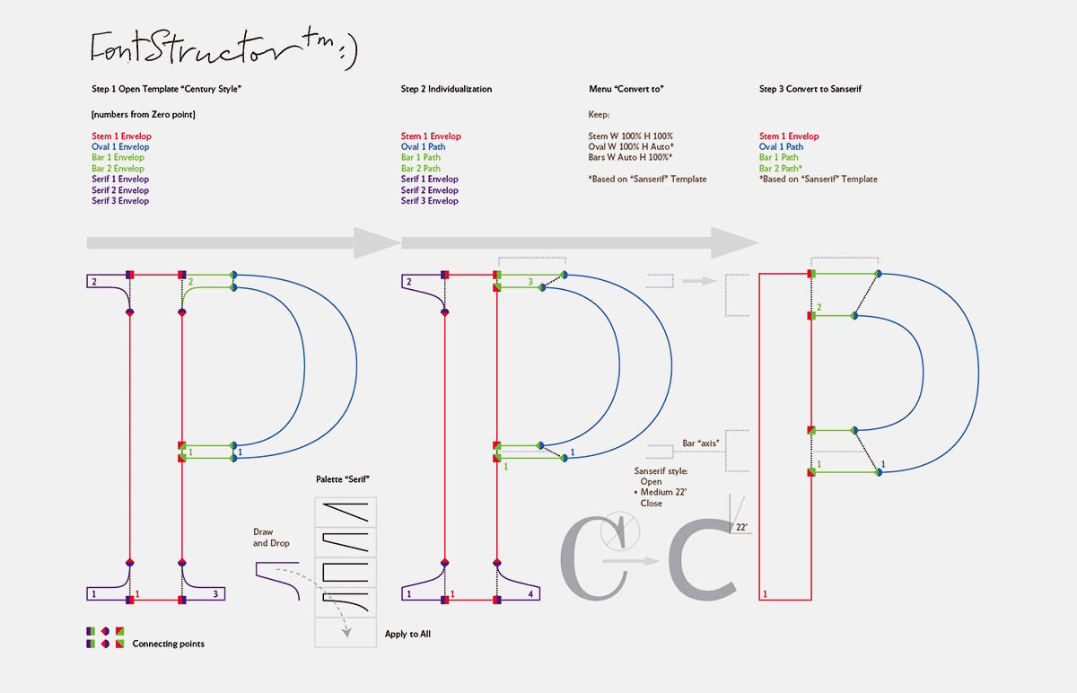
There was a project by Yuri Gordon, Proteus/Fontstructor, and there were even attempts to integrate these developments into FontLab. The idea was to be able to change, say, the appearance of serifs (and even the very existence of serifs) in the entire font with one click of the mouse. Nothing came of it.2 -
@Dsche thanks for sharing. Tools like this don't appear to be very longlived.
0 -
Carl Enlund said:Tools like this don't appear to be very longlived.As far as I understand, two things happened with Yuri Gordon's project:a) the guys at Fontlab created a working prototype and realized that the average computer's processing power wasn't sufficient for a full implementation (this was about 10 years ago), but they incorporated some of the ideas into new versions of Fontlab (Action/Adjust even allows for some control over serifs, the problem is that there's no way to tell the program what's a serif and what isn't).b) Yuri Gordon himself, having probably created a hundred fonts, became disillusioned with modern type, seeing it as overly polished. That is, in his view, imperfections in line, the imprint of individuality, are now gaining value.3
-
We have built a software called Glyphormator, it is a desktop solution which works like LTTR/INK, but more advanced. LTTR/INK is better for ones who want the integration in Adobe Illustrator. Few months ago I invited many designer to try it's beta version in the form of a web app (almost zero showed interest). Glyphormator is primarily created as a realistic calligraphy/lettering tool, but as well can be used for creating characters. If Adam Twardoch would be interested to colaborate, we could implement it as a FontLab plugin probably as well.
I was thinking about making a plugin for Adobe Illustrator, but integrating in the environment which is stuck in the past, and for which they hire 10+ years experience product managers without any knowledge in typography and related, seams a waste of time.
We have parametric tool (still not finished), but oriented to our proprietary engine. You could use created shapes in the existing engines. The problem with most of solutions is that they try to produce something for the engines which are limited in it's core.
I would suggest to all, to start abandoning legacy tech. I am ready to offer the environment to the community, but when mindsets detach from the belief that Microsoft, Apple and similar needs to start changes. Their policy is to wait users to complain and demand features, not to offer features in advance. For all of these years, you can clearly see that typo user experience is their least concern. In the amount we influence changes on the market, they will happen. Users will never demand something they don't know can be better, and our tasks is to present them the problems, and possible solutions.2 -
Yes, parametric font editors often fail if the goal is making something unique or unexpected. Especially if you get bounded to a small design space.Dsche said:
[...]b) Yuri Gordon himself, having probably created a hundred fonts, became disillusioned with modern type, seeing it as overly polished. That is, in his view, imperfections in line, the imprint of individuality, are now gaining value.
I'd rather design something by hand and only later "make it parametric" where it makes sense.0




Categories
- All Categories
- 47 Introductions
- 4K Typeface Design
- 501 Type Design Critiques
- 591 Type Design Software
- 1.1K Type Design Technique & Theory
- 675 Type Business
- 908 Font Technology
- 29 Punchcutting
- 544 Typography
- 129 Type Education
- 333 Type History
- 82 Type Resources
- 114 Lettering and Calligraphy
- 33 Lettering Critiques
- 81 Lettering Technique & Theory
- 580 Announcements
- 101 Events
- 116 Job Postings
- 176 Type Releases
- 186 Miscellaneous News
- 270 About TypeDrawers
- 54 TypeDrawers Announcements
- 114 Suggestions and Bug Reports