Primework

The web doesn't need another HTML replacement.
It needs better tools for the problems HTML and CSS weren't designed to solve.
Primework is a precision rendering framework that complements the web platform. Use browser primitives where they already work well, and use Primework where deterministic rendering, advanced typography, precision layout, and custom rendering become part of the product.
It can be used:
- Standalone
- Embedded in existing applications
- As an overlay where only part of the UI needs precision rendering
No rewrites. Adopt it only where it adds value.
Primework is also an experiment in rethinking rendering on the web. I hope some of the ideas explored here can help inspire future browser engine improvements—so these kinds of workarounds become unnecessary over time.
This is just the beginning, and we would love your feedback.
Check out the project, share your thoughts, and contribute if you're interested.
https://kunstx.online/primework
Comments
-
I tried following the link, but the page fails to load (Zen browser).EDIT: Also fails in Chrome.
0 -
Please wait until sometime today or tomorrow, the namecheap.com provider is under maintenance. We are all discussing the issue and waiting for more info. This is first time happening on such large scale.John Hudson said:I tried following the link, but the page fails to load (Zen browser).EDIT: Also fails in Chrome.
You can check a GitHub repo until then:
https://github.com/kunstx-src/primework0 -
Works now! On my phone, the website is not as flawless as it should be, given the case you are making.
Then again, I'm not sure I understand the problem you are trying to solve.0 -
Same here. That is after both looking at the website and the repo.
There are some specific buzzwords: “deterministic layout, advanced typography, and precision rendering”
I would love to know exactly how, and in what ways, it is more deterministic in its layout, more advanced in its typography, and more precise in its rendering. I don’t mean to suggest it is not these things; there just isn’t enough high-level (or perhaps mid-level?) info provided.0 -
Hi, thanks for trying. Yes today it is back up. What OS and browser are you using? Have in mind that updates are still made and of course many bugs will occur. It is a new project, and it is a very detail project. In any case it would be an overkill to use it just for simple sites, but for any advanced typography layouts, documentation and similar, it is worth to take time with it.Jasper de Waard said:Works now! On my phone, the website is not as flawless as it should be, given the case you are making.
Then again, I'm not sure I understand the problem you are trying to solve.
Please read what I have answered to Thomas, so you can understand with more details.0 -
Hi Thomas, thanks as well for engaging. Please note that this is a new project, very detail project and it is still updated in all aspects, so for sure there is some lack of information or possible bugs. I will try to update with more info on the page and repo itself.Thomas Phinney said:Same here. That is after both looking at the website and the repo.
There are some specific buzzwords: “deterministic layout, advanced typography, and precision rendering”
I would love to know exactly how, and in what ways, it is more deterministic in its layout, more advanced in its typography, and more precise in its rendering. I don’t mean to suggest it is not these things; there just isn’t enough high-level (or perhaps mid-level?) info provided.So deterministic layout basically means that if you give it the same inputs, you get the exact same output every single time, in every browser, because Primework is doing the layout math itself in JavaScript instead of handing that job off to the browser's own layout engine, which makes a bunch of judgment calls under the hood that you don't really control.
A good example of this is CSS's line-height: normal, which people assume is some fixed multiplier like 1.2, but it's actually not specified as a fixed number at all, the spec leaves it up to the browser and the font to decide. Primework's lineSpacing value, on the other hand, is just a plain multiplier, size times lineSpacing, nothing fuzzy about it, no browser discretion involved. There's no "normal" in Primework, every spacing number is a formula you can literally read off the node definition. The other piece of this is that because the whole layout gets solved algebraically from the constraint tree before anything ever gets painted to the screen, there's no reflow step afterward. Nothing shifts around as fonts finish loading or as content streams in, because nothing streams in, you declare your constraints up front, the solver resolves them once, and that's it. That's actually the root cause of most of the classic CSS layout-shift problems, fonts swapping in late, images without declared dimensions pushing things around, that kind of thing. It's also why Primework asks you to be explicit about sizing upfront, which is really the tradeoff you're making in exchange for that determinism.Advanced typography claim is about Primework measuring actual font metrics instead of relying on CSS's blunter tools. So for instance you can size text by cap height or x-height or ascender instead of only ever sizing by the em square, which is what CSS font-size does, and the em square includes a bunch of invisible space above and below the letters that varies quite a bit depending on the typeface. That's actually why heading1 defaults to using cap height instead of the em box. There's also proper optical centering going on, when you center text vertically inside a button or link, Primework is measuring the real ascent and descent of that specific font and centering based on those actual numbers, rather than leaning on CSS's line-height-based centering, which is a well known approximation and not true optical centering. And there are these spacing reference options that let you measure the gap between two elements relative to an actual letterform feature, like the baseline or the cap height or the descender, which is just something CSS margin can't do, because margin always measures from the edge of the content box, never from an actual point on a glyph.
And then precision rendering really just means that the layout math and the actual painting are the same operation. Text and shapes get placed at exact computed canvas coordinates instead of going through a browser's own text flow and box model and subpixel rounding, which can behave slightly differently depending on which rendering engine you're using. I do want to be careful not to overstate this one though. This is precision in position and spacing, not precision in how an individual letter gets rasterized. The actual edges of a glyph still get anti-aliased by whatever font rasterizer the OS or GPU is using, and that's true whether the text is sitting in a canvas or in a div, Primework has no control over that layer, and it would be misleading to imply otherwise. What it does control is everything upstream of that, where a glyph starts, how wide a line ends up being, where the next element begins, and all of that gets computed once and deterministically instead of being resolved through the browser's own layout algorithm.
We would be flattered if the actual browser engines would inherit this system and implement it in it's core. Until then we made Primework to solve detial problems.
If there would exist interest, we would as well implement our custom multilingual engine, which doesn't use OTF, TTF and other current formats and can present all complex scripts.1 -
You’ve mostly talked about this in terms of text layout. Does the deterministic precision apply to graphics also? The language you are using reminded me of Nick Sherman’s longstanding challenge for someone to be able to render an image of a dollar bill at actual size in a browser (as measured on screen) without knowing the output device. If you’re doing your own math, perhaps Primework can do this?0
-
Graphics in the relation to the layout, but not in that way. Now you went into totally another field of calibrating the view for the real document presentation. Even certain workflows with Primework would be for printed documents or media, I don't think such kind of verification would be necessary for the users.John Hudson said:You’ve mostly talked about this in terms of text layout. Does the deterministic precision apply to graphics also? The language you are using reminded me of Nick Sherman’s longstanding challenge for someone to be able to render an image of a dollar bill at actual size in a browser (as measured on screen) without knowing the output device. If you’re doing your own math, perhaps Primework can do this?0 -
A good question to ask of any new technology is "what problem does this solve that I can't solve already?"
A good way to document any new technology is to show examples of that problem and how the technology solves it.11 -
There will be examples. A day has only 24 hours. In regards to the problems, you probably didn't work much with front-end or with digital documentation, or don't understand certain typography parameters. The problem is that the whole digital text environment is organized and developed by software engineers, developers, tech teams in general, without typography professionals teams.Simon Cozens said:A good question to ask of any new technology is "what problem does this solve that I can't solve already?"
A good way to document any new technology is to show examples of that problem and how the technology solves it.0 -
You “probably” ought to look up the background of the person you are saying “probably” doesn’t know a bunch of things.
8 -
Me saying probably is a way being polite, because he is coming into conversation as a cowboy and showing that he actually doesn't know, or trying to sabotage the tech progress. Just because he created SILE, it doesn't mean he can claim such an ego trip that he solved all problems, while he didn't solved them even in his SILE. So I don't need to check up the background, it's that some people need an ego therapy.Thomas Phinney said:You “probably” ought to look up the background of the person you are saying “probably” doesn’t know a bunch of things.
0 -
When someone actually doesn't know, it's a positive ignorance, when someone does know very well, but speaks opposite (for any of possible reasons) is the most ignorant and corrupted.Thomas Phinney said:You “probably” ought to look up the background of the person you are saying “probably” doesn’t know a bunch of things.-1 -
It can happen that people misread tone in online conversations, and I think that has happened here. I hope you can re-read Simon's post with a presumption that his intentions are constructive (as his contributions unfailingly are in my experience) rather than sabotaging. The question he asked is one that should shape the actions and communications of every entrepreneur.kunstx said:Me saying probably is a way being polite, because he is coming into conversation as a cowboy and showing that he actually doesn't know, or trying to sabotage the tech progress. Just because he created SILE, it doesn't mean he can claim such an ego trip that he solved all problems, while he didn't solved them even in his SILE. So I don't need to check up the background, it's that some people need an ego therapy.6 -
It is possible, but we evaluate stances by the apparent, not by the inner intentions. If so, he will explain broader, but for me at this state, I see it as a person who just rushed to comment dismissively with a presumption that it is not possible that someone made a solution, and which is worse expressing as there are actually no problems to solve. He didn't even had time to properly analyse the project. If he did, then again even worse, since then he is clearly acting on certain agenda to reject the speech on the existing problems.Craig Eliason said:
It can happen that people misread tone in online conversations, and I think that has happened here. I hope you can re-read Simon's post with a presumption that his intentions are constructive (as his contributions unfailingly are in my experience) rather than sabotaging. The question he asked is one that should shape the actions and communications of every entrepreneur.kunstx said:Me saying probably is a way being polite, because he is coming into conversation as a cowboy and showing that he actually doesn't know, or trying to sabotage the tech progress. Just because he created SILE, it doesn't mean he can claim such an ego trip that he solved all problems, while he didn't solved them even in his SILE. So I don't need to check up the background, it's that some people need an ego therapy.
This happens every time when problems are mentioned. It is like a Stockholm syndrome in the font tech. "Don't mention problems, there are improvements, it is hard to migrate or change, leave it as it is", - something like this. They are protecting the delusion, so they don't have to regret all these years of lame technology, for which there was no technical reasons, only wrong decisions.
It is ok to make wrong decisions, but it is not ok to reject proper ones.
At the end, he is commenting for the tech which is primarily created to solve digital typography problems, in the browser environment, (even solving for printed media) and instead of asking what he doesn't understand, acting as he did, while clearly he has no proficiency in frontend related tech. His own websites shows that, in the structure and accessibility. That is a prolongation of the other side of the tech industry problems, where software developers, engineers, programmers, whatever; think that plugging in the logic into any slop on the frontend is a project done.
In any case, thank you for trying to mediate, I don't have problems to say I am wrong when proven so, but as well there is an experience when ever writing on similar issues, and as well no time to guess. Who ever writes something, let him elaborate on his thoughts and intentions.
0 -
You do have some very fair points here:
- Programmers are generally awful at user experience and front-end.
- I specifically am awful at user experience and front-end.
- I'm aware that I do have ego problems, and this can sometimes be expressed as a competitive and dismissive attitude towards other people's projects. (Sorry everyone - working on it, I promise...)
I'd love better web typography. I attempted to properly analyse the project; I read the source code and the docs to Primework. But that was not enough for me - perhaps I'm being slow, perhaps because I'm awful at user experience and front-end - to work out what problems this was trying to solve. Or rather, how it would help to solve those problems. In fact, you know yourself that it is not enough, because you are now working on better docs. That's great! I look forward to reading them.
5 -
Please then next time write as so and similar, so we avoid long rants, debates, people coming in taking sides, etc. It's not about you, me, or anyone's personality, but about making the tech better and at the end with optimal options in all fields.Simon Cozens said:You do have some very fair points here:- Programmers are generally awful at user experience and front-end.
- I specifically am awful at user experience and front-end.
- I'm aware that I do have ego problems, and this can sometimes be expressed as a competitive and dismissive attitude towards other people's projects. (Sorry everyone - working on it, I promise...)
I'd love better web typography. I attempted to properly analyse the project; I read the source code and the docs to Primework. But that was not enough for me - perhaps I'm being slow, perhaps because I'm awful at user experience and front-end - to work out what problems this was trying to solve. Or rather, how it would help to solve those problems. In fact, you know yourself that it is not enough, because you are now working on better docs. That's great! I look forward to reading them.
I just released the project, so yes of course it needs more updates in docs, examples/showcases, and the code itself. I made it opensource for that reason, that people engage as well, and that they research, build, grow and that at the end the framework itself is not necessary. The end result should be browsers supporting all that can be.
In regards to the frontend. It is a necessity that every font tech professional and designer, understands the frontend, since it's just a one more media, and the most used media. It is the paper of today. If typeface designers, font tech developers and other, don't understand the problems in the most used media for text, then we can't have progress.
The very important point, is that today we are absolutely not limited by the decisions of big corporations. We can edit, change, influence and revolutionize typography products. Yes, in someway at the end it is not a matter of life or death, but then let's just use console output, bitfonts, matrix printers etc. A world can function on basic levels, but when certain groups claiming advanced products, when we witness them being broken, and we can fix them, lets fix them.1 -
When I mention frontend, it's not just the browser based frontend, but any frontend across different OSs on desktop solutions, mobile and tablet devices, embedded solutions, kiosks and signage systems, static displays. etc. Any text output running on a certain system. It is the most used media besides paper.0
-
Before anything else, I should say that I am not a web-platform or browser-layout expert. There are people here who know much more about these things than I do, so I may be getting some technical details wrong. I am mainly trying to understand what Primework is doing and what problem it is trying to solve. So, please correct me where needed: I could well be missing the point as easily as Florence Foster Jenkins missed a pitch.
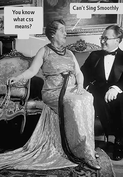 One thing I am still trying to understand is the phrase ‘measuring actual font metrics’. As I understand it (with the help of Chattie), Primework uses Canvas TextMetrics, including glyph-bounding-box measurements obtained from selected character sets, to derive several typographic quantities, such as cap height, x-height, ascender, and descender. I especially wonder what ‘actual’ means here. These are measurements derived from particular glyphs, using choices made by Primework, and are not necessarily the same as the corresponding metrics encoded in the font. Will they always correspond to what a typographer would consider the relevant measurement?
And the main question, for those who understand this much better than I do: since these measurements come from the browser’s Canvas text-measurement implementation, can they differ between browsers or platforms because of differences in the underlying text implementation? If so, how does that fit with Primework’s aim of deterministic layout? After all, deterministic calculation is not the same as deterministic rendering across platforms.
The other thing I wonder about is where Primework needs to sit in the stack. As I understand it, Primework is not intended simply as a replacement for HTML and CSS, but introduces a separate rendering/layout layer alongside them. However, could some of what Primework does happen before CSS? In other words, could it describe things in terms of cap height, baseline, font measurements, and other typographic relationships, calculate the geometry, and then generate HTML/CSS? That would also avoid having to do this work at runtime.
CSS can already handle fractional values, so I do not think numerical precision itself is the issue. Perhaps some of these ideas could eventually become CSS primitives. CSS is already gaining more font-relative units and other typographic features. If Primework is identifying useful typographic relationships that CSS cannot currently express, perhaps some of these could eventually become part of CSS itself?
From my own experience, ordinary web design is usually not about asking whether the cap height is exactly 40px from an edge. It is more often simply: does this look right? You adjust font size, line-height, margin, padding, gap, etc., and move on. I do not necessarily see that as a crude workaround. It is also one of the strengths of CSS: you describe the relationships you want, and the browser deals with a huge amount of complexity underneath.
So, for me, the interesting question is not whether Primework is ‘more precise’ than CSS. It probably is in the areas it chooses to measure. The question is where that extra precision is actually useful, and whether it needs a separate rendering system or could instead become a higher-level way of describing typography that ultimately uses the existing web platform.
To conclude, one small observation from someone who has been around TypeDrawers for quite some time: when I posted my FontEnigma project, I also received some comments that were quite critical and I actually enjoyed reading them. Some made me reconsider things I had overlooked.
I think this is one of the good things about putting a project up for discussion here. People will inevitably approach things from different backgrounds, misunderstand things, or make assumptions. However, that can be valuable feedback too. It can show where an idea needs more explanation, or where a claim may be understood differently from what was intended.
And perhaps one other thing: the fact that I do not experience a particular problem myself does not necessarily mean that the problem does not exist. It may simply mean that I have different requirements or have found a different way of working around it.5 -
Hi Frank, thanks for the extensive overview and your interest. You asked that question right in the middle of a work session where I was updating exactly that part of the project. Yes, glyph measurements can genuinely vary by rendering engine and OS font fallback, that is why Primework has an opt-in method, loadFontMetrics, that reads a font's actual OS/2 table directly instead of estimating cap-height and x-height from how the browser happens to rasterize a reference glyph. It uses opentype.js to parse the real font file bytes. This directly addresses the thing you pushed on: since it's reading the same declared numbers out of the same file, two different browsers parsing that file get identical results, because it's the same parsing code running in both, not two different native rendering engines making their own judgment calls.
It comes with its own real limitation, the parser can't read WOFF2 files without an external decompressor, so it specifically needs a TTF or OTF copy of the font, even if you're still serving WOFF2 for the actual page rendering elsewhere.
The numbers themselves could differ by rendering engine without using this opt-in available.
The other thing I wonder about is where Primework needs to sit in the stack. As I understand it, Primework is not intended simply as a replacement for HTML and CSS, but introduces a separate rendering/layout layer alongside them. However, could some of what Primework does happen before CSS? In other words, could it describe things in terms of cap height, baseline, font measurements, and other typographic relationships, calculate the geometry, and then generate HTML/CSS? That would also avoid having to do this work at runtime.It's not possible to prerender something and that CSSOM presents it like that, it is not possible to live edit the actual rendering system of the browser. Primework is a canvas based layer, which has html aliases for accessibility. Browsers are not like software with plugins you can edit. Only changes can happen on the build itself. That is why browser developers need to implement proper text rendering options so we don't have to create solutions like Primework.
The problem is that there is no proper cooperation between browser development teams and typography experts on that scale. Their decisions as well are slow, and the whole ecosystem is not organized in the best way.
Primework is something we released based on the engine already implemented in our Pub Suite. It has an another branch of a custom engine, which doesn't work with OTF, TTF or any standard formats, but our proprietary, which are constructed to support all world scripts and allow plugins production.
I don't mind constructive criticism, just that before in the past, I had been attacked in the way as if I am speaking some nonsense or imagining problems, by people who pretend there are no problems. Especially now since this is an open source project, contributions are very welcome.0 -
Hi Zlatan, thank you very much for the extensive explanation. That clarifies the issue considerably.
Regarding reading the vertical metrics directly from the font tables: with OS/2 version 2 and higher, sCapHeight and sxHeight can, of course, be read directly. For ascender and descender, however, things are less straightforward. As you know, sTypoAscender/sTypoDescender, usWinAscent/usWinDescent, and the hhea Ascender/Descender values have different purposes, and fonts do not necessarily use these values in the same way. There are webfonts where the different vertical-metric fields have been made identical, for example based on the usWin values.
So which values does Primework consider authoritative for ascender and descender? Does it use the sTypo values, the usWin values, the hhea values, or some combination or fallback logic? Also, although I would not recommend it, these values can theoretically differ between different weights or styles of a type family. Does Primework therefore treat the metrics as properties of each individual font file rather than of the family as a whole?
One thing I am still not quite clear about is the distinction between Primework’s calculations and its rendering architecture. If Primework can calculate these typographic relationships from the font data, I do not see why those calculations necessarily have to be tied to the canvas-based runtime. For layouts where the result is known at authoring or build time, could the same calculations not be used to generate ordinary HTML/CSS? The browser would then still do the final rendering, but the values supplied to CSS would have been calculated by Primework rather than approximated manually.
The question, then, is whether Primework’s calculation engine needs to be the same thing as its rendering engine. Or am I simply underestimating the complexity involved in getting the calculated result into ordinary HTML/CSS?0 -
@LeMo aka PatternMan aka Frank E Blokland you caught something I'd genuinely missed. Of everything in this project, the ascender/descender resolution was the piece I'd spent the least time actually researching, and it showed. I'd read one field, sTypoAscender/Descender, used it unconditionally, and moved on without checking whether the font was even telling me that was the right one to use. It happened to produce the correct numbers for the fonts this project actually uses, but only because those specific files were built so their different metric tables agree with each other. That's luck, not a design decision, and your question is what made me go back and actually look at it properly rather than let it sit.
Here's how it worked before: sTypoAscender/Descender, full stop, no flag check, no fallback, nothing else considered. hhea was read elsewhere for a different purpose, but never brought into this decision. usWin was never touched at all. If a font's sTypo fields happened to be missing, or if a font used usWin as its real intended metric for some reason, there was no path that would have caught that, it would have just silently fallen through to a hardcoded 0.8/0.2 ratio guess.
I updated and it now checks the font's own OS/2.fsSelection USE_TYPO_METRICS bit first, which is the actual spec-sanctioned signal for which field the font wants trusted, exactly the mechanism you were pointing me toward. If that bit is set, it uses sTypo. If not, it falls back to hhea, since that's the more conservative, more widely-honored default historically. Only if both of those are somehow missing does it reach for usWin, and even then it's treated explicitly as a last resort, with a comment in the code saying why, since that value tends to overstate true line height. I didn't just wire this up and assume it was right. It is verified by pulling the real IBM Plex Sans and IBM Plex Mono files, confirming they both carry that USE_TYPO_METRICS flag, and calculating what a layout height should be under the sTypo hypothesis versus the usWin hypothesis, then checking that the actual code output matched the correct one and not the other.
In regards to your per-file question, no, it's currently per-family, not per-file, and that's a real gap - now I fixed that too. You can now register metrics for one specific weight of a family, without it silently overwriting or being applied to every other weight.
One thing I'm not pretending to have solved is that variable fonts can theoretically vary these same metrics across their weight axis using a MVAR table, and I checked the actual parsing library this depends on, and it doesn't read that table at all. So that specific kind of variation is still invisible to this, and fixing it properly would mean writing a parser for a table, which is more than I'd want to take on without knowing it's actually needed for a real case first. I could make it in the future, but in any case I plan that the branch with proprietary engine would become more used when released, so no reverse engineering is necessary.
Appreciate you pushing on this one specifically. It was the thin part of the implementation, and now it's better with your help.
If you would like to cooperate on Pub Suite and other projects I built, it would be my pleasure. I am already quite burned out in last year, working 9 to 5 in a company as a software developer, and in free time running these projects with Kunst X. There is a whole ecosystem related to this, I still didn't present all.
Oh and the second part of your question. Figuring out where things go and actually drawing them are already two separate steps, not one fused operation. Canvas is used as we could say virtual environment, which bypass the recalculation of each html node, which would be problematic with CSSOM, and optimizing all relations, which would often brake. Easiest for you to see the problems of CSSOM is to analyse it's line-height property, it is not actual typographic line height, but the height of the element, which translates into agony when trying to faux the real typographic behavior. There are many tries of making baseline alignment with CSS, which all fail at the end.
*Commented using a help of Anthropic Claude Sonnet 5, or as in the dev community known as Not a Claude Code. Claude Code is a terminal based agent tool.0 -
This is just 100% a Claude Code response (except for the last two paragraphs). Wow.1
-
It's not a Claude Code response but a Claude processed response, and the problem is? First learn what is Claude Code and what is Claude, and then comeback with some useful contribution. I am a one man band, so please tell me that upon everything I do, I need to fulfill your desires and wishes after a hardworking day as well?SCarewe said:This is just 100% a Claude Code response (except for the last two paragraphs). Wow.
It seams you have so much free time and instead of contributing to the world with something useful, trying to belittle people.
0 -
Hi Zlatan, I am glad my comments were a bit helpful. As for participating, I am already happily swamped with my daily practice and always short of time.
By the way, the Pixar short One Man Band from 2005 is one of my favorites and always cheers me up.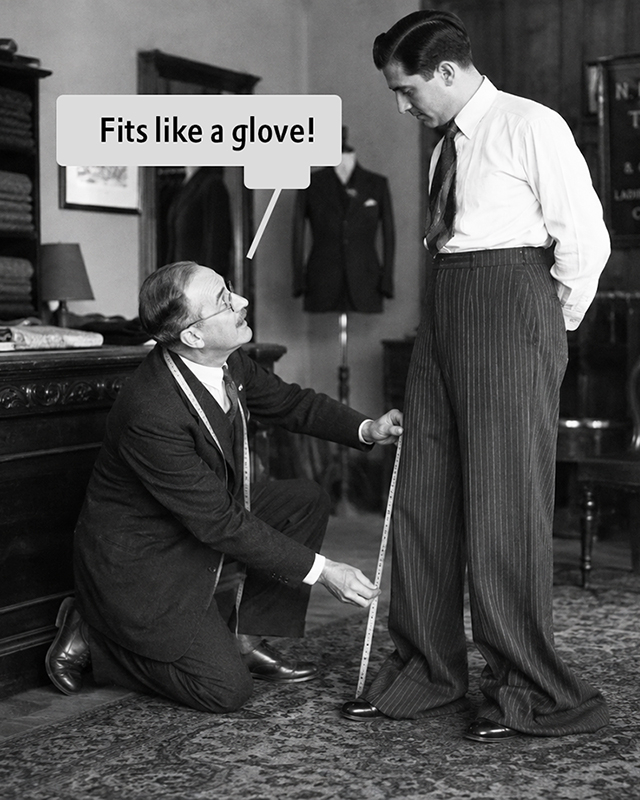 [Chattie Images]0
 -
@LeMo aka PatternMan aka Frank E Blokland Not a bit, but much of a help. I am sorry but I don't understand the analogy from the meme, it's in a relation to?
One thing I would like to emphasize, is what I always comment on your posts at LinkedIn. The mindset attached to the typesetting era. If you would consider to start speaking on it, I believe that the community would understand problems more clear.
Gutenberg, woodblock setters and other, didn't have a choice. I mean they had as well, but it would be unrealistic to expect from them realizing it all in their lifespan. Later generations did have more capabilities to split from the limiting practice, but they continued with just replicating the same system, which should have been abolished even with typesetting machines, what to say with photo typesetting and especially with digital tech. So until today the em square stayed as a reference placeholder, and causing all the mess in relations, units, layout constructions, etc. It's time to accept that we are not laying typesetting blocks of characters, nor engraving ones. When typographers' minds go out from the boundaries of a "lego brick" like system, then the issues will hopefully vanish.
I believe that with few posts in the community (if understood and accepted) and few more solutions, until the end of the next year, the whole world can accomplish the most complete typography system in all world scripts, with all complex features, on almost all devices and media.
It would as well expand the typeface design market itself, designed products, supreme user experience, and informational revolution. It's a win win situation for everyone.
In regards to your letter composition reconstruction research, It is always interesting to learn from it, but to add what I as well comment, that we need to emphasize the starting point, which is a writing media nib shape. Of course, there are no rules you "must" follow, but for the consistency, the proper relation inside the characters relations, this is the most ignored feature which is a basis of letter construction. At least for the styles which are in the reference to such media used in written manuscripts. We can refer the construction process to a pre calligraphy era, or invent new styles, but always to clean reference system will save designers and consumers from headaches.0 -
Hi Zlatan, the meme-message in this case is that ‘measuring actual font metrics’ very much depends on what you measure. If you, for example, measure sTypoDescender with USE_TYPO_METRICS enabled, that still does not tell you whether its value is representative of the actual vertical extents of the design.
As for the other subjects you bring forward, I will be brief. They are off-topic and could easily lead us into an endless discussion which, although interesting, is unlikely to result in an agreement. I reckon we approach these matters from rather different perspectives.
The important thing, in my opinion, is to keep two things separate: historical foundations, which I have researched, and personal views on the direction in which type design and related technology should develop.
As for writing and its relationship to movable Latin type, I describe this extensively in my dissertation. A central point in my argument is that the required systematization and standardization was already intrinsic to Carolingian minuscule and its derivatives, as recorded in the LetterModeller application.
Writing and typography share the creation of patterns, but there is a quintessential difference: in writing, space is defined by pen strokes, whereas in type, the space allocated to each character is defined by its side bearings. These boundaries have no equivalent in calligraphy, but are required by the rectangular paradigm.
That does not mean that we should regard the rectangular paradigm as a fixed recipe for the future. If you or anyone else comes up with something demonstrably better, I reckon the majority of participants here on TypeDrawers and elsewhere will happily embrace it.
I wish you a lot of success with all your endeavours!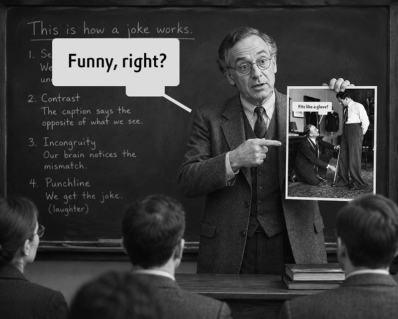 [Chattie Images]0
 -
@LeMo aka PatternMan aka Frank E Blokland Oh but the measure sTypoDescender with USE_TYPO_METRICS is now updated as feature not the as the foundation of truth. Vector-outline measurement is processed further, and as well the canvas render (which can variate in certain unnoticable amount based on the rendering engine behavior). But in any case for Latin based scripts it's not so important, since the line height is measured from baseline to baseline, and margins from baseline, and from x height, with regular text (Where cap characters are few), and in all caps examples from baseline and from cap height. This is the best performing optical case. Em is allowed as the choice for those who want to continue legacy of confused parameters (and that was the main direction of the other subject, and less about construction elements).
Even the text highlight is allowed in multiple options, from ascender to descender, from cap height to descender, from cap height to baseline and from x height to baseline. (I hope I didn't miss some).
But that is all for this reverse engineering or adding on top of existing engine. When user community hopefully accepts the new engine we are building, it will be the end of existing engines and it's limitations.
In regards to analysing calligraphy vs movable type design, there is more understanding needed, since even in your Lemo method, you are approaching strokes only with linear movement. Characters are composed by rotatable movement, and not just in 2 dimensions. In the similar mindset Erik Spiekermann claimed dot foundation is a round shape, which is not correct.
Thanks, to you as well I wish further success.
P.S.
Yes, funny 0
0 -
kunstx said
It's not a Claude Code response but a Claude processed response, and the problem is?7. Use of A.I.
From the TypeDrawers rules.
If A.I. is used in your post, it must be clearly labeled. Failure to do so will result in deletion of your post and/or banning.6


Categories
- All Categories
- 47 Introductions
- 4K Typeface Design
- 497 Type Design Critiques
- 591 Type Design Software
- 1.1K Type Design Technique & Theory
- 674 Type Business
- 907 Font Technology
- 29 Punchcutting
- 544 Typography
- 129 Type Education
- 333 Type History
- 82 Type Resources
- 114 Lettering and Calligraphy
- 33 Lettering Critiques
- 81 Lettering Technique & Theory
- 580 Announcements
- 101 Events
- 116 Job Postings
- 176 Type Releases
- 186 Miscellaneous News
- 270 About TypeDrawers
- 54 TypeDrawers Announcements
- 114 Suggestions and Bug Reports