Critique on accents and special characters for slanted font

JanetLanier
Posts: 7
This is my first font. It's a handwritten script font called Gentle Hands. After receiving feedback on another post about my accents being too far left, I researched and tried to find guidelines for where exactly an accent should be placed over a letter. I set a slanted guideline at 67º which is the Glyphs slant angle of most of my letters. I placed the guideline over the visual center of each letter and centered the accent over that guideline so that its placement continues the slant of the letter. Sometimes deciding where the visual center of certain letters should be was challenging. I also received suggestions that the Thorn is rather plain compared to the other letters. I'm assuming the thorn fits in but the Thorn needs to be addressed. I'm mostly interested in feedback on the accent placements. Thank you!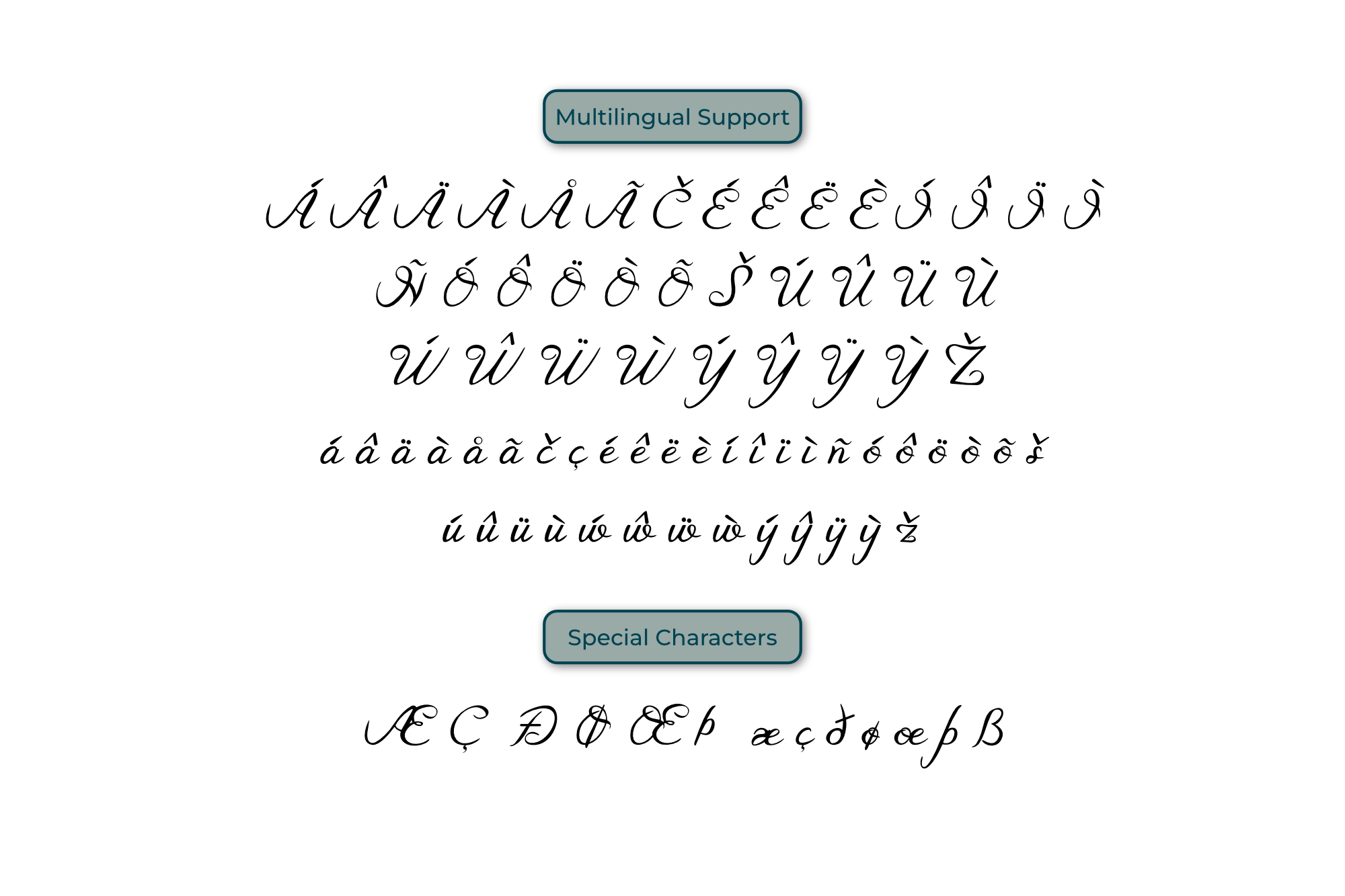
Tagged:
0
Comments
-
Positioning isn’t bad, though your graves need to come a bit left and your acutes a bit right.
Design wise, compared to their current designs, the dots of the dieresis should be the same height, but the other diacritics should be slightly slanted to the right.
On the caps, most of these seem a bit small and/or light — except the caron and circumflex. The dots of the dieresis are way too close together, and could be heavier as well.
Contrariwise, many of these are too big and/or too heavy for the lowercase.
It is not unusual to have two sets of accents, one for caps and one for lowercase. But in this typeface with its tiny x-height, having two sets is pretty much a necessity.2 -
I recommend using sample words, such as l’élève (which is good for forming a relationship between the apostrophe and the acute/grave) and Brasíl.
Note that your acute is “upside down”—the sharp point is usually better at the bottom.
I like the different heights of the dieresis dots—a nice touch.3 -
Nick Shinn said:I recommend using sample words, such as l’élève (which is good for forming a relationship between the apostrophe and the acute/grave) and Brasíl.
Note that your acute is “upside down”—the sharp point is usually better at the bottom.
I like the different heights of the dieresis dots—a nice touch.
Thanks Nick. Wow, I can't believe I had the acute upside down. I think when I was creating these, I was thinking more of a pen stroke where the pen starts thick and trails off as it goes to the right but you're right I had it upside down. I wasn't sure on the dieresis being different heights. I think if I had more of a bouncy fun font, it would fit into the style so I think I'm going to make them level as Thomas had suggested but keep the idea for a future font. Thanks for the feedback!0


Categories
- All Categories
- 47 Introductions
- 4K Typeface Design
- 497 Type Design Critiques
- 590 Type Design Software
- 1.1K Type Design Technique & Theory
- 674 Type Business
- 904 Font Technology
- 29 Punchcutting
- 543 Typography
- 128 Type Education
- 333 Type History
- 82 Type Resources
- 114 Lettering and Calligraphy
- 33 Lettering Critiques
- 81 Lettering Technique & Theory
- 577 Announcements
- 101 Events
- 116 Job Postings
- 174 Type Releases
- 185 Miscellaneous News
- 270 About TypeDrawers
- 54 TypeDrawers Announcements
- 114 Suggestions and Bug Reports