The Place of the Low-waist 'a' in Modern Latin-Based Fonts

Dsche
Posts: 31
First of all, I want to apologize for any possible mistakes in my English, but I hope I can still formulate it clearly.
In his latest work, Carl Dair depicted the lowercase 'a' as follows:
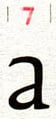
We observe a narrow sign with a diagonal stroke connected to a vertical stem noticeably below the optical midline. The back is slightly, but still noticeably curved. In other places the glyph is depicted in a similar way:
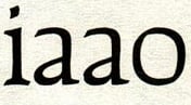
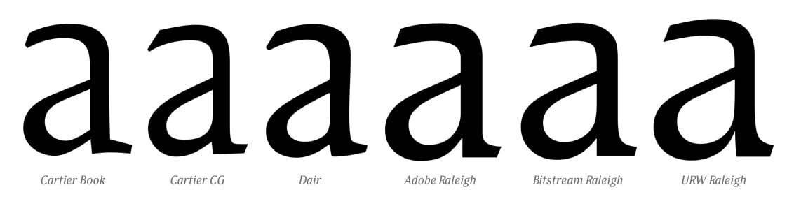
However, different designers, in different years and with different goals, approaching Dair's legacy, chose for their versions of the font a more familiar typeface, with a connection at least not below the optical midline:
In his latest work, Carl Dair depicted the lowercase 'a' as follows:
We observe a narrow sign with a diagonal stroke connected to a vertical stem noticeably below the optical midline. The back is slightly, but still noticeably curved. In other places the glyph is depicted in a similar way:
However, different designers, in different years and with different goals, approaching Dair's legacy, chose for their versions of the font a more familiar typeface, with a connection at least not below the optical midline:
My question is this: is there a significant reason for such a derogation? A significant reason rooted in the expected form of the modern Latin alphabet, maybe?
The difficulty for me is that I'm not familiar enough with the Latin alphabet, and I can only seriously consider the place of such a glyph in the Cyrillic alphabet. And if we were to create a Cyrillic font inspired by Dair's work, then...
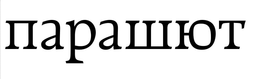
Well, in Cyrillic, such a glyph looks archaic, strange, and becomes the narrowest glyph in the entire alphabet (except for Cyrillic alphabets that use 'i'). Archaism is no vice. The strangeness is noticeable at first glance, but when reading, the eye quickly adjusts and doesn't stumble over every letter. The narrowness is actually a blessing; Cyrillic is tragically overloaded with wide glyphs, and this fence simply needs to be broken up with something.
So, for Cyrillic, I would leave this version at least as an alternative, since modern fonts allows alternative glyph shapes.
But what about Latin? Is it possible to do this in a modern Latin alphabet, or will it definitely be unpleasant/inconvenient to read?
Tagged:
1
Comments
-
I associate this feature with Garamond types, and just like you found with Dair, some revivalists follow suit with the low bowl (e.g. Stempel Garamond, Adobe Garamond) while others even out the counters (e.g. ITC Garamond, Sabon). It may be that the “regularizing” is a period preference of the middle half of the twentieth century, contemporaneous with developers of Neo-Grotesque types ironing out the terminal angles of 19th-century fonts to strict horizontals and verticals.
The case for raising the bowl I suppose is making the counter areas more even and thus evening out the typographic color. But there is a contrary case to be made that the lower bowl better distinguishes /a from other lowercase letters with “horizontals” in the middle like /s or /e (especially when /e’s crossbar is high in the typeface, which is typical of this kind of Renaissance type).
I would say if Slimbach judges it workable in a modern Latin alphabet, it’s hard for me to claim otherwise!2 -
To some extent, the size of the bowl is linked to the optical size: a small/low bowl can look elegant when used large. At the same time, it needs to retain a certain size in order to stay open when used for text and captions.The example typefaces you list come in a single size only AFAICT. The original Cartier is more of a display face. With his Cartier Book, Rod McDonald wanted to turn it into a “functional text face” (as suggested by the name); that’s why the bowl in a is larger. The others are multipurpose designs intended to work across a range of sizes.Shoko Mugikura and Tim Ahrens, authors of Size-specific adjustments to type designs, show an illustration of the a in ATF Garamond across a range of sizes: the larger the size, the lower the bowl.3
-
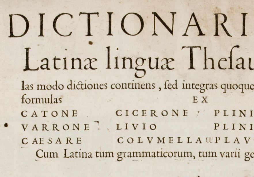
Yes, the argument about legibility in small font sizes is clear and has already been made when I discussed the issue with my colleagues, but there are good historical examples of how small bowl sizes are used for not-too-large inscriptions and do not raise any complaints.Florian Hardwig said:At the same time, it needs to retain a certain size in order to stay open when used for text and captions.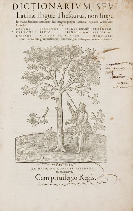
1 -
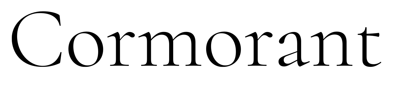
Craig Eliason said:I associate this feature with Garamond types, and just like you found with Dair, some revivalists follow suit with the low bowlIndeed!

0 -
1
-
@Florian HardwigThe original Cartier is more of a display face.No, it was “The first Canadian type for text composition…”
—Carl Dair, first proof, 1966
In this proof, the bowl is very small, as in the first example shown above.
When it went into production shortly after, it was enlarged.
Still a small “low waist” bowl, but not quite so extreme.
**
While Macdonald’s Cartier Book employs evenly spaced vertical stems as the basis of text colour, which is the norm today, Dair followed a much earlier principle, as demonstrated in this showing of Dair, my 2017 restoration of the original font design: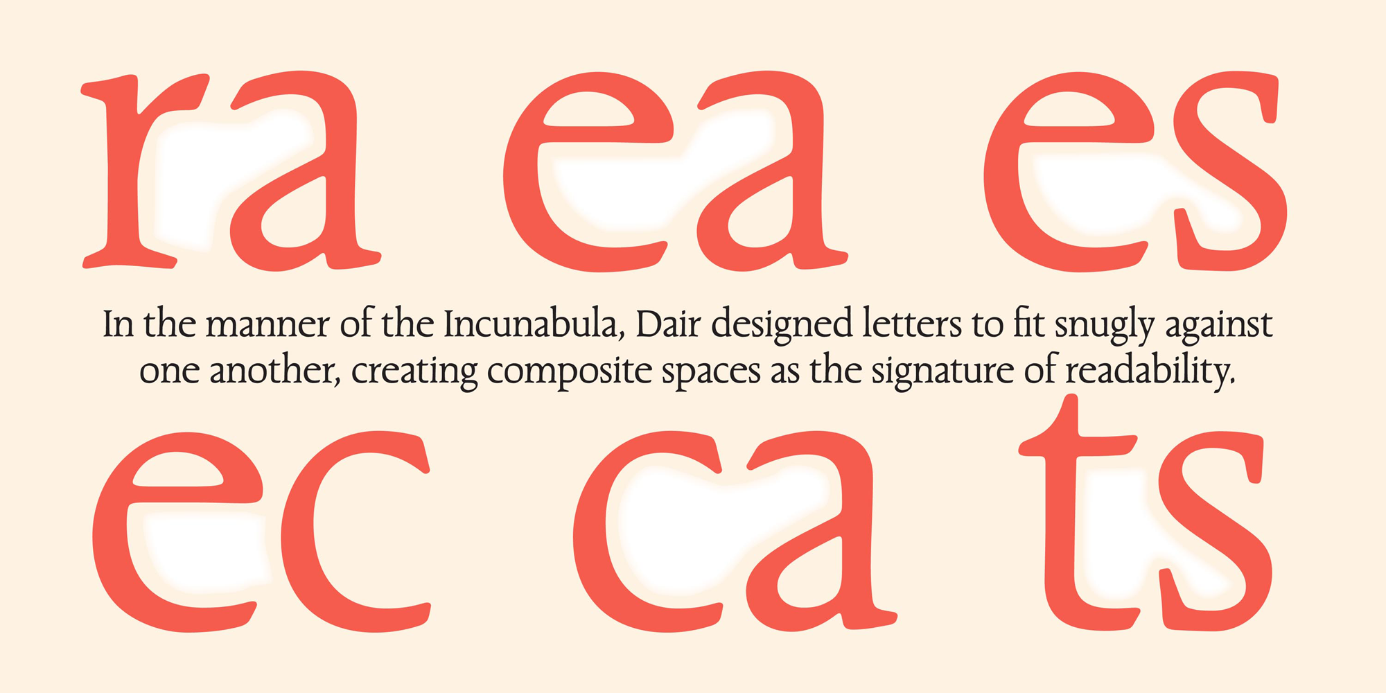
3




Categories
- All Categories
- 47 Introductions
- 4K Typeface Design
- 500 Type Design Critiques
- 591 Type Design Software
- 1.1K Type Design Technique & Theory
- 674 Type Business
- 907 Font Technology
- 29 Punchcutting
- 544 Typography
- 129 Type Education
- 333 Type History
- 82 Type Resources
- 114 Lettering and Calligraphy
- 33 Lettering Critiques
- 81 Lettering Technique & Theory
- 580 Announcements
- 101 Events
- 116 Job Postings
- 176 Type Releases
- 186 Miscellaneous News
- 270 About TypeDrawers
- 54 TypeDrawers Announcements
- 114 Suggestions and Bug Reports