
Honorific ligatures for Islamic texts: gaps and open questions
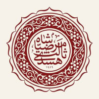
husada
Posts: 1
We are building a digital library platform for classical Islamic texts, and in the process of evaluating fonts for the platform, we ran into a challenge.
One of our goals is to offer readers, particularly those already familiar with classical Arabic book printing, an experience that feels both authentic and comfortable to read, while remaining clean and modern. For that, we needed a font that is a clear, readable Naskh; well-supported; and importantly, one that includes well-crafted honorific ligatures.

We chose to limit ourselves to OFL because we need a font we can freely use, host, and potentially extend. Among the OFL options we evaluated, Scheherazade New stood out as the strongest candidate overall. However, its honorific ligatures did not match the aesthetic we were looking for.

The best honorific glyphs we found were in KFGQPC Arabic Symbols. The visual quality and calligraphic weight there are excellent, and clearly informed by established printing tradition. But KFGQPC has several problems for our use case: its glyphs are placed in a separate symbols font using Private Use Area codepoints rather than the assigned Unicode honorific slots, which means they are not text-searchable and interoperable; its coverage is also incomplete, with many honorific expressions common in the broader Islamic scholarly tradition simply absent; and finally, its EULA does not permit modification or redistribution.
So we ended up handcrafting them ourselves: 61 honorific ligatures as clean SVG artwork (union paths), drawing from the visual standards of classical Arabic printing, with reference to the visual forms and compositions of KFGQPC but not directly derived from them:
Coverage spans 11 groups (alh, sal, slt, slm, slw, rad, rhm, rmt, qds, hfz, mix). Most have assigned Unicode codepoints; a smaller number are PUA candidates.
Since we are graphic designers rather than font engineers, we are limited in our ability to take this further on our own, so we raised the issue with the SIL team. The discussion is here: https://github.com/silnrsi/font-scheherazade/issues/15
The conversation has evolved in an interesting direction: it seems what would be most valuable for Scheherazade New is improving the consistency of its existing honorific letterforms with its own Naskh base, rather than replacing them with our Thuluth artwork. Our Thuluth collection remains available as a standalone open-source set for anyone who needs it, and we are also separately exploring the possibility of building a Scheherazade New derivative that incorporates the Thuluth honorifics as a distinct font, though that is still in early consideration.
This feels like the right forum to get informed feedback on all of this: the artwork, the approach, the SN proposal, or anything else. Very happy to hear from anyone with experience in Arabic font development or Islamic publishing typography.
Tagged:
4
Categories
- All Categories
- 47 Introductions
- 4K Typeface Design
- 495 Type Design Critiques
- 577 Type Design Software
- 1.1K Type Design Technique & Theory
- 671 Type Business
- 885 Font Technology
- 29 Punchcutting
- 539 Typography
- 125 Type Education
- 333 Type History
- 81 Type Resources
- 113 Lettering and Calligraphy
- 33 Lettering Critiques
- 80 Lettering Technique & Theory
- 569 Announcements
- 100 Events
- 116 Job Postings
- 170 Type Releases
- 182 Miscellaneous News
- 270 About TypeDrawers
- 54 TypeDrawers Announcements
- 114 Suggestions and Bug Reports