Fillmore

Craig Eliason
Posts: 1,525
Fillmore is now available from Teeline Fonts.
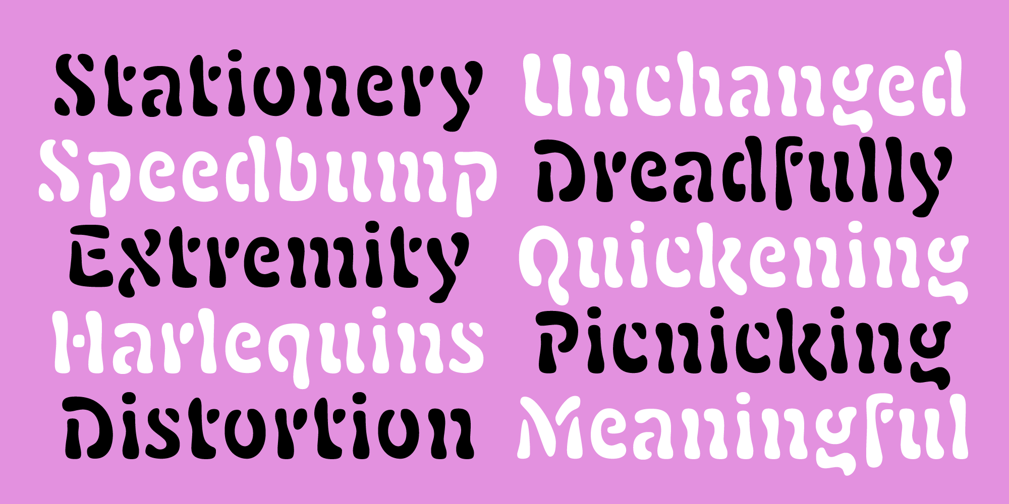 This font was inspired by my research in recent years on the Auriol types from the first few years of the twentieth century, which culminated in an article in Printing History. Besides French art nouveau design, other influences include biomorphic Surrealist art, Isamu Noguchi sculpture and furniture, and 60s psychedelia like light shows and Lava Lamps.
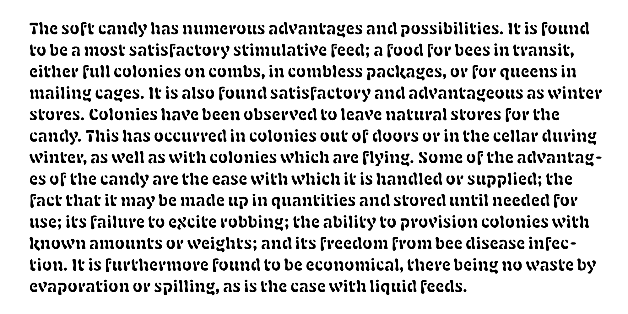
 Though its blobs seem casual, I was careful to arrange the weight to boost letter coherence, resemble familiar patterns, and even out the color. As a consequence of that care, the regular weight works (perhaps surprisingly) well for running text at smaller sizes:
0
Comments
-
It works better at small sizes, indeed. The breaks are nicely absorbed by the distance small sizes provide. A very fun offering, perhaps a good candidate for greeting cards?0
-
Thanks for the feedback Chris!0

Categories
- All Categories
- 47 Introductions
- 4K Typeface Design
- 497 Type Design Critiques
- 590 Type Design Software
- 1.1K Type Design Technique & Theory
- 674 Type Business
- 904 Font Technology
- 29 Punchcutting
- 543 Typography
- 128 Type Education
- 333 Type History
- 82 Type Resources
- 114 Lettering and Calligraphy
- 33 Lettering Critiques
- 81 Lettering Technique & Theory
- 577 Announcements
- 101 Events
- 116 Job Postings
- 174 Type Releases
- 185 Miscellaneous News
- 270 About TypeDrawers
- 54 TypeDrawers Announcements
- 114 Suggestions and Bug Reports