Film title inspired font

Nick Cooke
Posts: 209
Here’s something I have been working on for a while, it started out as a (fairly) faithful rendition of the film titles but I found it to be too crude to work as a font. So this is my third rework that I am finally happy with, although it has veered off a fair bit from the original but I think it looks much better. 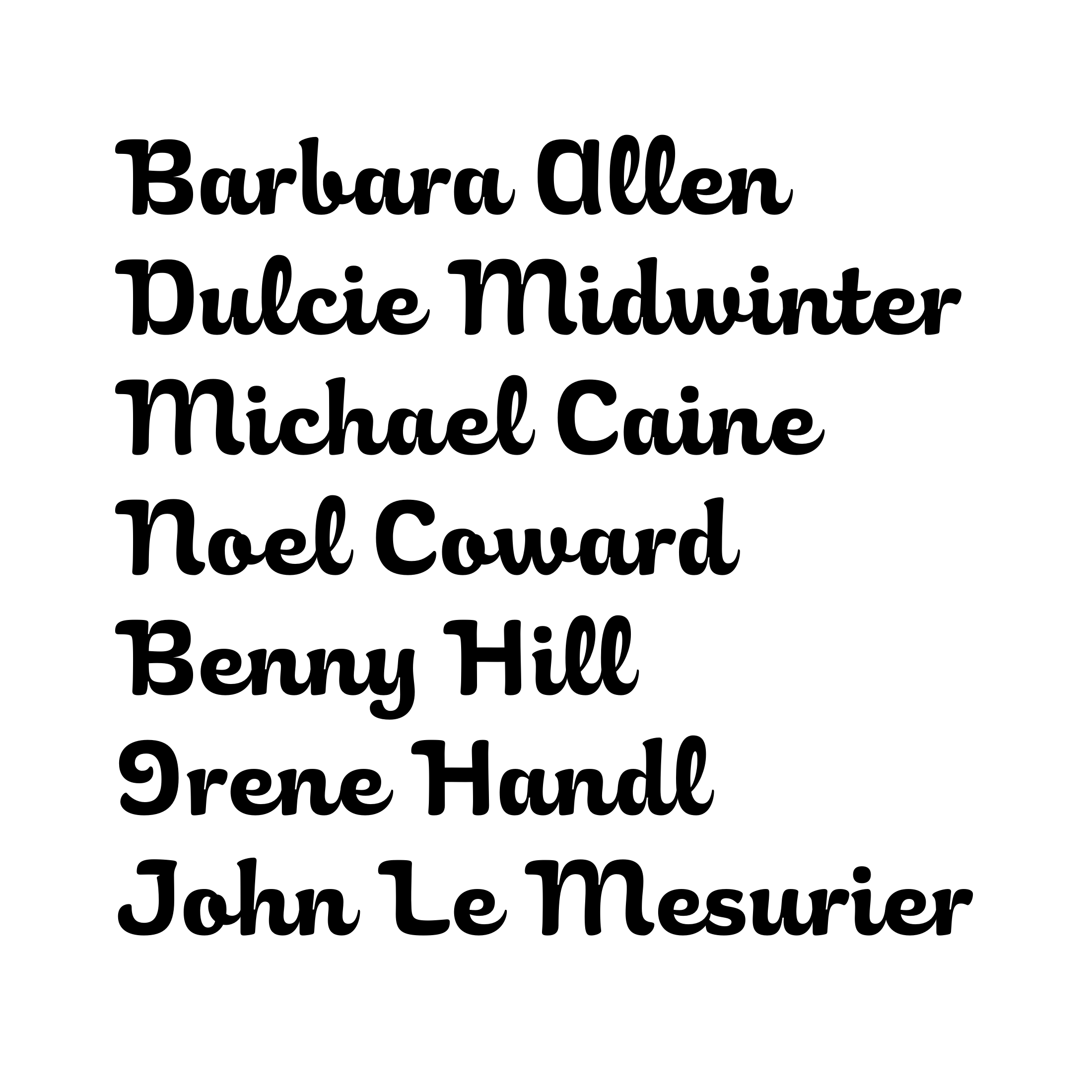
0
Comments
-
Hello Nick,
Nice work! Out of curiosity: why no bindings with the capitals ? With calt maybe?0 -
The Italian Job?0
-
That's why the font is called Dorzoff.Nick Shinn said:The Italian Job?") 1
1 -
I don't think they need to be joined, besides they wouldn't work if set in all caps.Yves Michel said:Hello Nick,
Nice work! Out of curiosity: why no bindings with the capitals ? With calt maybe?0 -
Connections coming out of /b and /o might be too thick.0
-
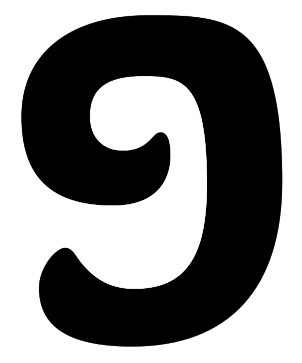
I like the way the font comes across! I also think the level of legibility is in general appropriate for a title font. However, at first glance, I thought the /I were an /O (probably because of the rounding at the top right).
0 -
(probably because of the rounding at the top right).
And not knowing the actress?0 -
Probably not as well as you do. But her name is the only reason I can be sure that it is an /I and not an /O. Maybe a sample of "If" could be a test if it is read as "Of".Nick Shinn said:(probably because of the rounding at the top right).
And not knowing the actress?
1 -
Here:
 0
0 -
With an /O as a comparison, the /I is of course immediately recognizable as such. But if I were to read “If” on its own, I wouldn't be sure whether it was ‘If’ or “Of.” Personally, for better recognizability, I would enlarge the superness in the upper right corner and make the tail at the bottom less expansive to the left, something like this:
 0
0 -
I agree that the recognizability of the cap “I” is a problem, though if one thinks of this as a display face for limited/particular uses, I am not sure it is a major problem.
There is plenty of contrast and not-strictly-brush-angle stroke thickness variation in the lowercase. So to me, it seems like there might be an option to deemphasize the decorative swash endings on the cap I by just having them thin as they progress. (And perhaps pull in the lower swash even more than Linus does.)0 -
Yeah, I think you could afford to make the /I much squarer, like the one in the film title that inspired this.1
-
Nice! Somehow the pairs of identical ells throw me off a bit; maybe have a ligature or contextual alternate to make the first in a pair a bit smaller?1
-
I don't like the shape of that I: it looks unbalanced. The film isn't The Hunchback of Notre Dame. But I have altered it a fair bit. There are also alternate final glyphs.Linus Romer said:With an /O as a comparison, the /I is of course immediately recognizable as such. But if I were to read “If” on its own, I wouldn't be sure whether it was ‘If’ or “Of.” Personally, for better recognizability, I would enlarge the superness in the upper right corner and make the tail at the bottom less expansive to the left, something like this: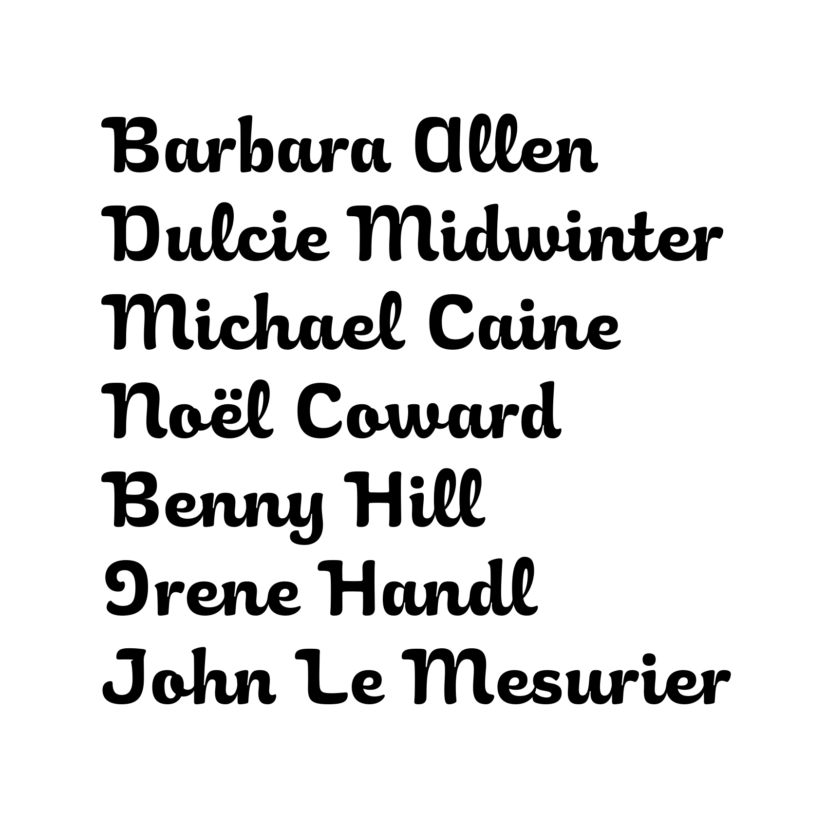 1
1 -
I recognize the /I now better than before and I like the new /I. Talking about alternate glyphs: You may want to add an /I.alt that is like the left part of the /H (just as "Irene Handl" in the movie).0
-
I would expect a forward-leaning /L/ for such a typeface, especially if you insist on the swashy /I/...1
-
You're right. The I is the 'Italian' style. The L has a bit more of a forward tilt now.Linus Romer said:I recognize the /I now better than before and I like the new /I. Talking about alternate glyphs: You may want to add an /I.alt that is like the left part of the /H (just as "Irene Handl" in the movie).
0 -
My eye catches on the /e/s connection1


Categories
- All Categories
- 47 Introductions
- 4K Typeface Design
- 493 Type Design Critiques
- 576 Type Design Software
- 1.1K Type Design Technique & Theory
- 669 Type Business
- 884 Font Technology
- 29 Punchcutting
- 537 Typography
- 124 Type Education
- 332 Type History
- 81 Type Resources
- 113 Lettering and Calligraphy
- 33 Lettering Critiques
- 80 Lettering Technique & Theory
- 569 Announcements
- 100 Events
- 116 Job Postings
- 170 Type Releases
- 182 Miscellaneous News
- 270 About TypeDrawers
- 54 TypeDrawers Announcements
- 114 Suggestions and Bug Reports