Unusual ligatures

michele casanova
Posts: 79
in Type History
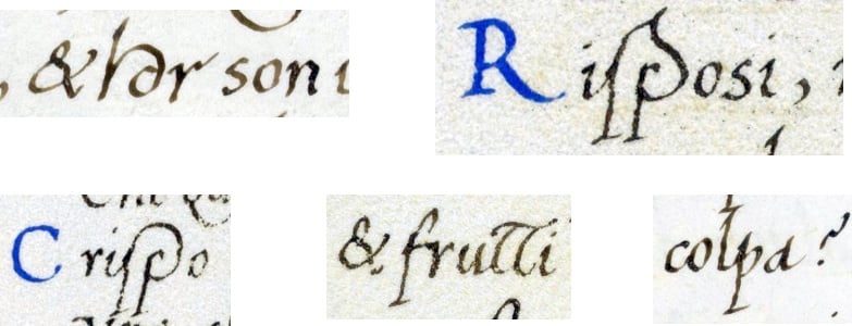
Browsing through Bartolomeo Sanvito's online manuscripts, I noticed some unusual ligatures (at least unusual for me).
Has anyone ever seen them in a typeface?
They seem interesting for a calligraphic font. There's also the "ancient" version of the question mark.
Has anyone ever seen them in a typeface?
They seem interesting for a calligraphic font. There's also the "ancient" version of the question mark.

"& hor son..." / "Riſposi"
"Criſpo" / "& frutti" / "colpa?"
Tagged:
4
Comments
-
That tt ligature reminds me somewhat of the łł ligature that Adam Twardoch proposed for script typefaces.
Many calligraphic typefaces (including several by Alejandro Paul) have tt ligatures, but usually without the crossbar raised as in Sanvito's example. Similarly, I think his other ligatures are too unfamiliar to modern eyes to find typographical examples of. I don't think typographical ligatures even in his day reflected the full range of forms used in handwriting, at least for Latin script (there are some Greek types that are perhaps overly packed with ligatures).0
Categories
- All Categories
- 46 Introductions
- 3.9K Typeface Design
- 489 Type Design Critiques
- 572 Type Design Software
- 1.1K Type Design Technique & Theory
- 663 Type Business
- 876 Font Technology
- 29 Punchcutting
- 530 Typography
- 121 Type Education
- 328 Type History
- 81 Type Resources
- 111 Lettering and Calligraphy
- 32 Lettering Critiques
- 79 Lettering Technique & Theory
- 561 Announcements
- 96 Events
- 116 Job Postings
- 169 Type Releases
- 179 Miscellaneous News
- 269 About TypeDrawers
- 53 TypeDrawers Announcements
- 114 Suggestions and Bug Reports