Needing some help with Zero-Width Glyphs

HalflingCaravan
Posts: 3
Most of the stuff I do is with board and card game designs, and I have no formal training at all… so please respond with fairly low jargon versions!
What I have been trying to get right is the following:
- I have an icon I want in one colour,
- I want that icon to have a background colour of a particular shape that may not match the shape of the icon itself (see below)
What I have been trying to get right is the following:
- I have an icon I want in one colour,
- I want that icon to have a background colour of a particular shape that may not match the shape of the icon itself (see below)
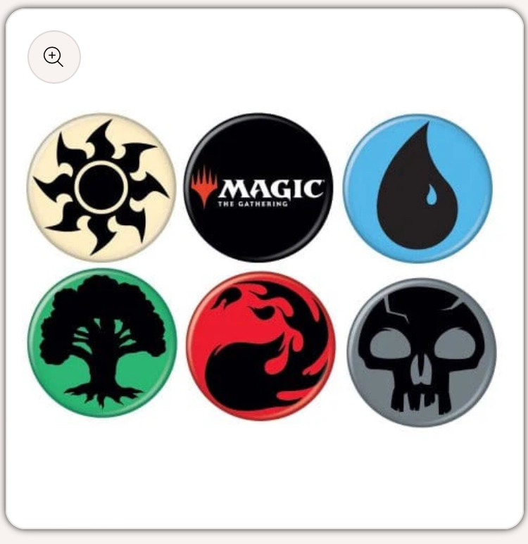
Now my solution for this in the font and layout design would be to create a foreground glyph (sunburst, water, tree, fireball, skull) and a background glyph (circle that extends outside the foreground) then colour them appropriately.
I understand that a zero-width glyph will let me “hide” one glyph under the other to achieve that effect.
I've done that and made a zero-width glyph, offset the background glyph so it sits on the right of the zero-width space.
When I use the font in the layout program things overlap just fine BUT there is a big empty void (probably the size of a glyph) at the start of left-aligned text. (See below: Note there is no space or paragraph indent in that text box and the paragraph has been set to left-align. It should be on the left edge of that blue text box)


Is there a better method to get this effect? I can live with a big void if I have to, but I'd really prefer not to...
(using FontForge on a Windows machine and Affinity Publisher as the layout program)
EDIT: Tried a 'stupid but maybe obvious' fix to it all. Instead of hanging the glyph to the right of a zero-width, I hung it off the left of the zero-width and it all worked for me. Thanks for the help people have given so far.

I understand that a zero-width glyph will let me “hide” one glyph under the other to achieve that effect.
I've done that and made a zero-width glyph, offset the background glyph so it sits on the right of the zero-width space.
When I use the font in the layout program things overlap just fine BUT there is a big empty void (probably the size of a glyph) at the start of left-aligned text. (See below: Note there is no space or paragraph indent in that text box and the paragraph has been set to left-align. It should be on the left edge of that blue text box)

Is there a better method to get this effect? I can live with a big void if I have to, but I'd really prefer not to...
(using FontForge on a Windows machine and Affinity Publisher as the layout program)
EDIT: Tried a 'stupid but maybe obvious' fix to it all. Instead of hanging the glyph to the right of a zero-width, I hung it off the left of the zero-width and it all worked for me. Thanks for the help people have given so far.
0
Comments
-
Ah, FontForge does not support actual multi-color fonts, which was my first thought for a solution.
Glyphs and FontLab both do this, and I believe Affinity Publisher supports them. These days, the COLR/CPAL variant is probably the way to go, especially (though not only) if you are on Windows.
Also assuming you don’t need to switch the colors for any given combo. That is, the tree always has a green background, etc. There are ways of handling multiple palettes, but I doubt Affinity supports those yet.0 -
Yeah I was looking to be able to change colour in layout hence the “two glyph” solution. The thing you see above is basically <1 <2 < 3 <4 etcwhere the < is the background coloured zero-width glyph.0
-
I think the way you're doing it with multiple layers is the best solution. Color fonts don't give you any flexibity if you want to adjust colors later. It also allows you to add effects to the color background layer.
If you add another row of text, is the second line also indented? What happens when you test it in other applications?0 -
Another option would be identical width glyphs, and stacking a text box with the icon string on top of a text box with the outlines. Not sure if that would be easier to deal with or not...0
-
I've done that before, it can be a nuisance for getting everything lined up and it makes the document a good chunk bigger.Craig Eliason said:Another option would be identical width glyphs, and stacking a text box with the icon string on top of a text box with the outlines. Not sure if that would be easier to deal with or not...
One of the constraints I'm working with, is that Affinity Publisher won't Find-Replace with a graphic in the replace. What this lets me do is set up a character style using the Wingdings Font, then I can search for whatever I want (e.g. [blue]) and then replace it (e.g. with <B) in the Wingdings font. Then after that is in across the whole document, I can find-replace for "< in Wingdings Font" and replace with "< in Wingdings Font, Colour = 0C 0M 0Y 0K".Ray Larabie said:I think the way you're doing it with multiple layers is the best solution. Color fonts don't give you any flexibity if you want to adjust colors later. It also allows you to add effects to the color background layer.
If you add another row of text, is the second line also indented? What happens when you test it in other applications?0 -
Fonts using the COLR or SVG tables do provide flexibility regarding colours if the app supports that. For one, there is a colour value that means text foreground colour as determined by the app. Also, the CPAL table can support multiple colour palettes; the app can provide options for switching between palettes. In addition, apps could also override the CPAL values with a custom palette. For Web apps, all this is supported in CSS.Ray Larabie said:I think the way you're doing it with multiple layers is the best solution. Color fonts don't give you any flexibity if you want to adjust colors later. It also allows you to add effects to the color background layer.
If you add another row of text, is the second line also indented? What happens when you test it in other applications?0


Categories
- All Categories
- 47 Introductions
- 4K Typeface Design
- 495 Type Design Critiques
- 577 Type Design Software
- 1.1K Type Design Technique & Theory
- 670 Type Business
- 885 Font Technology
- 29 Punchcutting
- 538 Typography
- 125 Type Education
- 332 Type History
- 81 Type Resources
- 113 Lettering and Calligraphy
- 33 Lettering Critiques
- 80 Lettering Technique & Theory
- 569 Announcements
- 100 Events
- 116 Job Postings
- 170 Type Releases
- 182 Miscellaneous News
- 270 About TypeDrawers
- 54 TypeDrawers Announcements
- 114 Suggestions and Bug Reports