Straight line to curved line in variable fonts – best practices?

elliott
Posts: 9
I'm doing some experimentation in preparation for a variable font I'm working on, and I've run into an issue.
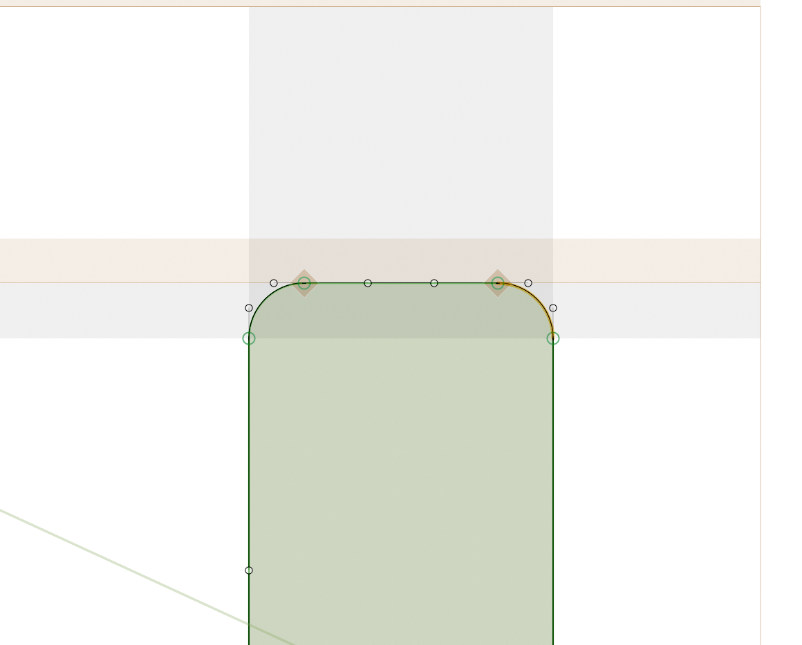
I want one axis of the variable font to morph the sides of the letters from straight to curved – i.e. transition from rectangles to blobs. My assumption is that, to ensure compatibility between masters, any nodes that will have handles in one master must have handles in the others. So here is what I'm doing, for example, with the top of the H:

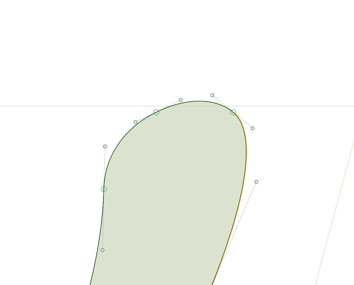
In Glyphs and FontGoggles this produces no issues – everything works smoothly with no weird kinks. However, in InDesign I'm getting this little dent:
Some troubleshooting information:
- The issue only appears in the variable font; non-variable TTF and OTF versions render normally in InDesign
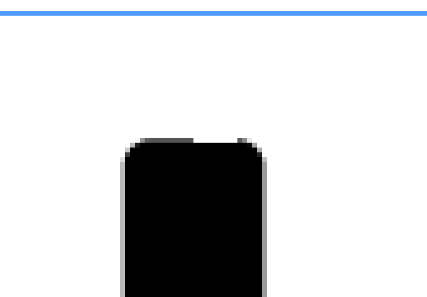
- The dent only appears at certain sizes – neither particularly small, nor particularly large – you can see in the image above that there are plenty of pixels to go around, so I'm not convinced it's a hinting issue
- The dent disappears if I delete the handles that run along the top line – but then I have compatibility issues
- Adding nodes along the top line doesn't make any difference
- Splitting the stem right down the middle, into two separate shapes, does eliminate the problem
- When I export from InDesign to PDF, the dent disappears
- My version of InDesign is rather old – 2020 – and I've heard there were errors with rendering variable fonts pre-2021, so it could be that
My question is: Is there a "correct" way to draw this sort of outline? Something I'm missing? I can't think of any other way to get the results I'm looking for.
I want one axis of the variable font to morph the sides of the letters from straight to curved – i.e. transition from rectangles to blobs. My assumption is that, to ensure compatibility between masters, any nodes that will have handles in one master must have handles in the others. So here is what I'm doing, for example, with the top of the H:

In Glyphs and FontGoggles this produces no issues – everything works smoothly with no weird kinks. However, in InDesign I'm getting this little dent:
Some troubleshooting information:
- The issue only appears in the variable font; non-variable TTF and OTF versions render normally in InDesign
- The dent only appears at certain sizes – neither particularly small, nor particularly large – you can see in the image above that there are plenty of pixels to go around, so I'm not convinced it's a hinting issue
- The dent disappears if I delete the handles that run along the top line – but then I have compatibility issues
- Adding nodes along the top line doesn't make any difference
- Splitting the stem right down the middle, into two separate shapes, does eliminate the problem
- When I export from InDesign to PDF, the dent disappears
- My version of InDesign is rather old – 2020 – and I've heard there were errors with rendering variable fonts pre-2021, so it could be that
My question is: Is there a "correct" way to draw this sort of outline? Something I'm missing? I can't think of any other way to get the results I'm looking for.
0
Comments
-
If you change both the ANGLE of the handles coming off an on-curve point AND the relative length ratio of those off-curve “handles,’ you will get kinks in the interpolations between the two masters.
0 -
Yes, InDesign (and Adobe in general) had some variable font rendering issues early on. Long resolved now, but not so sure about InDesign 2020 (which would be the October 2019 release).
Also if you want to share, say, a one-glyph font and let somebody test it in a newer InDesign, that might be an idea?
0 -
Hi Thomas, thanks for your comment. Sorry I may not have been clear – this dent appears at the extreme of the axis, so as far as I understand no interpolating is taking place yet.Thomas Phinney said:If you change both the ANGLE of the handles coming off an on-curve point AND the relative length ratio of those off-curve “handles,’ you will get kinks in the interpolations between the two masters.
Embarrassingly, just after I posted I had a look at a variable font that featured similar axes – in this case it was a sans turning into a serif – with similar bezier handles arranged along a straight line. Same issue – areas that feature "flattened" beziers sometimes appear "sunken" into the horizontal stems. I suspect it's my version of Adobe.0 -
Ah, I understand that the problem you are seeing is at an extreme.
But there will be at least some degree of "kinking" in interpolation, from your current configuration. Maybe not severe enough to care about, but it is going to happen. Even though that is not the problem you are noticing right now.
Anyhow, if you want to share just a single-glyph font (or the whole thing) somebody else could test it in a more recent version of InDesign and see if the main weirdness goes away.0 -
OK, this is a weird thought, but if it's working in other things but not InDesign, I suggest it's worth a try: use fontmake to compile the font with the --no-optimize-gvar option. i.e.
fontmake -o ttf -g YourGlyphsFile.glyphs --no-optimize-gvar0


Categories
- All Categories
- 47 Introductions
- 4K Typeface Design
- 495 Type Design Critiques
- 577 Type Design Software
- 1.1K Type Design Technique & Theory
- 671 Type Business
- 885 Font Technology
- 29 Punchcutting
- 539 Typography
- 125 Type Education
- 333 Type History
- 81 Type Resources
- 113 Lettering and Calligraphy
- 33 Lettering Critiques
- 80 Lettering Technique & Theory
- 569 Announcements
- 100 Events
- 116 Job Postings
- 170 Type Releases
- 182 Miscellaneous News
- 270 About TypeDrawers
- 54 TypeDrawers Announcements
- 114 Suggestions and Bug Reports