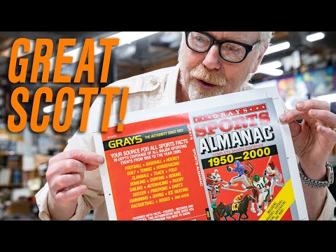
Print shop to the Stars. (Adam Savage again)

John J. Blair
Posts: 39
These folks create all manner of printed material for on-screen use.  https://www.youtube.com/watch?v=0TS6x8dK2u0
 https://www.youtube.com/watch?v=0TS6x8dK2u0
3
Comments
-
Wow, thanks for sharing this, @John J. Blair.
One of the things mentioned supports a theory I have about typographic props in the nineties and 2000s. As some of you may know, I wrote an article on my website over twenty years ago called "Typecasting: The Use (and Misuse) of Period Typography in Movies" (and subsequent blog posts) where I called attention to anachronistic typography in films.
The thing I noticed was that most of the examples (especially the worst ones) were from the nineties onward. In the video above, the guy mentions that prior to the nineties, nearly all Hollywood films got their printed props from Earl Hayes Press, but then started doing them in-house. This fits with my observation. Apparently, once production companies started making their own props, the knowledge and expertise of Earl Hayes Press was lost.
Since then, especially in the last ten years, this attention to detail seems to have recovered. The level of quality in more recent films has become at least as high as the examples shown in the video (and given me much less to complain about).8 -
Thanks for the video, John.I just hope they washed their hands really well before handling everything.1
-
Adam Savage is back with more printed movie props. This time he is at Earl Hays Press looking at explosives packaging used in movies.
 https://www.youtube.com/watch?v=BMZ63jv39vQ 2
 -
Related to this subject, Leah Spencer wrote for Alphabettes about her specialized work for film and TV, which often includes designing period-specific letterforms.
2 -
Visit the Earl Hays print shop with their graphic designer Carly Graham.
 https://www.youtube.com/watch?v=QCW6mH39yQg
1 -
I will have to look that up!Sander Pedersen said:Related to this subject, Leah Spencer wrote for Alphabettes about her specialized work for film and TV, which often includes designing period-specific letterforms.0 -
As a model railroader, I try to replicate vintage signs seen in old photographs for use on my model railroad.1
-
Leah’s article has great advice on how she makes old-timey signage for things like Marvelous Mrs. Maisel. I was fascinated, very smart stuff.2
-
Leah Spencer has an effective approach to protecting what is hers and adding value to her personal brand.0
-
I was very impressed with the period typographical props in Mrs. Maisel (not to mention everything else about the show). My only (minor) complaint was the use of House's Fabulous Script (slightly modified) for the logo of the fictional talk show's logo (The Gordon Ford Show). But it's one of those cases where, even though it's technically an anachronism, it looks the part.3
-
Here's how Earl Hays deals with Newspapers for cinema.
 https://www.youtube.com/watch?v=S97bFh4X8Tc&t=605s 0
 -
I was over the moon to have gotten a shout-out in one of his videos! Very cool
 2
2
Categories
- All Categories
- 46 Introductions
- 3.9K Typeface Design
- 489 Type Design Critiques
- 572 Type Design Software
- 1.1K Type Design Technique & Theory
- 663 Type Business
- 875 Font Technology
- 29 Punchcutting
- 530 Typography
- 121 Type Education
- 328 Type History
- 81 Type Resources
- 111 Lettering and Calligraphy
- 32 Lettering Critiques
- 79 Lettering Technique & Theory
- 561 Announcements
- 96 Events
- 116 Job Postings
- 169 Type Releases
- 179 Miscellaneous News
- 269 About TypeDrawers
- 53 TypeDrawers Announcements
- 114 Suggestions and Bug Reports


