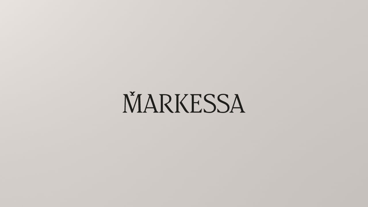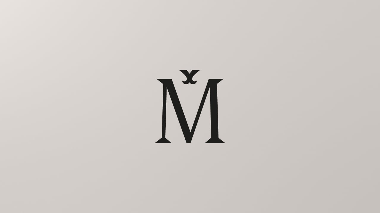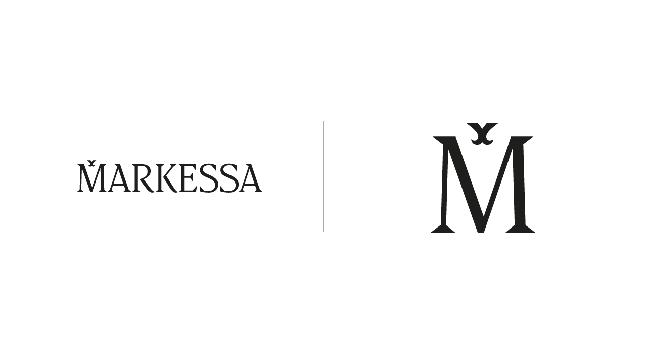
New logo with custom type: MARKESSA. How did I do?

Cristóbal Alarcón
Posts: 80
Hi Type Drawers! It feels good to come back with a post here, it's been a while since I've done a purely typographic logo. This time, I wanted to make as many changes as possible before asking for your help, so that, you know, I can be confident with myself and test my skills and knowledge  .
.
Brief
This is MARKESSA, a client's small business looking to sell beauty and cosmetics products. Her primary sources of inspiration were the logos of Lancome Paris and Markova, and after some back and forth and discovery sessions, she chose these alternatives as the foundation of the new logo.
Markessa has three references:
- First and foremost, her name is "Marcela". Explaining the relevance of the M.
- The double "SS" is derived from her surname. I'm not sure if I should reveal her identity, but she has an Italian surname with a double SS.
- The entire word Markessa refers to Marquess people in royalty, and we intend to carry that concept throughout the visual identity.

Since it's a small business, she will first sell her products via WhatsApp. Because of this requirement, readability became an important consideration, and all ideas involving high contrasting letter-forms were discarded because they would cause issues when seen at small scale. Still, I'm attempting to balance readability and still make it look aesthetically pleasing when seen up close. However, as brand awareness grows, we intend to give more importance to the "M" and the icon alone, but those are logo-specific concepts.
Question
Still, I'm not entirely sure if it could look better:
- I'm not that confident about how the "S" and the "A" are drawn
- Letter-spacing at "ESS" feels tight at small scales for me, I'm not sure. But I think there is something in there and needs improvement, despite having already made adjustments.
- If serifs are consistent and if the overall letter-forms look good.
What do you think?
Tagged:
0
Comments
-
My biggest concern is some slight weighting issues.
The thinnest bits of M and A are significantly thinner than the top right diagonal of the K, horizontal strokes, or the thinnest bits of R and S. I would thin those other letters (K R S etc.) to match.
The lower right diagonal on R and K and the middle/spine of S could be just a *tiny* bit heavier.
However much S has overshoot now, try just a tiny bit more, like 1/6 more than it does now.1 -
- The /S is wide, make it narrow.
It should be the same width as the /E
Search for a Similar font and put the /S on your background layer, it will help you to improve the curves. Junge is a different style, but has similar proportion to your logo, it may do the job. Scale it if needed.
- The /M is narrow, make it wider
You will also benefit of having more white space around the little birdie thingy. It will look less crowded. Use the same method as the S a guide.
Typical uppercase proportions goes like this (from Narrower to Wider), of course you can change them as you wish for different type styles, but this is a good reference:
I
J
L
F
E S T
P Y Z
B K R V X
C
A
D G U
H N
O Q
M
W
You can learn a lot more about proportion by reading this curated selection of type related book, all online and for free. Start with the ones that have 5 stars.
- The /A crossbar looks bolder than the 1st thin diagonal
Make it about the same as the 1st diagonal
I will also suggest you to try a standard, simple straight line /A crossbar
This is personal opinion only, because I hate this current wavy trend
You can tell your client that all this wavy lines will go away as soon as a new and different trend get into fashion next year, hence his logo will look "old" next year, once the current trend goes out of fashion. A more classical /A crossbar will make his logotype last longer. Unless she wants to hire you again next year for a logo update to next year's trend.3 -
I really like both Petit Poison and Markessa concepts. You are talented at branding typography! PP is very creative, and Markessa looks noble and elegant.
Agree with what is already written here, and would like to give one more vote for the classic straight crossbar for the /A and narrower (more elegant) /S shapes.
The lower counter of the S is too big and the whole letter tends to fall behind.
Maybe a bit wider E. Yes, the spacing seems a bit tight for the "ESS" part.
0 -
What is above the M? My first thought was that it was an X; second that it was a crossed swords. But I don't know why that's there. If you want to go with the concept of marquess, the heraldic sign for a marquess is a coronet.0
-
Thomas Phinney said:My biggest concern is some slight weighting issues.
The thinnest bits of M and A are significantly thinner than the top right diagonal of the K, horizontal strokes, or the thinnest bits of R and S. I would thin those other letters (K R S etc.) to match.
The lower right diagonal on R and K and the middle/spine of S could be just a *tiny* bit heavier.
However much S has overshoot now, try just a tiny bit more, like 1/6 more than it does now.Noted! I'll be making those adjustements.PabloImpallari said:- The /S is wide, make it narrow.
It should be the same width as the /E
Search for a Similar font and put the /S on your background layer, it will help you to improve the curves. Junge is a different style, but has similar proportion to your logo, it may do the job. Scale it if needed.(...)Originally both the "M" was wider and the "S" tighter, but it didn't felt right for me. For sure typography wise they had their intended widths, but logotype wise I felt it unbalanced. Maybe I over did it. I'll fiddle with that and try to find a middle point, then make a comparison and showcase it, keeping in mind that it should look both visually balanced as a logo but still stay somewhat readable.About the "A" crossbar, I think it fits the brief. Since those artistic movements in royalty than span from 1600 to 1800ish where very wavy and organic. It's a trend for sure, but in this specific case I think it fits for the brand royal feel. I'm still thinking on changing it to some other kind of wave tho heh.
Thank you so much! I appreciate those comments, specially knowing I'm not that experienced with type designIgor Petrovic said:I really like both Petit Poison and Markessa concepts. You are talented at branding typography! PP is very creative, and Markessa looks noble and elegant.
Agree with what is already written here, and would like to give one more vote for the classic straight crossbar for the /A and narrower (more elegant) /S shapes.
The lower counter of the S is too big and the whole letter tends to fall behind.
Maybe a bit wider E. Yes, the spacing seems a bit tight for the "ESS" part. Noted about the "E".About the lower "S" counter, why do you say so? Does it feels inconsistent with the other letters? I personally really like the openness to it. Again, all of this was to fit more in a logotype context and a brand. Would that change something in the criteria of how things should look? I think it adds a bit more character to the wordmark.
There coronet was indeed a starting point , mainly when trying to add a symbol in the middle of the "M" the same as the coronet has the clover in the middle, but I discarded concepts that associated it directly to a coronet and opted for a more abstract and personal symbol.Simon Cozens said:What is above the M? My first thought was that it was an X; second that it was a crossed swords. But I don't know why that's there. If you want to go with the concept of marquess, the heraldic sign for a marquess is a coronet.It's a new concept in logo design I'm implementing that there are 6 big types of logos, the one I used here is a logo with an accessory that, when isolated, it shouldn't hold much meaning. It's in Spanish, but this concept comes from Norberto Chavez, or at least that's what I understood so far of it.Now, about the symbol. What does it means? Nothing really, it's just a shape built with the wordmark serifs, and for the lower part I got inspired from these details in letter works from Rococo/Baroque times.0 -
Ideas for the /A: check out Nadall, or Astoria TitlingNF
1 -
I see, in that case, I would say go for your taste. I was thinking from the perspective of the default S design, where the lower bowl is just a bit bigger in order to look the same and to stabilize the form. If your choice is the obviously bigger lower bowl that's the aesthetic matter, and you should follow your intuitionAbout the lower "S" counter, why do you say so? Does it feels inconsistent with the other letters? I personally really like the openness to it. Again, all of this was to fit more in a logotype context and a brand. Would that change something in the criteria of how things should look? I think it adds a bit more character to the wordmark.
Wavy A crossbar and S shape remind me of contemporary revivals of the Art Deco and Arts & Crafts vibe. The rest of the letters look less romantic and more serious to me, which is my personal preference. But I can imagine the fashion/cosmetics audience would prefer that romantic touch
1 -
The crowning mark is perfectly subtle. The swung A crossbars are a good idea, if in need of finesse. The S, though, does not have the same look of royalty. I think S might benefit from a more narrow built-on-circles Trajan attitude, and you might try ball terminals, which might not be as out of place as you would expect.
0 -
What era are you intending to evoke with the typography for this brand?
Currently the more even glyph widths are more “modern”; the narrower S and wider M some folks are proposing would be more “old style.” I think it really depends what feel you want.
Given the brand name and the crown-thing I would have _guessed_ you might go with a more classic, old style widths scheme. But it is up to you!
Cheers,
T1 -
I am not a professional, but the first A looks closer to the M than the R. I’m not sure why. Maybe the right foot of the A is too big. Maybe the serifs at the top of the M and A just make it look that way, and it’s unavoidable. But it doesn’t look quite right to me.2
-
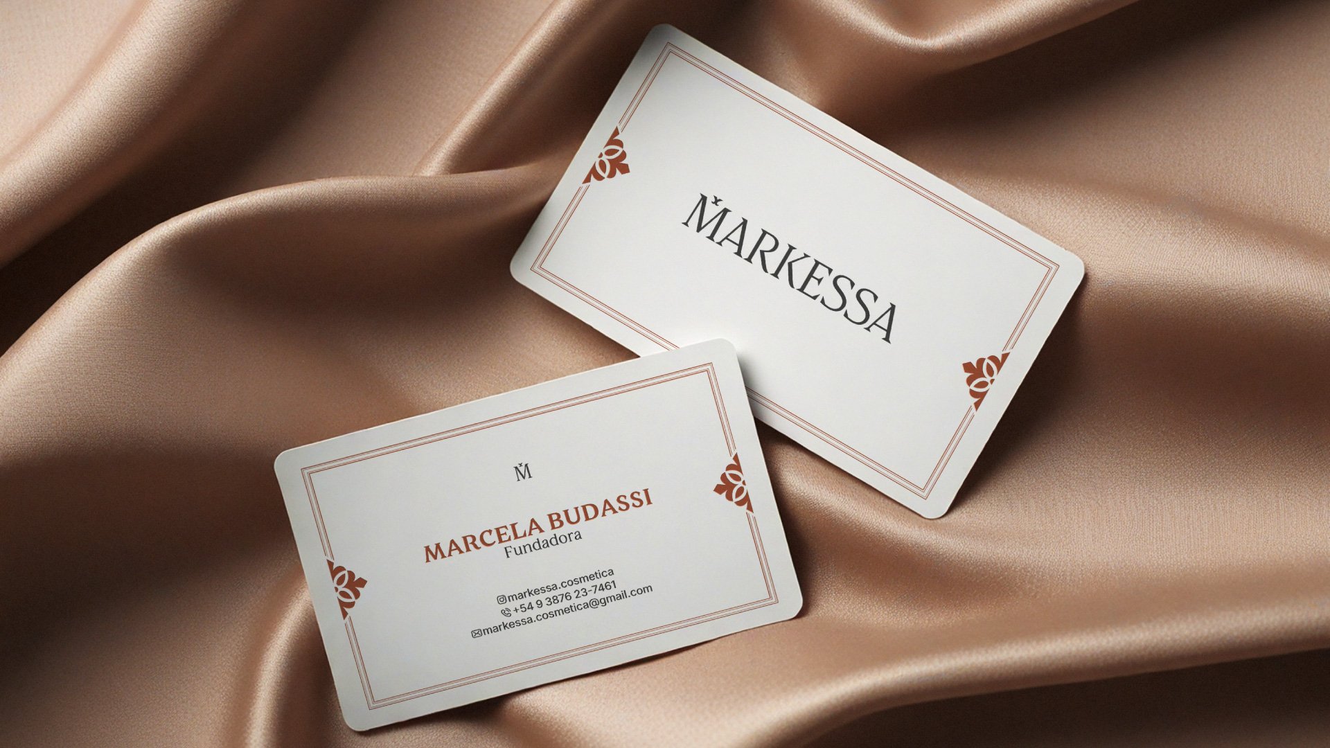
Hi people! Sorry for the necro. I'm not sure why I never updated you, maybe because the project extended for far too long with other design needs that I didn't make time to upload here the results.To give closure to this this was the final work I delivered.Any suggestions are open as always, but the project it's done and won't get updates mainly because the business closed.


0
Categories
- All Categories
- 46 Introductions
- 3.9K Typeface Design
- 489 Type Design Critiques
- 572 Type Design Software
- 1.1K Type Design Technique & Theory
- 664 Type Business
- 877 Font Technology
- 29 Punchcutting
- 530 Typography
- 121 Type Education
- 328 Type History
- 81 Type Resources
- 111 Lettering and Calligraphy
- 32 Lettering Critiques
- 79 Lettering Technique & Theory
- 562 Announcements
- 97 Events
- 116 Job Postings
- 169 Type Releases
- 179 Miscellaneous News
- 269 About TypeDrawers
- 53 TypeDrawers Announcements
- 114 Suggestions and Bug Reports


