Slow Learner Needs More Advice

Michael Vokits
Posts: 214
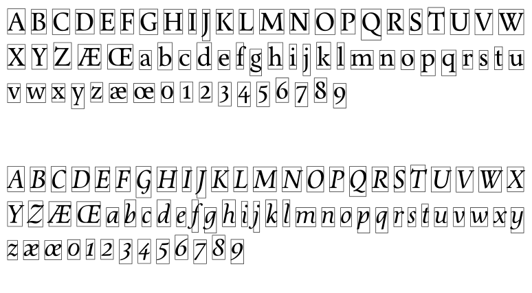
Hello! I've been working on this font for many, many years, and I just can't finish it. I can appreciate beauty and grace, but actually creating it is something very different. (If only art were as easy as music and language!) Anyway, here's where my antiqua is:

There's something simply wrong with them, and I just can't figure it out. I want to match the italic /h glyphs to the /a glyphs, but I'm worried that'd make the italic too monotonous. Are both /T too narrow? Should I make the italics more pointy? Is roman /Z too wide and /H too narrow? Should the italic caps have more italic shapes? Et cetera ad infinitum ad nauseam. Overall, it seems to me that I'm trying to match several designs, and they just aren't harmonizing. Am I right in thinking that italic /a has too wide of a bowl at the NW corner (the angle is too wide), and glyphs formed on its model just repeat that? Ugh.

There's something simply wrong with them, and I just can't figure it out. I want to match the italic /h glyphs to the /a glyphs, but I'm worried that'd make the italic too monotonous. Are both /T too narrow? Should I make the italics more pointy? Is roman /Z too wide and /H too narrow? Should the italic caps have more italic shapes? Et cetera ad infinitum ad nauseam. Overall, it seems to me that I'm trying to match several designs, and they just aren't harmonizing. Am I right in thinking that italic /a has too wide of a bowl at the NW corner (the angle is too wide), and glyphs formed on its model just repeat that? Ugh.
0
Comments
-
You're at a point where questions like "Is roman /Z too wide and /H too narrow?" no longer have an objective answer. It is up to you, and that's a choice you should feel confident in making, because the choices you've made so far are elegant.
1 -
As far as I can tell, your roman is done; it looks perfectly good. If understand you correctly, you're perceiving a mismatch between the steep bowl-to-stem join of /a/b/d/p/q and the shallow bowl-to-stem join of /h/m/n/u/y in the italics. I do not think you should make them the same, as differentiation is important and you don't want to create a dazzle that cuts against the flow of reading, but I think they may harmonize if you made the latter group a bit more narrow.Give italic /r some room in its right sidebearing! I don't see the other problems you describe, it's all very nice. I think the consistent overall slight narrowness of the roman capitals is a good choice and need not be tinkered with.1
-
Just for gits and shiggles, I'm experimenting with a redesigned italic /n -- the join is lower on the stem, being more consistent with /a, which I've also reworked (probably too much). Old on left, new on right.

0 -
Michael,the thin parts of the a’s are too thick, seen next to your n. The decision about weather to choose the deep or the high offspring (n) needs to get judged by watching text bits. Either some real text or some nonsense like this may do:handanna mennodunga and homminunto umpa annedonna comenonna none humbanangoAnnalena Karenina Donaldino Trumphatore Emengilda Adriana Gelantina Onno Eminento1
-
IMHO, making a classic serif typeface has a lot to do with comparing your own efforts with successful examples of the same genre. (I guess this applies to other genres as well.) So I use a file like the one I am attaching. This is a simple InDesign file that consists in two text boxes: in the first one I put my work-in-progress type and, in the other one, some other type that I consider superb. I am very careful of using the same visual x-height for both samples (that is the reason behind the two letters at the top left, so I can equalize both “x” closely). For this test I use Kern King, but the text is not so important at this moment – what I am looking for, line by line, is for those little hidden details that makes the other typeface looks great and mine plain wrong. Of course, then I compare it with some other similar types, so I can get a better understanding of what is happening with my not-so-great design. I think your work is nice overall, but this might help you to refine it.
2 -
Thanks, guys!
0 -
Now with bold weights. /M and /N are probably too wide.
Any advice on making a better /W? I think I might just be obsessed with matching /A and /W... it's a hard fixation to break.
0 -
Hunh; I'd thought the different terminals would make a much larger difference. It really is much more a matter of color and spacing than details. Live and learn; now I can do something better.1
-
Why are you showing the glyphs with those boxes around them? It would be much more inviting to just show some samples at a large size. From the pdf, my main comment is that the spacing needs a lot of work. Texture and rhythm are everything in a text font.2
-
I'd like to say the boxes made sense once upon a time, but it's clear they never did. Anyway, I've stripped out the kerning info, and the results are much improved.
 0
0 -
Make your numerators and denominators bigger. /three and /five look like they're floating (to me those lax bottom curves work better for oldstyle figures) and /nine is clearly misaligned. Sidebearings of caps look really tight next to each other. Bold roman feels overall much more loosely spaced than the other three styles. Italic is tightest of all. Relative weights of all four don't seem to be worked out clearly.1
Categories
- All Categories
- 46 Introductions
- 3.9K Typeface Design
- 489 Type Design Critiques
- 572 Type Design Software
- 1.1K Type Design Technique & Theory
- 663 Type Business
- 876 Font Technology
- 29 Punchcutting
- 530 Typography
- 121 Type Education
- 328 Type History
- 81 Type Resources
- 111 Lettering and Calligraphy
- 32 Lettering Critiques
- 79 Lettering Technique & Theory
- 561 Announcements
- 96 Events
- 116 Job Postings
- 169 Type Releases
- 179 Miscellaneous News
- 269 About TypeDrawers
- 53 TypeDrawers Announcements
- 114 Suggestions and Bug Reports


