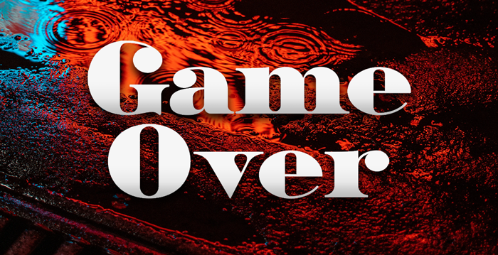
FFAA (First Fat Antiqua Attempt)

Ivan Ginev
Posts: 5
Hi all, first post  I work mostly in the UI design field and don't have a lot of typography experience.
I'm working on this black extended Antiqua type, based on specimen from the Bulgarian artist Boris Angelushev (first image) which I found in a typography book.
This started as a university project - straight translation of the original from a photo to vector. Then I went way over my head, tweaked some of the shapes and made all the English and Bulgarian Cyrillic letters + numbers and some symbols. Since the specimen had only the capital Cyrillic letters I had to guess and extract most of the lowercase and latin letters from other works of Angelushev and different black Antiquas. I've used Bodoni, Scotch, Didot and Kazimir as references.
This is only Illustrator vectors so far and is still messy, that's why I'm posting raster instead of PDF, apologies. All feedback is welcome.


Tagged:
0
Comments
-
It's O.K.0
-
It's definitely got some charm, and I like the fused serifs.There are a few things that the original, despite its crudeness, does better than your rendition, though. For instance:
- In letters like /П/, your fused serifs look heavier than the actual horizontal bar. I'd add weight to the bar, even if it breaks with the established weight for your thins.
- Your /З/ and /С/, and corresponding letters in Latin (such as /C/ and /G/) follow the shape of /O/ too much. In the original, the tops and bottoms of the curve become rather flat and stay close to the guidelines rather than curving back down. The extrema don't like in the geometric center of the glyph, but are shifted toward its open side (left for the /З/, for instance). This greatly helps the overall shape look right.
- Your /o/ is very pointy at the top and bottom; compare to the original... relatedly, your Latin /b/d/p/q/ have very pointy bowls and an ungainly join where the bowl meets the serifed stem foot/head (compare to the much better join in /n/). Your original has a Cyrillic /р/ with a much nicer solution for both the bowl shape and the join, although it does have a bit of a capital-letter flair that might look out of place in Latin. (Also note that /р/'s bowl doesn't touch the baseline, it hovers above it a bit to make more space for the descender, which is much shorter than yours.)
- Your /ь/ъ/ы/ look like they are hovering due to the raised heel. The original shows a /ъ/ with a flat serifed heel, which I find very fitting for the style.
- It's a detail, but: Your /fi/ ligature looks very wide; I'd rein in the flag of the /f/ a bit, even if it no longer ends above the stem of /i/ then.
I do prefer your solution for Д and Л over the original!1 -
Strongly agree with Christian on the fused serifs VS hairline horizontal strokes, and the joins from bowl to stem would work better smoothed out on /b /d /p /q.
My main feedback is that the counter of all round letters such as /O, /o, C, /c, etc, shouldn’t have a straight inner section, but simply be a curve like the counters in /B. I’ve made a crappy illustration on my phone to clarify. 1
1 -
That's a good point, Matthijs. I was wondering why /З/ and /С/ looked so stiff in the new version, and it's gotta be that interior vertical.
0 -
Thank you very much - the curved parts of /B /P /C /O, etc. were really nagging me. I am trying to find a middle ground between the straight lines of Bodoni and the curves of Angelushev, but will probably get closer to Angelushev's original and what Matthijs shows.

Regarding the /ъ and /ь - the hovering effect is intentional - it's part of the contemporary approach to Bulgarian lowercase - does it look weird from Western point of view? 0
0 -
I've implemented your recommendations on the joints and round letters and definitely start to like it more
 Thank you, work continues.
2 -
An update on my work on the font.
I've bought Fontself extension for AI, and it's amazing little piece of software. I can finally see the font in action. It's a a really nice experience to make tiny changes and see how they affect a big chunk of text.
The font still have inconsistencies which I don't know how to address, particularly the numbers and the ampersands.


0
Categories
- All Categories
- 46 Introductions
- 3.9K Typeface Design
- 489 Type Design Critiques
- 572 Type Design Software
- 1.1K Type Design Technique & Theory
- 663 Type Business
- 875 Font Technology
- 29 Punchcutting
- 530 Typography
- 121 Type Education
- 328 Type History
- 81 Type Resources
- 111 Lettering and Calligraphy
- 32 Lettering Critiques
- 79 Lettering Technique & Theory
- 561 Announcements
- 96 Events
- 116 Job Postings
- 169 Type Releases
- 179 Miscellaneous News
- 269 About TypeDrawers
- 53 TypeDrawers Announcements
- 114 Suggestions and Bug Reports


