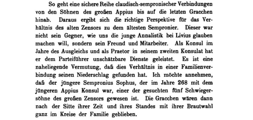
German lead type for scholarship
konrad ritter
Posts: 204
Calling all the expert authorities on this forum. I'd like to ask for your thoughts on two questions.
1. What do you think the ratio x-height/ascender is, in the lowercase of this Scotch Roman type? It's from nonfiction work set in early 1920s Germany. A wonderfully calm presence on the page; very pleasant to read in. I'm really curious.
2. Among the modern, digital Scotch Romans, which one do you think comes closest to this look/structure? I'd be really grateful for your recommendations.
I'm attaching two screen caps and two PDF samples, for edification. Thank you in advance!


Tagged:
0
Comments
-
-
-
My Scotch Modern could do the first. It has small caps, and size variants, for the footnotes.1
-
Thank you, Mr Shinn. Much appreciated!0
-
I am puzzled about your first question. Since you have the actual type samples, I would think that you are better able to measure the ratio of x-height to ascender height in the samples than we would be from your images.Thus, in your first sample, the ascender height seems to be 17 pixels, compared with 11.5 pixels for the x-height, and in your second sample, the ascender height seems to be about 14.75 pixels, compared with 9.75 pixels for the x-height.But this is a measurement, not a matter of opinion.0
-
Thanks, Mr Savard. Sorry to confuse the reader. I don't have the technical know-how to find out that ratio. It seems you do, and the numbers you suggested are good enough for me. I should have mentioned that I'm not trained in these matters, so I approached the hive mind on this forum. I trust its collective judgment.0
-
Initially, I was surprised by your reply. As every introductory book about type begins with a diagram defining things like x-height and cap-height, and surely with your knowledge and interest in this field, you could not have failed to open one such book, how could you not know something so basic, without any need for extensive formal training?But I have just learned something new about these matters myself, which shows me I was wrong about this! I attempted to draw one of those diagrams myself, and here is the result:
 It includes some nonstandard terms, in purple.The Cap height is the height of a capital letter, and the x-height is the height of a small letter without descenders or ascenders, like an x, right?So in answering your question, I supposed that the ascender height was the height of a whole letter with an ascender, and not the height of just the ascender (the part above the x-height) itself. In that, I was in line with the standard use.But that reasoning leads me to define the descender height as the full height of a letter with a descender, and not the height of just the descender itself... and that is wrong, so it is shown in purple as a non-standard term.Why is the standard terminology so inconsistent? Well, it isn't. But it is consistently something different from what I was thinking.Cap height, x-height, ascender height, and descender height are not sizes; they are co-ordinates. The terms in sans-serif type, shown in red, show the real standard usage; thus the cap height is the position of the tops of capital letters relative to the baseline, and the descender height is the position of the bottoms of descenders relative to the baseline.1
 -
Thank you, Mr Savard. Very helpful. Apologies, my question (about the ratio) was ambiguous, and could mislead people. That wasn't my intention.
My point in the reply was more prosaic: I don't know how to go about getting numbers like you did: 11.5 pixels, 17 pixels, etc. That's the part I wish I knew how to do myself. If I did, I could just go on and measure a lot of x-heights in that sample, then average them; and do the same for ascender heights, and so on. It's getting the number of pixels that eludes me.
0 -
For that, I used a paint program, viewed the image at 800%, turned the grid on, and counted. And I estimated 25% or 50% based on the shade of pixels at the border.
0 -
Excellent tip. Thank you!0
-
There is a measurement tool in Photoshop that can help with the counting of the pixels. It also shows the angle of the measurement.0
-
Thank you, Mr Seifert!0
-
In particular, I'd look at the Micro cut of Nick's Scotch Modern.
Brunel, from Commercial Classics, might give the same feel as the first sample—especially Brunel Short No 20 -
Thank you, Mr Nolan. I can't believe I overlooked Brunel. Both your suggestions are very good -- in fact, I had been looking lovingly at Scotch Micro. But, don't you think their ascenders are quite a bit shorter than in the sample I posted? I'm no expert, so it's just how it strikes my untrained eye.
For everyone's delight, I'm posting another sample of great type for science writing. It precedes the German one above by almost a century. It's from a 1847 survey of arithmetical books post-Gutenberg by Augustus de Morgan, the famed logician. Behold the beauty. I''m thinking I should start a thread on this theme.
0 -
Yes, they are shorter. You could also look at the version of Brunel No 2 that isn't short.0
Categories
- All Categories
- 46 Introductions
- 3.9K Typeface Design
- 489 Type Design Critiques
- 572 Type Design Software
- 1.1K Type Design Technique & Theory
- 663 Type Business
- 875 Font Technology
- 29 Punchcutting
- 529 Typography
- 121 Type Education
- 328 Type History
- 80 Type Resources
- 111 Lettering and Calligraphy
- 32 Lettering Critiques
- 79 Lettering Technique & Theory
- 561 Announcements
- 96 Events
- 116 Job Postings
- 169 Type Releases
- 179 Miscellaneous News
- 269 About TypeDrawers
- 53 TypeDrawers Announcements
- 114 Suggestions and Bug Reports

