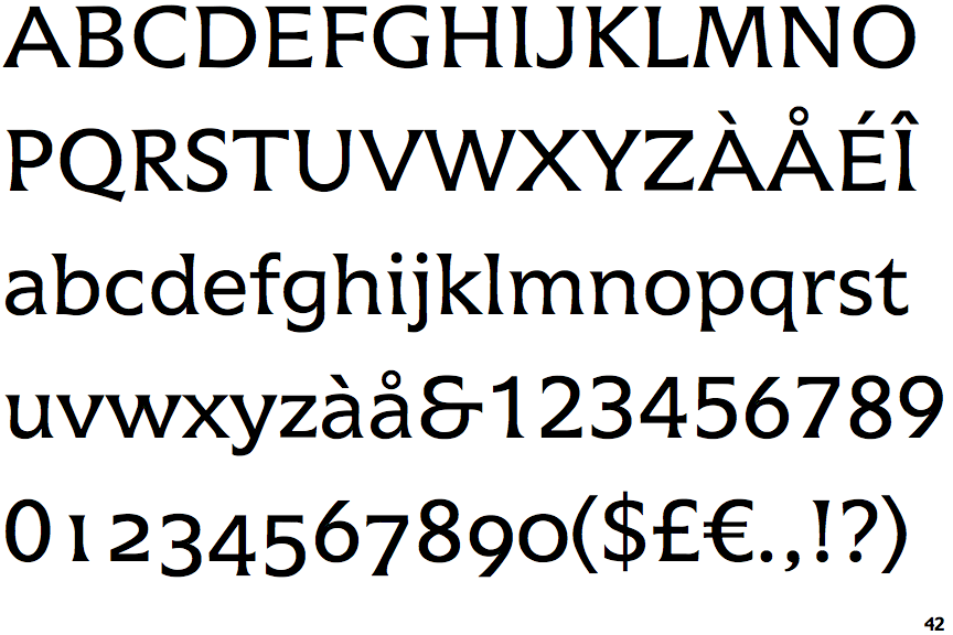
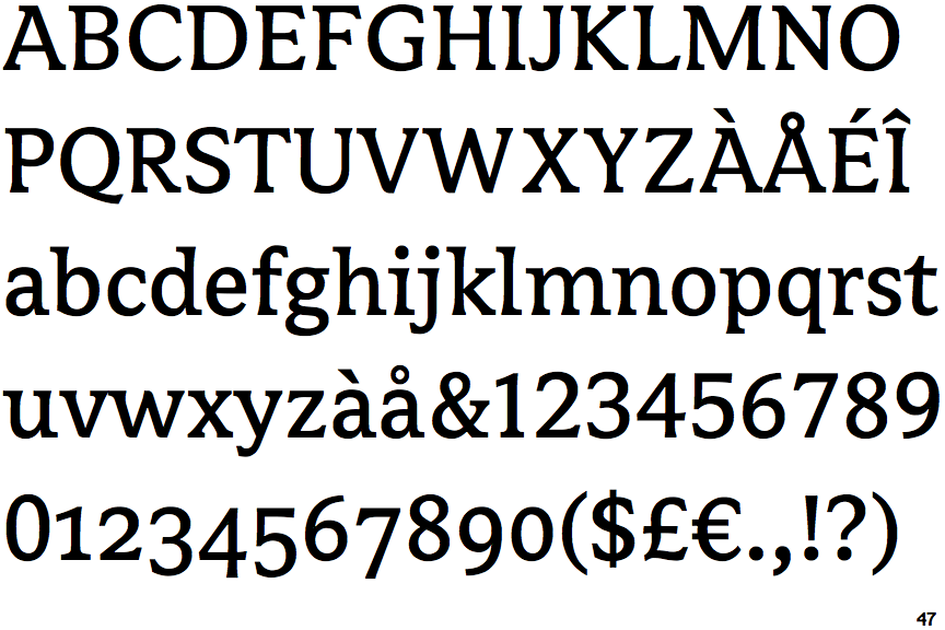
Classifying Icone by Adrian Frutiger and Avance by Evert Bloemsma
Rafael Cases
Posts: 38
In seeing both Icone and Avance, both of them have a rather similar look, with a similar sculptural and notan-centred paradigm.
How would they be classified? I know that Didone don't fit them. They most certainly don't fit the Oldstyle paradigm. Slabs and Transitional feel awkward for them too. But for some reason, Avance fits in its application as a body text despite its fairly quirky forms.
How would they be classified? I know that Didone don't fit them. They most certainly don't fit the Oldstyle paradigm. Slabs and Transitional feel awkward for them too. But for some reason, Avance fits in its application as a body text despite its fairly quirky forms.
Tagged:
0
Comments
-
I guess they would fall in the “Glyphic” cathegory, related to letters engraved or chiseled into metal or stone.4
-

(Image by Identifont)
Icone (1980) by Adrian Frutiger
(Image by Identifont)
Avance (2000) by Evert Bloemsma0 -
How you would classify them depends in part on what classification system you are using. Define that first, then classify. Otherwise, use a bunch of descriptive words and don’t worry about classification.
If we are talking the Vox-ATypI classification, I can certainly see Icone as glyphic. Avance, not so much.6 -
It certainly is true, though, that most existing schemes of type classification don't leave room for designs as original as Icone and Avance. Even Optima would cause some trouble. To me, Icone looks like a quasi-Latin, and Avance like a quasi-Clarendon.
1 -
Well, the overall treatment of Icone is "Glyphic".
Avance by Bloemsma is a semi-serif hybrid, but its modulation have that "glyphic" quality, so it can be seen as a Slab/Egyptian Semi-Serif with Glyphic qualities.1 -
To my eye, Icone is a modulated spur serif, while Avance is a kissing cousin of Palatino with modulated serifs, although less extreme than Icone. They both undulate to a certain degree, with bottom serifs leading and top serifs following.
0 -
In classifying/sorting typefaces, I find it helpful to imagine the letters without detailing and contrast – as a skeletal structure. I would also advocate a tag-based classification if you want something that is actually useful, as Indra Kupferschmid does brilliantly for Fontstand.
Icone appears to me constructed from a formal shape principle, rather than the typical skeleton+contrast+detailing scheme you get when mimicking a writing tool (give or take some abstraction). The term “Glyphic” fits this quite nicely – carved rather than written. The capital proportions are classical-ish, but exaggerated. The apertures are large, with terminals directed outwards. The arches start from the bottom of the stem and curve all the way around, but the curve is not the typical symmetrical one you’d find in a “Modern” serif or a “Grotesque”. Verdict:
a lot of abstraction, with just a hint of translation (sculpted)
dynamic structure
low contrast
semi-serif-ish
Avance has assymetrical arches shooting out from a high point on the stem, large apertures with terminals directed outwards. The capitals are leaning only slightly towards the classical wide/narrow scheme. These are traits you would find in a “Transitional” or late “Old Style” serifs. Looking at the lowercase ‘g’, you would not be able to stick a loop with that tension (no matter how monolinear) into a static “Grotesque” face. Verdict:
translation with some minor abstraction
dynamic structure
low to medium contrast
semi-serif
2 -
Is the term "spur serif" common in English? I am not familiar with it. From what I get it might refer more to typefaces with a hint of serifs.Nick Curtis said:To my eye, Icone is a modulated spur serif, while Avance is a kissing cousin of Palatino with modulated serifs, although less extreme than Icone. They both undulate to a certain degree, with bottom serifs leading and top serifs following.
"Glyphic" is a pretty established typographic term, as it qualifies the tapered nature of the terminals (and generally absence of serifs).
Depending on how you look at it, Avance does have the quality of glyphic typefaces, but of course one can see these as heavily modulated serifs as opposed as a tapering of the stems.0 -
"Spur serif" means a small serif, as in Copperplate Gothic or Serif Gothic.0
-
Thanks Mark, I kinda guessed that. :-)Mark Simonson said:"Spur serif" means a small serif, as in Copperplate Gothic or Serif Gothic.0 -
Axes, not boxes.
Don't classify, describe, using locations on spectra.1 -
Sure. Classification shows the ropes as soon as a design has truly something new to it. But nonetheless, it can be handy, if it’s well thought. One must not forget that it’s a tool.Hrant H. Papazian said:Axes, not boxes.
Don't classify, describe, using locations on spectra.0 -
To me type classification is a bit like Newton's Laws: fine for high school, but then you learn it's essentially wrong.0
-
Newton's Laws are such a fantastic approximation of how physics work at the scale of human experience that it took the scientific method centuries to find the cracks, let alone understand them. It's hilarious that you'd use them as an example for a failed framework, especially as applied to something as inherently fuzzy as art history, of all things.
0 -
Not a failed framework at all, most people don't ever need more. But in our own field we're not high schoolers, we should use the college stuff. So I can admit that "essentially wrong" might have been too bold (pardon the pun) because fuzzy cultural stuff is indeed... relativist. :-) But please don't call it Art, that's an ideological black hole (sorry).0
-
Hrant H. Papazian said:But please don't call it Art,It is true that typefounding is commonly thought of as a Craft, rather than as an Art, as it serves a practical end - and is, for the most part, constrained by the condition that people shall be able easily to read the result of the type designer's labors.However, as type designs do embody creativity, and are sometimes at least done without regard for their commercial prospects, I am not convinced that this is an appelation that can be entirely excluded. Even if this field will not necessarily applaud its Schoenbergs or its Karlheinz Stockhausens.0
-
Most typeface classification is art history in its most basic sense, and that doesn't imply that type design is Art in a romantic sense (any more than most of the things that humans have ever made and found pleasure in are Art in the romantic sense). The most commonly used typeface classifications derive directly from cataloguing and grouping historical typefaces. The category labels explicitly reference historical types. The only classification systems that are not art historical are those that attempt a descriptive cataloguing of features and construction.
I hardly need to point out, again, that the easiest and least art-specific way to speak about historical type design and typography is to use the same art history terminology that is applied to other things that people have made — furniture, buildings, clothes, music, as well as fine art — in the same cultural milieu.2
Categories
- All Categories
- 46 Introductions
- 3.9K Typeface Design
- 489 Type Design Critiques
- 572 Type Design Software
- 1.1K Type Design Technique & Theory
- 663 Type Business
- 877 Font Technology
- 29 Punchcutting
- 530 Typography
- 121 Type Education
- 328 Type History
- 81 Type Resources
- 111 Lettering and Calligraphy
- 32 Lettering Critiques
- 79 Lettering Technique & Theory
- 561 Announcements
- 96 Events
- 116 Job Postings
- 169 Type Releases
- 179 Miscellaneous News
- 269 About TypeDrawers
- 53 TypeDrawers Announcements
- 114 Suggestions and Bug Reports


