Crypt type

Nick Cooke
Posts: 209
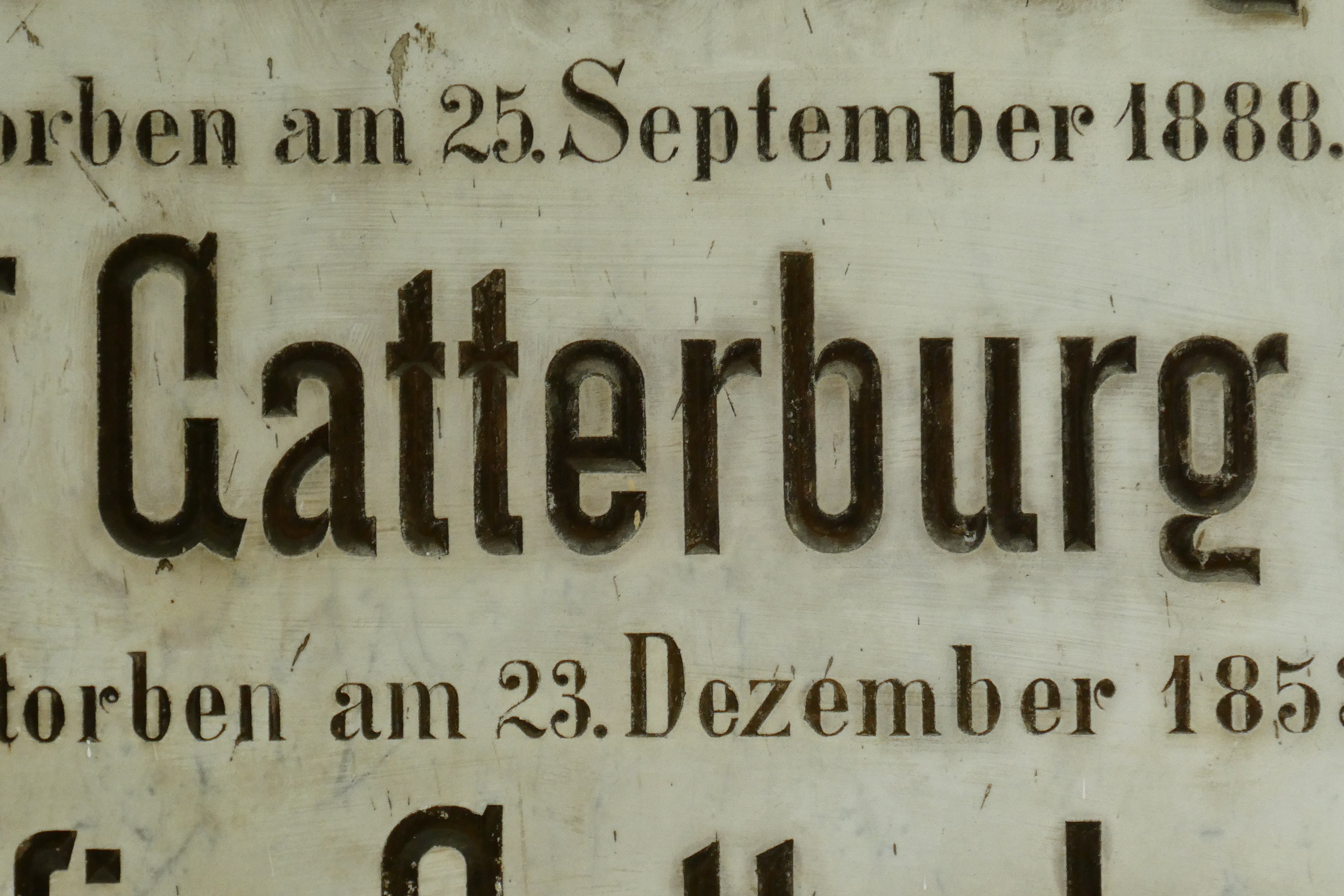
Some of you may have seen this on Twitter recently: "Something old but surprisingly modern in development".
I have been developing it further; making the Thin weight more condensed to fit with the style of the inscription, and a couple of extra weights, a Regular and Bold. There was some comments about the style of the G and g, so I produced an alternate style for those, (original style on the left, 2nd image), but having lived with it for a while now I am quite used to the original style and I think it fits perfectly.
Any comments regarding style, proportions etc?


0
Comments
-
What about an alternate /g with the same structure as the original, but the bowl goes down to the baseline (or at least the descender goes as deep as /p/q/y)? It's maybe the depth of it more than the unconventional structure that my eye gets hung up on.2
-
I usually love all of your work, but it seems something was "missed" in your redesign and digitization, I find it too "regularized" and cold, while the original is very warm.
This kind of curves can be very tricky, as they can be mistaken – this goes for superelliptical forms as well. And I would definitely keep just the original /g or at best a one-storey /g, dropping your usual lovely "hallmark" /g which here seems a bit out of place. :-)2 -
Also, /m feels too wide and the boldest /w too cramped.0
-
The only other descender in the original, the /p, is very modest. Could that be a reason for that short /g? (Which I like, by the way.)
If you agree then the other descenders might need following suit.0 -
In metal I have seen a similar /g and short descenders in fonts which were cast large on the body. It's different, but I like it.
1 -
I think that idea for the alternate /g works better Craig. The first alt /g I created wasn't very successful and didn't really fit in. Original /g in Hedwig, new alt in Gatterburg. I also widened the Bold /w.Craig Eliason said:What about an alternate /g with the same structure as the original, but the bowl goes down to the baseline (or at least the descender goes as deep as /p/q/y)? It's maybe the depth of it more than the unconventional structure that my eye gets hung up on. 0
0 -
I find it quite lovely as amended. I hate you for finding it first.
1 -
Er... thanks?Nick Curtis said:I find it quite lovely as amended. I hate you for finding it first.0 -
Overall, very stylish and warm IMPO.
I would make the tail of the /g somewhat more undulating, like a tilde, and I would try a version of the font with rounded corners. The tail of the /G should perhaps be more pronounced. The hood of the /a can perhaps be less wide in the lighter weights. Also, I think the bolder weights should be more spaced out in proportion to the lighter ones, despite the tall appearence and the negative space inside the letters. This rule should not be followed to the... uh... letter.
This is probably based on some (newspaper?) font from the era, does anyone have an idea which it is?0 -
I think the lighter weights should be more spaced out than the bolder weights. I brought the tail of the G in a bit so the space between it and the following letter is not so big. I like the sharpness of it, and don’t think rounded corners would add anything. Why do you think it’s based on a newspaper type? I can see why you would think that, but why would a monumental mason base their lettering on newspaper type?0
-
Short descenders to remind that life is short. This indeed looks gravey! Except for the right Geography, which is completely lively.
0 -
The font looks very similar to a font in a 19th century newspaper I saw somewhere. Of course I could be mistaken.Nick Cooke said:Why do you think it’s based on a newspaper type?0 -
Stonecutting. No wonder I couldn't find it in specimen catalogs. The style looks familiar for me, because you obviously took the picture in Vienna. Similar style was used in books for title-pages at this time. But G and g are very special.0
-
The photos were taken in Austria Helmut, but in Salzburg, not Vienna.0
-
Oh, the name of the family is still known. And I grew up in the neighbourhood of Zwölfaxing and Pellendorf (two small villages near Vienna) where the person in the first line was landlord in the 19th century. So I assumed that they must be buried in Vienna.0
Categories
- All Categories
- 46 Introductions
- 3.9K Typeface Design
- 489 Type Design Critiques
- 572 Type Design Software
- 1.1K Type Design Technique & Theory
- 663 Type Business
- 875 Font Technology
- 29 Punchcutting
- 530 Typography
- 121 Type Education
- 328 Type History
- 81 Type Resources
- 111 Lettering and Calligraphy
- 32 Lettering Critiques
- 79 Lettering Technique & Theory
- 561 Announcements
- 96 Events
- 116 Job Postings
- 169 Type Releases
- 179 Miscellaneous News
- 269 About TypeDrawers
- 53 TypeDrawers Announcements
- 114 Suggestions and Bug Reports


